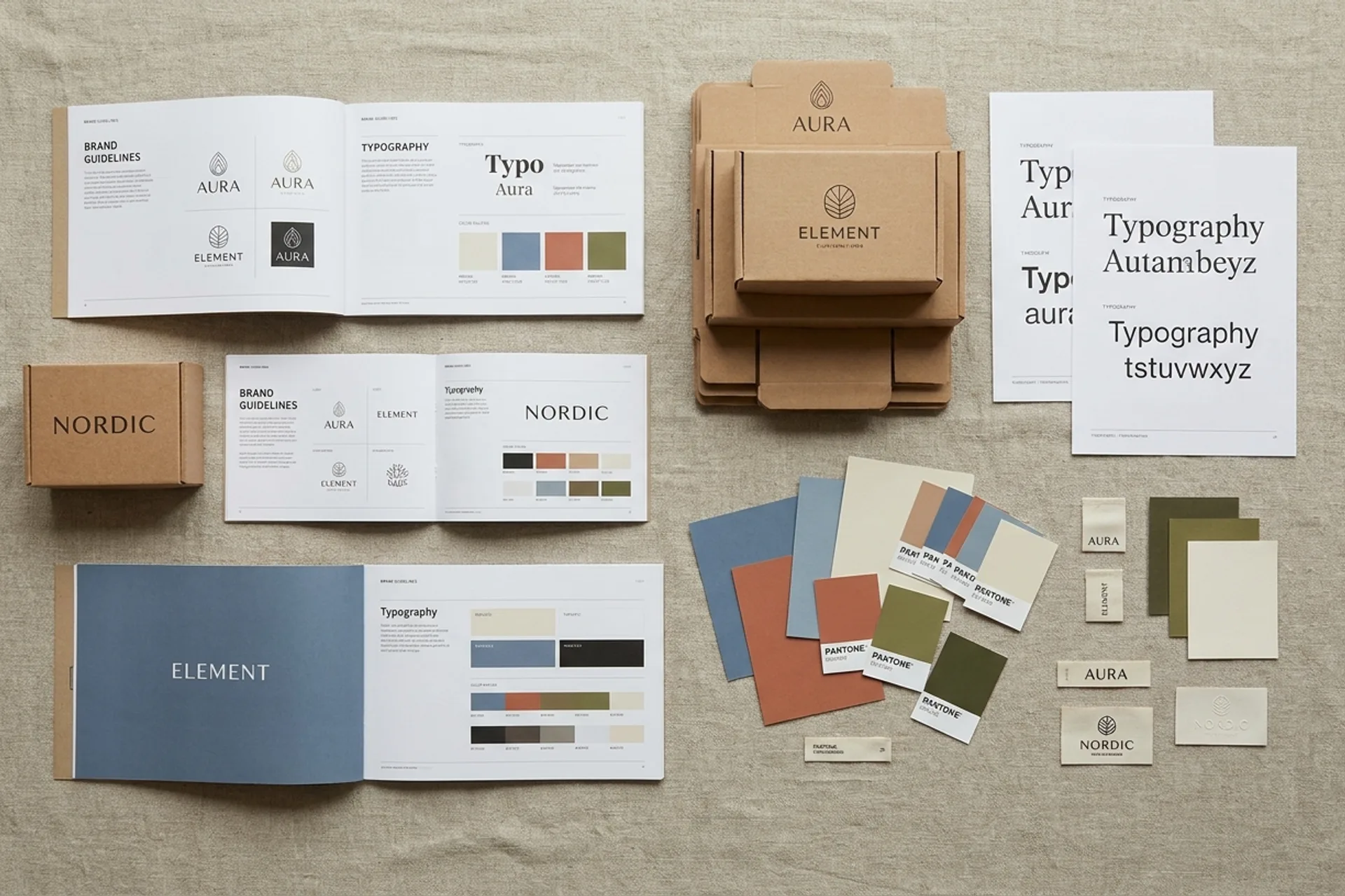
5 Brand Guidelines That Are Actually Worth Reading
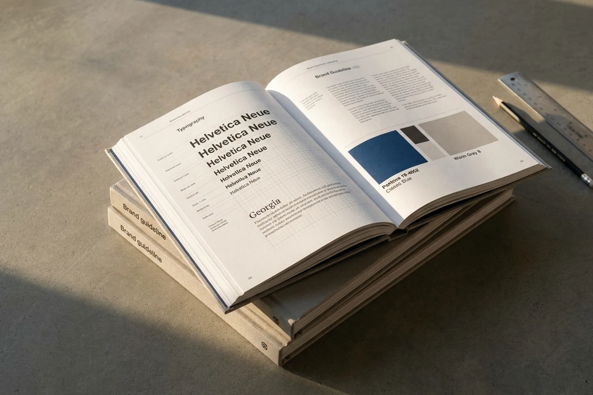
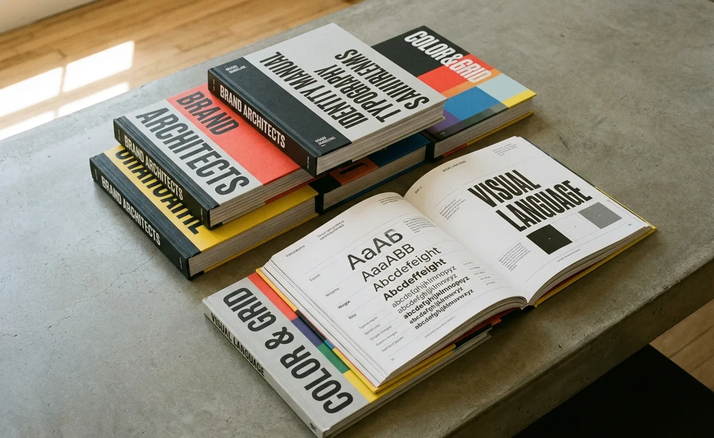
Brand guidelines are the most expensive design deliverable that nobody reads. An agency spends weeks — sometimes months — crafting a meticulous system of rules, examples, and specifications. The client downloads the PDF, opens it once during the handoff meeting, and never returns. The document lives in a shared drive, accumulating digital dust, while the marketing team guesses at hex codes and the junior designer scales the logo by dragging the corner handle.
This isn't a delivery problem. It's a design problem. Most brand guidelines examples are organized around the brand's logic (logo first, then color, then type) rather than the user's needs (how do I make a social post that looks right?). They're written in the language of designers for an audience that mostly isn't designers. And they're delivered as static PDFs in an era of living design systems.
But some companies have cracked it. The five brand guidelines below are worth reading not because they're comprehensive — most are relatively concise — but because they practice what they preach. They're design artifacts in their own right: opinionated, usable, and genuinely helpful.
1. Spotify — The Playbook That Sounds Like the Brand
Spotify's brand guidelines are publicly accessible at spotify.design, and they're one of the few corporate style guides that reads like it was written by humans who enjoy their work. The document opens not with logo specifications but with the brand's personality: "innovative, sincere, passionate, collaborative, playful." From there, every rule is contextualized — not just what the standard is, but why it exists and when to flex it.
The standout detail is the "duotone" section, which — despite the technique being largely retired from active campaigns — remains in the guidelines as a case study in how a visual tool can be used and then gracefully sunset. It's rare for guidelines to document what the brand no longer does, but this honesty makes the document more useful, not less. Designers who discover the duotone treatment on old assets know it's intentionally archived, not accidentally missing.
The Spotify guidelines succeed because they treat the reader as a creative partner, not a potential infringer.
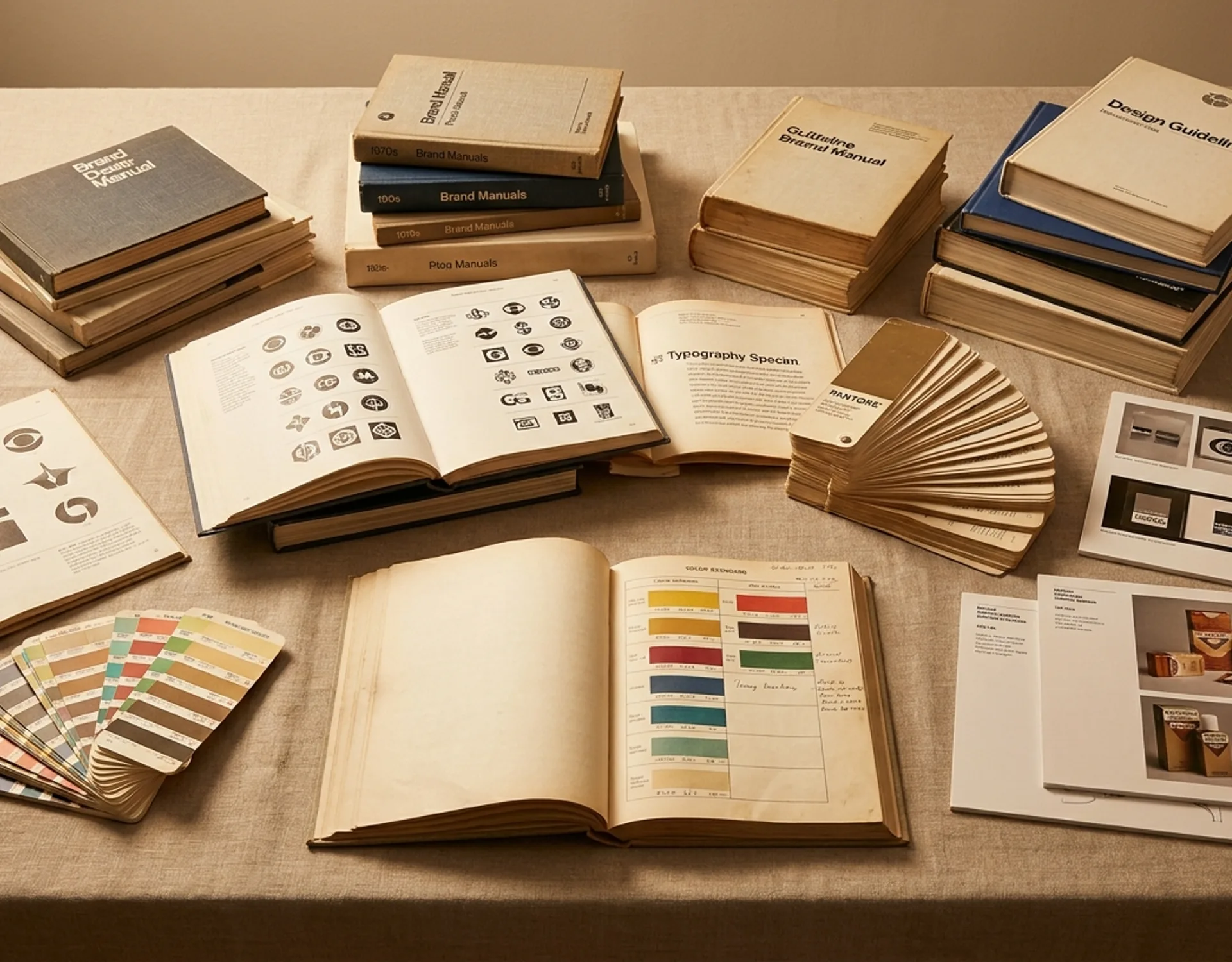
2. NASA — The 1975 Standards Manual That Defined an Era
NASA's Graphics Standards Manual, designed by Danne & Blackburn in 1975, is arguably the most famous brand guidelines document in history — not because NASA is a consumer brand, but because the document itself is a masterwork of systematic visual thinking.
The manual specified every application of the NASA "worm" logotype: size relationships, spacing, color values for screen printing, vehicle livery, signage, and publications. Each page is a study in precision. The Pantone callouts, the technical diagrams showing minimum clear space in fractions of an inch, the photography showing the logotype applied to spacecraft and launch facilities — the manual makes the case for the identity through evidence rather than assertion.
Richard Danne and Bruce Blackburn understood something that many contemporary guidelines miss: the document's job is to make the system feel inevitable. If a reader finishes the manual and thinks "of course that's how it should look," the guidelines have succeeded. NASA's manual achieves this through relentless specificity. There's no ambiguity, no room for interpretation that would weaken the system. The constraints are the design.
A 2015 Kickstarter by Standards Manual LLC reissued the original document, and it sold out immediately — purchased by designers who wanted to study the manual as much as the identity. When your guidelines become a collectible, you've transcended the format.
3. Slack — Brand Guidelines as Product Documentation
Slack's brand guidelines (brandfolder.com/slack) take an approach that reflects the product itself: organized, searchable, and built for teams. Rather than a single linear document, Slack's guidelines are structured as a resource library — assets, rules, and examples grouped by use case rather than brand element.
Need to create an event banner? There's a section for that. Building a co-marketing piece with a partner? Guidelines for that, too, with specific rules about logo lock-ups, clear space, and color combinations that work with Slack's palette alongside a partner brand. The guidelines anticipate real workflows rather than abstracting everything into theory.
The writing deserves particular attention. Slack's guidelines are written in the brand's own voice — clear, direct, slightly warm, with the occasional dry aside. The logo rules section notes that "our logo should always have room to breathe" — a cliché in most guidelines, but in Slack's case followed immediately by pixel-specific clear-space measurements. The human language earns the reader's attention; the technical specificity keeps their trust.
What Slack demonstrates is that guidelines structured around situations ("I'm making a presentation deck," "I'm writing a blog header") serve practitioners better than guidelines structured around elements ("Logo," "Color," "Typography"). The user's question is never "tell me about the logo." It's "how should this thing I'm making look?"
4. Audi — Engineering Precision Applied to Identity
Audi's brand guidelines are not publicly accessible, but enough of the system has been documented through case studies and agency portfolios that its approach is well understood — and widely studied.
The Audi brand design system, managed by KMS TEAM (now Strichpunkt) and later Audi's in-house design team, treats brand identity with the same engineering precision that Audi applies to its vehicles. Every element is defined with tolerances: the rings logo has a geometric construction grid measured in units relative to the overall mark width. Typography is specified not just by typeface (Audi Type, a custom family) but by size ratios, line-height relationships, and mathematical proportions that create visual consistency across any format.
The standout is Audi's approach to motion. At a time when most brand guidelines were still PDF-only, Audi's system included detailed motion principles: how the rings animate, the timing curves for transitions, the rules governing how elements enter and exit the frame. The guidelines didn't just specify the brand's static appearance — they specified how the brand moves.
For designers working on brand systems for premium or engineering-led brands, Audi's guidelines are required study. They prove that systematic rigor and creative expression aren't in tension — they're the same discipline applied at different scales.
5. Mailchimp — Brand Voice as Design Material
Mailchimp's Content Style Guide, an extension of the broader brand guidelines developed during the Collins rebrand, is the best example of voice and tone guidelines in the industry. The document — publicly accessible at styleguide.mailchimp.com — doesn't just tell writers to "be friendly." It provides graduated examples across different emotional contexts: how to write when the user is celebratory (a successful campaign), how to write when the user is frustrated (a delivery failure), and how to write when the user is learning (onboarding).
The guide's "Voice and Tone" section distinguishes between the two concepts with unusual clarity. Voice is consistent (always Mailchimp: informal, expert, slightly weird). Tone varies with context (celebratory, supportive, serious, depending on what the user is experiencing). This framework — stable voice, variable tone — is cited in writing circles as the gold standard for brand voice documentation.
What makes Mailchimp's guidelines worth reading alongside the four visual-identity-focused examples above is the reminder that brand guidelines aren't just about how things look. The most visible brand touchpoint for many companies is language — error messages, button labels, email subject lines, help documentation. Mailchimp's Content Style Guide treats these touchpoints with the same rigor that Audi applies to logo spacing. The lesson: if it carries the brand's name, it needs guidelines.
What Separates Guidelines That Get Used from Guidelines That Collect Dust
Across these five examples, a pattern emerges. The guidelines that work share three qualities:
They're organized around use cases, not brand elements. Slack structures by workflow. Spotify opens with personality. NASA provides application-by-application specifications. The reader finds what they need because the document is organized around their problems, not the brand team's taxonomy.
They're written with voice. Every guideline above sounds like the brand it represents. NASA's manual is precise and institutional. Mailchimp's is warm and slightly irreverent. Spotify's is collaborative. The guidelines are the first test of whether the brand system works — if the document itself doesn't embody the voice, why would anything else?
**They specify the why alongside the what.** Telling someone the logo needs 20 pixels of clear space is a rule. Explaining that clear space preserves legibility at small sizes and prevents visual competition with adjacent elements is a principle. Rules get broken when the enforcer isn't in the room. Principles get followed because the user understands the logic.
If your guidelines are gathering dust, it's worth asking: are they designed for the people who need them? Or are they designed to impress the people who commissioned them?
For a practical guide to structuring brand guidelines that clients actually use, see our upcoming Designer's Toolkit #3.