Consider a brand identity that includes thirty-two typographic styles. Four weights across two widths, each in roman and italic. In the static font era, that identity required thirty-two separate font files — thirty-two HTTP requests, thirty-two entries on a licensing invoice, thirty-two points of friction every time a new team member set up their design environment. The brand guidelines ran to several pages just to document which file to use where. And when the creative director wanted to explore a weight between Regular and Medium — a weight that would give body text just slightly more presence on a light background — the answer was simple: you cannot. That weight does not exist. Commission a custom cut, wait three months, or choose the nearest available option and move on.
Now consider the same identity built on a variable font. One file. Two files, if you separate roman and italic. Every weight between the thinnest hairline and the heaviest black is available continuously, addressed not by a filename but by a number on a sliding axis. The width, the same. The designer who wants that in-between weight simply sets `font-weight: 450` and it appears — no new file, no new license, no waiting. The typographic palette of the brand is no longer a finite set of options. It is a continuous space.
This is the variable font revolution, and it has been underway since 2016. But its most consequential effects are only now becoming visible — not in the technology itself, which is well-established, but in the way it is reshaping how organisations think about brand identity, design systems, and the relationship between typographic expression and technical constraint.
What a Variable Font Actually Is
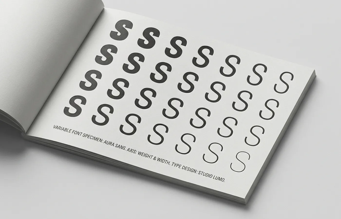
The underlying technology is elegant in its logic. A traditional, static font file contains one fixed set of outlines — the shapes of the letters at a single weight, width, and style. A variable font file contains a set of master outlines plus mathematical instructions for interpolating between them. The result is a single file that can produce an effectively infinite range of typographic variations along defined axes.
The OpenType 1.8 specification, published jointly by Apple, Google, Microsoft, and Adobe in September 2016, formalized this capability. It defined a set of registered axes — weight, width, italic, slant, and optical size — that any variable font could implement using standardized parameters. A weight axis, for instance, maps to CSS values from 1 to 1000, where 400 is Regular and 700 is Bold. But a variable font with a weight axis does not simply contain Regular and Bold. It contains every value in between, and often values beyond, rendered by interpolating between the designer's master drawings.
This was not entirely new as a concept. Apple's TrueType GX variations and Adobe's Multiple Master format had explored similar territory in the 1990s, but both arrived too early. The tools were not ready, the browsers were not ready, and the design culture was not ready. OpenType 1.8 succeeded where its predecessors failed because the ecosystem moved with it. Browser support followed quickly — all major browsers supported variable fonts by 2018. Design tools adopted the format. And critically, web standards provided the CSS mechanisms to actually use the technology, through `font-variation-settings` and the higher-level properties like `font-weight` and `font-stretch` that accept continuous values.
The result is a technology that is no longer emerging. It is here, it is broadly supported, and it is increasingly the default for serious typographic work on the web. The question is no longer whether to adopt variable fonts. It is what becomes possible when you do.
From Performance to Expression
The first wave of variable font advocacy was dominated by a single argument: performance. And the argument was genuine. A brand that previously loaded six or eight static font files — Regular, Medium, Bold, and their italics — could replace them with a single variable font file that was often smaller than the combined static files it replaced. Fewer HTTP requests. Smaller total payload. Faster page loads. In an era of increasing attention to web performance and its impact on user experience, conversion rates, and search rankings, this was a compelling case on its own terms.
The sustainability angle reinforced it. Every byte served to every user on every page load carries an energy cost. When a variable font replaces multiple static files, that reduction is multiplied across millions of page views. For a high-traffic brand site, the cumulative reduction in data transfer is meaningful — not transformative in isolation, but directionally significant in an industry that is slowly learning to account for the environmental cost of its decisions.
But performance, it turned out, was only the opening argument. The more profound shift was what happened when designers realised that the same technology that made their font loading faster also made their typographic palette richer.
In a static font world, a brand's typographic options are discrete. You have Regular and you have Medium. There is nothing in between unless someone draws it. In a variable font world, those options are continuous. The space between 400 and 500 on the weight axis is not empty — it is populated with an infinite number of valid, well-drawn intermediate states. And each of those states is available in CSS with a single property declaration, at zero additional file-size cost.
This changes the nature of typographic decision-making. Instead of choosing from a menu, the designer is navigating a space. Instead of selecting a weight, they are tuning one. The difference sounds subtle, but its implications for brand identity are substantial. A brand built on variable fonts can specify a weight of 420 for its body text — a value that exists nowhere in the traditional typographic vocabulary but that may be precisely right for the particular typeface, screen density, and background color in question. The brand's typography becomes tuned rather than selected, bespoke rather than off-the-rack.
IBM Plex: The Corporate Case Study
Few organisations have demonstrated the strategic value of variable fonts in brand identity as clearly as IBM. When the company introduced IBM Plex in 2017 as its first bespoke typeface in decades, the decision to develop it as a variable font family was inseparable from the brand strategy it served.
IBM Plex needed to work everywhere IBM works — on a smartwatch face, in a data dashboard, across a sprawling enterprise website, in developer documentation, on conference stage screens. It needed to carry a consistent identity across these wildly different contexts while adapting its typographic behavior to each one. A static font family could achieve consistency. Only a variable font could achieve both consistency and adaptation.
The variable axes of IBM Plex allow IBM's design system to specify precise typographic values for each context rather than rounding to the nearest available weight. Body text in a documentation site can sit at a slightly different weight than body text in a marketing page, reflecting the different reading conditions and different relationships between text and interface. The typeface is the same. The identity is coherent. But the expression is tuned to its context.
This is the variable font value proposition for large organisations: not merely that it is technically more efficient — though it is — but that it transforms typography from a set of fixed assets into a responsive material. The brand is no longer constrained by the cuts its type designer happened to produce. It has access to the full design space that those cuts define.
IBM also open-sourced IBM Plex, making the variable font files freely available. This decision amplified the case study's influence, allowing designers across the industry to work with a variable font family built to enterprise-grade standards and to see firsthand how continuous typographic variation operates inside a design system.
Google and the Infrastructure of Variation
If IBM demonstrated the strategic case, Google demonstrated the infrastructural one. Google Fonts, the world's largest open-source font library, began its transition toward variable fonts in earnest around 2019 and has since made variable versions available for hundreds of its most popular families. When Google prioritises a technology in its font infrastructure, the ripple effects are enormous — Google Fonts serves typefaces to billions of web pages.
The performance benefits at this scale are not incremental. A variable version of a popular family like Roboto or Open Sans, served to millions of sites, represents a meaningful reduction in global font traffic. Google's infrastructure optimises this further through techniques like progressive font enrichment — serving only the character subsets a page actually needs, combined with variable capabilities that reduce the number of files required regardless of how many styles a page uses.
But Google's investment also signaled something broader to the design community: that variable fonts are not a specialty format for typographic enthusiasts. They are the future baseline. When the default option in the world's most-used font service is a variable font, the technology ceases to be an opt-in choice and becomes the path of least resistance.
Google's own brand typography reflects this commitment. The company's evolving design language and Material Design system have increasingly incorporated variable font capabilities, treating weight and grade as continuous design tokens rather than discrete style selections. The grade axis — which adjusts the apparent weight of type without changing its width or layout — is particularly significant in interface design, where you may want to make text visually heavier on a dark background without reflowing the layout. This kind of fine-tuning was simply not possible with static fonts.
The Small Studio Advantage
Variable fonts are not only a technology for large corporations with global design systems. Some of the most inventive uses have come from smaller studios and independent designers who recognised that variable fonts offer a creative canvas, not just an engineering optimization.
The Danish studio Kontrapunkt used variable font technology in its identity work for the Danish national broadcaster DR, creating a typographic system where weight and width could respond dynamically to content type and screen context. The identity feels unified across platforms not because it uses the same static style everywhere, but because it draws from a continuous typographic space that adapts while remaining recognizably itself.
Studios like Dinamo in Basel — whose work with variable fonts as a creative medium we have covered previously — treat the technology as an opportunity to blur the boundary between type design and interaction design. Their variable font specimens are not static showings of a typeface at various weights. They are interactive environments where the user moves through the typeface's design space in real time, experiencing the relationships between styles as continuous rather than discrete. This reframes the typeface itself as a dynamic object, something closer to a material than a tool.
For smaller brands and startups, variable fonts offer a practical advantage that is easy to overlook: typographic range without typographic overhead. A young company that licenses a single variable font file has access to the same breadth of typographic expression that previously required licensing an entire family of static styles. The economic and logistical simplification is significant, particularly for digital-first brands whose typography lives primarily on the web, where variable fonts deliver their performance benefits directly to the end user.
How Variable Fonts Change Design Systems
The implications for design systems are worth examining closely, because this is where variable fonts shift from being a better format to being a different way of thinking about typographic infrastructure.
In a traditional design system, typography is defined as a set of named styles — Body, Heading 1, Caption, Label, and so on — each mapped to a specific combination of typeface, weight, size, and line height. The weight is drawn from the static styles available: Regular, Medium, Semibold, Bold. The system is a matrix, and every cell in the matrix must correspond to an existing font file.
A design system built on variable fonts replaces this matrix with a coordinate space. Styles are still named and documented, but the values they reference are positions on continuous axes rather than labels on discrete files. The system can specify `font-weight: 450` or `font-stretch: 87%` and know that these values will render correctly without requiring a specific file to exist for each one.
This changes how design teams work. It reduces the friction of typographic exploration — trying a slightly heavier caption weight is a property change, not a new asset to source and load. It simplifies asset management — one or two files replace a folder of static cuts. And it enables something that static fonts fundamentally cannot: typographic responsiveness.
Responsive typography — type that adjusts its properties based on viewport size, user preferences, or ambient conditions — has been theoretically possible with static fonts but practically clumsy. You could switch from Regular to Medium at a breakpoint, but the jump was abrupt, and the available values were limited to whatever the type designer had drawn. With variable fonts, weight can scale smoothly alongside viewport width. A heading might sit at weight 700 on a large desktop screen and ease down to 600 on a phone, with the transition happening continuously rather than in steps. The typography breathes with the layout rather than snapping between predetermined states.
Design tokens — the abstract, platform-agnostic values that power modern design systems — are a natural partner for variable fonts. A token like `--heading-weight` can be set to any numeric value, resolved differently across platforms and contexts, and applied to a variable font that will render it faithfully. The token system becomes the control surface; the variable font becomes the rendering engine. Together, they create typographic systems that are simultaneously more precise and more flexible than anything static fonts could support.
What Comes Next
The variable font format defined by OpenType 1.8 included a set of registered axes — weight, width, italic, slant, optical size — but it also allowed for custom axes, defined by the type designer for purposes the specification did not anticipate. This extensibility is where the format's future may be most interesting.
The grade axis, already mentioned in the context of Google's Material Design system, is a strong candidate for wider adoption. Grade adjusts the visual weight of type — making strokes thicker or thinner — without changing the width of any character. This means you can make text appear bolder on a dark background (where light-on-dark type tends to look thinner than dark-on-light at the same weight) without affecting line breaks, text reflow, or layout stability. For design systems that must work across light and dark modes, grade is not a luxury. It is a solution to a real and persistent problem.
Optical size, another registered axis, adjusts the design of letterforms based on their rendered size. At small sizes, an optically-sized variable font automatically opens its counters, thickens its thin strokes, and loosens its spacing — all the adjustments that skilled typographers used to make by hand when selecting a caption cut versus a display cut. CSS now supports automatic optical sizing through `font-optical-sizing: auto`, allowing the browser to select the appropriate optical size based on the computed font size. This is typographic intelligence baked into the font file itself, and it is available to every site that uses a variable font with an optical size axis.
Animation is the axis — in both senses — where variable fonts intersect most visibly with interaction design. Because the transition between any two points on a variable font axis is mathematically smooth, those transitions can be animated. A heading can ease from weight 300 to weight 700 on hover. A logo can breathe, its strokes thickening and thinning in a slow, continuous loop. Text can respond to scroll position, cursor proximity, or data values, its typographic properties bound to interaction states in the same way that color and opacity have been for years.
This is not universally advisable — animated type can easily become distracting or inaccessible — but it represents a genuinely new expressive capability. Typography has been static for five centuries. Variable fonts, for the first time, make it a time-based medium. How designers use that capability responsibly, in service of communication rather than decoration, will be one of the defining questions of typographic practice in the coming years.
The deeper transformation, though, may be less visible than animation and more structural than performance. Variable fonts are changing what it means for a brand to have a typeface. The relationship is no longer "we use this font" — a fixed object, selected from a catalogue, deployed identically everywhere. It is "we occupy this typographic space" — a continuous range of expression, defined by axes and boundaries, adapted to context, and tuned to the specific demands of each moment where the brand meets its audience.
That shift — from selection to navigation, from asset to system, from fixed to fluid — is the real revolution. The file format was just the mechanism. What it enables is a new relationship between brands and their most fundamental visual material.
WeLoveDaily is a design publication for people who care about how things look, work, and feel.