Walk into an Aesop store and the first thing you notice is what is missing.
There are no promotional posters. No seasonal window displays. No backlit photographs of models with improbable skin. No fragrance clouds engineered to ambush you at the threshold. Instead, there is a room — specific, considered, quiet — in which rows of amber glass bottles sit on surfaces made from materials that belong to the building or the neighbourhood: reclaimed timber in Melbourne, oxidised steel in Tokyo, pink marble in London, raw concrete in Berlin. A sink invites you to wash your hands. The lighting is warm but not flattering. The staff do not approach unless approached.
The experience is so conspicuously unlike conventional retail that it registers as a statement. And it is. Every Aesop store is a carefully constructed argument that restraint — in communication, in visual design, in the very act of selling — can generate more desire than any campaign.
This is the inaugural WeLoveDaily Brand of the Month, and Aesop is the right place to start. In a landscape of brands competing to be the loudest, the brightest, the most algorithmically optimised, Aesop has built one of the most recognised luxury identities in the world by doing conspicuously, deliberately less. The question is how — and whether the model can survive what comes next.
Melbourne Beginnings
Dennis Paphitis opened his first hair salon in Melbourne in 1987. He was a hairdresser by trade but a reader by temperament — the kind of person who named his company after the ancient Greek fabulist and stocked the salon shelves with literary journals alongside the shampoo. The earliest Aesop products were formulated for his salon clients, packaged in the amber glass bottles that remain the brand's most recognisable visual element nearly four decades later.
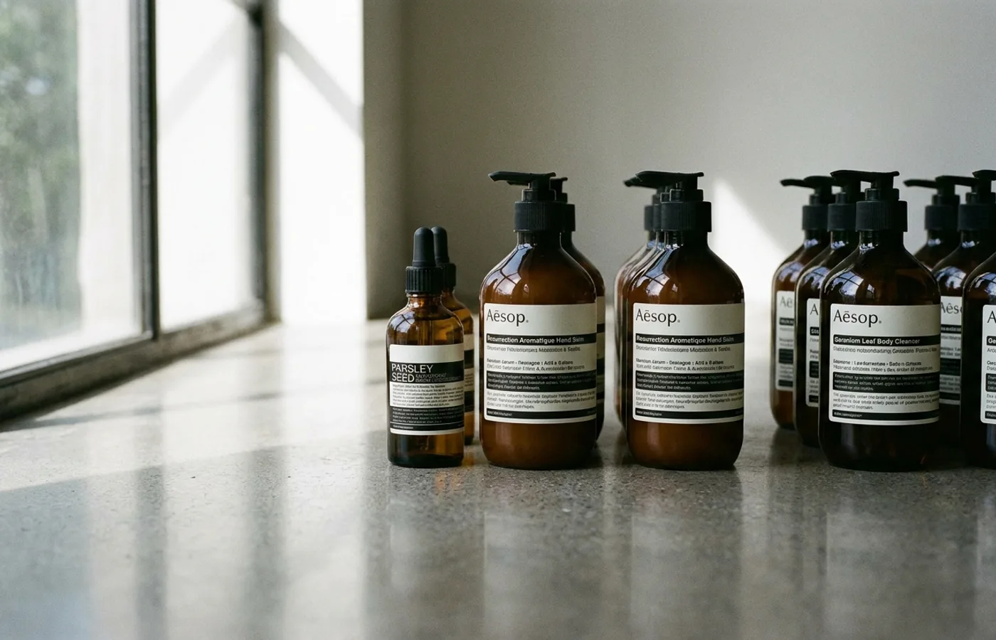
The bottles were not a branding decision, at least not initially. Paphitis chose amber glass because it protected the plant-based formulations from UV degradation. But the choice turned out to carry enormous semiotic weight. Amber glass signals apothecary, laboratory, craft. It suggests that the contents are functional rather than decorative, that they were made with intention rather than manufactured for shelf appeal. The bottle became the brand before the brand had a strategy.
Paphitis has spoken about his early conviction that the beauty industry's visual language was fundamentally dishonest — that the glossy imagery, the retouched faces, and the pseudo-scientific claims insulted the intelligence of the consumer. His response was not to create a better version of conventional beauty marketing but to reject the conventions entirely. No product photography in advertising. No celebrity endorsements. No aspirational imagery. The product would speak through its formulation, its packaging, and the environment in which it was sold.
This was not a marketing strategy in the way the term is usually understood. It was an aesthetic position — a belief that visual restraint and intellectual seriousness could create a different kind of desire. Paphitis was betting that there existed a consumer who would respond to absence the way most consumers respond to abundance.
He was right. Aesop grew slowly through the 1990s and 2000s — first across Australia, then into international markets — building a following among consumers who responded to the brand's understated intelligence. There was no viral moment, no celebrity catalyst, no venture-funded blitz-scaling. The growth was organic in the truest sense: people discovered the amber bottles, tried the products, and told other people. Word of mouth, underpinned by design conviction, was the only growth engine.
By the time the wider market began paying attention — the international expansion into Paris, London, and Tokyo in the mid-2000s — Aesop had already established the identity principles that would remain essentially unchanged for the next two decades.
The Identity System
Aesop's visual identity is one of the most disciplined in contemporary luxury — remarkable not for any single element but for the rigour with which every element is controlled.
Typography. The brand's typographic identity centres on Optima, Hermann Zapf's humanist sans-serif from 1958. It is an unusual choice for a luxury brand. Optima is neither the high-contrast Didone that fashion houses favour nor the geometric sans-serif that technology companies default to. It occupies a distinctive middle ground — calligraphic in its stroke modulation, with subtle thickening at the terminals that gives it warmth without ornament. The typeface has the precision of a sans-serif and the organic quality of a serif, which mirrors Aesop's own positioning: scientific rigour expressed with human warmth.
Optima appears on every bottle, every piece of collateral, every store sign. The consistency is absolute. There are no secondary display typefaces, no seasonal typographic variations, no expressive headline treatments. The brand says one thing, typographically, and it says it the same way everywhere.
Packaging. The amber bottles and aluminium tubes are Aesop's most powerful brand asset — more recognisable, arguably, than the wordmark itself. The packaging system is deliberately monochromatic: amber glass with cream labels, aluminium tubes with brown ink, cardboard boxes in a single shade of kraft. There is no colour-coding by product category, no gradient systems, no seasonal limited editions in collector packaging. Every product looks like every other product. The system communicates that the brand is the authority — not the individual SKU.
The labels themselves are dense with text: full ingredient lists, usage instructions, and the botanical provenance of key components, set in small type that rewards close reading. This is the opposite of the beauty industry norm, where packaging is designed to be scanned at arm's length. Aesop's packaging demands proximity, attention, time. It treats the consumer as a reader, not a browser.
The deliberate absence. What Aesop does not do is as important as what it does. There is no product photography in the brand's marketing — no glistening bottles shot against marble surfaces, no serum droplets suspended in midair. There is no advertising in the conventional sense: no print campaigns, no television spots, no paid social media placements with influencers. There are no seasonal campaigns, no limited-edition collaborations with fashion designers, no celebrity brand ambassadors.
This absence is not passive. It is an active, ongoing, expensive choice — expensive because every brand that does not advertise must rely on earned attention, which requires the product, the packaging, and the retail experience to be good enough to generate conversation without paid amplification. Aesop's identity system is engineered to make advertising unnecessary, which is a considerably more ambitious design brief than making advertising effective.
Retail as Brand Medium
If Aesop's packaging is the brand's typographic signature, its stores are the brand's architecture.
Aesop operates over 400 retail locations worldwide, and no two look alike. This is not a figure of speech. Each store is designed as a site-specific response to its location — the neighbourhood's history, the building's materials, the local architectural vernacular. The brand commissions architects and designers for individual stores the way a gallery commissions site-specific installations, treating each location as both a retail space and a design project.
The results are extraordinary in their range. In Tokyo's Aoyama district, Torafu Architects created a store from stacked cardboard tubes — a warm, cellular interior that references both Japanese paper craft and laboratory storage. In London's Lamb's Conduit Street, the store features pink Verona marble and terrazzo, a nod to the Georgian architecture of the surrounding Bloomsbury streets. In São Paulo, the architect Paulo Mendes da Rocha — a Pritzker Prize laureate — designed a store with raw concrete walls and a single long timber table, the space as austere and uncompromising as the Brazilian Brutalist tradition it references.
The Berlin store on Alte Schönhauser Straße uses reclaimed wood and raw plaster, the materials left deliberately unfinished in a way that reads as both artisanal and industrial. In the Marais district of Paris, the store is set within a former electrical substation, the original infrastructure preserved as sculptural elements. In Melbourne's Flinders Lane — where the brand began — the store is small, intimate, and almost domestic in scale, the amber bottles arranged on shelves with the care of a private library.
What unites these radically different spaces is not a visual system but a design philosophy: every store must feel inevitable in its context. The brand does not impose a template onto a location; it discovers what the location wants to be and then fills that space with Aesop's product. The effect is that walking into an Aesop store anywhere in the world feels simultaneously familiar and specific — you recognise the amber bottles, the sink, the quiet, but everything else belongs to the place.
In New York's Nolita, the store designed by Architecture at Large features a custom terrazzo floor that incorporates fragments of locally sourced marble, the colour palette drawn from the neighbourhood's cast-iron facades. In Stockholm, the design references Scandinavian modernism with pale wood and clean lines that feel native to the city's design culture. Each location is an act of architectural translation — the same brand language rendered in a completely different material vocabulary.
This approach is staggeringly expensive. Commissioning individual architects for individual stores, sourcing local materials, allowing extended design timelines — none of this is efficient. But efficiency is not the point. The point is that every store becomes a design story, a piece of content that generates press coverage, architectural photography, and word-of-mouth without the brand spending a single dollar on advertising. The stores are the marketing, and they work because they are genuine — designed with the kind of conviction that cannot be faked or optimised.
The Anti-Marketing Strategy
Aesop's refusal to advertise is often described as anti-marketing, but this framing misses the sophistication of what the brand actually does. Aesop does not reject marketing. It rejects the form of marketing while mastering its function.
The brand's cultural strategy is built on three pillars that generate attention without conventional advertising.
Literature and curation. Aesop has a long history of incorporating literary references into its brand experience — a direct inheritance from Paphitis's literary sensibility. Stores have featured curated reading lists displayed alongside the products. Book recommendations have been printed on receipts. The brand has partnered with independent publishers for in-store events and limited-edition collaborations that foreground ideas rather than product. Product names reference botanical science and classical language — Parsley Seed, Resurrection Aromatique, Fabulous Face Cleanser — each name carrying a quiet erudition that rewards the curious consumer.
The brand's connection to literature extends to its broader communication style. Aesop's website copy reads more like magazine editorial than marketing. Product descriptions are precise and understated, avoiding the superlatives and pseudo-scientific claims that characterise the beauty industry. The tone is that of a knowledgeable friend rather than a salesperson — informed, restrained, and confident enough to let the product speak for itself.
The overall effect positions Aesop not as a skincare company that happens to be cultured but as a cultural institution that happens to sell skincare.
Architecture as publicity. As described above, each store generates its own press cycle. When Aesop opens a new location with a notable architect, the design press covers it. Dezeen, Wallpaper*, Monocle, ArchDaily — these publications write about Aesop stores not because they are paid to but because the stores are genuinely interesting as architecture. The brand receives editorial coverage that money cannot buy, in publications that its target audience already reads.
Sensory experience as conversion. The hand-wash ritual at Aesop's sinks is the brand's most effective sales technique, and it involves no selling whatsoever. A consultant invites you to try a product by washing your hands at the store's basin. The experience — the texture of the cleanser, the scent of the botanicals, the warm water, the considered environment — is the pitch. No claims are made about the product's efficacy. No comparisons are drawn with competitors. The product is simply experienced in a context designed to make that experience as pleasurable as possible. The conversion happens not through persuasion but through sensation.
This strategy is a masterclass in what the marketing theorist Doug Stephens calls "retail as media" — the idea that physical retail spaces are not distribution channels but communication platforms, environments in which a brand can tell its story through direct, multisensory experience. Aesop understood this before Stephens coined the term, and it executes the concept more convincingly than any brand in the luxury sector.
After L'Oréal
In 2023, L'Oréal acquired Aesop from its parent company Natura &Co for approximately $2.5 billion — a staggering valuation for a brand with roughly $700 million in annual revenue. The acquisition was the largest in L'Oréal's history, a clear signal of how highly the world's biggest beauty conglomerate valued Aesop's brand equity.
The deal immediately raised the question that haunts every acquisition of a design-led brand: can the identity survive at scale?
The concern is not theoretical. L'Oréal is a company of enormous scale and efficiency, with a portfolio of brands — from Lancôme to Maybelline to Garnier — that operate according to the conventions Aesop has spent decades rejecting: mass advertising, celebrity endorsements, seasonal campaigns, aggressive distribution. The fear, expressed widely in design and business press at the time, was that L'Oréal's gravitational pull would gradually erode the very qualities that made Aesop worth $2.5 billion.
Nearly three years later, the early evidence is cautiously reassuring. Store design standards have been maintained. The advertising blackout continues. The packaging system remains unchanged. L'Oréal appears to understand, at least for now, that Aesop's value is inseparable from its restraint — that the brand's identity is the product, and that diluting the identity would dilute the revenue.
But the structural tensions are real. L'Oréal is a public company with quarterly growth expectations. Aesop's model — slow expansion, expensive stores, no advertising — is inherently capital-intensive and margin-constrained. The pressure to accelerate store openings, expand into new product categories, or introduce the kind of marketing campaigns that drive volume will be constant. Whether Aesop's identity can hold under that pressure depends less on design decisions than on corporate governance — on whether L'Oréal's leadership continues to view Aesop as a brand that grows by doing less rather than more.
There is also the question of digital presence. Aesop's e-commerce experience, while clean and typographically consistent, has never achieved the same immersive quality as its physical retail. In an era where an increasing share of luxury purchases happen online, the brand must find ways to translate its spatial intelligence — the materiality, the quiet, the sensory invitation — into a digital environment that inherently resists those qualities. This is perhaps the most interesting design challenge Aesop faces under L'Oréal's ownership: not how to preserve the stores, but how to build a digital experience that is their equal.
The comparison with peers is instructive. Le Labo, acquired by Estée Lauder in 2014, has maintained much of its identity — the handwritten labels, the made-to-order positioning, the industrial-chic retail environments — while expanding significantly. Byredo, acquired by Puig in 2022, has similarly preserved its visual identity through ownership transition. The precedent suggests that luxury conglomerates can steward acquired brands without destroying them, provided the acquirer respects the brand's self-imposed constraints.
The risk, though, is not dramatic destruction. It is gradual dilution — the slow accumulation of small compromises that individually seem harmless but collectively erode the rigour that makes the brand distinctive. One seasonal collaboration. One paid social media campaign. One store designed from a standardised template rather than commissioned from an architect. None of these would be fatal in isolation. Together, over time, they would be.
Lessons for Brand Designers
Aesop's identity offers several principles that extend well beyond skincare.
Restraint is a design decision, not a budget constraint. Aesop does not do less because it cannot afford to do more. It does less because it has concluded — correctly — that every additional element dilutes the system. This is an active, ongoing discipline, not a default state.
Consistency compounds. The amber bottle, the Optima type, the monochromatic packaging — these elements are not remarkable in isolation. They are remarkable because they have been maintained without variation for decades, accumulating brand equity that no campaign could replicate. The lesson is not to find the perfect visual element but to find a good one and defend it relentlessly.
The environment is the message. Aesop's stores demonstrate that the physical context in which a product is experienced shapes perception as powerfully as any advertising. For brands in any category, the lesson is that every touchpoint — retail, packaging, digital, service — is an identity surface, and each one should be designed with the same conviction.
Absence creates desire. In a market saturated with visual noise, the brands that refuse to participate in the noise become more visible by virtue of their silence. Aesop's lack of advertising is not a weakness. It is the brand's most powerful differentiator — a silence that, in a room full of shouting, commands more attention than any voice.
Design conviction must be institutional, not individual. Paphitis's aesthetic sensibility created Aesop's identity, but the brand's endurance depends on that sensibility being embedded in the organisation's culture, processes, and governance — not residing in a single founder's taste. Aesop's challenge under L'Oréal is fundamentally a challenge of institutional design: can the discipline be maintained when the person who established it is no longer making every decision? The brands that endure are the ones that codify their design principles deeply enough to survive leadership transitions, acquisitions, and the inevitable pressure to do more, louder, faster.
This is, perhaps, the deepest lesson Aesop offers. Brand identity is not a set of visual assets. It is a set of decisions — and, more importantly, a set of refusals. The amber bottle is not the identity. The decision to use the same amber bottle for every product, without variation, for nearly forty years — that is the identity. The store design is not the identity. The decision to commission a different architect for every store, at enormous cost, because the alternative would betray the brand's spatial philosophy — that is the identity. Identity lives not in what a brand looks like but in what it will not compromise on.
Next month, Brand of the Month turns to Stripe — a company that, like Aesop, built a distinctive identity by treating design as a strategic discipline rather than a cost centre. Where Aesop's restraint is sensory and spatial, Stripe's is typographic and computational. The comparison is worth making.
WeLoveDaily is a design publication for people who care about how things look, work, and feel.