TL;DR — Key takeaways
- Good rebrands solve a positioning problem; great rebrands solve one and refuse to touch the equity that already works.
- The pattern across 15 recent refreshes: strip the ornament, keep the recognition anchor, invest the savings in a typographic or color asset that compounds.
- The failures in this sample share a single trait — a brand trying to be both premium and mass at the same time.
---
A rebrand is a visible symptom of an invisible decision. What changed about the business? Who's the new customer? What did the old identity stop saying? The fifteen refreshes below answer those three questions in fifteen different ways, with fifteen different levels of success. This piece stitches the patterns together.
The framework we used
Each entry below is scored on three axes: clarity of the problem the rebrand was trying to solve, quality of the solution shipped, and risk to existing equity. A rebrand can succeed on two of three and still look great at launch; the ones that succeed on all three are the ones that age well.
The fifteen
1. Jaguar — 2024 Identity Reset
Verdict: High risk, contested solution, clarity of problem was correct. Jaguar's 2024 reset correctly identified that the brand had eroded into invisibility among younger luxury buyers. The response — a bold wordmark and near-complete abandonment of heritage visual cues — trades on a premise the brand must now actually deliver: that a next-generation product line justifies the visual distance. If the cars work, the rebrand reads as brave. If they don't, it reads as erasure.
2. Tropicana — The $35M Lesson
Verdict: Cautionary tale. Tropicana's 2009 redesign (by Arnell Group) famously shipped a minimalist carton that stripped the orange-and-straw shelf signifier, tanking sales by an estimated 20% and reversing within two months. The lesson hasn't aged — shelf recognition at a glance is a brand asset that shows up on no balance sheet but disappears the moment you kill it.
3. Instagram — The 2016 Gradient, Re-proven in 2024
Verdict: Vindicated bet. The 2016 flat-icon + gradient move was mocked at launch. Eight years later, Instagram's 2024 identity refresh doubled down on the gradient as the brand's primary load-bearing element. The thesis — that color can do the work typography used to do — is now one of the most-cited examples of consumer-brand durability in the last decade.
4. Air France — Heritage Without Nostalgia
Verdict: Textbook category move. Air France's 2023 refresh updated the custom typography and refined the seahorse mark without touching the French-blue equity that defines the brand at the airport gate. The wordmark got contemporary; the feeling didn't. Heritage categories rarely thread this needle.
5. Mailchimp — Two Years On
Verdict: Quirk survived the system. R/GA's 2018 Mailchimp refresh was criticized for risking the brand's playful equity against a more corporate posture. Two years post-Intuit acquisition, Freddie the mascot and the cream-yellow palette remain load-bearing. The system absorbed growth without losing voice.
6. Volvo — The Quiet Rebrand
Verdict: Under-discussed execution of the decade. Volvo's multi-year evolution stripped chrome ornamentation in favor of a near-flat wordmark and a tightly restrained Scandinavian color system. The category (automotive) punished most parallel attempts; Volvo's worked because the product language and the brand language were redrawn simultaneously.
7. Figma — A Design Tool Builds Its Own Brand Language
Verdict: The SaaS brand-system archetype. Figma's identity is no longer the F-in-a-box logo — it's the color-and-geometry language that runs across their conferences, merchandise, and developer materials. The shift happened gradually enough that it felt natural to users; look at 2020 Figma next to 2026 Figma and the distance is significant.
8. Airbnb — The Bélo, A Decade Later
Verdict: Validated by time. DesignStudio's 2014 rebrand was ridiculed at launch for the Bélo symbol's ambiguity. Ten years in, the mark is the most durable consumer-brand symbol of the 2010s — scalable, culturally neutral, tattoo-legible. The mockery was a timing problem; the mark was correct.
9. Anthropic — Quiet Confidence
Verdict: Category-defining refusal. In an AI sector saturated with holographic gradients and neural-network particle systems, Anthropic's serif-on-cream identity reads as research, not hype. A brand system built around what it refuses to do. Other frontier AI labs will copy within three years.
10. Arc Browser — Browser as Object
Verdict: Furniture-grade SaaS. The Browser Company's identity argues the browser is a room you live in, not a tool you use. Warm, rounded, considered. The sub-category (indie browsers) was previously invisible; Arc's brand made it visible.
11. Linear — Speed as a Visual Language
Verdict: The monospace-violet template. Linear's identity compounds speed into every typographic and spatial choice. The cost is that the aesthetic has been thoroughly copied across dev-tool startups (see: Vercel); the benefit is that Linear sits at the top of the category because they did it first and best.
12. Vercel — The Dev-Tool Lingua Franca
Verdict: Won the aesthetic, lost the differentiation. Near-black backgrounds, geometric illustration, restrained accents — Vercel's identity became the template for every dev-tool that shipped after 2022. The problem: the template is so broadly adopted that "Vercel-aesthetic" brands are now hard to tell apart at first glance.
13. Bluesky — The Antidote to Platform Aesthetics
Verdict: The refusal is the brand. Every major social platform of the last decade converged on the same visual register: bright, saturated, algorithmically-friendly. Bluesky's ink-blue butterfly on flat white refuses the convention entirely. The refusal is readable — users feel the difference before they articulate it.
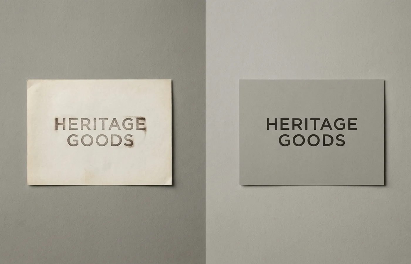
14. The Branding People — A Studio Redefines Itself on Systems
Verdict: Proof-of-thinking rebrand. The Mexico City studio's 2026 self-rebrand is a working demonstration of the thesis "brand system > brand identity." The deliverable is engineering-spec clarity rather than expressive decoration. Readers of the before-and-after can see the studio's methodology on the page.
15. Think Agency — Digital Liquid
Verdict: Right motion, right reason. Dubai's Think Agency rebranded around a "digital liquid" concept as the shop evolved from mobile-only to full-service digital. Motion-identity is a saturated move by 2026; what saves the system is that the motion is grounded in a specific business argument (the evolution), not decoration.
The patterns
Three things repeat across the fifteen.
Refresh the asset; protect the anchor. Nearly every successful rebrand here updates the typographic or color treatment while leaving one recognition asset untouched (Figma's F, Volvo's iron-sign frame, Instagram's gradient, Airbnb's Bélo, Air France's seahorse). The failures either kept the wrong anchor or killed the right one.
Distance, not modernity. The strongest entries read as distant from the old brand rather than modern. Modernity is a commodity — every brand can hire a studio to shave off chrome and tighten the typography. Distance requires the business to actually be doing something different (Volvo's product redesign, Arc's browsing premise, Anthropic's research posture).
One asset compounds. Every system here has a single load-bearing asset that does most of the brand work in the wild. Instagram: color. Linear: monospace. Airbnb: the Bélo. Anthropic: the cream background + serif wordmark combination. Spread the work across five equal assets and none of them get strong; concentrate on one and it compounds across every surface.
What to do with this
Read any of the fifteen entries in full for the strategic detail. Each links through to its full breakdown on the brand pages. For a ranked list of the studios executing at this level, see our 25 brand guidelines worth studying in 2026. For recent curated project coverage, see the New Work feed.