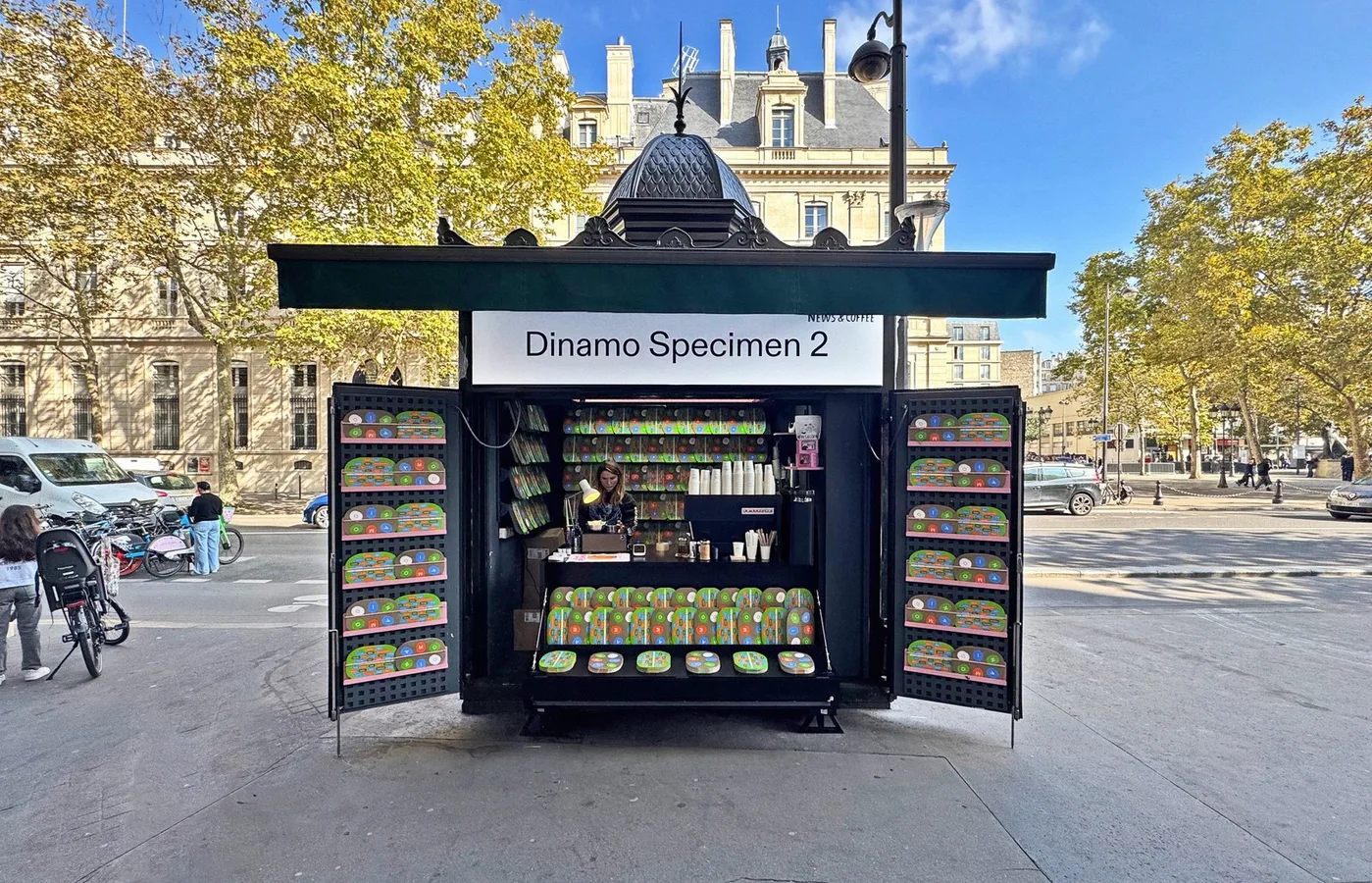
You've seen a Dinamo typeface today. You probably didn't know it. That's partly the point.
ABC Favorit appears on screens belonging to some of the most design-literate brands of the past decade: technology companies, cultural institutions, fashion labels that care deeply about visual language but would never describe themselves as "typographic." ABC Whyte shows up in editorial layouts and app interfaces where the brief was clearly "modern but not cold, distinctive but not loud." These are typefaces that do their work by refusing to announce themselves. They communicate a sensibility without demanding attention for it.
This is the paradox of Dinamo, the Basel-based operation whose approach to type foundry branding has become one of the most influential models in the industry: their typefaces are everywhere, but the studio itself operates with a deliberate remove from the noise of the design world. No self-congratulatory social media cadence. No personal brand theatrics. Just typefaces that carry arguments embedded in their design, and a pricing model that treats accessibility as a design decision, not a marketing gimmick.
The Foundry as Cultural Position
Dinamo was founded by Johannes Breyer and Fabian Harb, who met while studying at the Basel School of Design, a detail that matters because Basel is not incidental to what Dinamo became. The city's typographic lineage runs through Armin Hofmann, Wolfgang Weingart, and the entire trajectory of Swiss graphic design. To start a type foundry in Basel is to accept a conversation with history. What made Dinamo different was the nature of their reply.