The 2026 layout survey
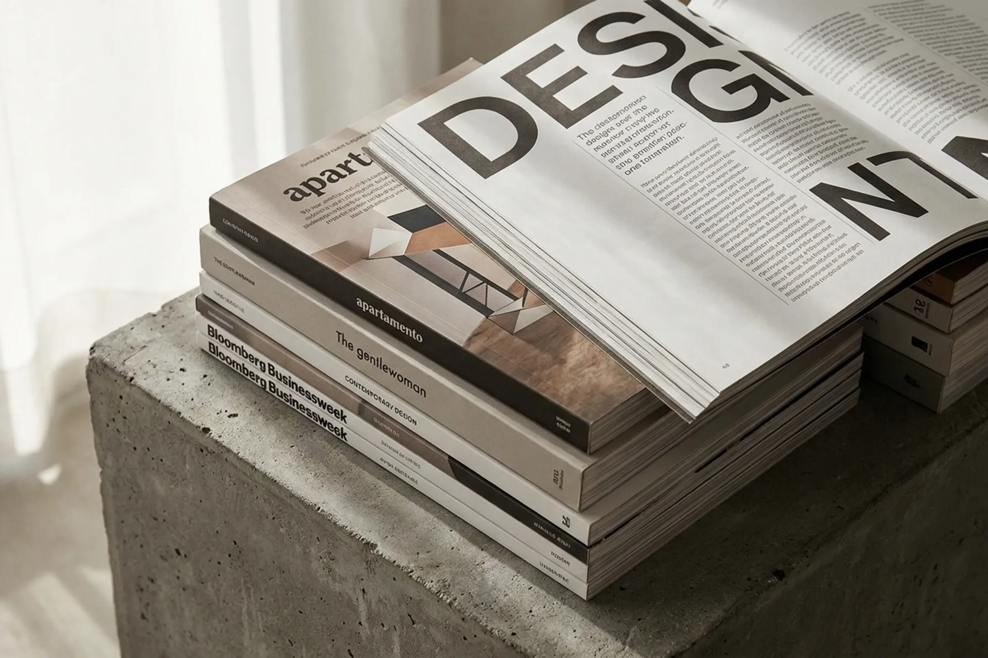
Thirty grids, one snapshotOur annual survey of the magazine layouts rewriting the grid is the densest single reference on this site: thirty contemporary spreads, each annotated for what it does to hierarchy, pacing, and the grid it breaks. If you study one page in this collection, study this one.
Editorial design in 2026 — 30 magazine layouts →
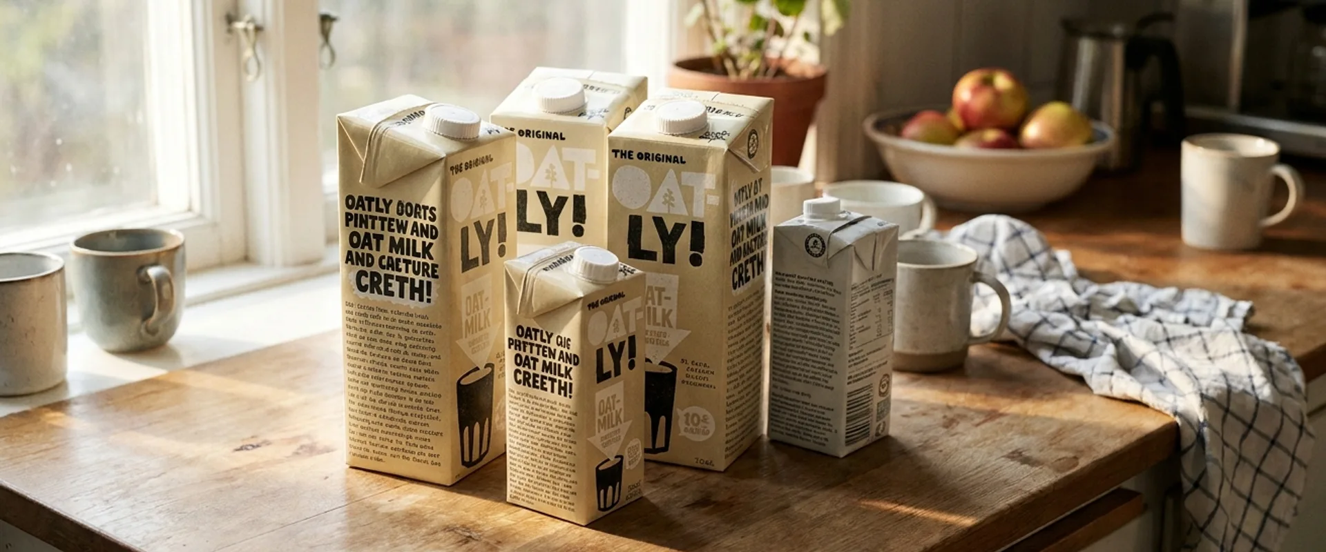
Oatly
Packaging as a magazineThe carton reads like a zine on purpose: dense hand-set type, self-interrupting copy, editorial pacing on a grocery shelf. Oatly is the clearest proof that editorial design is a sensibility, not a medium — it works anywhere words meet a surface.
The carton as editorial →
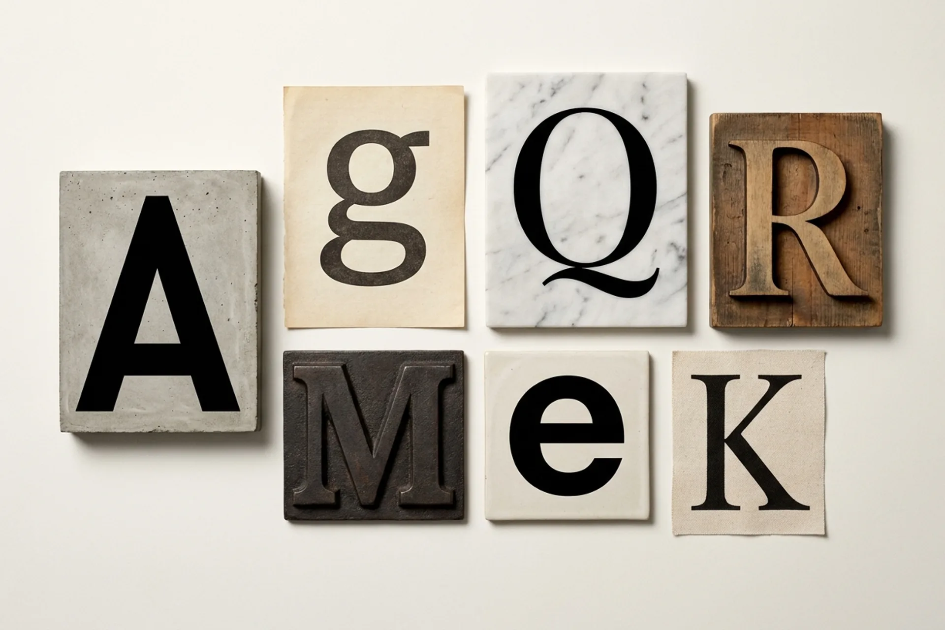
Luxury fashion
The serif as house styleHigh fashion built its visual authority in magazines, and it still speaks in editorial conventions — sharp high-contrast serifs, generous white space, images allowed to breathe. A category-wide study in how print-era editorial craft became a positioning tool.
Why serifs still rule luxury →
Lisbon
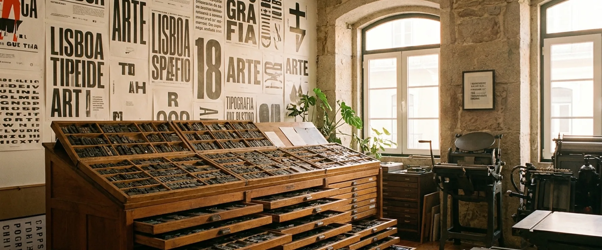
A city with editorial voice