Lisbon's design-capital narrative has been running for about five years now, and every piece of the coverage focuses on the same elements: the architectural restoration of the old town, the azulejo revival, the wave of creative migration from Berlin and Barcelona, the low cost of studio rent. These are real components. They are not, however, the engine.
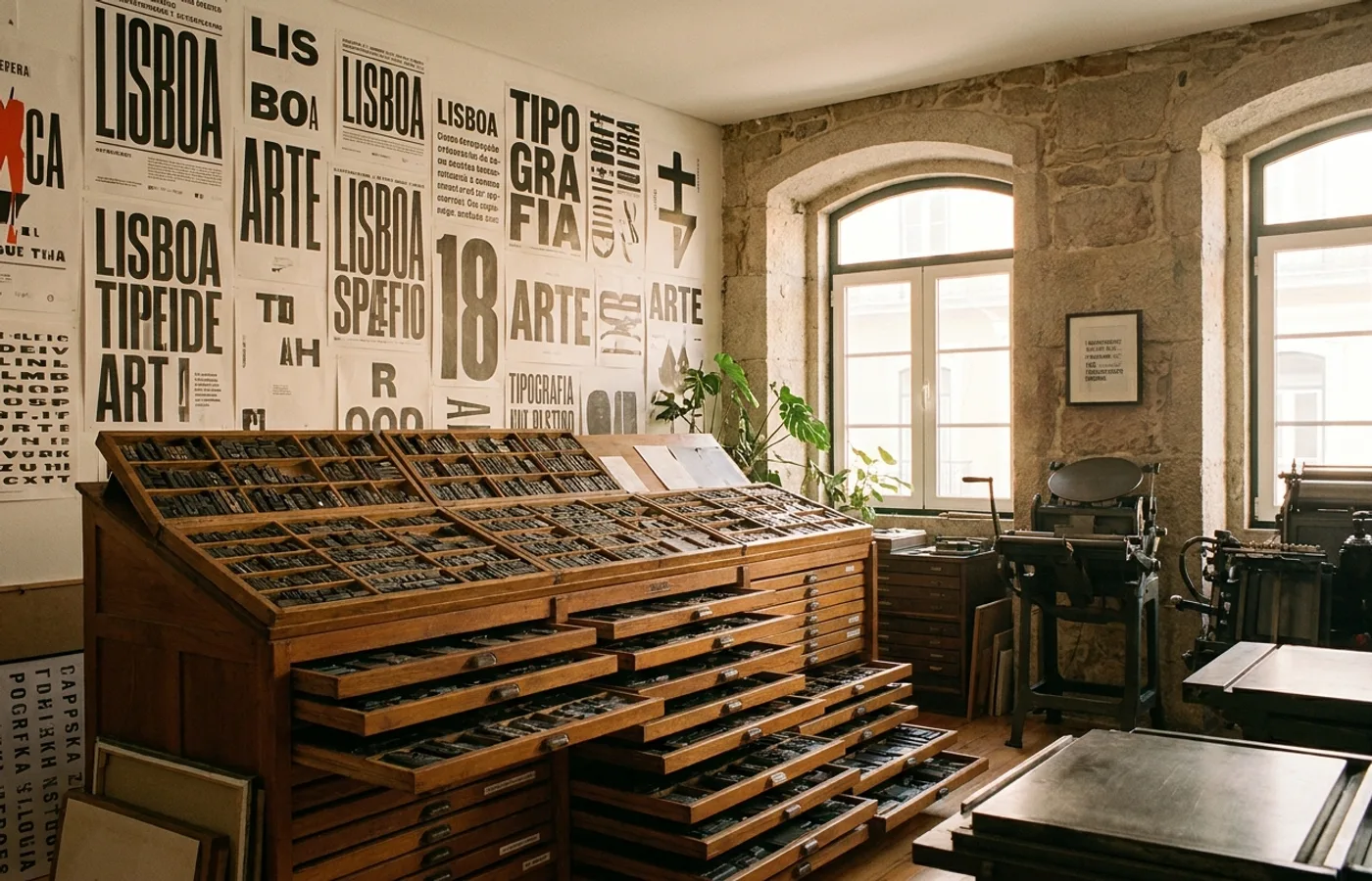
The engine is typography. More specifically, the engine is a cluster of independent type foundries that have quietly made Lisbon one of the most productive cities in Europe for type design, and whose output is visible on brand systems across the continent.
The Foundries
Four Lisbon-linked foundries are doing most of the heavy lifting.
Grilli Type (GT), though headquartered in Switzerland, has had a strong Portuguese designer base for years and maintains operational links to Lisbon. Its catalog — GT Alpina, GT Walsheim, GT Flexa, GT Super — has become default typography for a significant share of European design-forward brands in the 2020s.
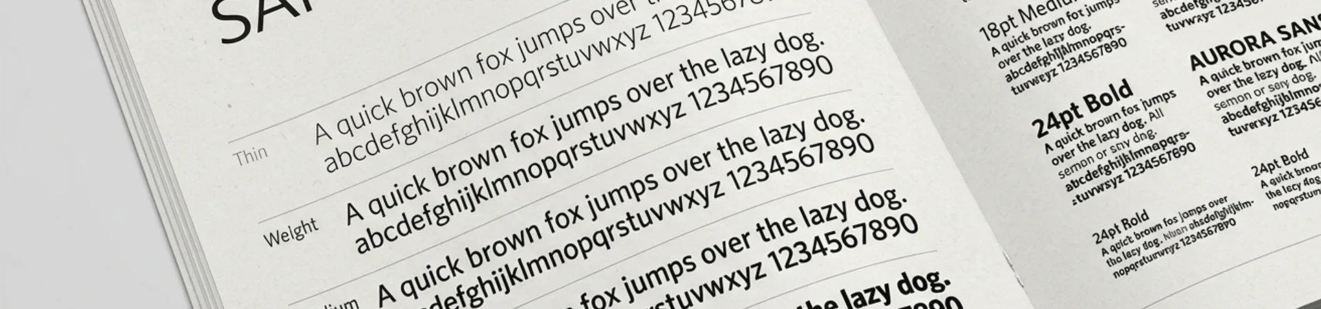
Hungry Grid, founded by Portuguese type designers, is rapidly becoming a go-to source for editorial and display type among European studios. Their releases pair technical precision with Iberian character — a quality that's hard to pin down but visible when you stack their specimen sheets next to the usual Dutch or German foundry catalogs.