Open the Stripe homepage and something immediately feels wrong — wrong, at least, for a company that processes hundreds of billions of dollars in payments annually. There are no stock photographs of handshakes. No pie charts gesturing vaguely at growth. No smiling business people standing in glass-walled conference rooms. Instead, there are gradients so precise they appear to have been mixed by a colourist, typography set with the care of a fine-press book, and illustrations that belong in a design annual rather than on a fintech marketing page.
This is the central paradox of the Stripe brand identity: it is an infrastructure company that looks like an editorial publication. It sells plumbing and presents it as architecture.
Since its founding in 2010 by brothers Patrick and John Collison, Stripe has grown into one of the most valuable private technology companies in the world — valued at roughly $65 billion as of its 2025 fundraise. But its influence extends well beyond payments processing. Stripe has, quietly and methodically, built one of the most distinctive brand identities in technology, one that has reshaped expectations for what a B2B company can look like, feel like, and communicate.
For a publication interested in how identity systems function in the world, Stripe is a case study in what happens when a company treats design not as a cost centre but as a strategic weapon.
The Collison Premise
To understand Stripe's design identity, you have to understand the founders' conviction — unusual in Silicon Valley, almost heretical in fintech — that taste matters.
Patrick Collison has spoken repeatedly about his belief that the quality of a company's artifacts reflects the quality of its thinking. It is a view more commonly associated with industrial designers or publishing editors than with infrastructure engineers, but it has permeated Stripe's culture from the start. The company was founded on the premise that online payments were unnecessarily complex — that the existing tools were ugly, confusing, and hostile to the developers who had to implement them. The original product insight was simplicity: seven lines of code to accept a payment.
But the design ambition extended beyond the product itself. From its earliest days, Stripe invested in visual quality that was, by any reasonable B2B standard, disproportionate. The first website was clean and typographically precise at a time when payment companies trafficked in corporate clip art. The API documentation was presented with the care and legibility of a well-designed textbook. The developer dashboard — a tool used exclusively by engineers — was given the same attention to visual hierarchy, spacing, and colour that a consumer app might receive.
This was not accidental. It was a thesis: that developers, despite the industry's persistent belief to the contrary, care about beauty. That the experience of reading documentation, of scanning an API reference, of navigating an admin panel, is shaped by the same design principles that govern any other human interaction with a visual interface. Stripe bet that taste would compound — that a beautiful product would attract better developers, who would build better integrations, which would create better end-user experiences, which would bring more merchants onto the platform.
The bet paid off.
The Typographic Obsession
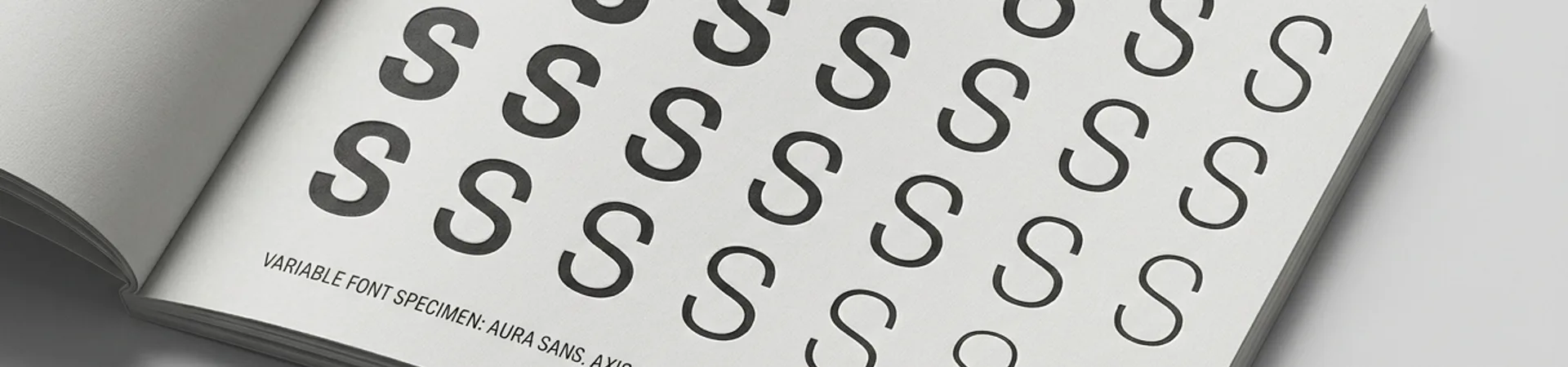
If you want to understand Stripe's design identity in a single element, look at the type.
Stripe has, over its history, cultivated one of the most deliberate typographic identities in technology. The wordmark itself — a simple, custom logotype — has been refined repeatedly, each iteration sharpening the letterforms while maintaining the approachable, slightly geometric quality that has become synonymous with the brand.
But the real typographic ambition lives in the broader system. Stripe's web properties have cycled through a considered rotation of typefaces that reflect the brand's positioning at the intersection of engineering rigour and editorial polish. The company's use of type is notable not for any single choice but for the precision of its execution — the leading, the measure, the hierarchy, the way headings relate to body text, the care taken with responsive scaling across screen sizes.
The documentation, in particular, is a masterclass. Stripe's API docs have long been held up as an industry standard, and a significant part of that reputation rests on typographic decisions: monospace code samples set in carefully chosen fonts, proportional text that maintains readability at extended reading lengths, a visual hierarchy that makes complex technical content navigable without sacrificing density.
This is not the work of engineers who happen to care about fonts. This is the work of a company that employs designers with the same seniority and influence as its engineering leadership — and that gives them the time and mandate to obsess over details that most B2B companies would consider indulgent.
Gradient as Signature
Colour, in most B2B branding, is functional — a primary blue for trust, an accent green for success states, a neutral palette for everything else. Stripe approached colour as an expressive medium.
The brand's signature gradients — those liquid blends of indigo, violet, teal, and rose that have become instantly recognisable across the technology industry — represent one of the most distinctive colour systems in contemporary corporate identity. They are not decorative. They are structural, serving as the visual signature that unifies Stripe's marketing materials, event branding, product interfaces, and editorial content.
The gradients first gained widespread attention through Stripe's annual Sessions conference and its marketing pages, where they were deployed at scale — vast, immersive fields of colour that transformed what could have been conventional product marketing into something closer to visual art. The effect was deliberate: gradient-rich environments signal sophistication and computational precision simultaneously, a visual metaphor for a company that processes payments at internet scale.
Critically, the gradients work because of the restraint everywhere else. Stripe's visual identity is predominantly clean, structural, and typographically driven. The gradients provide the emotional counterpoint — warmth, movement, and a sense of premium quality that most infrastructure companies never achieve. It is the contrast between engineering clarity and chromatic richness that gives the system its power.
The influence has been enormous. In the years since Stripe popularised its gradient-forward approach, the technique has proliferated across the technology industry — from startup landing pages to enterprise SaaS platforms. The gradients have become, for better or worse, the visual shorthand for "we are a serious technology company that also cares about aesthetics." Few of the imitators achieve the same sophistication, largely because they copy the surface (colours blending into other colours) without understanding the underlying system (a tightly controlled palette with intentional colour stops and consistent luminance relationships).
Stripe Press and the Editorial Gambit
In 2018, Stripe did something that no payments company had any business doing: it launched a publishing imprint.
Stripe Press publishes books — physical, beautifully produced books — on topics ranging from economic progress and scientific discovery to urban planning and the history of technology. The catalogue includes works by authors like Tyler Cowen, Nadia Asparouhova, and Tamara Winter, with titles that explore the conditions under which human progress accelerates or stalls.
The books themselves are designed with conspicuous care. Custom cover treatments, considered typesetting, high-quality paper stock, thoughtful binding. These are not corporate-branded content marketing pamphlets. They are genuine publishing artifacts, reviewed in mainstream media and stocked in independent bookshops.
The strategic logic is subtle but profound. Stripe Press positions the company not merely as a payments processor but as an institution concerned with the broader ecosystem of innovation, entrepreneurship, and economic infrastructure. The books attract readers who are themselves founders, engineers, policymakers, and investors — precisely the audience Stripe needs to reach, engaged through a medium (long-form publishing) that carries cultural authority far exceeding any blog post or white paper.
This is brand building at a different altitude. Stripe Press does not mention Stripe's products. It does not contain calls to action. It does not drive leads in any measurable, attribution-model sense. What it does is associate the Stripe name with intellectual seriousness, long-term thinking, and the cultivation of ideas — qualities that, for a company asking you to trust it with your money, are worth more than any conversion funnel.
The design community has taken particular notice. Stripe Press has won recognition in design and publishing circles for its production quality, and the imprint has become a reference point for how technology companies can engage in cultural production without the self-serving transparency that typically undermines corporate publishing efforts.
The Developer Experience as Design Surface
Most discussions of Stripe's design focus on the marketing — the gradients, the typography, the editorial ambition. But the more structurally interesting design work happens inside the product itself.
Stripe's documentation is legendary among developers, and its design is a significant part of why. The API reference is structured with a split-pane layout — prose explanation on the left, working code examples on the right — that has become the de facto standard for developer documentation across the industry. The interaction design is precise: syntax-highlighted code blocks with one-click copying, language toggles that persist across page navigations, request/response examples that update dynamically as you modify parameters.
The Stripe Dashboard — the admin interface where merchants manage their accounts — applies the same design rigour to what is essentially a back-office tool. The information architecture is clean, the data visualisation is purposeful, the typography maintains the brand's characteristic precision. It is, by any measure, one of the best-designed admin panels in enterprise software.
Stripe Checkout — the embeddable payment form — extends the design philosophy to the end user. The form is spare, legible, and fast, with subtle animations and transitions that communicate trustworthiness through smoothness. Every micro-interaction has been considered: the way a card number formats as you type, the way the card brand icon appears once the issuer is detected, the way error states resolve themselves gracefully rather than shouting.
What ties these product surfaces together is a design principle that Stripe has never formally articulated but that permeates its work: infrastructure should feel inevitable. The best infrastructure disappears — and the way Stripe achieves that disappearance is not through minimalism as absence but through minimalism as precision. Every element earns its place. Nothing is decorative that isn't also functional. The result is a product experience that feels effortless, which is of course the hardest thing to design.
Making B2B Aspirational
The conventional wisdom in B2B branding has long been that business buyers are rational actors who make decisions based on features, pricing, and integration capabilities — not on whether the marketing website has good typography. Stripe's success constitutes a running refutation of this view.
Stripe proved that developers — often characterised as indifferent to visual design — are in fact acutely sensitive to it. The quality of Stripe's design artifacts functions as a proxy for the quality of its engineering. If the documentation is this well-designed, the reasoning goes, the API is probably well-designed too. If the dashboard is this polished, the underlying infrastructure is probably reliable. Design quality becomes a trust signal, a heuristic for engineering rigour.
This insight has reshaped B2B branding across the technology industry. Companies like Linear, Vercel, Notion, and Figma have all, to varying degrees, followed Stripe's lead — investing in visual design, editorial content, and typographic precision at levels that would have been considered absurd for enterprise or developer tools a decade ago. The "Stripe aesthetic" — clean, gradient-rich, typographically precise, editorially ambitious — has become a recognisable genre, a visual vocabulary that an entire generation of technology companies has adopted.
The influence is visible not just in marketing but in product design. Developer documentation across the industry has improved measurably since Stripe set the standard. Admin dashboards have become more considered. The expectation that B2B products can and should be beautiful is now mainstream — and Stripe, more than any other company, normalised that expectation.
The Cost of Taste
None of this comes cheaply. Stripe's investment in design is substantial and sustained — a dedicated design organisation, an in-house brand team, a publishing imprint, and the institutional patience to allow design decisions to compound over years rather than quarters.
The risks are the ones that accompany any taste-driven strategy. Design trends shift; what feels fresh today can feel dated in five years. The gradient aesthetic that Stripe popularised is now so widely imitated that it risks becoming generic. The typographic precision that distinguishes Stripe's documentation requires ongoing investment — every new product, every API change, every new feature must be designed to the same standard, or the system's coherence erodes.
There is also the question of scalability. Stripe's design quality was established when the company was smaller, when a small team of exceptional designers could maintain quality across a manageable number of surfaces. As Stripe grows — more products, more markets, more touchpoints — maintaining that standard becomes exponentially more difficult. The history of technology branding is littered with companies that achieved design excellence early and lost it as they scaled.
But for now, Stripe's identity system remains one of the most coherent and influential in technology. It is a demonstration that B2B branding need not be a compromise between professionalism and personality, between trustworthiness and beauty. It is proof that infrastructure companies can aspire to the same design standards as consumer brands — and that doing so is not indulgence but strategy.
What Stripe Teaches
The design lesson from Stripe is not "add gradients to your landing page." It is more fundamental than that, and more difficult.
Stripe's identity works because design is not a department — it is a value. The visual quality of the brand is a direct expression of the founders' belief that how something is made matters as much as what it does. That belief is embedded in hiring, in organisational structure, in the allocation of time and resources, in the willingness to ship a documentation page three weeks late because the typographic hierarchy wasn't right.
Most companies cannot replicate this, not because they lack the budget but because they lack the conviction. Design excellence at Stripe's level requires institutional patience — the acceptance that the returns on a beautifully designed API reference or a carefully produced book are real but indirect, compounding over years in ways that no attribution model will capture.
For identity designers and brand strategists, Stripe offers a provocation: what would it mean to design a B2B brand as if beauty were a competitive advantage rather than a nice-to-have? As if the quality of every touchpoint — documentation, dashboards, error messages, email receipts — were a direct expression of the company's values?
Stripe suggests the answer is a brand that developers don't just use — but one they recommend, admire, and, in their own way, love.
WeLoveDaily is a design publication for people who care about how things look, work, and feel.