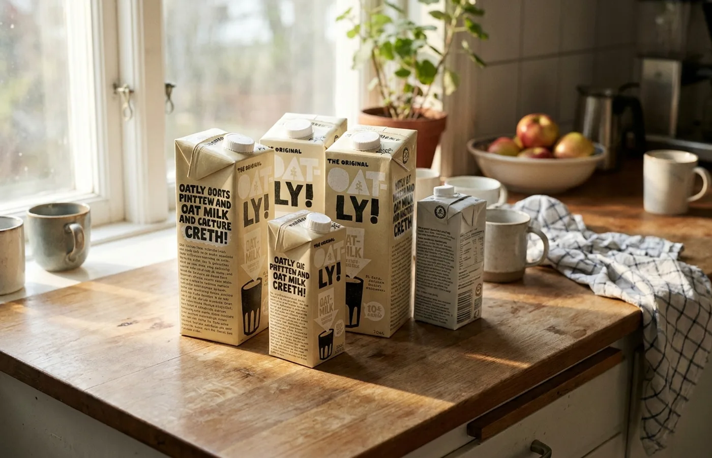
Pick up a carton of Oatly Barista Edition and turn it around. Where every other beverage brand places a nutrition label, a barcode, and as little else as legally permitted, Oatly has put something unexpected: prose. Not marketing copy in the conventional sense — not a tagline, not a claim, not a burst of enthusiasm about calcium content. Actual prose. Paragraphs of it. Written in a voice that sounds like a very clever friend who happens to work at an oat milk company and cannot quite believe they are being allowed to say all this on the side of a carton.
There is, on one edition of the packaging, a long passage about the environmental impact of dairy production, written in a tone that is simultaneously earnest and self-aware. On another, a meditation on what it means to be a food company that talks to consumers as though they are adults. On still another, a paragraph that acknowledges you are reading the side of a carton and wonders aloud what that says about you.
This is the Oatly brand identity packaging system at work, and it represents something genuinely novel in the history of consumer goods design. What Oatly did — beginning in earnest around 2012, when the company underwent a radical rebrand — was to treat every surface of its packaging not as real estate for selling, but as a page in a publication. The carton became a magazine. The side panel became an op-ed column. The ingredient list became an occasion for commentary. In doing so, Oatly did not merely differentiate itself in the plant milk aisle. It demonstrated that packaging could function as a medium in its own right — that the physical object a consumer holds in their hand could deliver something closer to editorial content than to advertising.
The consequences of this insight have rippled across the entire consumer goods landscape. But to understand what Oatly actually built, and why most of its imitators fail to replicate it, you have to start with the man who made it possible.
The Schoolcraft Intervention
Oatly was not always interesting. For nearly two decades after its founding in the 1990s — the company grew out of research at Lund University in Sweden — it was a perfectly ordinary Scandinavian health food brand. The packaging was clean, functional, and forgettable. The brand communicated in the language of nutritional benefit and environmental responsibility. It looked like what it was: a niche product for people with lactose intolerance.
The transformation began in 2012, when Toni Petersson took over as CEO and hired John Schoolcraft as Creative Director. Schoolcraft, an American who had spent years working in advertising in Europe, brought a conviction that would reshape the company entirely: that Oatly's brand voice should not sound like a brand at all.
Schoolcraft's creative philosophy was rooted in a specific observation about how people relate to packaged goods. Most FMCG brands, he recognized, operate on the assumption that consumers are either not paying attention or actively hostile to marketing messages. The typical packaging strategy follows accordingly — shout the product benefit, display an appetizing photograph, minimize text, get out of the way. Schoolcraft saw an opportunity in inverting this assumption. What if you treated the consumer as someone who was, in fact, paying attention? What if you wrote for them as though they were reading, not scanning?
This was not a cosmetic change. It required rebuilding Oatly's entire creative operation. Schoolcraft brought creative work in-house, dismantling the company's relationship with external agencies and building an internal team that could write, design, and produce every touchpoint. The logic was straightforward: you cannot have a consistent, human voice if that voice is being assembled by committee across multiple agencies. A brand that wants to sound like a person needs to be written by people who know each other, argue with each other, and share a sensibility.
The result was something that had no real precedent in the food and beverage industry — a creative department that functioned more like a magazine editorial team than a marketing department. Schoolcraft hired writers who could actually write. He gave designers the freedom to break the conventions of packaging layout. And he insisted on a principle that sounds simple but is, in practice, almost impossible to sustain inside a corporation: every piece of communication that leaves the building should be something the team is genuinely proud of.
The Department of Mind Control
If you want to understand how Oatly's creative culture actually operates, you need to understand the conceit at its centre: the internal creative department is called the Department of Mind Control.
The name is, of course, a joke — but it is a joke that does real work. By naming its creative team something absurd and self-deprecating, Oatly accomplished several things simultaneously. It signalled to employees and the public that the company does not take itself too seriously. It acknowledged the fundamentally persuasive nature of branding — the fact that all marketing is, on some level, an attempt to influence behaviour — rather than pretending otherwise. And it gave the creative team an identity, a sense of mission, and a degree of internal autonomy that is unusual in corporate settings.
The Department of Mind Control is not a name on an org chart that nobody sees. It appears on packaging, in advertisements, on the company's website. When Oatly publishes a piece of communication that is particularly provocative, the attribution often goes not to "Oatly" but to this fictional department. The effect is subtle but significant: it creates a layer of narrative between the corporation and the consumer. You are not being spoken to by a multinational food company. You are being spoken to by a group of people inside that company who have been given the licence to say interesting things.
This structural decision — giving the creative team a public-facing identity separate from the corporate brand — is one of the least discussed and most important aspects of the Oatly model. It solves a problem that plagues every company attempting to develop an authentic brand voice: the inherent contradiction of a corporation trying to sound like a human being. By creating the Department of Mind Control as a named entity, Oatly gave itself permission to be inconsistent, irreverent, and occasionally strange in ways that would feel jarring coming from a corporate voice but feel natural coming from a self-aware creative team.
The Design System: How the Carton Became a Page
The Oatly brand identity packaging system is, at the level of visual craft, a carefully constructed machine designed to look unconstructed. Every element — the typography, the illustration style, the layout logic, the writing — works together to create the impression of spontaneity, of something dashed off by hand rather than refined through dozens of iterations. This impression is, of course, a lie. But it is an extraordinarily well-designed lie.
Start with the typography. Oatly uses a custom typeface that blends hand-drawn imperfection with the consistency of a designed system. The letterforms are irregular, slightly wobbly, as though written with a thick marker by a confident but imperfect human hand. This is not a typeface that whispers premium or shouts discount. It exists in a register that most food packaging does not occupy — personal, informal, slightly loud. It reads like handwriting that has been professionalised just enough to be legible at scale.
The type is set large. This is one of the most immediately recognisable features of Oatly packaging and one of the most frequently imitated. Where conventional food packaging reserves its largest type for the product name and uses small text for everything else, Oatly blows up secondary text — side-panel copy, environmental messaging, even legal-adjacent language — to a scale that demands attention. The effect is that the carton reads more like a poster than a package. Text that would be invisible on any other product becomes the dominant visual element.
Then there is the illustration style. Oatly's visual language relies heavily on line drawings and simple illustrations that share the hand-drawn quality of the typography. These are not the polished, high-production illustrations you might find on a premium juice brand or a craft beer. They are deliberately rough, deliberately charming, deliberately the kind of thing that looks like it could have been drawn by someone on the creative team during a meeting. Again, this impression is constructed. The illustrations are carefully art-directed to sit at precisely the right point on the spectrum between amateur and professional — skilled enough to be visually appealing, rough enough to feel anti-corporate.
The copywriting is where the system transcends design and becomes something closer to literature. Oatly's packaging text is, line for line, some of the best commercial writing produced in the last decade. It operates through a series of rhetorical moves that are consistent across products but never formulaic: direct address to the reader, self-referential commentary on the act of branding, genuine information about oat milk production and environmental impact, and a pervasive tone of wry intelligence that treats the consumer as a collaborator rather than a target.
Consider the way Oatly handles the mundane obligation of listing ingredients. Where another brand would present this information in the smallest legally permissible type and move on, Oatly uses it as an opportunity for engagement — adding commentary, context, and personality to material that has never, in the history of food packaging, been considered worth reading. The implicit message is: we care about this enough to make it interesting, and we think you care enough to read it.
This approach — treating every square centimetre of packaging as editorial space — is the core innovation of the Oatly design system. It is not a logo. It is not a colour palette. It is not a typeface, though all of these elements are part of it. It is a posture: the decision to treat packaging as a publishing medium.
The Tensions That Make It Work
The most interesting thing about the Oatly brand is not any single design decision but the set of tensions the brand holds in balance. These tensions are what give Oatly its distinctive energy, and they are precisely what most imitators fail to understand.
The first tension is between corporate and anti-corporate. Oatly is a large, well-funded food company — it went public on the Nasdaq in 2021 — that communicates as though it is a scrappy insurgent. Its packaging mocks the conventions of marketing. Its advertisements acknowledge the absurdity of advertising. Its website contains passages that read like they were written by someone who is slightly embarrassed to work for a corporation. This is not accidental naivety. It is a sophisticated tonal strategy that requires constant calibration. Lean too far in the anti-corporate direction and you become unbelievable; lean too far toward polished professionalism and you lose the voice entirely.
The second tension is between earnest and ironic. Oatly genuinely cares about sustainability. The company's environmental messaging is not greenwashing — it is central to the product's reason for existing. Oat milk produces significantly less carbon emissions than dairy milk, and Oatly has been transparent about its environmental data in ways that go beyond what the industry requires. But this earnest commitment is delivered through a voice that is persistently ironic, self-aware, and willing to undercut its own seriousness. The result is a brand that can talk about climate impact without sounding preachy — a trick that very few purpose-driven brands have managed to pull off.
The third tension is between designed and handmade. As described above, the entire visual system is built to appear spontaneous while being meticulously controlled. This is perhaps the most technically demanding aspect of the Oatly identity. Handmade typography that actually looks handmade is easy to produce. Handmade typography that looks handmade, works at every scale, reproduces cleanly across dozens of SKUs, and maintains brand recognition across global markets — that is a design problem of considerable complexity.
These tensions are not bugs in the system. They are the system. The Oatly brand works because it holds multiple contradictory qualities in suspension, creating a voice that feels alive, unpredictable, and fundamentally different from the flat, optimised language that characterises most consumer goods branding. The moment any of these tensions collapses — the moment Oatly becomes either fully ironic or fully earnest, either genuinely anti-corporate or comfortably corporate — the voice dies.
The Imitators: Why Copies Fall Flat
Walk through any grocery store in 2026 and you will see the Oatly voice everywhere. The chatty side-panel copy. The oversized hand-drawn type. The self-aware meta-commentary about being a brand. The environmental messaging delivered with a wink. An entire generation of consumer goods brands — particularly in the plant-based, wellness, and DTC spaces — has absorbed the Oatly playbook and attempted to reproduce it.
Most of these attempts fail, and they fail for instructive reasons.
Innocent Drinks, the UK smoothie brand, pioneered a conversational packaging voice years before Oatly's rebrand and deserves credit as an important precursor. But Innocent's tone — warm, sweet, relentlessly friendly — operates in a different register. It is charming without being challenging. It never makes you uncomfortable. Oatly's voice, at its best, has an edge that Innocent's lacks: a willingness to be confrontational, to address the reader's scepticism directly, to acknowledge that the act of selling oat milk is inherently a little absurd.
Minor Figures, the UK-based specialty coffee and oat milk brand, has developed packaging that is clearly in conversation with Oatly — bold typography, conversational copy, a generally irreverent tone. But where Oatly's visual language is deliberately rough and hand-drawn, Minor Figures leans toward a more polished, design-conscious aesthetic. The effect is subtly different. Minor Figures looks like a brand designed by people who admire Oatly. Oatly looks like a brand designed by people who do not care what other brands look like — even though, of course, they care enormously.
The broader wave of DTC brands that adopted the conversational voice in the late 2010s and early 2020s — the wry, self-deprecating, slightly too clever copy that became a template across everything from vitamins to pet food — owes a clear debt to Oatly. But the DTC application of this voice typically strips out the tensions that make Oatly work. The copy is ironic without being earnest. The design is clean and polished without the handmade quality. The self-awareness is purely performative — a brand pretending to be embarrassed about being a brand, without the genuine discomfort that gives Oatly's version its charge. As we explored in our examination of why so many DTC brands look the same, the problem is not the voice itself but the flattening of it — the reduction of a complex tonal strategy to a set of copywriting tricks.
What these imitators miss is that the Oatly voice is not a voice at all, in the sense of something that can be defined in a brand guidelines document and handed to a freelance copywriter. It is the output of a specific creative culture — the Department of Mind Control, the in-house team, the accumulated institutional knowledge of what works and what does not — that cannot be reverse-engineered from the packaging alone. You can copy the typeface. You can copy the layout. You can copy the meta-commentary. But you cannot copy the organisational structure and creative philosophy that produce it. Duolingo understood this intuitively when it built its own character-driven brand identity — the voice emerged from an internal creative culture, not from a branding agency's playbook.
Oatly Now: Scale, Scrutiny, and the Strain of Going Public
The most significant test of the Oatly brand has not been competition from imitators. It has been the company's own growth.
Oatly's IPO in May 2021, which valued the company at roughly $10 billion, represented a fundamental shift in the brand's position. A company whose entire identity was built on being the anti-corporate alternative to big dairy was now, by any measure, a big company itself. It had institutional investors, quarterly earnings calls, and the relentless pressure of public markets to deliver growth. The tension between anti-corporate voice and corporate reality — always present but manageable when Oatly was a mid-size Swedish company — became acute.
The years following the IPO were difficult. The stock price declined sharply from its debut. The company faced supply chain challenges, reported significant losses, and underwent leadership changes. Critics questioned whether the brand premium could sustain a company at public-market scale. Activist short-sellers scrutinised the company's environmental claims. The narrative — insurgent brand takes on Big Dairy — collided with the reality of a publicly traded corporation trying to achieve profitability.
What is interesting, from a design and branding perspective, is how the packaging voice has navigated this period. Oatly's creative output has not abandoned its core tone, but there are observable shifts. The environmental messaging has become more careful, more precisely worded, reflecting the legal scrutiny that comes with public company status and the heightened sensitivity around greenwashing claims. The irreverence remains, but it is calibrated differently — less "we can't believe we're getting away with this" and more "we know exactly what we're doing."
The company has also expanded its visual system to accommodate a growing product range and new markets, including significant pushes in China and the United States. This expansion has tested the flexibility of the design system in ways that were not relevant when Oatly was primarily a Scandinavian brand. Packaging that reads as charmingly irreverent in Stockholm can read as confusingly verbose in Shanghai. Copy that works in Swedish-inflected English does not automatically translate — culturally, not just linguistically — to American grocery aisles.
John Schoolcraft departed from Oatly in 2023, a transition that raised questions about whether the brand voice could survive without its architect. The early evidence suggests that the voice has enough institutional depth to continue — the Department of Mind Control, after all, was never a one-person operation — but the long-term trajectory is uncertain. Creative cultures are fragile. They depend on specific people, specific dynamics, specific permissions granted by leadership. Whether Oatly's next chapter of creative work can match the quality and distinctiveness of its first decade remains an open question.
What is not in question is that the brand has been permanently altered by its encounter with public markets. The Oatly of 2026 is not the Oatly of 2014. It cannot be. A company answering to shareholders operates under constraints that a private company does not, and those constraints inevitably shape the creative work. The question is not whether the voice will change but whether the change will be managed with the same intelligence and care that built the voice in the first place.
What Oatly Proved
Strip away the specific details — the oat milk, the Swedish origin story, the Department of Mind Control — and what Oatly demonstrated is something larger than any single brand. It proved that packaging is an underexploited design medium.
For decades, the dominant assumption in consumer goods was that packaging existed to perform a set of functional tasks: protect the product, communicate the product name, display legally required information, and perhaps — if the marketing budget allowed — carry a promotional message or an appetizing photograph. The creative ambition of most packaging design was confined to the front panel. The sides and back were administrative space — a place for nutrition facts, barcodes, and regulatory compliance.
Oatly treated packaging as a total surface. Every panel was an opportunity. Every line of required text was an occasion for writing. The physical object in the consumer's hand was not a container with some decoration on it; it was a medium, with as much creative potential as a magazine page or a poster or a website. This insight — that packaging is a publishing format, not just a protective shell — is Oatly's most significant contribution to design culture.
The implications extend well beyond the plant milk category. If a half-litre carton of oat milk can function as an editorial object, then so can a cereal box, a shampoo bottle, a bag of flour, a tin of beans. The entire supermarket is, potentially, a library. Every product on every shelf is a surface that could carry writing worth reading, design worth looking at, ideas worth engaging with. The fact that most of them do not is not a limitation of the medium; it is a failure of ambition.
This is what separates Oatly from a merely successful rebrand. Plenty of brands have updated their packaging and seen a sales lift. Plenty of brands have adopted a distinctive voice and built loyalty around it. What Oatly did was expand the definition of what packaging can be. It is the difference between renovating a house and demonstrating that houses can fly.
There is a moment — it happens in the kitchen, in the morning, when you are half awake and waiting for the coffee to brew — when you pick up the Oatly carton to pour some into your cup and your eye catches a line of text on the side panel. It is funny, or it is surprising, or it makes you think about something you had not considered before. You stand there for a few seconds, reading the side of a milk carton. This is a completely absurd thing to be doing. It is also a small, genuine moment of delight — a minor proof that the designed world can be more interesting, more generous, and more human than it usually bothers to be.
That moment is Oatly's legacy. Not the typeface, not the illustrations, not the tone of voice. The moment. The proof that a consumer object can give you something you did not expect and did not ask for, if the people who made it cared enough to put it there.
WeLoveDaily is a design publication for people who care about how things look, work, and feel.