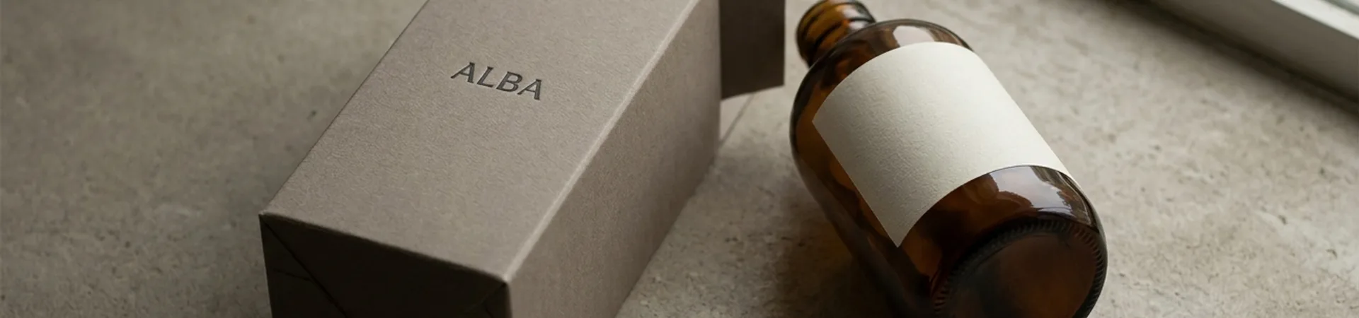
On January 29, 2026, Austin-based Atla Branding Agency released Reggie — a brand identity for a pet food company that treats its mascot as the brand rather than as decoration.
The system
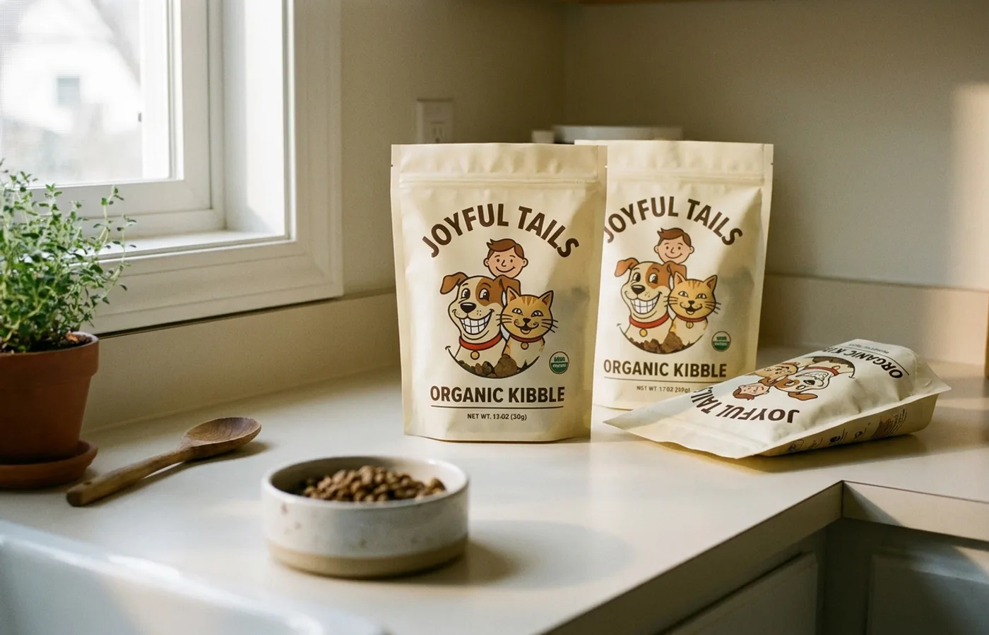
Reggie's identity is built on an illustrated character (developed with Astronaut Monastery) that carries the brand across every surface: packaging, social assets, retail, digital. Most pet brands treat the product photograph as the hero and tack on a cute icon; Reggie inverts the hierarchy. The character is the packaging's centerpiece; the food is secondary.
The typography is a rounded humanist sans — warm, specific, reads as contemporary without trying to look generationally trendy. The color palette leans on warm creams and a saturated accent that reads as both pet-aisle-friendly and adult-home-compatible.
Why it works
The pet food category is dominated by either bag-of-kibble-with-dog-photo utilitarianism or aggressively-illustrated "premium" brands that mistake ornament for quality. Reggie's character-first system splits the difference: the illustration is the argument for care, but the typography and color restraint is the argument for seriousness. A brand a pet owner can be seen buying.
Credits
- Studio: Atla Branding Agency, Austin, TX
- Creative Direction: Daniela Barrio de Mendoza, Jose Pablo Dominguez
- Design: José Aceves
- Strategy Director: Ricardo Camargo
- Copy Editor: Levi Ramirez Rodriguez
- Illustrations: Astronaut Monastery
- Published: 2026-01-29
- Source: Behance