On February 3, 2026, The Branding People — the Mexico City studio responsible for a notable share of the new-wave Latin American brand identity work of the 2020s — published their own rebrand. The system they shipped is a thesis statement about how they work: structure first, clarity second, expression third.
The system
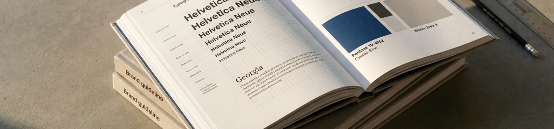
The new identity is built on a tight grid-first scaffolding that reads more like engineering documentation than a marketing deck. The wordmark is a precise custom logotype; the color palette is restrained to a primary and a pair of editorial-weight accents; typography pairs a contemporary grotesque with a display serif reserved for statement moments. Motion is used sparingly — transitions that demonstrate the system's modularity rather than decorate it.
The studio's Behance publication frames the redesign as a "redefinition" expressed through "brand systems rooted in structure and clarity." Decoded, that is the difference between a brand identity (a look) and a brand system (an operating capability).
Why it's notable
A studio's self-rebrand is always a test case — the work is a public proof of the thinking. The Branding People's new system works because it resists the trap that catches most studio rebrands: over-performing personality at the expense of utility. The identity could serve a client as easily as it serves the studio. That restraint is the point.
Credits
- Studio: The Branding People, Mexico City
- Tools: Adobe Illustrator, InDesign, After Effects, Photoshop, Firefly, Figma, Webflow
- Published: 2026-02-03
- Source: Behance