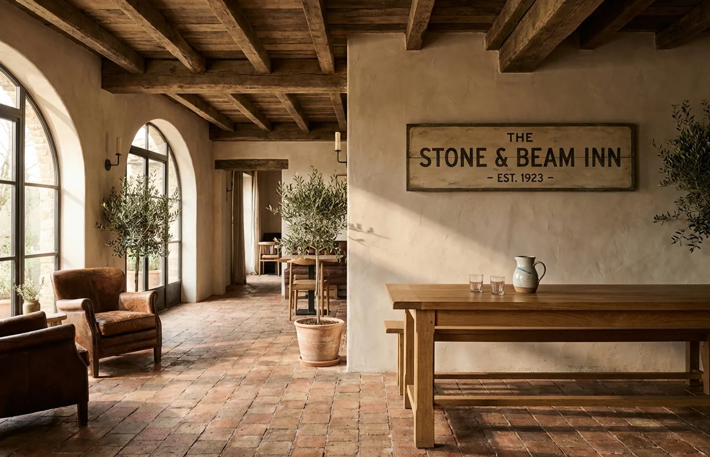
On March 25, 2026, Atla Branding Agency released Rustico — a brand identity for a restaurant and hotel where the craft of the brand matches the hospitality positioning.
The system
Rustico's identity leans into textural honesty: a wordmark drawn with the slight inconsistency of a hand-cut serif rather than the clinical precision of a contemporary sans. The color palette is earthen — warm cream, a terracotta accent, a deep forest that anchors signage and menu covers. Materials specified in the guidelines matter more than usual: letterpress business cards, hand-stamped bag tags, matte-finished menu paper.
The studio avoided the most common trap in hospitality branding — trying to be both "artisanal" and "luxury." Rustico commits to artisanal. Luxury is a consequence of the commitment, not a separate axis to optimize.
Why it matters
The best hospitality identities feel older than they are. Rustico's system is a clear example: a reader would guess the brand has existed for 20 years. That patina is hard to engineer and easy to get wrong. Atla got it right by resisting the impulse to modernize any detail that didn't need modernizing.
Credits
- Studio: Atla Branding Agency, Austin, TX
- Tools: Adobe Illustrator, InDesign, Photoshop
- Published: 2026-03-25
- Source: Behance