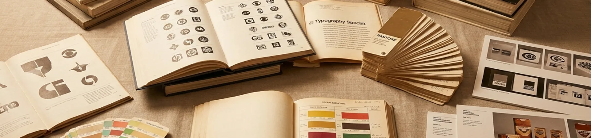
Sustainability branding has a visual problem. It looks like sustainability branding.
You know the aesthetic: muted earth tones, a leaf somewhere, a sans-serif that whispers "we care." It's well-intentioned and utterly forgettable. The circular economy deserves better than beige.
Koto's identity system for Raylo — the UK-based device leasing platform — proves that a sustainability-driven business can look as sharp as any premium tech brand. Sharper, actually, because the identity doesn't just describe what Raylo does. It makes you feel the loop.
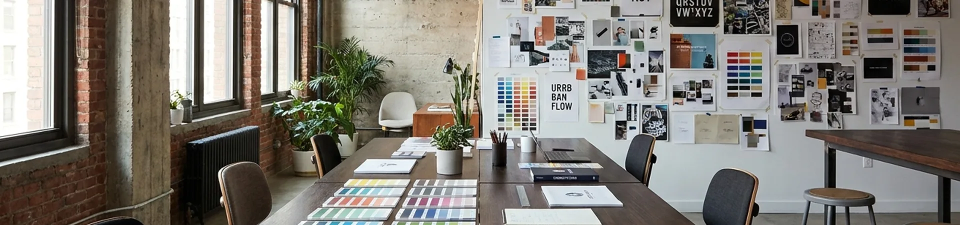
The Brief
Raylo's model is elegant: lease a phone, use it, return it, and it gets refurbished and re-leased. No e-waste. No two-year contracts designed to make you upgrade. A genuine closed loop.
The challenge: how do you brand a loop without being literal about it? Every circular economy company reaches for the same visual metaphors — arrows chasing each other, infinity symbols, recycled-paper textures. Koto refused all of them.
The Mark: Motion Without Cliche
Raylo's logomark is a continuous ribbon form — not a circle, not an arrow, but a dimensional loop that suggests perpetual motion. It reads as a "R" from one angle and as an abstract cycle from another. The ambiguity is deliberate: it rewards a second look without demanding one.
The stroke weight is confident. The geometry is precise but not mechanical — there's a warmth in the curves that keeps it from feeling clinical. It's the kind of mark that looks simple until you try to draw it yourself.
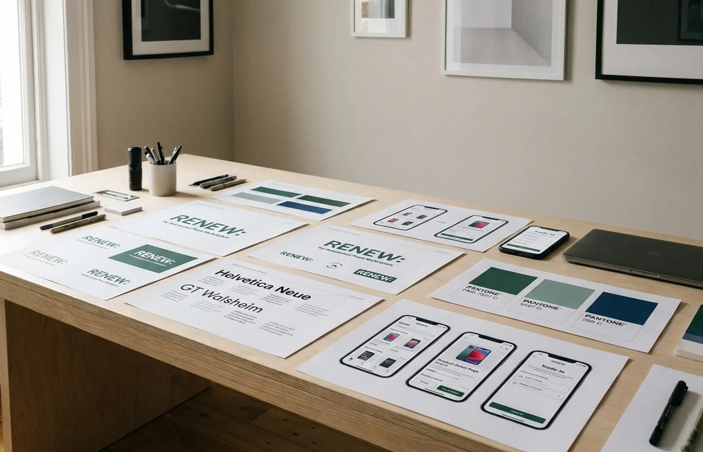
Color: Confidence Over Compromise
Koto gave Raylo a palette that breaks every sustainability branding convention. The primary color is a saturated electric violet — not calming, not earthy, not apologetic. It announces itself. The secondary system runs through warm coral, deep navy, and a clean white that gives the violet room to breathe.
This palette says: "We're not a compromise. We're a better option." That distinction matters. Raylo isn't asking customers to sacrifice — it's offering premium devices at lower cost with less guilt. The color should match that proposition, and it does.
Typography: Two Weights, Total Clarity
The type system runs on a geometric sans (GT Walsheim) at two weights: bold for headlines, regular for body. That's the entire system. No display face. No decorative treatments. No typographic personality beyond "clear and confident."
This restraint works because the brand's personality lives in the color and motion, not the letterforms. The type is a vehicle for information — and in a category where customers need to understand leasing terms, return processes, and device specs, clarity beats character every time.
The System in Motion
Where Koto's work truly excels is in the motion identity. The ribbon mark animates into a continuous loop that flows across screens, transitions between app states, and guides the eye through marketing materials. It's not decorative animation — it's the brand's central metaphor made kinetic.
The loading states use the ribbon. The confirmation screens use the ribbon. The packaging uses the ribbon as a structural element, wrapping around the box in a way that makes unboxing feel like participating in the loop. Every touchpoint reinforces the same idea without repeating the same execution.
What Makes This Work
It refuses the category aesthetic. Raylo looks like a premium tech brand, not an environmental initiative. This is strategic: the target customer is choosing Raylo for value and convenience first, sustainability second.
The metaphor is felt, not stated. The ribbon communicates circularity through form and motion, never through literal recycling imagery. Show, don't tell — applied to brand design.
Constraint creates recognition. Two type weights. One primary color. One motion principle. The system is so tight that any single element is identifiable as Raylo.
It scales down gracefully. The mark works as a favicon. The color is identifiable in a notification dot. The motion identity adapts to a 2-second app transition or a 30-second brand film. This is engineering, not just design.
The Takeaway
Koto's work for Raylo is a case study in category disruption through design. By refusing to look like a sustainability brand, Raylo gets to act like one without the visual baggage. The identity earns attention on its own terms — and that attention creates the space to deliver the circular economy message.
If you're building a purpose-driven brand in 2026, study this work. The lesson isn't "use purple." The lesson is: your visual identity should match your value proposition, not your category.
This is a WeLoveDaily Studio Spotlight — our series showcasing exceptional new brand identity work. Studios: submit your work for consideration.