The Invisible Design of Luxury Packaging: Unboxing as Brand Experience
There is a moment in every Apple unboxing that nobody talks about but everyone registers. You lift the lid of the iPhone box, and it resists — not much, just enough to slow the reveal. The suction between the lid and base creates a controlled, pneumatic drag that takes roughly three seconds to complete. Those three seconds are designed. Apple's packaging team — reportedly over 200 people — tested the lid resistance to create what the company internally describes as a "moment of anticipation." The friction isn't a manufacturing byproduct. It's a design decision, and it communicates a message: what's inside this box is worth the wait.
Luxury packaging design operates in this register — a layer of brand experience that customers feel without consciously analyzing. The weight of a Tiffany box, the sound of a Hermès ribbon being untied, the smell of tissue paper in an Aesop bag. These are designed experiences, engineered with the same rigor that luxury brands apply to the products themselves. And they represent some of the most sophisticated thinking in contemporary brand identity, operating in a sensory domain that screens and pixels cannot reach.
The Packaging Hierarchy: Layers of Meaning
Luxury packaging design operates across a hierarchy that most consumers never consciously parse but that designers engineer deliberately.
Tertiary packaging is the outermost layer — the shipping box. For most e-commerce brands, this is a brown corrugated carton, functionally invisible. For luxury brands, it's the first brand touchpoint. Chanel ships in boxes with the interlocking C's embossed on the tape. Net-a-Porter's black-and-white shipping boxes are photographed for Instagram more often than the products inside them. The shipping box sets expectations before the unboxing experience begins.
Secondary packaging is the presentation layer — the branded box, bag, or case that holds the product. This is where most luxury packaging design investment concentrates. The Tiffany Blue box (Pantone 1837, matched to the company's founding year), the Hermès orange box board, the Apple white — these secondary packaging elements carry brand recognition that rivals the products they contain.
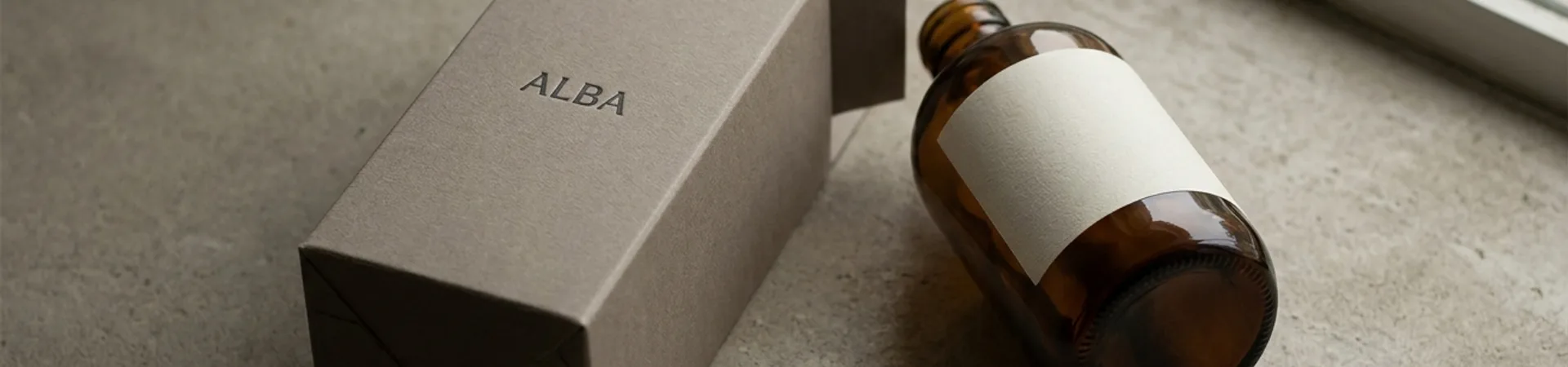
Primary packaging is the product's immediate container — the perfume bottle, the watch case, the cosmetics compact. Here, packaging and product merge. An Aesop hand wash bottle is as much a design object as the formulation inside it. The amber glass, the apothecary-style label typography, the pump mechanism's resistance — every element is calibrated to reinforce the brand's philosophy of intelligent restraint.
What distinguishes luxury packaging from premium packaging is the intentionality across all three layers. A premium brand might invest in a beautiful box. A luxury brand designs the experience of discovering what's inside it.
Material as Message
In luxury packaging, material isn't a cost line — it's a communication channel. Every surface, weight, and texture carries meaning, and the brands that understand this most deeply treat material selection as a strategic decision, not a procurement decision.
Paper weight and texture. The weight of a box communicates value before it's opened. Hermès uses a rigid board weight for its iconic orange boxes that's significantly heavier than industry standard — a decision that increases shipping costs but communicates substance. The interior tissue paper is acid-free, with a specific crinkle quality that Hermès considers part of the sensory experience. Aesop, by contrast, uses brown kraft paper and recyclable card — deliberately humble materials that communicate the brand's rejection of performative luxury. Both approaches are equally intentional. The material is the message.
Surface finish. Matte finishes signal restraint and confidence — Celine, The Row, Bottega Veneta. Gloss finishes signal energy and celebration — MAC Cosmetics, Tom Ford. Soft-touch coatings (a laminate that gives paper a velvet-like feel) have become a signifier of "new luxury" — used by brands like Glossier and Byredo that want to feel premium without feeling traditional. Each finish is a brand positioning decision encoded in substrate.
Color as material decision. In luxury packaging, color is not simply a graphic design choice applied to a surface — it is a material commitment. Tiffany's robin-egg blue is not printed; it is a custom-dyed paper stock produced to proprietary specifications, which means the color is embedded in the material itself rather than sitting on top of it. This distinction matters because dyed-through stock ages differently than printed stock: it doesn't chip, scratch, or reveal a white substrate at the edges. The color is the material. Hermès takes the same approach with its orange box board — a specific shade mixed into the paper pulp, not applied after the fact. These brands understood decades before the DTC era that owning a color at the material level creates a sensory signature that printed color cannot replicate. When a customer handles a Tiffany box, the color feels integral in a way that a printed CMYK match never would, because the paper's cut edges, its interior surface, and its wear patterns all remain consistently blue. Pantone partnerships and proprietary color standards are now common in luxury packaging precisely because of this principle: the color must survive physical contact, not just visual inspection. Even brands working in ostensibly neutral palettes — The Row's dove grey, Celine's putty — select their packaging shades with the same precision, understanding that a neutral is not an absence of color but a deliberate suppression that communicates discipline.
Structural material. The choice between rigid box (non-collapsible, like Apple), folding carton (collapsible, like most retail), and specialty materials (wood, metal, fabric-covered board) communicates the brand's relationship to permanence. A rigid box says: keep this. A folding carton says: the product is the point, not the packaging. Luxury watchmakers use rigid boxes lined with fabric because the box is understood to be part of the product — a permanent home, not disposable packaging.
Sensory Design: Beyond the Visual
The most sophisticated luxury packaging design operates across senses that graphic designers rarely consider. Packaging is one of the few brand touchpoints where the audience physically interacts with the design — holding it, opening it, hearing it, smelling it. The best luxury brands design for all of these interactions.
Sound. The click of a magnetic closure on an Apple product box. The pop of a champagne-brand gift box lid. The whisper of tissue paper being unfolded. These sounds are not accidental. Magnetic closure mechanisms are engineered to specific magnetic strengths, which determine the force required to open (and the resulting click volume). Luxury brands test closure sounds the way automotive brands test door-closing sounds — because the sound communicates build quality before the customer sees the product.
Weight and resistance. The perceived value of a packaged product correlates directly with the package's weight — a finding documented in consumer psychology research and exploited by every luxury brand with a physical retail presence. Brands add weight deliberately through heavier board stock, glass rather than plastic containers, and metal hardware (clasps, hinges, closures). The heaviness isn't functional. It's communicative: this object has substance.
Sequence. The order in which the customer encounters each element of the packaging is a designed narrative. Apple's unboxing sequence is famously controlled: lid, product (face up, screen visible), accessories beneath in nested compartments. The product appears first, before any documentation or accessories, because the first emotional reaction should be to the product itself. Tiffany follows a different narrative: outer bag, then ribbon, then box, then inner cushion, then product — a multi-layered reveal that extends the anticipation and creates the ceremonial quality that defines the Tiffany purchase experience.
Scent. Some luxury brands incorporate scent directly into packaging materials. Louis Vuitton's tissue paper carries a signature fragrance. Abercrombie & Fitch (in its luxury-adjacent positioning era) famously pumped cologne through retail HVAC systems. Even unscented packaging has olfactory properties — the smell of fresh cardboard, of tissue paper, of ink on uncoated stock — that contribute to the subconscious sensory profile of the unboxing experience. Neuroscience research on olfactory memory suggests these scent associations are unusually durable; a customer who encounters a specific packaging scent may recall the brand months or years later with a vividness that visual branding alone rarely achieves.
Designing for the Camera
The rise of unboxing content — from YouTube videos to Instagram Stories to TikTok reveals — has fundamentally altered how luxury brands approach packaging design. Packaging is no longer experienced only by the purchaser. It's broadcast to audiences of thousands or millions, and the brands that understand this have begun designing packaging for two audiences simultaneously: the person holding the box and the person watching on screen.
This dual-audience requirement has specific design implications. Colors must read accurately on camera — which is why brands increasingly test packaging under ring-light and smartphone-camera conditions, not just showroom lighting. Structural elements must create visible "moments" — the lid lift, the ribbon pull, the tissue reveal — that photograph and film well. Brand marks must be positioned where they'll be visible in the overhead-shot framing that dominates unboxing content.
Some brands have designed packaging features specifically for social sharing. Glossier's pink bubble-wrap pouch — a secondary packaging element that became the brand's most photographed asset — exists because the design team understood that the pouch would be photographed and reused as a cosmetics bag, extending the brand's visual presence far beyond the point of sale.
The tension is obvious: designing for the camera risks designing for spectacle rather than experience. The most effective luxury brands resolve this by ensuring that the qualities that photograph well — material beauty, structural drama, color confidence — are the same qualities that feel good in the hand. Hermès doesn't design for Instagram. It designs objects that are inherently photogenic because they're inherently well-made.
The Sustainability Tension
Luxury packaging faces a growing conflict between brand experience and environmental responsibility. The multi-layered, material-rich unboxing experiences that define luxury brands are, by definition, material-intensive. Secondary packaging that's designed to be kept forever is also packaging that's manufactured from virgin materials with significant carbon and resource footprints.
The industry's response has been uneven. Some brands have reduced packaging layers, switched to recycled or recyclable materials, and redesigned structures to minimize waste. Stella McCartney's packaging uses FSC-certified materials and soy-based inks. Chloé has moved to fully recyclable mono-material packaging. Aesop's commitment to brown kraft and minimal packaging is a sustainability position as much as a brand aesthetic.
Others have resisted, arguing — with some justification — that luxury packaging that's kept and reused has a longer functional life than disposable packaging that's recycled. A Hermès box that becomes a permanent storage vessel on a customer's shelf isn't waste in the same way that a cardboard shipping box recycled after one use is. The calculation is genuinely complicated — lifecycle analysis yields different conclusions depending on whether you weight carbon emissions, virgin material consumption, or landfill volume — and the industry hasn't settled on a consensus.
For designers, the challenge is creative: how do you design packaging that feels luxurious, communicates brand values, and is environmentally responsible? The brands doing this best are those that have made sustainability part of the brand story rather than treating it as a constraint on the brand story. Aesop's humble packaging is the brand — restraint and intelligence expressed through material choices. The sustainability isn't at odds with the luxury. It's the luxury.
Packaging as Brand System: The Identity Connection
The most instructive way to think about luxury packaging is not as a logistics discipline or even a design specialty but as a branch of brand identity. Every decision described in this article — material, weight, sequence, sound, color — is an identity decision. Packaging is where the brand system becomes physical.
Consider how Aesop's packaging connects to its broader identity. The amber glass bottles, the apothecary-style labels set in Optima, the brown kraft bags — these aren't standalone packaging choices. They're expressions of the same design philosophy that governs Aesop's retail architecture (designed individually for each store, using local materials), its digital presence (restrained, typographic, monochrome), and its brand voice (literary, precise, never loud). The packaging is the brand system in your hand.
The same principle operates at Apple, where the packaging's white surfaces, precise tolerances, and elimination of unnecessary text mirror the product design philosophy of reductive clarity. Or at Tiffany, where the blue box's cultural weight is inseparable from the store's Fifth Avenue presence and the brand's photographic style. In each case, the packaging doesn't just contain the product — it extends the brand system into the tactile domain.
For designers working primarily in digital brand identity, packaging offers a critical lesson: brand systems that account for physical experience are more durable than those that exist only on screen. A brand that has considered how it feels in the hand — literally — has thought about identity at a depth that a logo, a color palette, and a type system alone cannot reach. The best brand guidelines include packaging principles not as an afterthought but as a core expression of the system's values.
This is why the current trend toward "brand experience design" — a discipline that bridges identity, environment, and packaging — represents an evolution in how the industry thinks about what brand design is. The box isn't separate from the brand. It is the brand, made tangible.
The Designers Behind the Box
Structural packaging design is a specialized discipline with its own studios, tools, and expertise — distinct from the graphic design and brand strategy firms that typically receive credit for brand identity work.
Progress Packaging, based in the UK, works with luxury and premium brands to develop structural packaging solutions that balance material innovation with brand expression. Burgopak, known for its patented sliding-drawer mechanism, has designed packaging for brands including Nokia, Bowers & Wilkins, and Samsung — structures where the opening mechanism itself becomes a brand signature.
These studios operate at the intersection of industrial design, materials science, and brand strategy. A structural packaging designer needs to understand how paper fiber direction affects fold quality, how magnetic field strength determines closure behavior, how humidity changes material dimensions — and how all of these technical factors serve the brand's experiential goals. The prototyping process alone can run dozens of iterations: testing lid resistance at varying humidity levels, stress-testing closures across thousands of open-close cycles, evaluating how a specific board stock performs under the heat of warehouse storage versus the cold of air-freight shipping. A single magnetic closure might undergo acoustic testing in anechoic chambers to calibrate the precise click that communicates quality without startling the customer. This is engineering work conducted in service of emotional outcomes — a combination that few other design disciplines require at this level of specificity.
The discipline deserves more attention from the design community. In an era when the most intimate brand experience many customers have is the moment they open a box, the designers engineering that moment are doing some of the most consequential work in brand identity — invisible, tactile, and impossible to replicate on a screen.