Melbourne's Jo Cutri Studio extended the Sundae brand into body mists in 2026 with a packaging solution that turns the bottle form itself into the brand's primary asset.
The system
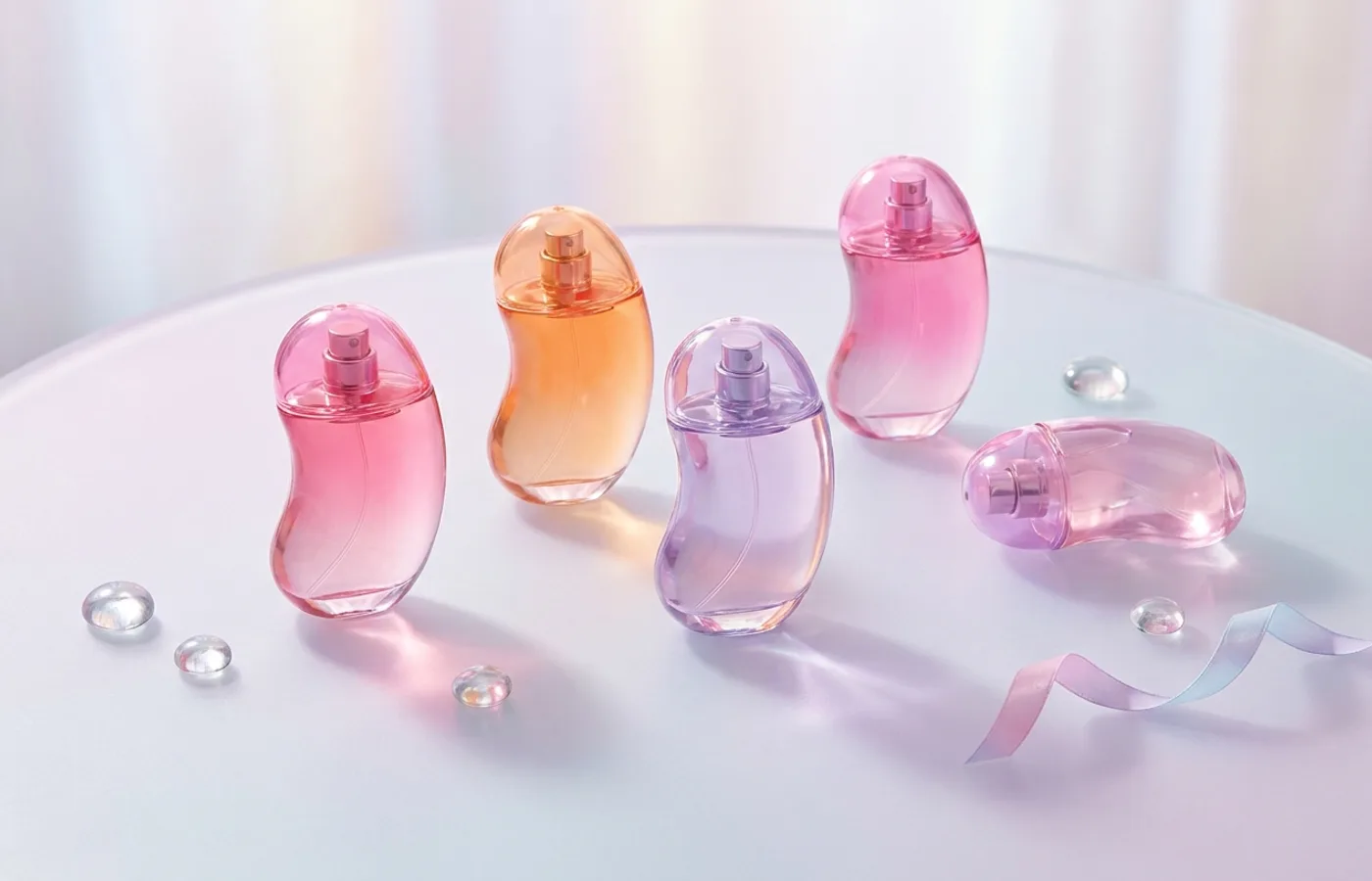
The central move is the bottle: a jellybean-inspired form whose curves and scale read as distinctly playful without crossing into novelty. The form is engineered for shelf presence — on a typical cosmetics shelf, the bottles punctuate the rectangular-bottle category's monotony. Six scent variants receive six color treatments, each readable at distance as a color-field rather than a label-first identification.
Graphic language is minimal on each bottle: the Sundae wordmark in a tight sans, the scent name in a smaller complementary weight, and no additional decoration. The color does the shelf work; the typography does the brand work.
3D development was handled by Monk Media, which matters — a jellybean form is easy to draw and hard to manufacture at packaging scale with consistent wall thickness, spray-mechanism integration, and stable base.
Why it works
The body-mist category is dominated by cylindrical bottles with spray pumps — a form factor so standardized that brand differentiation falls entirely to graphic design on the label. Sundae's jellybean shape breaks the category's form consensus without sacrificing function. The brand becomes recognizable at 10 feet, not just at arm's length.
Y2K-aesthetic influences are visible but restrained — the bottle form hints at Y2K without forcing a pastiche that would date quickly. Jo Cutri's restraint is what makes the system sustainable beyond a single retail season.
Credits
- Studio: Jo Cutri Studio, Melbourne
- 3D Development: Monk Media
- Client: Sundae
- Published: 2026
- Source: Behance