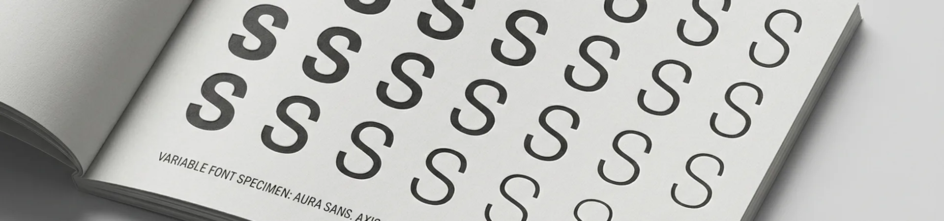
Open six browser tabs. Pull up the homepages of a mattress company, a skincare line, a luggage brand, a vitamin subscription, a toothbrush startup, and a dog food delivery service. Now squint. Remove the product photography and you are looking at the same website six times over. A geometric sans-serif wordmark in lowercase. A muted colour palette — blush, sage, cream, perhaps a single accent of terracotta. Generous whitespace. A hero image that could pass for a lifestyle editorial. A tagline that uses the word "designed" or "crafted" or, if the brand is feeling adventurous, "reimagined." A Trustpilot badge. A subscription prompt.
This is not an exaggeration. This is Wednesday on the internet.
DTC brand design sameness has become so pervasive that it has earned its own critical vocabulary. Bloomberg journalist Ben Schott coined the term "blanding" in 2020 to describe the phenomenon. Graphic designer Thierry Brunfaut of Base Design called it "the death of visual identity." And yet, years later, the template persists — not as a relic but as the default setting for any new consumer brand entering the market. The question worth asking is no longer whether these brands look alike. It is why they continue to choose sameness when the entire promise of direct-to-consumer was supposed to be differentiation.
The Template and Where It Came From
Every visual monoculture has an origin story, and this one begins with three brands that genuinely earned their aesthetic: Glossier, Casper, and Warby Parker.
Glossier, launched in 2014, understood something that legacy beauty brands had ignored. Its audience did not want to be sold aspiration through high-gloss campaigns and unattainable faces. It wanted to see itself — real skin, real light, real bathrooms. Emily Weiss and her team built a visual identity around millennial pink, a clean sans-serif logo, and a photographic style that felt like a friend's Instagram feed rather than a department store counter. It was radical because it was honest. The design matched the brand's actual position in the market: approachable, digital-first, community-driven.
Casper did something similar for mattresses. The brand's cheerful illustrations, its blue-and-white palette, its copywriting that treated a mattress purchase as a minor life upgrade rather than a solemn investment — all of it worked because it was a genuine response to a genuinely terrible buying experience. The old mattress industry was showrooms and commission-based salespeople and confusing product tiers. Casper's design said: this does not have to be complicated. The visual simplicity was the message.
Warby Parker arrived even earlier, in 2010, with a brand identity that borrowed from literary culture — the name itself a nod to Jack Kerouac characters — and translated it into a clean, bookish, slightly witty visual language. The design communicated a specific worldview: that eyewear could be both affordable and culturally literate.
These three brands succeeded not because of their design choices in isolation but because those choices were inseparable from their brand positioning. The aesthetic was the argument. The problem is what happened next.
The Infrastructure of Sameness
What happened next was infrastructure.
The visual language pioneered by a handful of genuinely distinctive brands was reverse-engineered into a reproducible formula. And the tools to reproduce it became astonishingly accessible. Shopify themes like Dawn, Debut, and their third-party descendants codified the DTC look into purchasable templates — pre-built layouts with clean grids, ample whitespace, and minimal decorative elements. A founder with no design background could install a theme, upload product photos, choose a Google Font from the sans-serif category, and have a website that looked indistinguishable from a venture-backed brand within an afternoon.
This is not Shopify's fault, exactly. The platform democratised e-commerce design in ways that are genuinely valuable. But democratisation without creative direction produces conformity. When the most popular templates all encode the same visual assumptions — that clean equals trustworthy, that minimal equals premium, that whitespace equals sophistication — the result is an entire marketplace that converges on a single aesthetic register.
The agency ecosystem amplified the effect. A generation of branding studios built their practices around DTC clients, and many of them developed internal playbooks that were, in essence, variations on the same brief: sans-serif wordmark, muted palette, lifestyle photography, brand voice that is warm but not too warm, witty but not too witty, confident but not too confident. The deliverables varied in quality but not in kind. A well-executed version of the template looked polished. A poorly executed version looked generic. But both occupied the same narrow visual territory.
Then came the brand-in-a-box services — companies that offered logo, colour palette, typography, and packaging design as a bundled product, often driven by questionnaires and AI-assisted generation. These services further compressed the design space, producing identities that were competent, consistent, and almost completely interchangeable. The output was not ugly. It was simply not distinctive. It solved for the absence of bad design rather than the presence of good design.
The cumulative effect is a marketplace where a consumer scrolling through Instagram ads cannot tell whether they are looking at a supplement brand, a bedding company, or a pet food startup without reading the copy. The visual signals that were once a shorthand for "we are different from the incumbents" have become the visual signals for "we are a DTC brand" — a category marker rather than a brand differentiator.
The Brands That Refused
Against this backdrop of studied sameness, a handful of DTC brands have made design choices so aggressively specific that they could never be mistaken for anything else. They are worth studying not as contrarians but as strategists — brands that understood that visual identity is a competitive asset, not a hygiene factor.
Liquid Death is the most obvious example, and also the most instructive. The canned water company launched in 2019 with a visual identity built on heavy metal typography, skull illustrations, and a colour palette of black and teal that looks like it belongs on a concert poster rather than a beverage shelf. The packaging design, created with artist J.R. Goldberg, is deliberately confrontational — gothic lettering, dripping textures, imagery that borrows from tattoo culture and horror illustration. Nothing about it says "wellness" or "hydration" in the language that the bottled water category has established. Everything about it says "we would rather be interesting than appropriate."
This is not randomness. Liquid Death's design is precisely calibrated to its brand strategy: turning water into an entertainment brand, making hydration culturally relevant to an audience that finds traditional wellness branding insufferable. The design does not just differentiate the product on a shelf. It creates a brand world — merch, social content, comedy videos, collaborations — that could not exist within the DTC template. The visual identity is not decoration applied to a product. It is the product's reason for existing in culture.
Oatly took a different route to the same destination. The Swedish oat milk company's visual identity, overhauled in 2012 by creative director John Schoolcraft, is built on deliberate imperfection. The packaging uses hand-drawn type, uneven layouts, and blocks of conversational text that read like a person talking to you rather than a brand messaging at you. The design borrows from zine culture, from protest posters, from the DIY aesthetic of independent publishing. On a supermarket shelf surrounded by the polished uniformity of plant milk competitors, Oatly looks like it wandered in from a different universe.
The specificity is in the details. Oatly's packaging includes long-form copy that is genuinely entertaining to read — a rarity in any category, and nearly unheard of in grocery. The typography is irregular in ways that feel intentional rather than careless. The brand's visual system extends to its advertising, which favours lo-fi production and absurdist humour over the aspirational lifestyle imagery that dominates the plant-based category. The design decisions are not safe. They are not optimised for broad appeal. They are optimised for memorability, and they work.
Fly By Jing, Jing Gao's Sichuan chili crisp brand, demonstrates what happens when a founder treats packaging design as cultural expression rather than category convention. The brand's jars, with their bold red and black palette, custom Chinese-inspired typography, and unapologetically maximalist label design, reject every convention of the "artisanal condiment" category — the kraft paper, the hand-lettered scripts, the muted earth tones. Fly By Jing's design is loud, precise, and grounded in a specific culinary and cultural tradition. It does not borrow the visual language of artisanal credibility. It asserts its own.
What these brands share is not an aesthetic — they look nothing alike. What they share is a refusal to let the available templates define their visual boundaries. They each started from a brand truth and built a visual identity that could only belong to them. That is the opposite of what the DTC template produces.
What Differentiation Actually Requires
The specific design decisions that separate these brands from the DTC monoculture are worth naming, because they are choices that any brand could make but most do not.
The first is typographic commitment. Liquid Death, Oatly, and Fly By Jing all use typography that would be impossible to swap onto another brand's packaging without it looking absurd. Their type choices are not selected from the safe middle of a font library. They are extreme, specific, and load-bearing — carrying as much brand meaning as the product name itself. The DTC template, by contrast, treats typography as a neutral vessel: clean, legible, interchangeable. A sans-serif that communicates "modern" communicates nothing at all when every competitor has made the same choice.
The second is colour courage. The muted palette of the DTC template — the blush, the sage, the oatmeal — functions as a visual safety net. It signals taste without risking offence. The rule-breakers use colour as a weapon: Liquid Death's black, Fly By Jing's red, Oatly's stark blue and white. These are not colours chosen to harmonise with an Instagram grid. They are colours chosen to interrupt a visual field.
The third is the willingness to sacrifice legibility for personality. Not literal legibility — the product name is always readable — but the broader legibility of category convention. When every DTC brand in a category adopts the same visual grammar, consumers can read any brand at a glance and understand what it is. The rule-breakers sacrifice that instant category recognition in favour of brand recognition. They would rather be confusing for a moment and memorable forever than immediately understood and immediately forgotten.
The fourth, and perhaps most important, is the decision to design from a point of view rather than from a template. The DTC aesthetic is fundamentally defensive — it is designed to avoid mistakes, to look professional, to not alienate anyone. The brands that break the mold are designing offensively — to attract a specific audience, to repel another, to make a claim about what the brand believes. Design from a point of view requires knowing what you stand for. Design from a template requires only knowing what category you are in.
The Cost of Playing It Safe
DTC brand design sameness is not a harmless default. It is an active strategic liability.
When every brand in a category looks the same, the only remaining differentiators are price and performance — exactly the territory where DTC brands are least equipped to compete against incumbents with scale advantages. Visual identity is one of the few asymmetric advantages available to a small brand. It costs the same to design a distinctive brand as it does to design a generic one. The difference is not budget. It is conviction.
The brands that will define the next era of direct-to-consumer commerce will not be the ones with the cleanest Shopify themes or the most tasteful colour palettes. They will be the ones that look like nothing else — because they had the nerve to design like nothing else. The template era of DTC branding is not a design trend. It is a design failure, and the correction is already underway.
WeLoveDaily is a design publication for people who care about how things look, work, and feel.