Walk through the Anthropic website and count the number of visual clichés you would expect from an AI company. The neural-network particle animation. The "AI" rendered in a glitch typeface with a holographic gradient. The hero video of a robotic hand touching a human hand. The neon-on-black palette borrowed from cyberpunk cover art.
You will not find any of them.
What you will find is a warm cream background, a black serif wordmark, and a small handful of pictographic gestures that read closer to a research journal than a Silicon Valley startup. The thesis is one sentence: we are researchers first, and the brand should look like it.
Restraint as Argument
Most frontier AI labs treat their identity as a promise of futurity. OpenAI's visual system leans on the black-and-white minimalism of a design-forward consumer brand, with the orb-like mark doing the imaginative work. Google DeepMind's identity pulls from the Google mothership — clean, corporate, sans-serif, gradient-friendly. Mistral uses a playful pixelated wordmark that telegraphs European indie charm.
Anthropic's identity does none of those things. It doesn't sell the future. It sells the present quality of the work.
The wordmark is a custom serif — refined, academic, confident in its stillness. The accent color is a warm, slightly-faded gold. Photography is treated more like a research publication than a product site. Documentation, papers, and interface screenshots take visual priority over stock renders or mood-photography.
This is a deliberate refusal. The company's product — Claude — is the most commercially successful chat model after ChatGPT, by most industry estimates. Anthropic could afford the visual swagger of a category leader. It chose the opposite.
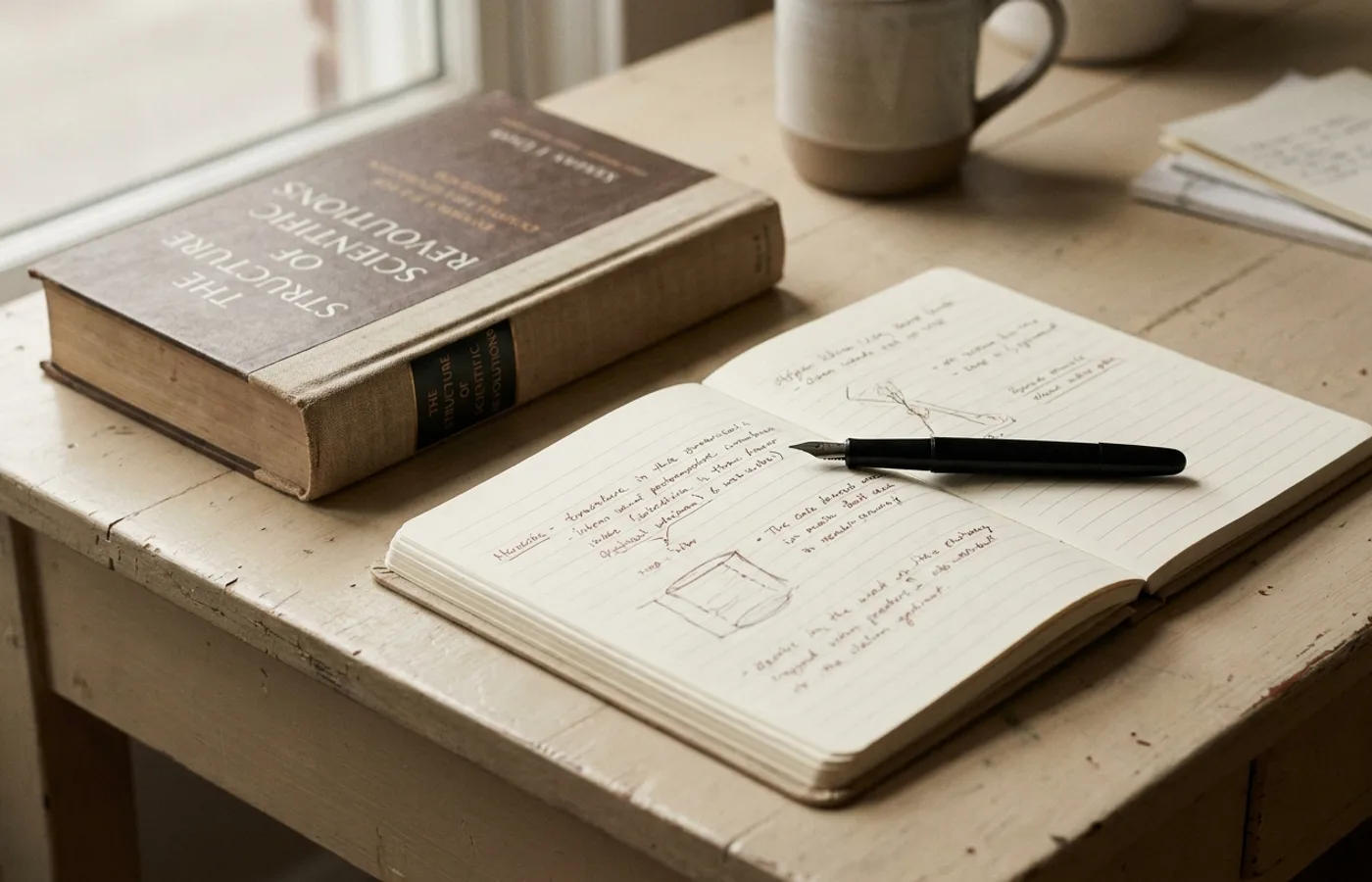
The Research Journal, Not the Launch Pad
The design system reads most similarly to a long-form editorial publication. The typography pair — a refined display serif with a humanist sans-serif for body — echoes Monocle or The New York Review of Books more than it does any AI or SaaS contemporary. Layouts privilege white space and line-height; headlines are never the dominant visual element.
Even the illustrative language — the occasional pictographic clipart that appears in product announcements and safety-research explainers — leans toward hand-drawn diagrammatic simplicity. It's the visual vocabulary of a researcher's whiteboard, not a marketing agency's moodboard.
The consequence is a brand that signals caution without saying the word. In a category where trust is the scarce resource, and where every other player's visual language screams we are moving fast and you should come with us, Anthropic's identity quietly says we are reading the papers carefully and we would like you to read them too.
Why It Works
The bet works because the audience it was designed for — enterprise buyers, academic collaborators, safety-concerned users — reads the restraint as competence. A CISO evaluating an AI vendor has seen enough neon gradients to develop an allergy. An academic researcher evaluating a commercial lab treats an ornate visual system as a warning sign. Anthropic's identity converts both to trust instead of having to earn it.
It also insulates the brand against the inevitable visual hype cycle. When the gradient-heavy AI startups of 2024 look dated by 2027, Anthropic's serif-and-cream system will still be legible, still feel current, still read as research.
The Lesson Beyond AI
Anthropic's identity is the strongest recent argument for visual restraint as competitive strategy. In a category saturated with sameness — and every new category arrives saturated now — the brand that refuses the template is the brand a skeptical buyer remembers.
The rest of AI will catch up to this move, the way consumer tech caught up to Apple's minimalism in the 2010s. For now, Anthropic owns the register: serious, considered, and quietly confident that the work speaks.
The lesson for every other brand — in AI or not — is that a category's visual consensus is a gift to the next entrant. You just have to have the nerve to walk around it.