Apple released San Francisco in 2014 as the system typeface for Apple Watch. Within two years, it had replaced Helvetica Neue across iOS, macOS, tvOS, and watchOS — ending a decade-plus run of licensed Linotype typography across Apple's operating systems.
The story usually ends there: "Apple got its own typeface." But the deeper consequence is structural, not aesthetic. San Francisco isn't a typeface. It's a typographic platform — and every operating system on earth has quietly copied its logic.
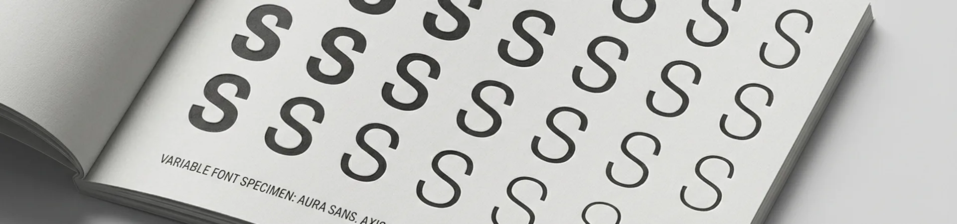
The Missing Cousin: Optical Sizes
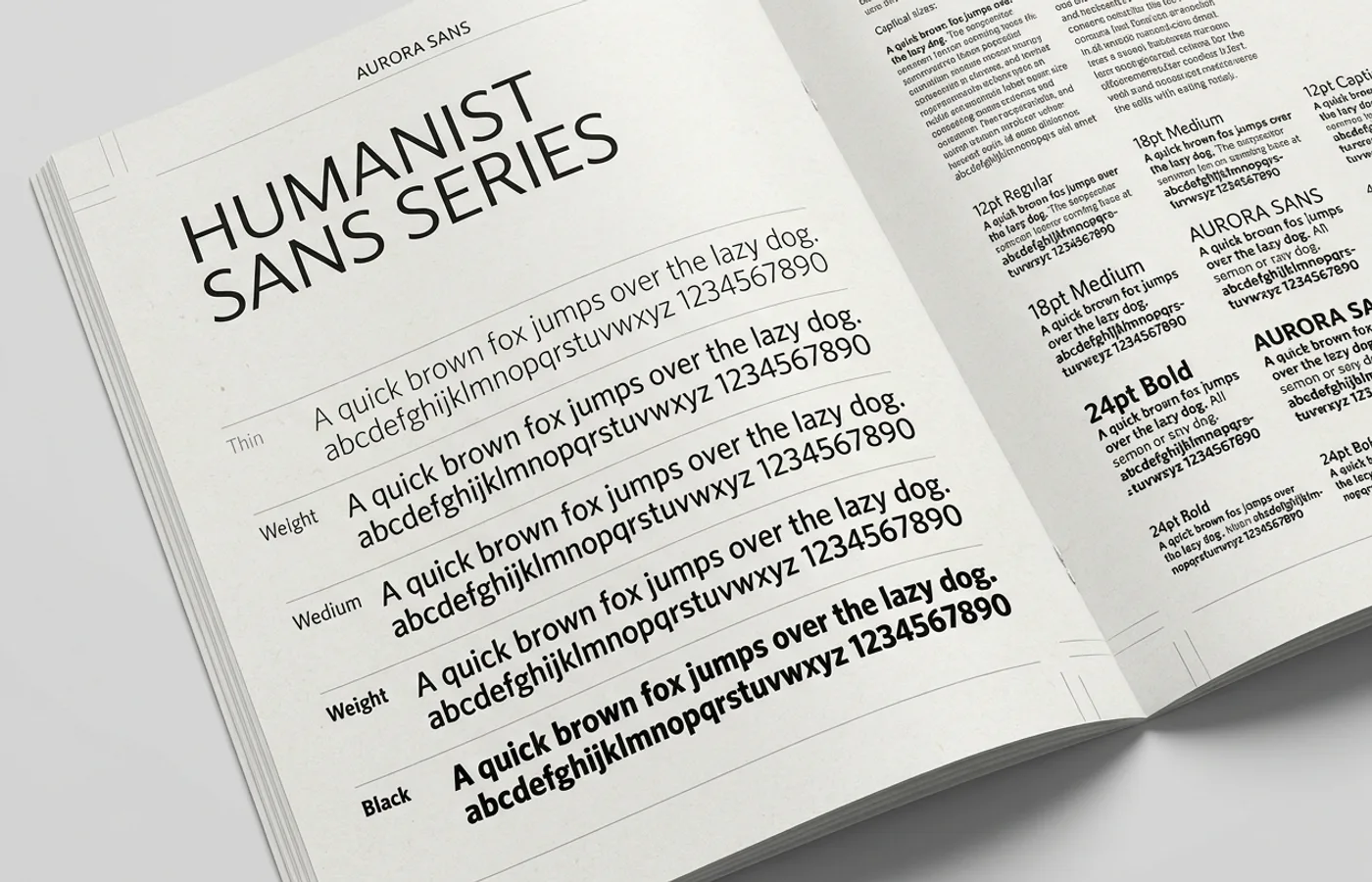
The critical feature of San Francisco is not how it looks. It's that it exists as a family of optical sizes. SF Pro Display for large sizes. SF Pro Text for body. SF Compact for watchOS and constrained spaces. SF Mono for code. SF Symbols for iconography.
Each optical cut is drawn differently. Display weights have tighter spacing, more delicate terminals, taller x-heights relative to cap height. Text weights have more generous spacing, heavier strokes for low-resolution legibility, rounder curves. The typeface auto-swaps the correct cut depending on the rendered size of the text. A 10-point button and a 48-point headline are set in visually different fonts, both under the same name.
This was unusual at the time. Most digital typefaces were drawn once and scaled mathematically. Optical-size families existed in print — Adobe had been shipping Minion and Poppl-Pontifex with optical cuts for years — but they were rarely used in UI design, and essentially never used by operating system typefaces.
San Francisco changed the default. If you design an OS now and your typeface doesn't have optical sizes, you're shipping an obviously inferior reading experience at the extremes.
The Variable Axes
The second deeper move was variable weight. San Francisco shipped as a variable font with a continuous weight axis from Ultralight to Black. This meant iOS could render button text at weight 420 and headline text at weight 680 without storing separate font files for every weight. The typeface became a parametric system rather than a fixed inventory.
Variable fonts existed before — OpenType 1.8's variable-font standard was finalized in 2016, Apple rolled into it gracefully — but Apple's mainstream adoption normalized them for UI work. Android followed with Roboto Flex. Google rebuilt its own typography as variable. Microsoft's Segoe family added variable axes.
Within five years of San Francisco's release, the operating-system typography assumption had rebaselined. Static, single-weight system fonts became a legacy choice.
The Symbols Library
The third and most recent move was SF Symbols — a library of over five thousand consistent pictographic icons that share the typeface's weight, optical sizing, and variable-axis behavior. An icon set is now a typographic asset rather than a separate design system. When you change the weight of your button text, the icon next to it thickens in proportion.
This conceptual shift matters. Before SF Symbols, a design team had to maintain two parallel asset libraries — one for typography, one for icons — and reconcile their weight and size relationships manually. Apple collapsed the two into a single variable-axis system. Every other OS-scale design system now either ships its own version of this or feels antiquated by comparison.
The Lesson Hidden in Plain Sight
San Francisco looks, on surface, like just another clean humanist sans. The real innovation is the architecture. Apple didn't ship a typeface. Apple shipped a typographic platform: optical sizes, variable axes, symbol integration, and a clear model for how all three interact at rendering time.
That platform is now the default assumption for how system typography should behave. Google's Material You, Microsoft's Fluent, the Linux GNOME HIG — all of them organize their typography around the same architectural principles, even when they use different typefaces.
The consequence is that Apple won a category without anyone declaring a category. "System typography" used to mean "pick a clean sans and scale it." Now it means "ship a parametric family with optical sizes, variable axes, and an integrated symbol library." That's a much bigger deal. It's the difference between shipping a product and setting the floor for every subsequent product.
The deeper lesson for brand identity is simple. The real leverage is in the architecture, not the artifact. Typefaces get copied. Platforms get inherited.