Browsers don't have brands. That was the category rule for two decades. Chrome, Safari, Firefox, Edge — all of them took their visual identity from a geometric logo, a functional color palette, and a posture of utility. You don't admire your browser. You use it.
Arc broke the rule.
The Browser Company's product — released in beta in 2022 and to general audiences in 2023 — is the first browser since Chrome's launch that users describe with aesthetic adjectives. Beautiful. Considered. Peaceful. These are words for furniture, not software. The brand made sure of it.
The Rebranding of the Tab
Arc's most radical product decision is that tabs don't live along the top of the window. They live in a sidebar, organized into "Spaces," and they expire — your open tabs archive themselves after 24 hours unless you pin them. This is a visual-design decision as much as a product decision. It moves the browser's locus of attention from the top edge to the left margin, where the eye rests more naturally on a Western reading surface.
The brand identity follows the UI choice. Arc's logo — a single large "A" with a soft, almost-handwritten weight — is never shown at size on the product surface. The real brand expression is the UI itself: the gentle rounded corners, the translucent blur on panel backgrounds, the considered use of color on tab chips.
This is an unusual strategy. Most software brands treat the logo as the anchor and the product UI as a separate concern. Arc treats the product as the brand, and the logo as a secondary object.
Materiality Over Function
Browse Arc's marketing site and you will notice what's missing: no productivity claims, no speed benchmarks, no comparison charts. The copy reads closer to a furniture brand's catalog than a software company's homepage. "A calmer internet." "A browser made for today." "Space to think." These are aesthetic claims about a feeling, not functional claims about a feature.
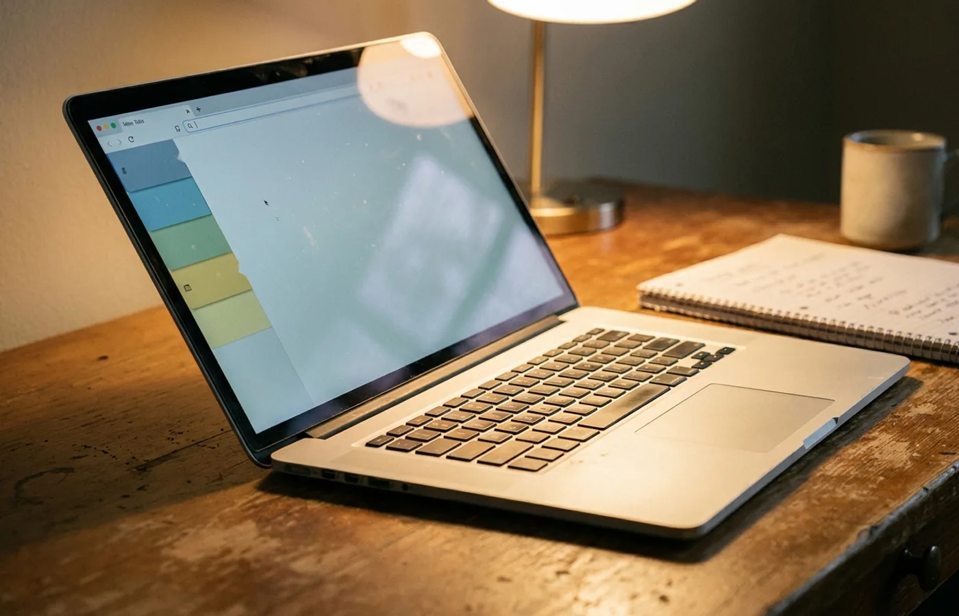
The photography treatment doubles down. Where most browsers market themselves with crisp screen-grabs inside stylized device frames, Arc shows the browser half-visible behind a houseplant, reflected in a rainy window, on a laptop with a mug of tea beside it. The positioning is: this is something you live with, not something you use.
The Bet Behind the Identity
The Browser Company's wager is that the browser is now furniture. Most users spend more waking hours in a browser tab than they do in any single room of their home. If that's true, the browser should reward long dwelling the way well-designed furniture does: through warmth, patina, and considered material choices. A chair is not a seat. A browser is not a window to the web.
This bet reframes the competitive set. Arc isn't competing with Chrome on tab count or JavaScript benchmark scores. It's competing with the ambient quality of your digital room — the same space occupied by Notion, Figma, Things, and Raycast. All of those brands share Arc's aesthetic register: warm, rounded, considered, quiet.
Why It Matters
Arc is small. Its market share is, by almost any metric, a rounding error against Chrome. But its cultural share is enormous. Designers and writers and indie founders — the people who shape tomorrow's consumer products — have largely moved to Arc, and the aesthetic they're absorbing will ship in every product they make next.
That's how category visual standards reset. Not through market domination, but through taste infection among the people who ship taste. In five years, when the next generation of browsers and developer tools looks like Arc — the ambient warmth, the sidebar-first UI, the furniture-grade material language — the rewrite of the browser category's brand rules will be complete.
The identity won't be Arc's anymore. It'll just be what a good browser looks like. That's the quiet, durable outcome of a real rebrand.