If you open the major consumer social apps side by side — Instagram, TikTok, Twitter-now-X, Snapchat, Threads — the visual register is strikingly uniform. Bright saturated accent colors. Rounded geometric iconography. Gradient backgrounds. Bold display typography. The icon-grid era of mobile operating systems produced a near-monoculture in social-app branding.
Bluesky's identity is the first serious consumer social brand since Twitter's 2006 launch that deliberately refuses that register. The refusal is the point.
The Visual Rejection
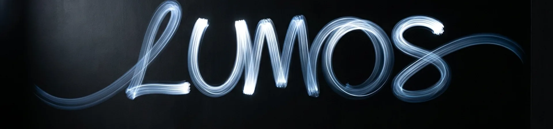
Bluesky's logo is a flat blue butterfly — not a gradient, not a complex geometric wordmark, not an abstracted letterform. The shade of blue is a singular, slightly-muted, almost-ink blue, not the saturated electric blues that dominate tech branding. The butterfly is drawn at a low level of abstraction — simple wings, a center spine, no rendering flourishes.
The typography across the app is a clean workhorse sans-serif — notably, not a custom type family designed to carry personality. Headers, body text, buttons all use the same treatment. The color palette is minimal: the ink blue, white, a neutral gray, and a single bright accent for action states.
This is all stylistic choice that reads as restraint by comparison to every other consumer social platform. It's also a calculated design argument: Bluesky is betting that in a saturated social-app field, the platform that looks the least like a platform wins.
The Decentralization Thesis Made Visual
Bluesky's product premise is decentralization — the AT Protocol, custom feeds, user-owned moderation. The brand needs to signal those values without screaming them. A logo and color palette that feels more like a publication or a reference tool than a consumer social product does that signalling.
The butterfly itself is an AT-Protocol native joke — "AT Proto" → "at-butterfly" — but it also reads as a naturalist's emblem, something you'd find on the cover of a field guide or a scientific journal. That register is not accidental. It positions Bluesky visually alongside reference books, academic networks, and open-source infrastructure, and away from the entertainment-platform register of TikTok or the corporate-conversation register of LinkedIn.
The visual argument is: this is a protocol, not a walled garden. The brand looks like a protocol.
Why It Works When Other "Alternative" Platforms Failed
Mastodon, Diaspora, Minds, Gab, Parler — the list of Twitter-alternative platforms is long, and most of them failed on visual brand as much as on product. Either they shipped generic Bootstrap-era web-app aesthetics that looked like abandoned 2014 side projects, or they overdid the "alternative" posture with edgy iconography, harsh dark modes, and anti-establishment signaling.
Bluesky avoided both failure modes. The visual system is specifically designed to be comfortable to users migrating from Twitter-era products while also reading as a deliberate aesthetic choice rather than a development team's default. The team clearly hired or contracted serious brand designers — the result is polished in ways that most decentralized-web projects are not.
This matters because brand polish is itself a trust signal. For a platform whose business model is "we hold less data and let you leave easily," the visual argument for legitimacy has to be strong. A platform that looks undercooked can't make that argument.
The Broader Lesson
Bluesky's brand is the rare recent example of a consumer product that wins by subtracting visual noise rather than adding it. The design vocabulary is simple enough that competitors can copy individual elements, but not the posture. The posture is the real asset.
For any consumer brand building in a saturated category, the lesson is uncomfortable. The category's visual consensus is a gift to the next entrant. You do not beat the consensus by optimizing within it. You beat it by walking around it and refusing its register entirely.
Bluesky walked around the platform-aesthetic consensus. The growth numbers — whether or not they eventually compound into scale — are a side effect of that refusal. The brand made the product possible to take seriously.