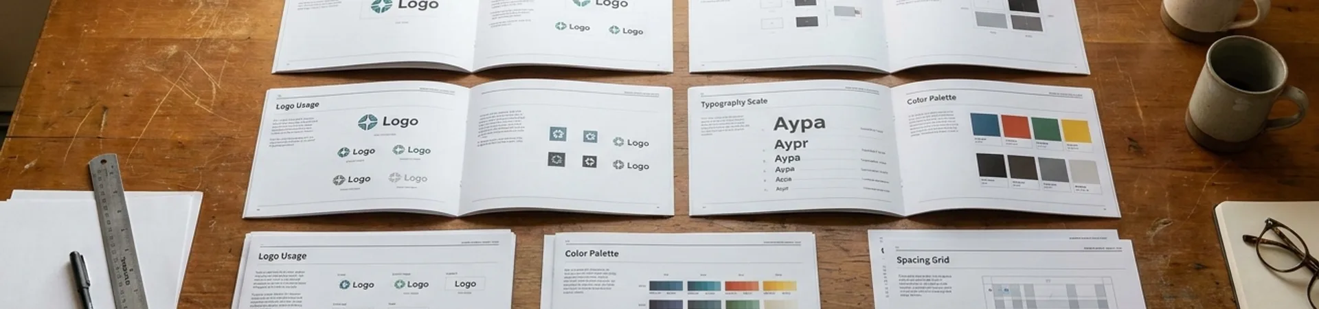
You manage a design system that serves two brands. Maybe three. Maybe a parent brand with regional variants that differ just enough to make a shared component library feel impossible. You have been maintaining parallel Figma files — one per brand, each drifting further from the other with every quarterly update. Style syncs are manual. Inconsistencies multiply. Every component change is a copy-paste operation multiplied by the number of brands you serve.
This is the problem Figma variables were designed to eliminate. Not as a theoretical capability — as a practical, production-tested workflow that replaces static style libraries with a single source of truth. This walkthrough shows you how to set it up.
The Problem with Parallel Files
The traditional multi-brand approach in Figma looks like this: one library file per brand, each containing the same component set with different colour tokens, type scales, and spacing values baked in. When a button component changes shape, you change it in Brand A, then Brand B, then Brand C. When a new component is introduced, you build it three times. When a spacing token needs adjusting, you adjust it in every file independently and hope no one misses one.
This is not a design system. It is a collection of systems that happen to share ancestry, and they will diverge. They always do. The cognitive overhead of maintaining parallel files is not just inefficient — it is structurally hostile to consistency.
Figma variables solve this by separating structure from skin. Components are built once. Brand differences — colours, type ramps, spacing scales, border radii, even content strings — are encoded as variable modes within a single collection. Switching a frame from Brand A to Brand B is a single click. The components do not change. Only their variables resolve differently.
If you have used design tokens in code (via Style Dictionary, Tokens Studio, or similar), the mental model is identical. Variables are Figma's native design token layer. Modes are themes.
Setting Up the Variable Architecture
Before touching Figma, decide on your variable taxonomy. A clean architecture here prevents months of confusion later. The structure below works for most multi-brand systems with two to five brands.
Step 1: Define Your Variable Collections
Create three variable collections. This separation is deliberate — it mirrors how design tokens are typically structured in engineering and prevents circular references.
Collection 1: Primitives Raw values with no semantic meaning. Think of these as your palette.
- `color/blue/500` → `#2563EB` - `color/neutral/100` → `#F5F5F5` - `spacing/base` → `8` - `radius/sm` → `4`
Primitives have no modes. They are brand-agnostic constants. If both brands use the same blue, it is defined once here. If they use different blues, both values exist as separate primitives.
Collection 2: Semantic Tokens Purpose-driven aliases that reference primitives. This is where branding lives.
- `color/bg/primary` → (references a primitive) - `color/text/default` → (references a primitive) - `color/action/default` → (references a primitive) - `spacing/component/padding` → (references a primitive)
Semantic tokens have one mode per brand. When the mode is "Brand A," `color/action/default` resolves to `color/blue/500`. When the mode is "Brand B," it resolves to `color/green/600`. Same variable, different resolution.
Collection 3: Component-Specific Tokens (optional, for complex systems) Scoped aliases for specific component contexts.
- `button/bg/default` → references `color/action/default` - `button/bg/hover` → references `color/action/hover` - `card/bg` → references `color/bg/surface`
This third layer is optional. For systems under fifty components, two collections are usually sufficient. Add the third when component-level overrides start cluttering your semantic layer.
Step 2: Create Modes for Each Brand
In your Semantic Tokens collection, add a mode for each brand. Name them clearly — `Brand A`, `Brand B`, `Brand C` — not `Mode 1`, `Mode 2`. You will be switching between these constantly; legibility matters.
For each semantic variable, set the value per mode by aliasing to the appropriate primitive:
| Semantic Variable | Brand A | Brand B | |---|---|---| | `color/action/default` | → `color/blue/500` | → `color/green/600` | | `color/bg/primary` | → `color/neutral/100` | → `color/cream/50` | | `color/text/default` | → `color/neutral/900` | → `color/charcoal/800` | | `radius/component` | → `radius/sm` (4px) | → `radius/lg` (12px) |
This is the core of the system. Every downstream component that uses `color/action/default` will automatically resolve to the correct brand colour based on which mode is active on the parent frame.
Step 3: Bind Variables to Components
Build your components using only semantic tokens — never primitives directly. A button's background fill is not `#2563EB`. It is `color/action/default`. A card's padding is not `16`. It is `spacing/component/padding`.
This discipline is non-negotiable. The moment a component references a raw value instead of a semantic variable, it breaks the theming chain. That component will not respond to mode changes. It will sit there, stubbornly blue, while everything around it switches to green.
Apply variables to:
- Fill colours — background, text, icon, border - Stroke colours and widths — border treatments - Padding and gap — spacing within auto-layout frames - Corner radius — if brand-differentiated - Typography — via string variables for font family (with limitations — Figma's type variable support is still evolving)
Step 4: Apply Modes at the Frame Level
Variables resolve hierarchically. Set the mode on the outermost frame, and every nested component inherits it. In practice:
1. Create a top-level frame for your page or screen. 2. In the right panel, under the variable collection's mode selector, choose `Brand A`. 3. Every component inside that frame now renders with Brand A's tokens. 4. Duplicate the frame. Switch the duplicate to `Brand B`. Instant brand switch — same components, different skin.
This is where the payoff becomes visceral. You are not rebuilding anything. You are not copying and pasting. You are changing a single property on a container, and an entire interface re-themes itself.
Real-World Application: A Two-Brand Product Suite
Consider a practical scenario. You are the design system lead for a company that operates two consumer brands — a premium tier and a value tier. Both share the same product architecture: login, dashboard, settings, checkout. The component inventory is identical. The brands differ in colour palette, border radius (premium uses sharp corners; value uses rounded), and type scale (premium runs a tighter scale with smaller body text).
With the variable architecture above:
- One Figma library file contains every component. - Two modes in the Semantic Tokens collection: `Premium` and `Value`. - Each mode maps colour, radius, and spacing primitives to the semantic tokens. - Designers working on the premium brand set their page frame to `Premium` mode. Designers on the value brand set theirs to `Value`. - A new component — say, a notification banner — is built once using semantic tokens, and it immediately works in both brands. - When engineering requests a design for the value tier's checkout flow, the designer duplicates the premium checkout screens, switches the frame mode, and the deliverable is ready for annotation. Total effort: seconds, not hours.
The variable setup took roughly two days of upfront work for this scenario. It eliminated approximately one day per week of manual syncing, duplicate maintenance, and "which file is the source of truth?" conversations.
When to Use This (and When Not To)
Ideal Use Cases
- Two to five brands sharing 70% or more of their component structure - White-label products where clients need branded versions of the same interface - Regional variants that differ primarily in colour, language, and localisation details - Light/dark mode (the simplest form of multi-mode theming — start here if you are new to variables)
Limitations
- Radically different brands that share less than 50% of their component structure do not benefit. If Brand A uses cards and Brand B uses list views, variables cannot bridge that structural gap. You need different components, not different skins. - Typography limitations. Figma variables can store font family as a string, but binding font family to a variable remains less fluid than colour or spacing. Some teams supplement variables with Tokens Studio for type-heavy theming. - Performance at scale. Files with thousands of variables across many modes can become sluggish. Audit your variable count quarterly. If primitives exceed 500, look for consolidation opportunities. - Learning curve for contributors. Designers unfamiliar with the primitives → semantic → component token hierarchy will accidentally bind to primitives or raw values. A five-minute onboarding walkthrough and a "variable hygiene" checklist in your contribution guide prevents most violations.
Complementary Tools
- Tokens Studio for Figma — if your engineering team uses Style Dictionary or W3C design tokens, Tokens Studio bridges Figma variables to code tokens bidirectionally. - Figma's Dev Mode — variables surface natively in Dev Mode inspections, giving engineers token names rather than hex values. - Variable scoping — restrict which variables appear for fills vs. strokes vs. spacing. This prevents contributors from applying a colour variable to a padding slot.
The Takeaway
Multi-brand design systems stop being painful the moment you separate structure from skin. Figma variables make that separation native — no plugins, no external token management, no parallel files drifting apart. The upfront cost is real: a day or two of variable architecture work that feels abstract and unglamorous. The return is concrete: every future component, every brand extension, every theme variant inherits the system automatically.
Build once. Theme everywhere. That is not a tagline. It is a file structure.
Designer's Toolkit is a biweekly series from WeLoveDaily exploring the tools, techniques, and workflows that working designers actually use. Next up: Optical Kerning for Display Type.