Most SaaS companies sell speed. They put racing stripes on their landing pages, they animate their loading states, they write headlines with "blazing" and "lightning" and "10x." Then you log into the product and it takes four seconds to render a page.
Linear is the opposite. The brand barely mentions speed. The product — a project tracker for software teams — is the fastest piece of business software most developers have used since the command line. And the brand system exists to compound that feeling at every surface.
The Identity of Less
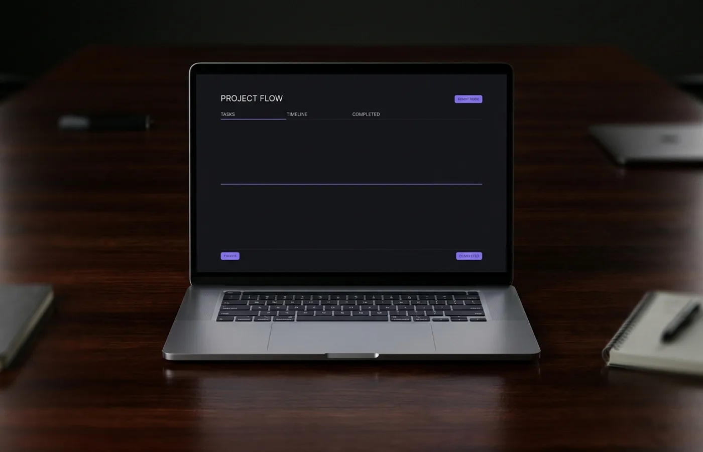
Linear's visual system is defined by what it refuses. There is no gradient. There is no illustration. There is no hero video. Every component — the logo, the documentation, the marketing site, the product UI — shares the same restrained palette: near-black backgrounds, off-white text, and a single electric-violet accent that shows up mostly in key moments rather than as a decorative wash.
The typography is monospace in the product and a tight grotesque sans on the marketing site. Both are set on an aggressive vertical rhythm — high line-height, low letter-spacing, dense columns. Reading Linear's documentation feels like reading a well-kerned terminal. That's the intended experience.
The identity's restraint is not minimalism for its own sake. It's bandwidth efficiency. Every pixel that's not information is a pixel that delayed a decision. Linear's brand is allergic to decoration because decoration is latency made visible.
The Grid Is the Brand
What Linear's competitors spend on illustration and animation, Linear spends on grid precision. Spacing is mathematical — every component lives on an 8-point grid. Typography scales are small and disciplined. Color has meaning: the violet accent signals an action or a status change, not a design flourish.
The consequence is that the product's UI and the marketing website feel like the same artifact. There's no handoff between "brand surface" and "product surface" the way there is in most SaaS. Visit linear.app and then open the app in a new tab — the typography, spacing, rhythm, and interactive texture are continuous. You don't cross a border from "brand" to "tool." There's no border.
This is a rare achievement. Most brands treat their marketing site and their product as different surfaces with different constraints, and the visual register shifts accordingly. Linear treats them as the same surface with the same constraints. The brand is the product. The product is the brand.
What Speed Looks Like
Speed in a brand system is not lightning bolts or motion lines. It's:
- Typography tight enough that the eye sweeps it quickly
- Spacing rhythmic enough that the reader's attention isn't wasted searching
- Color used parsimoniously enough that the one accent signals something meaningful
- Animations short enough that they never steal more than a frame's worth of attention
- Language direct enough that marketing copy reads like product copy
Linear's system exhibits every one of those traits. The brand isn't about speed. The brand is speed, translated into typographic and spatial form.
The Ripple
Linear's identity has already become the template for a new generation of developer tools. Look at Raycast, Vercel's dashboards, Planetscale's documentation, Cal.com's recent marketing refresh, and you will see the same set of moves: dense monospace or tight grotesque, near-black palette with a single saturated accent, aggressive vertical rhythm, no illustration, a product-and-marketing-surface that share the same DNA.
This isn't coincidence. Linear hired away designers from some of these companies, or sold to users who later designed them. The category's visual standard has a new north star.
The lesson is bigger than SaaS. Linear demonstrates that a brand's adjective — fast, warm, premium, brave — should not be decorated into the system. It should be built into the system's bones. When the grid itself expresses the adjective, the brand doesn't need to claim anything. The evidence is already on the screen.