Lisbon's design-capital narrative has been running for about five years now, and every piece of the coverage focuses on the same elements: the architectural restoration of the old town, the azulejo revival, the wave of creative migration from Berlin and Barcelona, the low cost of studio rent. These are real components. They are not, however, the engine.
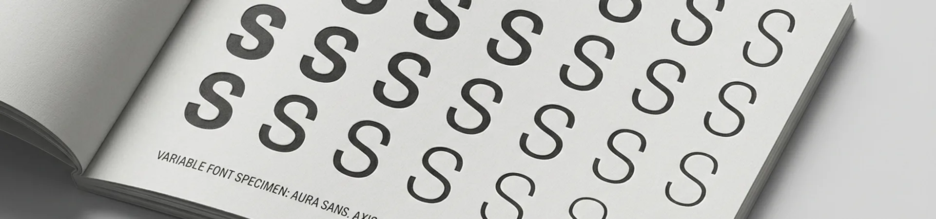
The engine is typography. More specifically, the engine is a cluster of independent type foundries that have quietly made Lisbon one of the most productive cities in Europe for type design, and whose output is visible on brand systems across the continent.
The Foundries
Four Lisbon-linked foundries are doing most of the heavy lifting.
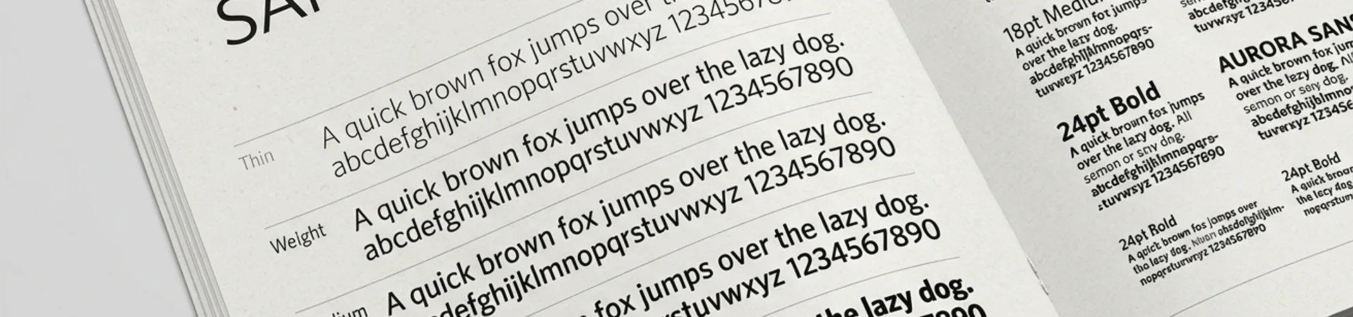
Grilli Type (GT), though headquartered in Switzerland, has had a strong Portuguese designer base for years and maintains operational links to Lisbon. Its catalog — GT Alpina, GT Walsheim, GT Flexa, GT Super — has become default typography for a significant share of European design-forward brands in the 2020s.
Hungry Grid, founded by Portuguese type designers, is rapidly becoming a go-to source for editorial and display type among European studios. Their releases pair technical precision with Iberian character — a quality that's hard to pin down but visible when you stack their specimen sheets next to the usual Dutch or German foundry catalogs.
Borbury, a smaller but sharply curated foundry, has built a reputation for ultra-contemporary display typefaces that show up in fashion and cultural brand work. The foundry's output is less about system typefaces (the work Grilli does) and more about statement display — the typography that carries a magazine cover or a gallery identity.
A2-Type, though London-based, has deep Portuguese roots through Henrik Kubel's collaborations and specific Lisbon clients. Its influence on the city's design register is out of proportion to its geographic distance.
Beyond these four, the independent-designer scene is substantial. Dino dos Santos (DSType) has been one of the most productive type designers in Europe for over a decade, operating from Portugal. Rita Carvalho, Diogo Terroso, and a younger cohort of designers have emerged from the Faculdade de Belas-Artes da Universidade de Lisboa and the associated typographic community.
Why Typography Is the Engine
Typography is infrastructure. A city with a mature type-design community produces three compounding effects.
It raises the floor of local brand work. When the best custom typefaces in Europe are produced down the street, local brand designers reach for them first. The design work improves because the typographic raw material is better.
It attracts international clients. A foundry is a global export business. A brand designer in Milan commissioning a wordmark will often reach for a Portuguese foundry's typeface not because of geography but because the catalog is strong. Money flows into the city through invisible licensing channels.
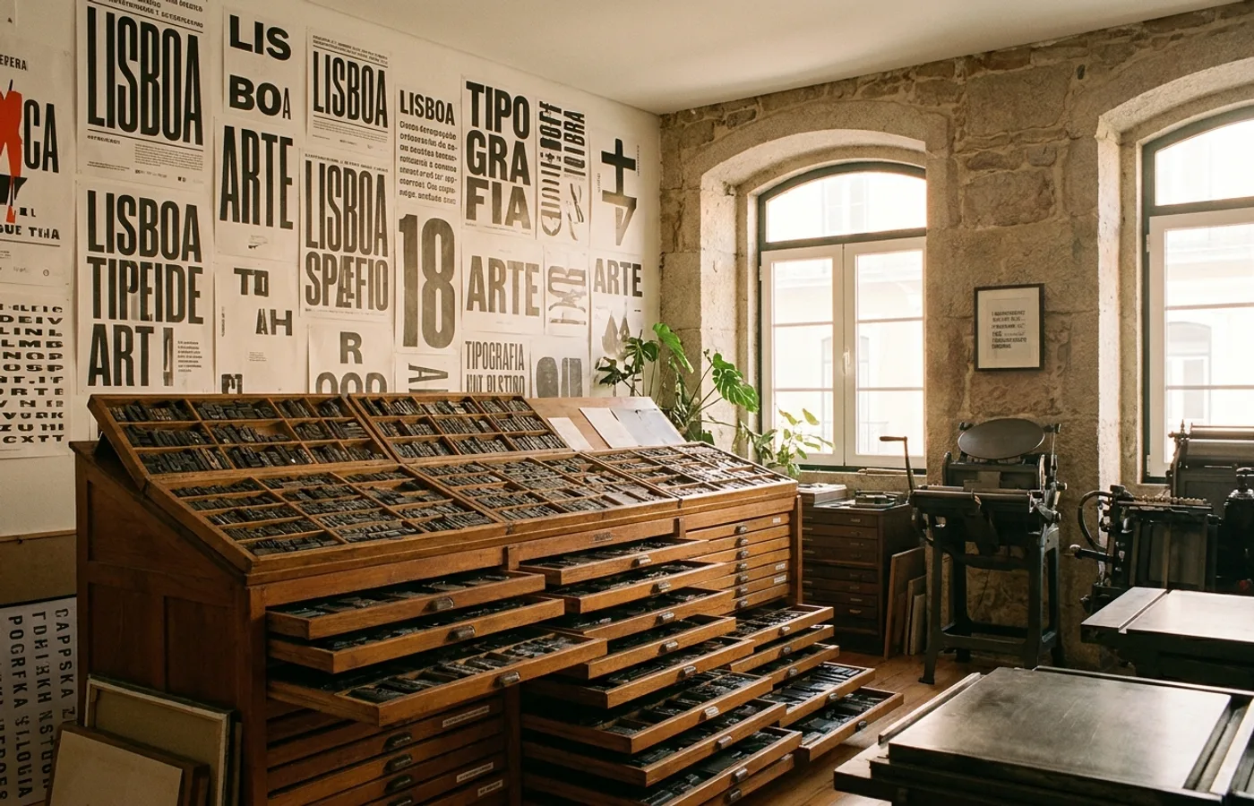
It creates a discourse. A type-design community sustains type specimens, type critiques, type lectures, type exhibitions. This discourse is unusually rigorous — typography is a craft with explicit quality standards — and it raises the analytical bar for all adjacent design work in the city.
Lisbon hit a threshold in all three effects around 2020, and the compounding has been visible ever since.
What The Press Misses
The lifestyle coverage — the cafés, the tiles, the architecture — is true but secondary. It describes the texture of the city, not its productive capacity. A city becomes a design capital when its infrastructure supports sustained international export. Lisbon's tile restoration is beautiful, but it doesn't export. Its type foundries do.
Compare to Barcelona ten years ago, which had superior architecture, better weather, more international creative migration, more press coverage — and a much weaker type-design scene. Barcelona's design capital status plateaued. Lisbon's continues to rise.
The difference is typography.
What To Watch
The next phase will depend on whether Lisbon's type foundries can maintain their pace while the cost of living rises. Foundry work is patient work — each typeface represents 12-36 months of design effort, typically funded by a mix of retail sales and custom commissions — and it cannot be done at pace in an expensive city unless the retail market sustains it.
The foundries are building that sustaining market now. GT's global influence, Hungry Grid's rapid catalog growth, and the broader Portuguese type community's rising visibility suggest the infrastructure will hold.
If it does, the durable legacy of Lisbon's design renaissance will not be the restored old-town facades. It will be the typefaces setting those facade signs, and the brands on every other European street that carry a Lisbon-designed wordmark without anyone noticing where it came from. That's the quiet, compounding version of a design capital.