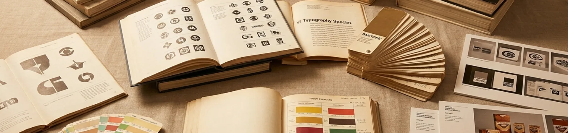
Zoo Studio, based in Vic, Spain, published a corporate-identity refresh for Mas Uniformes in 2026 — a hospitality workwear shop celebrating its 75th anniversary. The refresh is a rare example of heritage-brand design that commits to the heritage rather than masking it.
The system
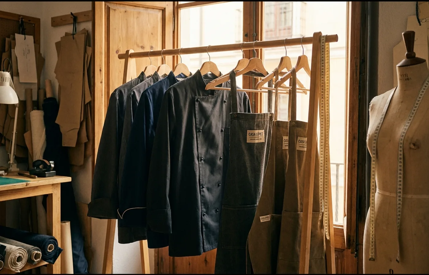
The wordmark is a modified sans-serif with an altered counter in the "A" — small typographic choice that gives the logo a distinguishing detail without sacrificing legibility at small scales (important for woven labels on garments). An anniversary badge inspired by measuring tape marks the 75 years; a secondary seal carries the brand's history as a graphic asset rather than a dated stamp.
Color palette is utilitarian: workwear white, chef-coat black, and a single warm accent that surfaces on packaging and signage. Typography on secondary collateral uses a complementary serif for body copy — a nod to the traditional tailor's paperwork that the brand has produced for decades.
Why it works
Most 75-year anniversary identities fall into one of two traps: a retro pastiche that makes the brand look like a theme, or a contemporary reset that throws away the equity the anniversary is meant to celebrate. Zoo Studio's solution threads both. The system is contemporary enough to carry the brand forward ten more years; the anniversary badge and measuring-tape motif acknowledge the craft heritage without embalming it.
Credits
- Studio: Zoo Studio, Vic, Spain
- Client: Mas Uniformes (75th anniversary)
- Published: 2026
- Source: Behance