On April 16, 2026, ONY Agency published a rebrand for Dubai-based Think Agency, marking the agency's evolution from a mobile-focused shop into a full-scale digital player. The new identity's core move: a "digital liquid environment" concept that translates agency evolution into a visual language.
The system
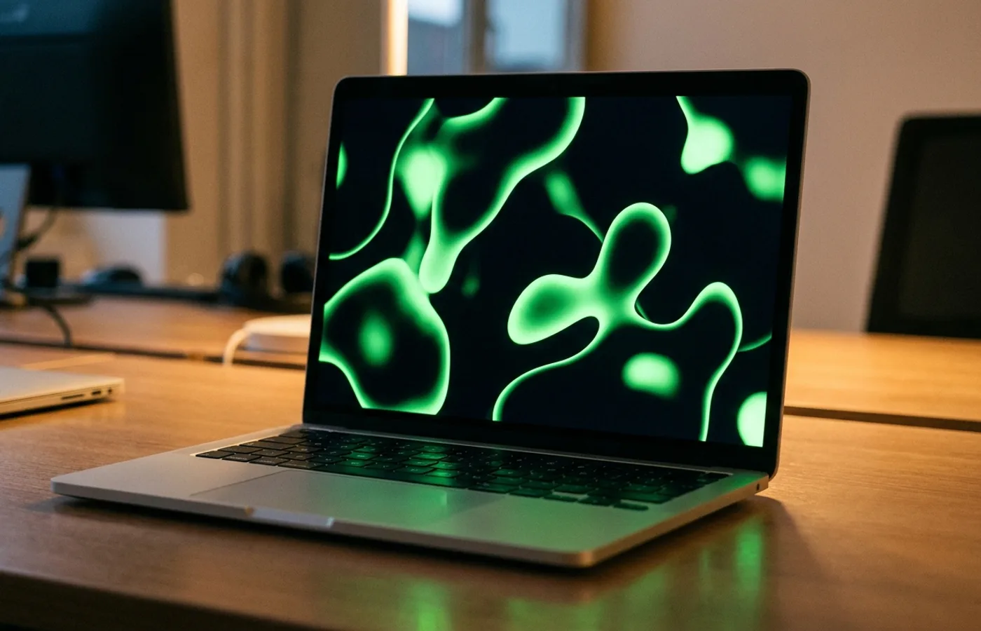
The identity's primary asset is a reinterpreted signature green — the brand color Think was already known for, but evolved into a fluid, motion-first element rather than a static swatch. Secondary typography is a tight sans that reads as engineering-grade; primary display moments are reserved for the liquid-form wordmark treatment.
Photography is integrated with graphic elements rather than treated as a separate asset library — a practical consequence of the digital-liquid thesis. Every surface the brand touches can hold a moving element that connects back to the core system.
Why it works
Agency rebrands are notoriously hard because the audience (other agencies, clients, industry press) is visually sophisticated and quick to spot cliché. "Motion identity" is, by 2026, a cliché. What Think Agency's rebrand does well is ground the motion in a structural argument about their business — from mobile-only to digital-native — rather than treating motion as decoration.
Credits
- Studio: ONY Agency
- Client: Think Agency, Dubai, UAE
- Published: 2026-04-16
- Source: Behance