Spend an hour browsing the marketing sites for developer-facing companies released in the last three years — Planetscale, Turso, Neon, Upstash, Trigger, Resend, Railway, Convex, Cal.com, Linear — and you will notice the same visual signature.
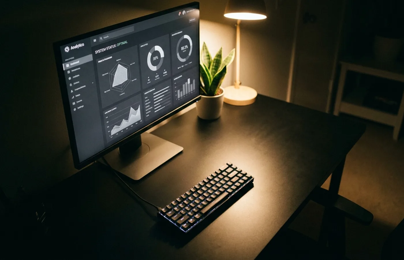
Near-black backgrounds. A single saturated accent color, usually violet, cyan, or electric green. Mono or tight grotesque typography at a generous line-height. Geometric SVG illustrations rendered in flat line-work rather than full-color illustration. Aggressive whitespace. A hero video that's mostly a dashboard screen capture with subtle motion. A pricing table with bold numbers and parsimonious copy.
This visual language has a name in the industry, half-jokingly: the Vercel aesthetic. It's not an invention of Vercel alone — it owes as much to Linear, to the Rauno Freiberg UI movement, to the JetBrains and Figma interfaces that preceded it — but Vercel's hosting platform, deployed across approximately every indie developer's weekend project between 2020 and 2024, standardized the look across the entire category.
The Ingredients
Strip the aesthetic down to its component parts and it's remarkably formulaic:
- Background: true black or near-black (#0a0a0a). Never pure white at rest.
- Type: a tight grotesque (Geist, Inter tight-tracking, GT America) or a mono (Geist Mono, JetBrains Mono) at roughly 16-17px body with 1.5 line-height
- Accent: one saturated hue (violet, cyan, green) used sparingly — on buttons, status dots, data highlights
- Space: generous margins, generous padding, generous letter-spacing above a certain size
- Motion: reserved. No parallax. No scroll-triggered spectacle. Just tasteful hover states and occasional animated numeric counters
- Illustration: geometric wireframes, isometric diagrams, grid-based iconography. No color-heavy character illustration.
- Copy: direct, punchy, often preferring a single sentence or a bold numeral over paragraph marketing
These seven ingredients, remixed, produce the current default. You can walk through twenty developer-tool homepages and they all feel like alternate cover designs of the same magazine.
Why It Converged
The convergence is not laziness. Three forces drove it.
The audience itself is visually sophisticated and allergic to amateur design. Developers notice when a marketing site uses a free Google Font. They notice when illustrations look like 2018 tech-Twitter stock characters. The safe move, category-wide, was to adopt a visual register that reads as evidence of good taste to this audience. Vercel's aesthetic signaled competence without forcing a brand into a distinct personality.
Dark mode became the default. Developers worked in dark IDEs, dark terminals, dark Figma files, dark Linear boards. A light-mode-only marketing site felt jarring. Companies shipped dark-by-default — and dark visual systems require a different illustration vocabulary than light-mode systems. Geometric flat line-work scales into dark mode; detailed character illustration doesn't.
The network effect of shared design teams. Every designer working in developer tools eventually worked with or for someone at Vercel, Linear, Figma, Notion, or their ecosystem. The visual language traveled with the talent. By 2024, a designer hired to refresh a dev-tool brand knew exactly what was expected — and shipped it.
The Trap
The consequence is that the category is now visually saturated. A new developer-tool brand, shipping today, inherits the Vercel aesthetic by default. Which means every new entrant looks like every other recent entrant. The visual system that signaled discerning good taste in 2022 now signals generic dev-tool in 2026.
This is the category's current problem. The aesthetic won. Now winning it doesn't mean anything.
What Breaks Out
The next interesting developer-tool brands will do one of two things.
They will break the palette — introducing warm neutrals, textured backgrounds, or a distinctly different color register. Supabase's recent identity refresh leaned into green-on-dark in a way that feels more biological than tech; Resend's cream-and-coral palette reads as a magazine rather than an IDE.
Or they will invest in a proprietary illustration or photography language. Clerk's human portraits, Vercel's own recent forays into custom 3D rendering, Stripe's continued commitment to bespoke imagery — these are the moves that make a dev-tool brand memorable when the typographic and color conventions are copied.
The lesson for every category goes beyond developer tools. When a visual register has converged, the safe choice is the invisible choice. The brand that wants to be remembered has to break something on purpose.