article
Work, articles, studios and categories across the archive.

project
…element rather than a logo. It is embedded in typography, in spatial design, in the way motion graphics move. The chevron stopped being a badge and became a grammar. That is a sophisticated…

ranking
…alongside body at 9-point is a now-standard move. Fifteen years ago it would have read as graphic design exercises; now it's magazine orthodoxy. Hierarchy collapse. Many of the titles…
project
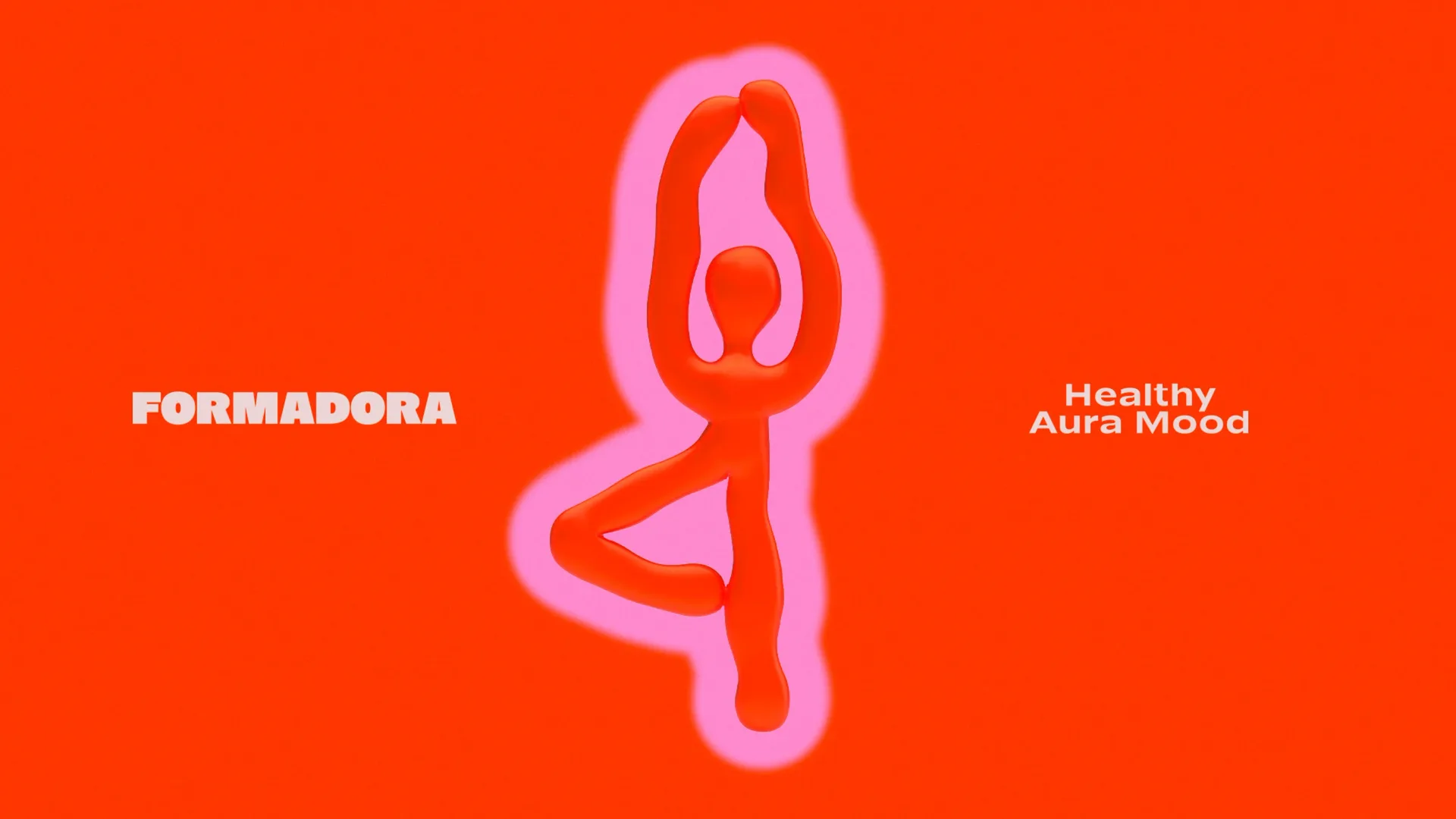
…being. The visual language reflects plasticity, movement, and emotional energy. Fluid graphic forms communicate flexibility, while the vibrant color palette sets the tone of joy, motivation…
ranking
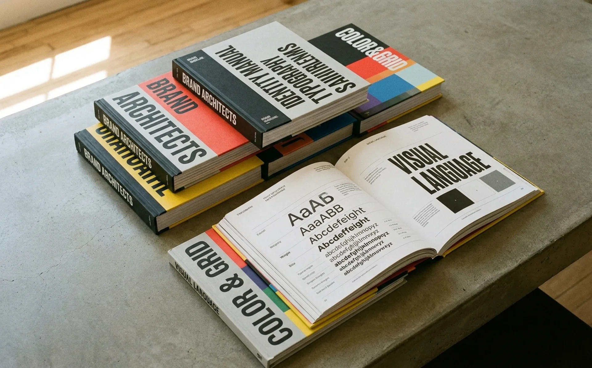
…a potential infringer. 2. NASA: The 1975 Standards Manual That Defined an Era NASA's Graphics Standards Manual, designed by Danne & Blackburn in 1975, is arguably the most famous brand…
ranking
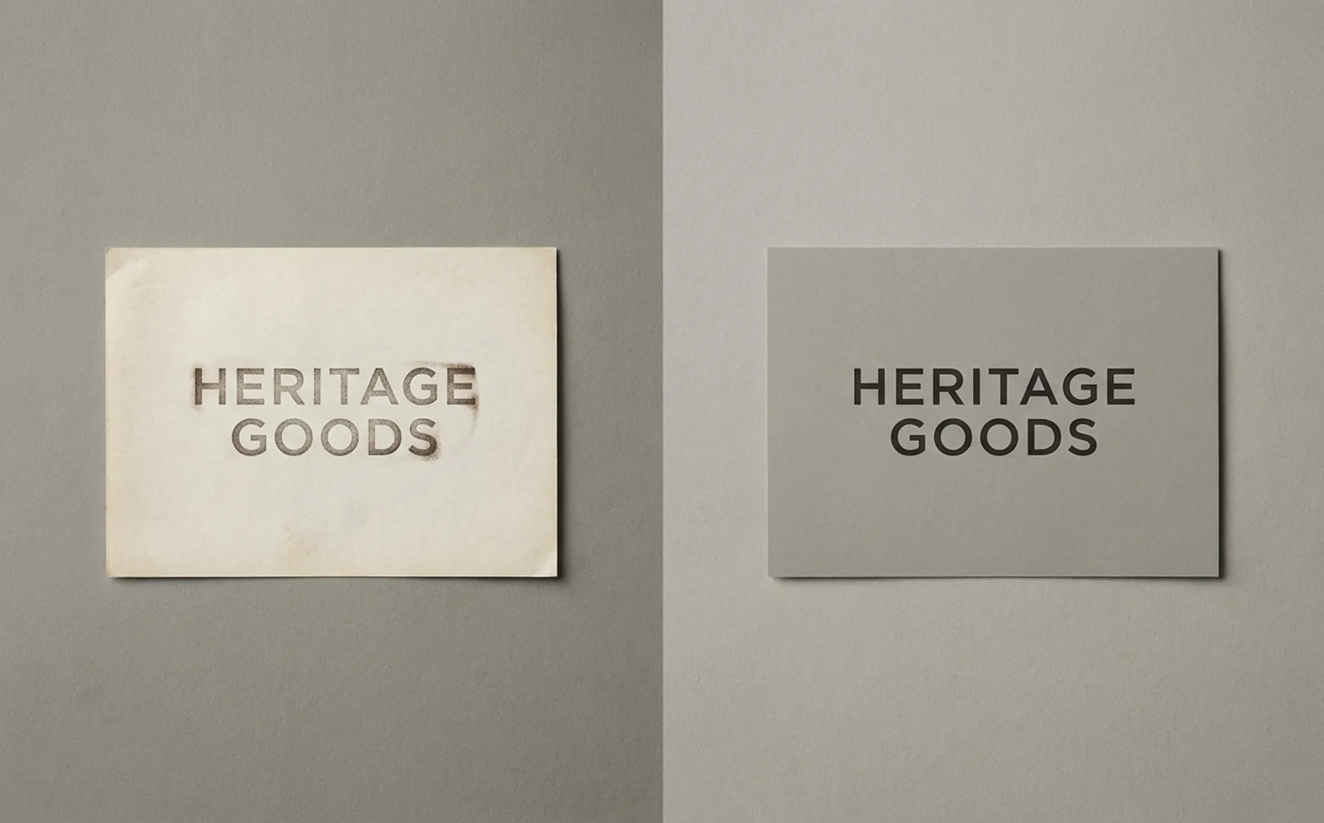
…the studio's methodology on the page. 15. Think Agency: Digital Liquid Verdict: Right motion, right reason. Dubai's Think Agency rebranded around a "digital liquid" concept as the…

article
…something closer to cultural emblem than corporate identifier, a distinction that owes less to graphic design than to the community infrastructure the company built around its product. The mark…

project
…they're trying to make you feel, and they've engineered every element (colour, typography, motion, voice, spatial design) to produce that feeling at scale. The engineering metaphor is…
project
…The Founding Argument Wolff Olins was founded in London in 1965 by Michael Wolff, a graphic designer, and Wally Olins, who was emphatically not one. Olins came from advertising, and…

project
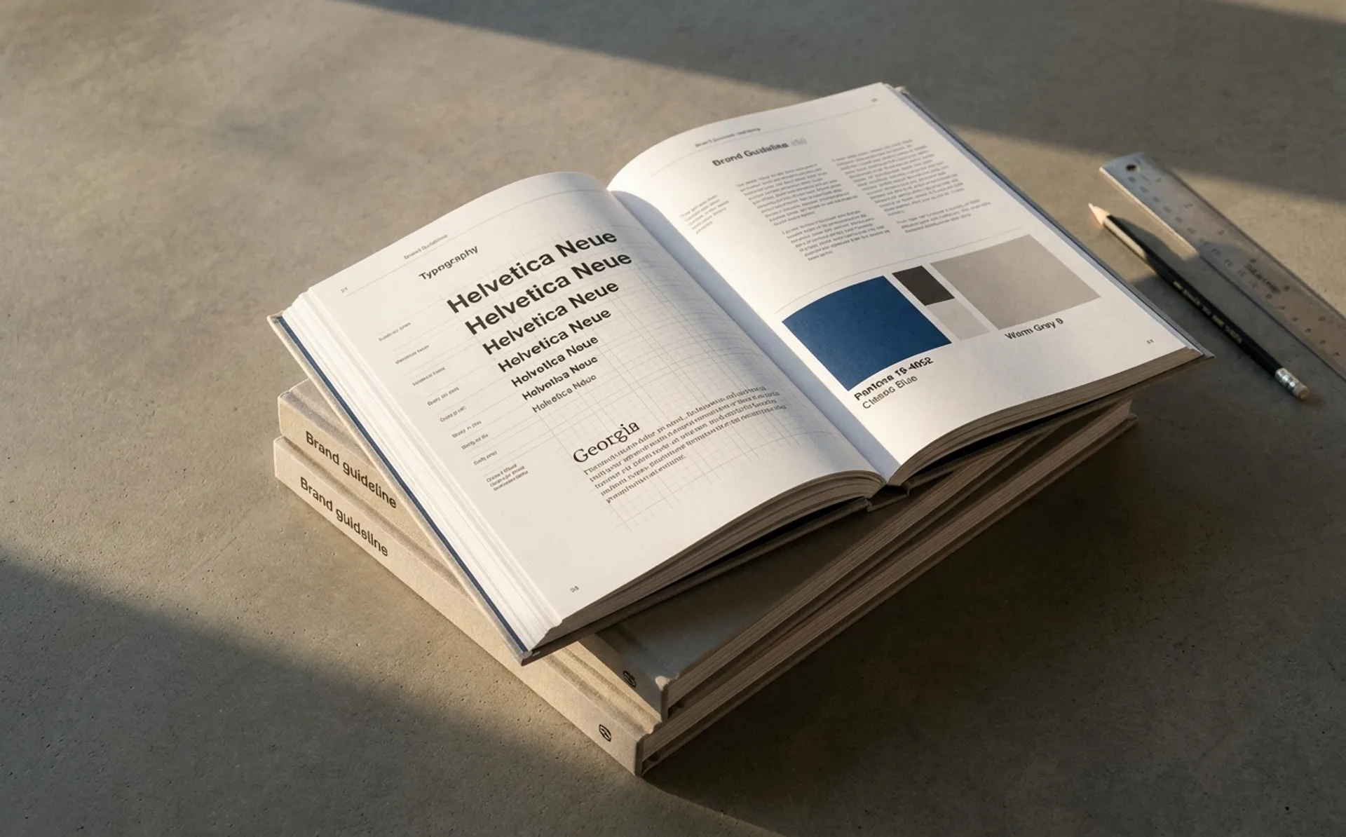
…wordmark visualizes the idea of subtraction—removing unnecessary skincare steps—while the graphic system expresses the concepts of balance and continuous circulation within the skin. Together…
ranking
…analysis on specific rebrands, see Rebrand Before & After: 15 Identity Refreshes Analyzed. For motion-identity systems specifically, see Kinetic Logos: A Field Guide to Motion Identity Systems…
article
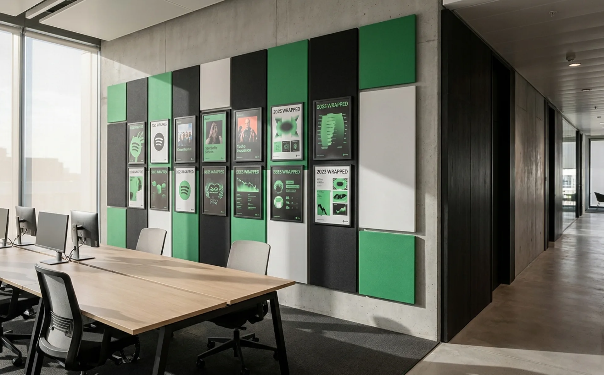
…duotone system (in which photographs were reduced to two-color overlays, creating bold, graphically flat portraits and scenes) solved a specific problem. Spotify needed a photography style…
project
…austerity of competitors like Spirit and Frontier. Lippincott's solution centered on a single graphic element: the heart. The heart symbol (rendered in Southwest's tricolor palette of blue…