What We Loved This Month: April 2026's Best in Brand Design
April was a month of contrasts in brand design. A legacy consultancy reminded the industry that corporate identity isn't a dirty word. A city showed that design culture is built by institutions, not aesthetics. And several brands proved — again — that the best identity work happens when designers solve real problems rather than chase visual trends.
Here's what caught our eye.
From Our Pages
Lippincott: The Studio That Invented Corporate Identity
Our latest Studio Spotlight profiled the agency that literally coined the term "corporate identity" in 1943. Lippincott isn't the kind of studio that dominates design Twitter, but its work for Samsung, Starbucks, and Southwest Airlines shapes the visual environment billions of people navigate daily. The piece examines how strategy-led, enterprise-scale brand work can be both rigorous and visually distinctive — and why the design press should pay it more attention.
Read the full profile: Studio Spotlight — Lippincott
Copenhagen's Design System at City Scale
Our feature on Copenhagen as the world's most design-literate city explored something beyond the usual "best designed cities" travel content. From Gehl Architects' pedestrian-first philosophy to the institutional backbone of the Danish Design Centre and KADK, Copenhagen has built design literacy into its civic infrastructure. A companion to our Tokyo wayfinding feature — same ambition, different scale.
Read the full feature: How Copenhagen Became the World's Most Design-Literate City
Mailchimp's Rebrand: The Retrospective Verdict
Two years into Intuit ownership, did the quirk survive the system? Our third Rebrand Retrospective found that the Collins-era identity has held up remarkably well — but the personality bandwidth has narrowed. The piece is a nuanced case study in what happens to distinctive brands during M&A integration, and the lessons apply well beyond email marketing.
Read the full retrospective: Mailchimp's Rebrand — Two Years On
The Invisible Design of Luxury Packaging
Apple's three-second lid resistance. Hermès' tissue paper crinkle. Tiffany's multi-layered reveal. Our feature on luxury packaging design explored the sensory decisions that brands engineer into unboxing experiences — a domain where invisible design does its most deliberate work.
Read the full feature: The Invisible Design of Luxury Packaging
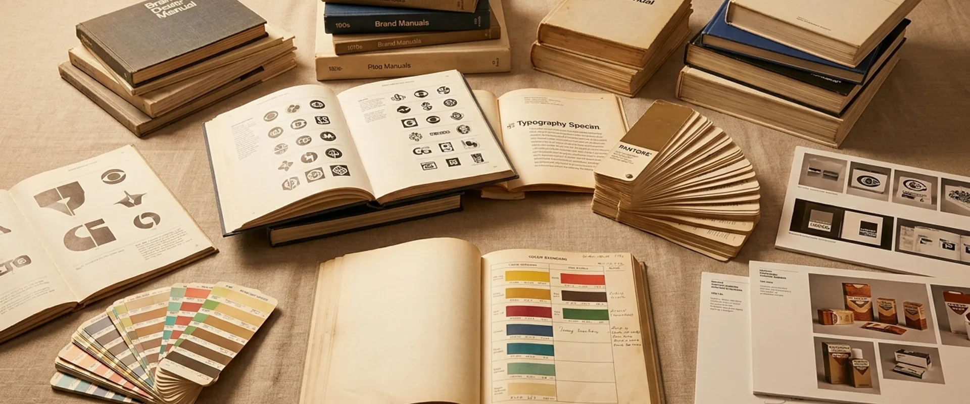
5 Brand Guidelines Worth Reading
Our listicle on exceptional brand guidelines — from Audi's meticulous system to Slack's self-aware playfulness — was our most-shared article of the month. The piece makes the case that brand guidelines are design artifacts worth studying in their own right, not just compliance documents. If you missed it, start with NASA's 1976 Graphics Standards Manual. It will change how you think about systematic design.
Read the full listicle: 5 Brand Guidelines Worth Reading
From the Industry
Volvo's Wordmark Refresh
Volvo quietly updated its wordmark in April, refining the letterforms of its iron-mark logo for the first time in nearly a decade. The changes are subtle — tighter kerning, slightly refined terminals, improved optical balance at small sizes — but the approach is worth noting. In an era of dramatic rebrands and social media discourse about logo changes, Volvo chose the opposite: a refinement so considered that most consumers won't notice it. Sometimes the bravest brand decision is a small one executed with precision.
Patagonia's Visual Identity Update
Patagonia rolled out an updated visual identity system in April that expanded its typographic palette while keeping the Fitz Roy mountain logo untouched. The addition of a custom serif for editorial and long-form content gives the brand a new register — warmer and more literary — that complements the existing utilitarian sans-serif. It's a smart evolution that grows the system's range without disrupting its foundations.
The Tokyo Design Festival Brand System
Tokyo's annual design festival unveiled its 2026 brand identity, designed by Kigi (the studio founded by Ryosuke Uehara and Yoshie Watanabe). The system uses a modular grid of geometric characters that can be combined and recombined to create unique compositions for each event and venue. It's a masterclass in variable identity — a system that's different every time you see it but unmistakably itself.
Oat Haus's Granola Butter Packaging Redesign
Small brand, big design. Oat Haus, the granola butter company, worked with studio Gander on a complete packaging redesign that replaced its original hand-drawn look with a bold, color-blocked system anchored by custom display type. The new design sacrifices indie charm for shelf impact — a trade-off that DTC brands must eventually make — but does it with enough personality to avoid the homogeneous "clean CPG" look. Worth watching.
Muji's European Packaging Refresh
Muji quietly rolled out a refined packaging system across its European stores in April, updating the kraft-and-white material palette that has defined the brand's physical retail experience since the 1980s. The changes are subtle — a slightly warmer kraft tone, cleaner label typography, and a new approach to product information hierarchy that prioritizes visual clarity over text density. What makes it worth noting is the discipline: Muji's packaging design has always been an exercise in saying less, and this refresh manages to say even less while communicating more. For a brand built on the rejection of branding, it's a masterclass in how restraint evolves.
Universal Music Group's Artist Brand Toolkit
UMG launched an internal brand toolkit in April giving artists and their teams standardized templates for social media, merch, and tour visuals — while preserving enough flexibility for individual artist identity. The initiative is interesting less for its design (the templates are competent but not remarkable) and more for what it signals: the music industry is catching up to the idea that brand systems, not just album art, define an artist's visual identity.
Fjällräven's Heritage Mark Update
The Swedish outdoor brand updated its arctic fox logo for the first time in nearly twenty years, simplifying the mark's line work for better performance at small sizes while retaining the hand-drawn quality that distinguishes it from the clean geometric marks dominating the outdoor category. The update was handled by Stockholm studio BVD and represents the kind of quiet, purposeful identity refinement — evolution, not revolution — that we think more brands should consider before reaching for a full rebrand.
One to Watch
Studio Nari — Seoul
Studio Nari, a two-person practice founded by Nari Kim in Seoul, has been producing identity work over the past year that fuses Korean typographic traditions with contemporary brand system thinking. Their recent work for a Seoul-based ceramics studio — where the logomark draws from Hangul calligraphic forms — and a Korean fermentation brand whose packaging integrates traditional Joseon-era color palettes with modern structural design shows a fluency in both cultural specificity and international design language that's rare in any market. What distinguishes Studio Nari from studios that merely "reference" local heritage is the structural integration: the Korean typographic traditions aren't decorative elements layered onto a Western design framework. They're the architectural foundation of the system. Keep an eye on them — the intersection of regional typographic heritage and global brand design is one of the most interesting spaces in identity right now, and Studio Nari is working at its center.
Coming in May
Next month brings WeLoveDaily's second Brand of the Month: a full deep-dive into Stripe, the payments company that proved infrastructure can have the visual identity of a design studio. Our preview publishes tomorrow — read it to see why Stripe is our pick and what the full analysis will cover.
Read the preview: Brand of the Month — Stripe: The Identity That Changed Fintech