Designer's Toolkit #3: Structuring Brand Guidelines Clients Actually Use
Every designer has produced a brand guidelines document that was never opened again. You spent two weeks crafting a 60-page PDF with perfect typography, meticulous color specifications, and clear-space diagrams that would make NASA's standards manual proud. You presented it to the client. They said it was beautiful. And then the marketing coordinator made the next social post by eyeballing the hex code and stretching the logo to fit.
The document wasn't the problem. The structure was.
How to create brand guidelines that actually get used is a different question from how to create brand guidelines that look impressive. Usage requires understanding who reads guidelines (rarely the person who commissioned them), when they read them (in the middle of producing something, not during a planning session), and what they need (answers to specific questions, not comprehensive education).
This toolkit provides a structural framework for building brand guidelines that clients consult, not just admire.
The Adoption Problem
Brand guidelines fail for predictable reasons, and most of them are structural:
Wrong audience. Guidelines are typically written by designers for other designers. But the people who most need guidelines — marketing coordinators, social media managers, product managers, external agencies — often aren't designers. They need to know what to do, not why the kerning is optically adjusted at display sizes.
Wrong entry point. Most guidelines open with the logo. This makes organizational sense (the logo is the foundation of the identity) but practical nonsense. Nobody opens brand guidelines to learn about the logo. They open them to answer a question: "What font do I use for a presentation?" "Can I put the logo on a dark background?" "What's the hex code for our primary blue?"
Wrong format. A 60-page PDF works as a reference document for designers building campaigns. It doesn't work for a content manager who needs to check a color value at 4 PM on a Friday. The format needs to match the context of use.
No maintenance plan. Guidelines that can't be updated without a redesign project are guidelines that will be outdated within six months. The brand evolves. The guidelines fossilize. The gap between official guidelines and actual brand usage grows until the guidelines are functionally irrelevant.
The Framework: Organize Around Use Cases, Not Elements
The single most impactful structural change you can make to brand guidelines is reorganizing them around use cases rather than brand elements.
Traditional structure:
- Logo
- Color
- Typography
- Photography
- Iconography
- Layout
- Voice and tone
Use-case structure:
- Quick-start guide (one-page cheat sheet)
- Making a presentation
- Creating social media content
- Writing for the brand
- Working with external agencies
- Building digital products
- Reference: full specifications
The traditional structure is logical. The use-case structure is useful. The difference is that a marketing coordinator looking to create an Instagram post doesn't need to read about logo construction — they need to know the image dimensions, the overlay treatment, the font and size for caption text, and where to find the template. A use-case-organized guide puts that information in one place.
This doesn't mean eliminating the element-by-element reference. It means moving it to the back — the appendix — and leading with the workflows people actually follow.
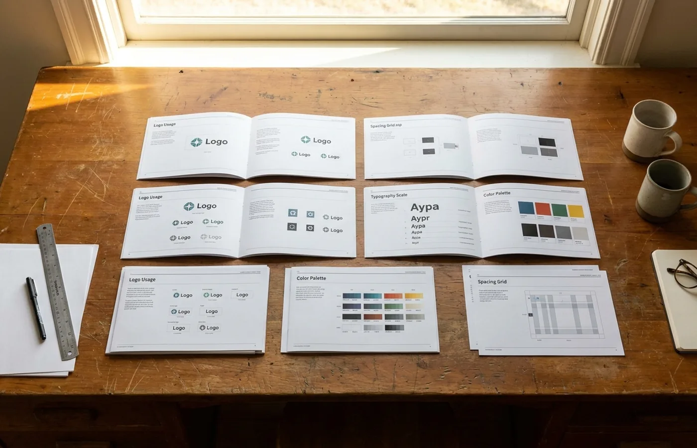
The Essential Sections (Prioritized)
1. The Quick-Start Page
This is the single most important page in your guidelines, and most guidelines don't have one.
A quick-start page is a one-page summary that answers the 10 most common questions: primary logo file, primary color hex codes, primary typeface name and where to download it, approved photography style (one example), do-and-don't grid with the four most common mistakes. Print it. Pin it above the marketing team's desks. Put it as page one of the PDF and the landing page of the web version.
The quick-start page handles 80% of daily brand decisions. Everything else is for the 20% that requires deeper guidance.
2. Logo Usage (Not Logo History)
Skip the origin story. Skip the design rationale. Skip the construction grid (unless your audience is other designers). Focus on:
- Approved versions: Primary, secondary, monochrome, reversed. Show each on light and dark backgrounds.
- Minimum size: The smallest size at which the logo remains legible. Specify in pixels for digital, mm for print.
- Clear space: Specify using a simple unit (height of the "l" in the logo, or a fixed pixel/mm value). Avoid complex ratio-based systems that require calculation.
- Don'ts: Show the five most common mistakes. Stretched, rotated, recolored, busy-background, too-small. Five is enough.
3. Color System
Lead with the colors people use most, not the complete palette.
- Primary palette: 2-4 colors with hex, RGB, CMYK, and Pantone values. Include a swatch large enough to judge on screen.
- Usage guidance: What each color is for. "Primary Blue is for headlines, buttons, and primary UI elements. Use at least 60% of the layout surface." Be specific.
- Accessibility: Note which color combinations pass WCAG AA contrast requirements. If possible, include a contrast matrix.
- Extended palette: Secondary and accent colors. Note that these are supplementary, not alternatives to the primary palette.
4. Typography
- Primary typeface: Name, weight range, where to download/purchase. Include a specimen showing the typeface at body and display sizes.
- Hierarchy: Show a complete example of heading, subheading, body, and caption text with exact sizes, weights, and line heights.
- Fallback typefaces: What to use when the primary isn't available (presentations on a client's machine, email clients with limited font support).
- Type in context: Show 2-3 real examples (social post, email header, presentation slide) with type specifications annotated.
5. Photography and Illustration
Show, don't tell. A photography direction page should be 80% images and 20% text.
- Approved style: 6-8 reference images that define the range.
- Avoid: 3-4 images that are explicitly off-brand.
- Practical notes: Lighting direction, color grading parameters, whether to use filters or presets, aspect ratios for common formats.
6. Voice and Tone
- Voice: 3-5 adjectives with brief explanations. "Confident: We state our position clearly. We don't hedge with 'maybe' or 'we think.'"
- Tone by context: How the voice adjusts for different situations (social, error messages, formal communications).
- Word list: Terms to use and terms to avoid. This is the most consulted section of any voice guide.
- Examples: Before/after rewrites showing off-brand copy corrected to on-brand.
Delivery Format: PDF vs. Web vs. Figma
| Format | Best For | Limitations | |--------|----------|-------------| | PDF | Formal handoff, print reference, archival | Can't be updated without redesign; poor searchability | | Web-based (Notion, Gitbook, Brandpad, Frontify) | Living documentation, searchable, team access | Requires ongoing hosting and maintenance | | Figma/design tool library | Designers working within design tools | Only accessible to Figma users; doesn't serve non-designers |
The recommendation: use all three, with clear roles.
- Web-based as the primary reference (searchable, updatable, accessible to everyone)
- Figma library as the working tool for designers (components, styles, tokens)
- PDF as the formal handoff document and offline reference (generated from the web version, not maintained separately)
The mistake most teams make is producing only a PDF, which combines all three roles into one static document. The PDF becomes simultaneously the reference, the working tool, and the handoff — and it's not great at any of them.
Building for Maintenance
Brand guidelines that can't be updated cheaply will become outdated. Plan for updates from the start:
Version and date every page. When someone questions whether a guideline is current, the version stamp answers the question.
Separate the stable from the evolving. Logo specifications rarely change. Social media templates change quarterly. Put them in different sections (or different documents) so one can update without touching the other.
Assign an owner. Guidelines without an owner are guidelines without a future. Designate one person (brand manager, design lead, or marketing director) as the guidelines owner, with explicit responsibility for keeping them current.
Build a change log. When a new color is added or a photography direction shifts, log the change with the date and reason. This creates an audit trail and helps team members understand why the guidelines say what they say.
Schedule quarterly reviews. A 30-minute review every three months catches drift before it compounds. Check: are people following the guidelines? Are there questions the guidelines don't answer? Has the brand evolved in ways the guidelines don't reflect?
Handling the Handoff Conversation
Delivering brand guidelines is a design project in itself, and the handoff determines whether the document lives or dies. Most designers email the PDF, walk through it once in a meeting, and move on. That's a handoff optimized for the designer's schedule, not the client's adoption.
Run a working session, not a presentation. Instead of presenting the guidelines page by page, bring a real task — an upcoming social campaign, a sales deck that needs updating, a product launch email — and work through it using the guidelines in real time. This does two things: it proves the guidelines are practical, and it surfaces gaps before you disappear.
Train the person who will actually use it, not just the person who approved it. The creative director signed off on the project. The marketing coordinator will open the document 200 times in the next year. Make sure the coordinator is in the room for the handoff. Better yet, have them complete a task using the guidelines while you watch. The questions they ask will reveal structural problems you can fix before final delivery.
Provide starter templates alongside the guidelines. Guidelines tell people what to do. Templates show them how to start. A Canva or Figma template for social posts, a Google Slides template for presentations, an email header template — these reduce the friction between reading the guidelines and applying them. Templates also function as guardrails: if the marketing coordinator starts from an on-brand template, the result stays closer to the system even if they never open the guidelines document at all.
Create a "brand hotline" for the first 90 days. This can be as simple as a dedicated Slack channel or email alias where team members can ask quick brand questions. The first three months after delivery are when habits form. If someone can't find an answer in the guidelines and has no one to ask, they'll guess — and guessing compounds into drift. The questions that come through this channel also become your best source material for the first quarterly update: they tell you exactly what the guidelines failed to make clear.
Document the "why" for contentious decisions. Every brand system has at least one rule that people resist — a restricted color, a typeface that's harder to work with, a logo clear-space requirement that feels excessive. When you know a rule will face pushback, include a one-sentence rationale directly in the guidelines. "The logo requires 24px of clear space because testing showed that tighter spacing reduced brand recognition by 18% at mobile sizes." A reason converts a rule from arbitrary restriction to informed decision.
When to Use (and When Not To)
This framework works best for:
- Growing companies with expanding teams who need consistent brand execution
- Agency handoffs where external partners need to produce on-brand work independently
- Post-rebrand launches where a new identity system needs to be adopted across the organization
This framework is less relevant for:
- Solo practitioners who are the brand's only designer
- Very early startups where the brand is still evolving rapidly and formal guidelines would constrain necessary experimentation
- Internal design systems that function more like component libraries than brand guidelines
The right moment to create brand guidelines is when more than one person is making brand decisions. Before that, guidelines are premature. After that, every day without guidelines is a day the brand drifts.
For inspiration on what exceptional brand guidelines look like in practice, see our companion piece: 5 Brand Guidelines That Are Actually Worth Reading.