On April 8, 2026, Graz-based designer Lukas Diemling published the brand identity for Orthofer — a family-owned Austrian pumpkin seed oil producer. The project was subsequently featured in Behance's "Best of" selection.
The system
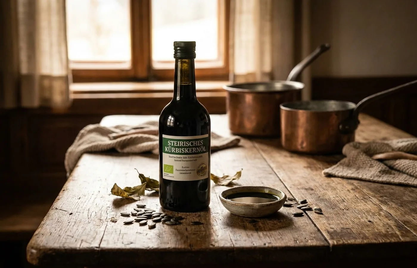
The identity's defining move is a flexible logo built around the pumpkin itself as the graphic element. Rather than rendering a pumpkin as a decorative icon, Diemling treats the pumpkin's silhouette as a mark that can be scaled, cropped, and reoriented across packaging, labels, and secondary materials — a modular asset rather than a fixed lockup.
The color palette is restrained to a premium food register: a deep forest green evoking the oil itself, a warm cream neutral, and a single accent that brings packaging labels and marketing collateral together. Typography pairs a confident display serif for the wordmark with a clean humanist sans for body applications.
The photography (also by Diemling) leans into harvest-season warmth without drifting into farm-to-table cliché — a distinction achieved through low-key lighting and restraint in prop styling.
Why it works
Specialty food category branding is easy to get wrong in one direction (generic "heritage" badges and over-stylized farmhouse typography) and equally easy to get wrong in the other (over-modernized minimalism that loses the heritage signal). Orthofer lands in the rare space where the brand reads as both considered and old — a signal that the family's multi-generation claim is real.
Credits
- Designer: Lukas Diemling (Design, Art Direction, Photography), Graz, Austria
- Recognition: Featured in Best of Behance
- Published: 2026-04-08
- Source: Behance