The Great Airline Rebrand Wave
Airlines are in the middle of a massive identity cycle. United, Lufthansa, Finnair, Japan Airlines, Korean Air, and a dozen others have either completed or announced visual overhauls in the past three years. The trigger is the same for all of them: post-pandemic fleet renewal created a natural moment to rethink livery, interiors, uniforms, and digital touchpoints simultaneously.
The Gold Standard: Air France
Air France's brand system is the benchmark. Their identity works because it doesn't try to be everything. The accent aigu on the logo. The navy and red palette that reads as distinctly French without being a flag. The typography that feels like it belongs on both a boarding pass and a wine label. Every touchpoint, from the cabin crew uniforms to the in-flight menu design to the lounge architecture, reinforces the same idea: effortless French elegance at 35,000 feet.
The Quiet Excellence: ANA
ANA takes a different approach. Where Air France leads with style, ANA leads with precision. Their brand world is rooted in Japanese hospitality principles: anticipation of needs, attention to invisible details, and a calm that borders on meditative. The brand doesn't announce itself. It reveals itself through experience. The seat design. The meal presentation. The way the cabin crew bows. It's brand as service choreography.
The Common Mistake
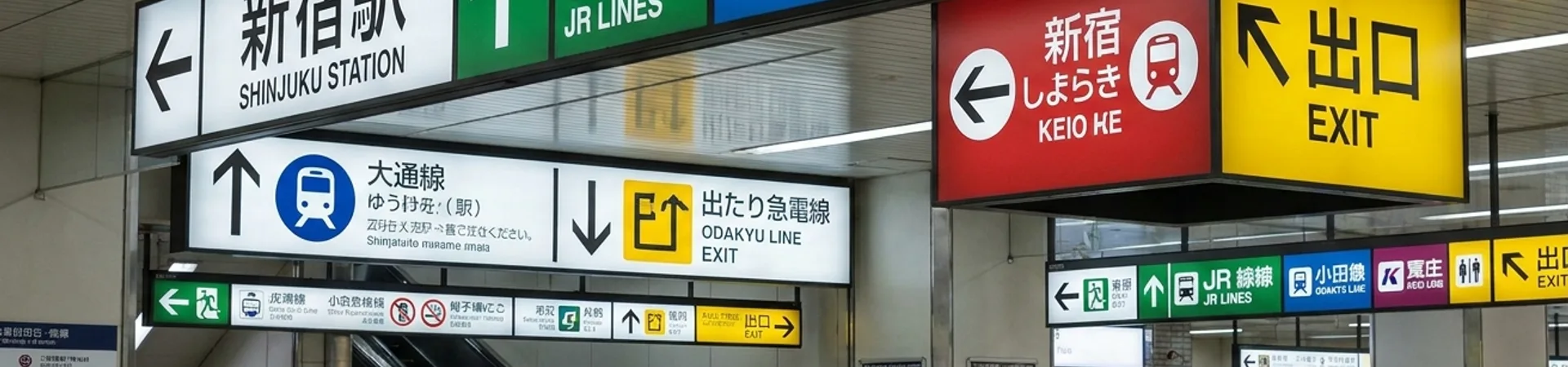
Most airline rebrands fail because they're designed for the investor presentation, not the passenger experience. A new logo on a tail fin looks great in a press release. But the brand lives in the 47 micro-moments between check-in and baggage claim. The boarding pass design. The gate signage. The safety card typography. The sound the seatbelt makes. Airlines that redesign the logo without redesigning the experience end up with a fresh coat of paint on the same broken house.
What Separates the Best
The airlines getting it right share one trait: they treat the brand as a system, not a symbol. Air France redesigned the menu before the logo. ANA redesigned the service ritual before the livery. Both understood that brand in aviation is experienced sequentially, over hours, not glanced at for seconds. That sequential experience design is what separates a rebrand from a redesign.