You arrive at Shinjuku Station for the first time and the scale is disorienting. More than three million passengers pass through this building every day, making it the busiest transport hub on earth — a distinction recognised by Guinness World Records and felt immediately in the body. The space is enormous, fragmented across multiple levels, and shared by at least six different rail operators. There are more than two hundred exits. The sound is a shifting composite of chimes, announcements in Japanese and English, and the dense murmur of crowds moving with purpose. Everything about the experience suggests chaos.
And yet, within minutes, you are on the correct platform.
You did not ask for directions. You did not open a map application. You followed a sequence of colored signs, each one appearing precisely where you needed it, each one typographically clear at a glance, each one confirming — through number, color, and pictogram — that you were moving in the right direction. You were guided by a design system so coherent that it functioned before you were consciously aware of it.
This is Tokyo train station design at its most characteristic: infrastructure so well-considered that it becomes invisible. And for anyone who works in design — whether in brand systems, digital products, or spatial environments — it is among the most instructive bodies of work in the world.
A System Born from Necessity
The history of Japanese rail wayfinding is, in essence, a story of scale forcing clarity.
In the immediate postwar period, Japan's railways were rebuilt rapidly under public ownership. Station signage was functional but rudimentary — hand-painted signs, inconsistent layouts, minimal consideration for anyone unfamiliar with the network. The system worked because ridership patterns were relatively predictable: commuters knew their routes; tourists were few. The architecture communicated through repetition and habit rather than through deliberate information design.
The transformation began in the 1960s, driven by two forces. The first was the 1964 Tokyo Olympics, which brought an influx of international visitors to a city whose transit signage was almost entirely in Japanese. The Games prompted the first systematic effort to introduce Latin-alphabet transliterations and basic pictographic signage across the rail network. Katsumi Masaru's pictogram system, developed for the Olympics, became foundational — not only for Tokyo's transit but for the global language of public pictograms that followed.
The second force was growth. Tokyo's rail network expanded dramatically through the 1960s and 1970s, and with it came operational complexity that no amount of local knowledge could resolve. New lines crossed old ones. Private operators built parallel routes. Transfer stations multiplied. The network became, in topological terms, one of the most complex public transit systems ever constructed, and the wayfinding had to evolve or the system would choke on its own passengers.
By the 1980s, Japan Rail — then undergoing privatisation into the regional JR companies — had begun to develop what would become the modern wayfinding framework: a layered system of color coding, alphanumeric station identifiers, typographic hierarchy, and pictographic language that could function across operators, across languages, and across the vast range of cognitive states in which a commuter might encounter a sign, from calm familiarity to anxious disorientation.
The Anatomy of Legibility
What makes Tokyo's station signage design remarkable is not any single element but the discipline with which multiple systems interact.
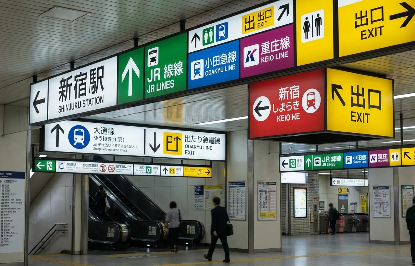
Begin with color. Each rail line in Tokyo is assigned a unique color, and that color is applied with absolute consistency: on route maps, platform signs, train exteriors, station name boards, digital displays, and mobile applications. JR Yamanote Line is a specific green. Tokyo Metro Ginza Line is orange. Toei Oedo Line is magenta. The colors are not decorative. They are the primary navigational input — the first thing a passenger registers, the fastest channel for confirming or correcting a decision. A commuter transferring from the Chuo Line (orange-red) to the Marunouchi Line (red) can distinguish the two at a distance, under fluorescent light, in a crowd, because the hues were selected to remain separable under precisely those conditions.
Then, numbers. In 2004, Tokyo Metro introduced station numbering — a letter prefix identifying the line, followed by a sequential number. Ginza Station on the Ginza Line became G-09. Shibuya on the Hanzomon Line became Z-01. The system was extended across operators in the lead-up to the 2020 Olympics, so that by the time international visitors arrived, every station on every line in central Tokyo carried a consistent alphanumeric code. This was a decision of quiet radicalism. It meant that a visitor with no Japanese, no map, and no data connection could navigate the entire network using only letters and numbers. The system did not require literacy in any specific language. It required only the ability to count.
Pictograms form the third layer. Tokyo's stations use a pictographic vocabulary that has been refined over decades — from the 1964 Olympic originals to the comprehensive set standardised ahead of 2020. Exits, toilets, elevators, ticket machines, information counters, accessible routes — each is represented by a pictogram drawn with geometric precision and tested for recognition across cultural contexts. The pictograms are not illustrations. They are glyphs in a functional alphabet, and they are deployed with the same positional consistency as the color and numbering systems.
Typography ties it together. Station signage in Tokyo uses a carefully controlled typographic hierarchy. Japanese text — typically in a clean Gothic typeface such as Shin Go or the system typefaces from the Hiragino family — is set at the largest size, establishing the primary reading layer for the majority of passengers. Romanised transliterations sit below or beside the Japanese, often in a humanist sans-serif that pairs well at smaller sizes. Chinese characters and Korean Hangul, added in waves from the 2000s onward, occupy a tertiary layer. The result is a sign that serves four language groups simultaneously without becoming cluttered, because the hierarchy is strict and the spacing is generous.
The Latin-script typography deserves particular attention. Where many international transit systems default to Helvetica or its derivatives, Tokyo's operators have shown a willingness to select typefaces for specific functional qualities. The use of faces like Frutiger — Adrian Frutiger's typeface originally designed for airport signage at Charles de Gaulle — reflects an awareness that wayfinding typography is not the same as editorial or brand typography. The letters must be distinguishable at distance, at speed, at oblique angles, and under inconsistent lighting. Tokyo's sign designers have, for the most part, chosen accordingly.
The Designers in the System
Western design culture tends to attach wayfinding systems to individual names — Massimo Vignelli's New York subway map, Jock Kinneir and Margaret Calvert's British road signs. Tokyo's wayfinding resists that narrative. It is the product of institutional design culture rather than individual authorship, and understanding that distinction is essential to understanding why it works.
GK Design Group, founded in 1957 by Kenji Ekuan, has been one of the most significant contributors to Japanese public design, including transit environments. Ekuan's philosophy — rooted in the idea that design should serve the public good and that everyday objects deserve the same attention as luxury goods — permeated GK's approach to station furniture, signage systems, and the industrial design of train cars themselves. The Narita Express, the Akita Shinkansen, and numerous JR East commuter trains bear GK's influence, and the studio's thinking about passenger experience extended naturally into the informational environment of the station.
Nippon Design Center, established in 1960 with the involvement of figures like Ikko Tanaka and Kazumasa Nagai, has shaped the broader visual culture in which Tokyo's wayfinding exists. While NDC's transit contributions are less directly attributable than GK's, the studio's influence on Japanese graphic design — its emphasis on clarity, geometric structure, and the integration of Japanese and Western typographic traditions — is visible in the design language of the rail network.
But the most important "designers" in Tokyo's wayfinding system may be the in-house teams at JR East, Tokyo Metro, and the other operators. These are not celebrity studios. They are departments staffed by designers and engineers who iterate on signage placement, test legibility under real conditions, and update systems incrementally across thousands of touchpoints. The work is unglamorous, cumulative, and profoundly effective. It represents a model of design practice — embedded, institutional, patient — that the profession would do well to study more seriously.
Three Operators, One Language
Here is a design detail that surprises, particularly if you have experienced the visual incoherence of transit systems elsewhere: Tokyo's rail network is operated by more than a dozen independent companies, and yet the wayfinding feels substantially unified.
JR East, Tokyo Metro, and Toei Subway are the three largest operators in central Tokyo. They are separate organisations with separate corporate identities, separate fare structures, and separate histories. A passenger transferring from a JR line to a Metro line is, in a meaningful sense, leaving one company and entering another. And yet the transition is visually seamless. The color-coding system spans all operators. The station numbering convention is shared. The pictogram vocabulary is common. The typographic hierarchy — Japanese primary, Latin secondary, Chinese and Korean tertiary — is consistent.
This coherence is not accidental; it is the product of deliberate coordination, accelerated significantly by the 2020 Olympics. The Japanese government's push for a unified visitor experience compelled operators to harmonise signage standards that had previously drifted apart. New guidelines were issued for sign placement height, minimum text size, color contrast ratios, and pictogram usage. Multilingual signage was expanded. Station numbering was universalised.
The result is something rare in design: a system that achieves visual unity without requiring organisational unity. Each operator retains its brand identity — JR East's green, Tokyo Metro's blue roundel, Toei's ginkgo leaf — while participating in a shared informational grammar. It is federated design, and it works because the grammar is strict enough to override the differences.
The 2020 Legacy
The Tokyo 2020 Olympics — held in 2021 after the pandemic postponement — left a complicated legacy in many respects, but in wayfinding design, its impact was unambiguously positive and enduring.
The Games accelerated changes that had been discussed for years. Station numbering was completed across all major operators. Multilingual signage was expanded from two languages to four in most central stations. Pictograms were updated and standardised, drawing on the original 1964 designs while incorporating contemporary accessibility requirements. Digital signage — real-time displays showing train positions, platform assignments, and service disruptions in multiple languages — was deployed at scale.
Perhaps most significantly, the Olympics prompted a rethinking of spatial wayfinding: not just signs on walls, but the design of floors, lighting, and architectural cues to guide movement. Several stations received renovations that integrated wayfinding into the built environment itself — colored floor markings leading to transfer points, illuminated ceiling bands indicating platform direction, tactile paving systems refined for consistency.
The Shibuya Station redevelopment, one of the largest station reconstruction projects in Tokyo's history, became a test case for this integrated approach. The new Shibuya Station, designed with involvement from architect Tadao Ando for the Fukutoshin Line areas and ongoing contributions from Nikken Sekkei and other firms, treats wayfinding as an architectural problem rather than a signage problem. The circulation paths, the sightlines, the vertical connections between levels — all were designed to reduce the cognitive load on passengers before any sign is read. The signage system then confirms what the architecture has already suggested.
This is wayfinding at its most ambitious: design so embedded in the environment that it ceases to be a separate discipline.
Beyond Transit
Tokyo's wayfinding principles have influence well beyond the rail network, and designers in other fields would be wise to study them.
The layered information hierarchy — primary, secondary, tertiary, each visually distinct and spatially consistent — is directly applicable to interface design. The principle that a user should be able to extract the most critical information (which line, which direction) in under two seconds, without reading a sentence, is the same principle that governs effective dashboard design, onboarding flows, and notification systems. Tokyo's stations achieve this through color-before-text, a technique that predates digital design by decades but remains underused in screen-based interfaces.
The federated consistency model — multiple independent operators sharing a common informational grammar while retaining distinct brand identities — maps precisely onto the challenge of design systems in large organisations. Any company running multiple product lines, sub-brands, or regional operations faces the same problem Tokyo's rail operators solved: how to maintain user coherence across organisational boundaries. The answer, as Tokyo demonstrates, is to distinguish rigorously between what must be shared (the navigational grammar) and what can differ (the brand expression).
The commitment to multilingual, multi-script design is increasingly relevant as digital products serve global audiences. Tokyo's approach — strict typographic hierarchy, generous spacing, consistent positioning of each language layer — offers a more sophisticated model than the common digital practice of simply toggling between language versions. In Tokyo, all languages are present simultaneously, and the system works because the hierarchy makes each one findable without making any one dominant to the exclusion of others.
What Other Cities Get Wrong
A brief survey of peer systems clarifies, by contrast, what Tokyo gets right.
London's Underground, often cited as the gold standard of Western transit design, has a justifiably celebrated map (Harry Beck's 1931 diagram remains one of the great works of information design) and a strong brand identity anchored by the Johnston typeface and the roundel mark. But the in-station wayfinding has accumulated decades of visual debt. Signage styles vary between eras of renovation. Digital displays coexist uneasily with printed signs from different generations. The Elizabeth Line, opened in 2022, introduced a sleek new design language that only highlights the inconsistency of the older stations surrounding it. London has a brilliant brand and an uneven environment.
New York's subway system presents a different problem. The Vignelli-era signage — Helvetica on black, white, or colored backgrounds — established a typographic standard of extraordinary clarity. But implementation has been inconsistent for decades. Signs are missing, contradictory, or positioned where they cannot be seen. The system's physical infrastructure — low ceilings, narrow corridors, poor lighting — works against legibility. The design is right; the deployment is wrong. New York proves that a wayfinding system is only as good as its maintenance.
Paris offers a third cautionary model. The RATP system has a distinctive identity — the Parisine typeface, commissioned specifically for the Metro, is a fine piece of design — but the network's wayfinding suffers from a problem of excess. Station interiors are dense with information: advertising, cultural notices, commercial signage, and navigational signs compete for attention in confined spaces. The result is visual noise that makes the wayfinding harder to extract. Paris demonstrates that even good signage can be undermined by a failure to control the surrounding visual environment.
Tokyo succeeds where these systems struggle because it treats wayfinding not as a layer applied to the station but as an integral property of the station itself. The signs are not competing with the environment. They are the environment — or, more precisely, the environment has been designed so that nothing competes with them. Advertising is present but confined. Architectural surfaces are neutral. Lighting is even. The wayfinding has room to breathe.
The Quiet Standard
There is something characteristically Japanese about the way Tokyo's wayfinding works: it does not announce itself. There is no design manifesto attached to it, no TED talk, no brand film. The system simply functions, with a consistency and intelligence that becomes apparent only when you look for it — or when you travel to a city where it is absent and feel its loss.
For designers, this is both inspiring and humbling. Tokyo's train station design represents what happens when a design problem is taken seriously over decades, when iteration is valued over invention, when the measure of success is not visual novelty but the quiet absence of confusion. It is design as infrastructure — not the kind that wins awards, but the kind that moves ten million people a day to exactly where they need to be.
Every discipline has its vernacular masterpieces: works so embedded in daily life that they are no longer perceived as design at all. Tokyo's rail wayfinding is one of them. And in a profession increasingly drawn to the spectacular, the disruptive, and the new, it stands as a reminder that the highest achievement of design may be to disappear entirely — leaving behind only the experience of effortless clarity.
WeLoveDaily is a design publication for people who care about how things look, work, and feel.