TL;DR — Key takeaways
- The magazines rewriting the grid in 2026 are not the ones abandoning it — they are the ones treating the grid as a compositional argument rather than a production shortcut.
- Four patterns recur across thirty contemporary titles: asymmetric typographic weight, intentional white space as a structural element, scale dissonance between body and display type, and typographic hierarchy collapse that forces the reader to slow down.
- Legacy titles and indie publications have reconverged aesthetically. The difference is funding, not form.
---
For a long stretch of the 2010s, editorial design in magazines ran on a quiet orthodoxy: a three-column body grid, a restrained typographic palette, airy margins, restrained photography crops. The visual register was "quality magazine" — comfortable, predictable, readable. Good design, little risk.
The last three years have broken the consensus. The titles below are the thirty most interesting examples — publications that are, in different ways, rewriting the grid. Most of them are not abandoning it. They are using it as a compositional instrument, foregrounding layout decisions rather than hiding them.
How this list is organized
Thirty titles, five categories. Each entry gets 60–100 words on its distinguishing move and what to study. Legacy titles, indie magazines, tech and brand-owned publications, fashion titles, and architectural or design-adjacent publications each bring a different set of constraints.
Legacy titles pushing forward
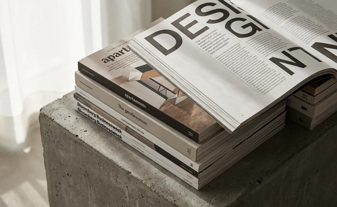
1. Bloomberg Businessweek
Richard Turley's multi-year art direction broke the reader's expectation that financial journalism had to look sober. The redesigns under Robert Vargas and successors have kept the typographic aggression while tightening the editorial discipline. Scale dissonance — 120-point display type against 9-point body — is the signature.
2. The New Yorker
The most conservative major American weekly still shipping. What's changed recently is the illustration program (more contemporary illustrators, looser commissioning briefs) and the covers, which now sit uncomfortably between editorial and political-cartoon. Study the magazine's refusal to modernize the body column.
3. The Gentlewoman
Penny Martin's editorial direction is the reference point for contemporary women's magazine design. Full-bleed portrait photography, unmodulated sans-serif typography at display scale, and a body column so restrained it reads as confidence rather than restraint. Imitators abound; none have matched the voice.
4. Apartamento
The interiors-magazine that redefined the category. Hand-drawn illustrations alongside documentary photography, asymmetric page compositions, a refusal to standardize article templates. Each issue's designer produces something slightly different within the system. The variation is the system.
5. Vogue Italia
Under Ferdinando Verderi's direction, the most consistently experimental of the legacy fashion magazines. Scale dissonance, typographic collage, intentional layout instability. A Vogue-budget reading of what a Dutch indie magazine would look like.
6. The New York Times Magazine
Gail Bichler's direction has extended the Times' appetite for dramatic photographic covers into the feature wells. The recent redesign introduced typographic elements that borrow from indie-magazine grammar — uppercase display type dropped into a paragraph, photographic crops that cross spreads.
Indie magazines
7. Migrant Journal
Six-issue editorial project that ended in 2019 but remains a reference. Designed by Offshore Studio. The grid was a compositional argument about movement and displacement. Each spread negotiates a different relationship between image, caption, and body text. Study the density.
8. Pin-Up
New York's most-read queer architecture magazine. Felix Burrichter's editorial direction treats architecture coverage as an occasion for editorial experimentation rather than the other way around. Typographic playfulness rare in architecture publications. Loose, varied grids per issue.
9. Dirty Furniture
Design-writing magazine covering "things in rooms." The editorial design is purposely uneven — some articles sit in classical three-column grids, others sprawl across asymmetric compositions. The unevenness tracks with the editorial thesis: design writing should not look uniform.
10. Accent Magazine
Italian-published English-language magazine covering contemporary visual culture. The typographic system is rigorously disciplined — a small type palette, tight body column, generous margins — but the image treatment is unusually daring. Full-bleed images rendered with deliberate imperfections.
11. Dummy Mag
German magazine covering sociology and politics through design-forward issues. Each issue has a theme and a correspondingly adjusted design system. The variation-per-issue model is closer to book design than magazine design. Influential among indie publishers.
12. Hot & Cool
Food magazine from Copenhagen that redefined what a food magazine could do typographically. Display type set uncomfortably large against minimal supporting elements. The magazine reads closer to a zine than a consumer publication despite the premium production.
13. Real Review
London architecture and design magazine with unusually aggressive typographic decisions. Jack Self's editorial direction pushes the body column to the edge of legibility and recovers the reading experience through pacing. Study the pacing.
Tech and brand-owned publications
14. Stripe Press books
Not strictly a magazine, but the editorial design vocabulary (Sohne typography, dense footnotes, custom chapter openers) has influenced contemporary magazine design significantly. See also Figma's documentation design for a related register.
15. Airbnb Magazine (and successors)
During its print run (2017–2020), Airbnb Magazine set a contemporary template for brand-owned editorial publications. Richly photographed travel features, restrained typography, a voice closer to The Gentlewoman than to a corporate newsletter. Succeeded by digital-native editorial from Airbnb's in-house team.
16. Stripe Quarterly (and internal editorial)
Internal editorial publications from Stripe circulating among customers and partners. Typographic precision, mathematically spaced grids, restrained color. Reads as a reference manual that happens to contain features.
17. The Drift
Not strictly tech-brand-owned, but emerging from the same San Francisco literary scene that tech editorial often references. Minimalist typographic program, essay-first posture, deliberately uneven paper stocks.
18. Figma Config zine
Conference program for Figma's flagship event, designed each year as a collectible. The typographic system mirrors Figma's identity without copying it. Contemporary magazine-design ambitions inside a branded artifact.
19. Vercel Quarterly (and related)
Documentation-adjacent publications from Vercel. Sparse, code-native, near-monochromatic. Influences how dev-tool brands across the category treat editorial.
Fashion titles rewriting the form
20. The Face (2019 revival)
Editor Matthew Whitehouse revived the title with design direction from Designers Republic alumni. The reboot refused contemporary fashion-magazine conventions. Asymmetric spreads, heavily cropped images, typographic aggression. The most-discussed fashion rebrand of the last five years.
21. System Magazine
Semi-annual fashion publication that treats each issue as a design book. Thom Murphy's direction refuses issue-to-issue consistency. The unpredictability is the editorial position.
22. i-D Magazine (Vice-era and post-Vice)
Digital-native redesign after Vice's collapse tested whether i-D's editorial personality could survive a platform shift. Terry Jones's original design language compressed into new formats. Contemporary relevance is contested but the case study is instructive.
23. HOLO
Digital-culture magazine covering art and technology. Print editions rare but reference-grade. The typographic system is the most rigorous in the category — every hierarchy decision is defensible.
24. Dreaming Leaves
Thai-Japanese indie fashion publication. Minimalist almost to the point of provocation — most spreads are one image and one paragraph of body text. The restraint is the editorial position.
Design and architecture adjacent
25. MacGuffin
Amsterdam-published design magazine covering "the life of things." Each issue is organized around a single everyday object. The art direction (led by the editors Kirsten Algera and Ernst van der Hoeven) produces some of the most inventive contemporary editorial design. A reference for any editor planning a themed issue.
26. PIN-UP
Already covered above. Appears in both categories because it straddles them.
27. Domus (under current direction)
Italian architecture magazine in its nth revival. Each editorial direction brings a radically different design system. The current era has leaned toward stark typography and sparse image treatments.
28. Frame
Interior-design magazine with the most aggressive photography cropping in the category. Design direction treats crops as editorial statements. Study the recurring move of cropping architectural photography through its typographic elements.
29. The Gourmand
British food, art, and culture magazine. David Lane's art direction is one of the most influential in contemporary editorial. Full-bleed photography, uppercase sans-serif typography, uneven margins. Reference for any food-adjacent publication.
30. Cherry Bombe
Women-in-food magazine with an editorial program that manages warmth without becoming sentimental. Typography is less experimental than the other titles on this list; the photographic program is the signature move.
The four patterns across the thirty
Walking the list, four moves repeat.
Asymmetric typographic weight. Contemporary magazines are rarely balanced. Display type sits heavy on one side of the spread; body type negotiates around it. The unbalanced composition forces the eye to make choices — which is the point.
White space as structural element. The best titles treat empty space as load-bearing. An empty column is not a waste; it's a reading cue. Magazines still running generously spaced grids are, in 2026, the ones with editorial confidence.
Scale dissonance. Display type at 120-point alongside body at 9-point is a now-standard move. Fifteen years ago it would have read as graphic design exercises; now it's magazine orthodoxy.
Hierarchy collapse. Many of the titles deliberately blur the distinction between caption, pull-quote, body, and headline. Reading them slower is not a failure mode; it's intentional.
Related reading
- 25 brand guidelines worth studying in 2026 — several brand systems overlap with the magazines here for structural typography.
- Kinetic logos: a field guide to motion identity systems — motion-design principles that apply to editorial as much as to branding.
- Rebrand Before & After: 15 Identity Refreshes Analyzed — typography moves in editorial and in identity work increasingly converge.
- The full Visual Identity category and Studio Spotlight archive.