Studio Spotlight — Lippincott: Corporate Identity at Scale
The design press has a type. It gravitates toward boutique studios with Instagram-friendly portfolios, founder-led practices with strong editorial voices, and identity projects where the client is either a cultural institution or a startup with interesting taste. Lippincott is none of these things. It is a strategy-and-design consultancy owned by Oliver Wyman, which is owned by Marsh & McLennan Companies, a global professional services firm with $23B in annual revenue. Its clients include Samsung, Starbucks, Southwest Airlines, Walmart, and Delta Air Lines. Its work is experienced daily by billions of people who have never heard its name.
And yet Lippincott branding has shaped the visual landscape of global commerce more profoundly than most studios the design community celebrates. The firm didn't just practice corporate identity. It invented the discipline — literally coining the term in the 1940s and building the methodology that every brand consultancy, from Pentagram to Collins, now builds upon.
The Origin: Walter P. Margulies and the Birth of a Discipline
Walter P. Margulies founded Lippincott & Margulies in 1943 in New York, at a time when the concept of a unified corporate visual identity didn't exist. Companies had logos, certainly. They had packaging and signage. But the idea that every visual touchpoint of a corporation — from the letterhead to the fleet livery to the annual report — should express a coherent design system? That was Margulies' invention.
The insight seems obvious now. In 1943, it was radical. American corporations operated in departmental silos. The advertising department commissioned one look, the facilities team chose another, and the executive suite selected stationery based on personal taste. Margulies argued that this visual fragmentation was a business liability — that a company's visual presentation communicated competence, coherence, and trustworthiness to customers, investors, and employees alike.
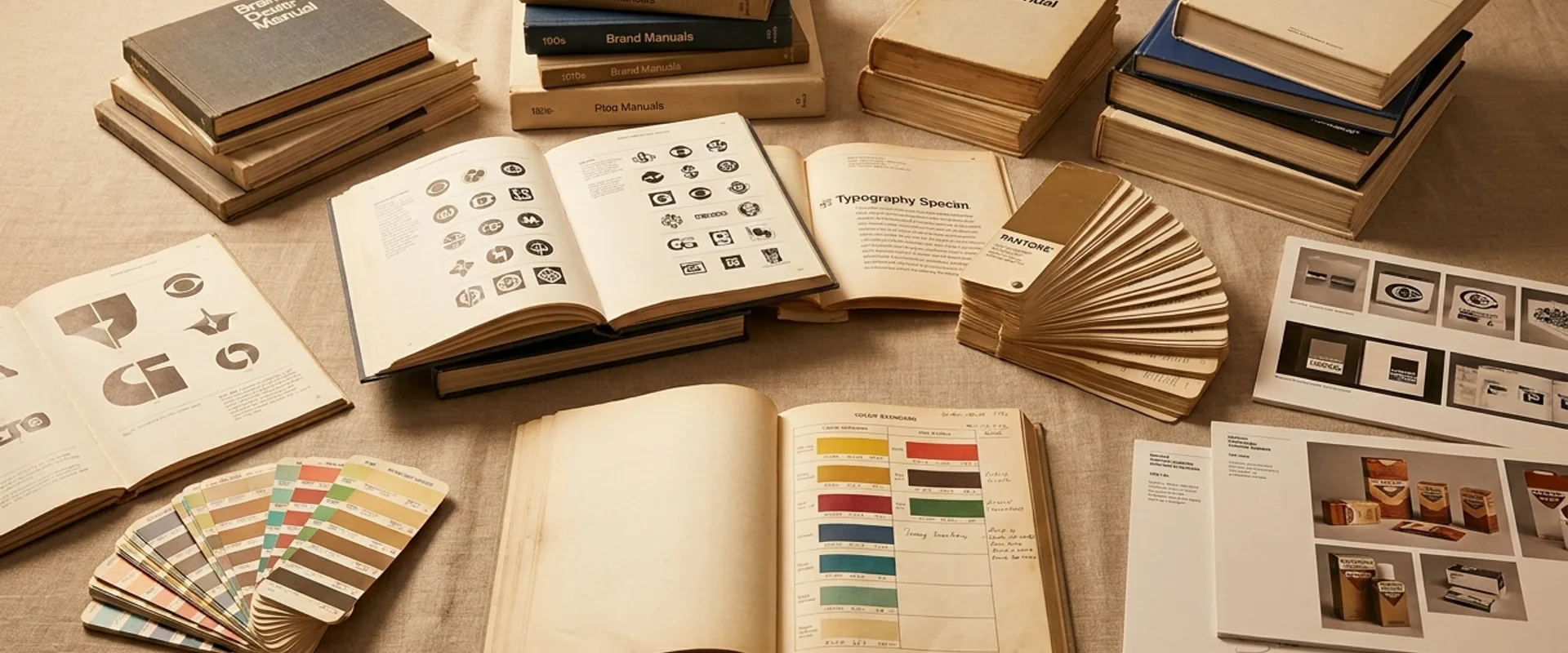
His first major project, a comprehensive identity program for a U.S. corporation, established the template: audit the existing visual landscape, identify inconsistencies, develop a unified design system, and create a standards manual that ensured compliance across every touchpoint. This workflow — audit, strategy, design, guidelines — remains the foundation of corporate identity practice 80 years later. Every brand agency follows some version of the process Lippincott pioneered.
The firm's early work produced some of the most enduring marks in American visual culture. The Amtrak arrow, the PBS profile, the American Express blue box — identities designed decades ago that still function today, in some cases with only minor refinements. Longevity at this scale is not an accident. It reflects a design philosophy that prioritizes structural clarity over stylistic expression, creating marks that communicate institutional character rather than chasing contemporary aesthetics.
The Lippincott Method: Strategy as Architecture
What distinguishes Lippincott from design-first studios is the centrality of strategy in its process. At Collins, strategy and design develop together in the same room. At Pentagram, the designer-partner often is the strategist, working through visual exploration to discover the strategic direction. At Lippincott, strategy comes first — not as a brief that constrains design, but as an architecture that shapes it.
This distinction matters because of the scale at which Lippincott operates. When Samsung undertakes a global brand refresh, the identity system must function across product lines, regions, retail environments, digital interfaces, and corporate communications. The strategic framework — what the brand means, to whom, and why — must be robust enough to guide design decisions across contexts that the original design team will never directly control.
Lippincott's strategic work typically begins with what the firm calls "brand architecture" — not the visual system, but the organizational logic. How does a corporation with multiple divisions, product lines, and sub-brands present itself? Is it a "branded house" (one master brand, like Google), a "house of brands" (independent brands under a corporate umbrella, like Procter & Gamble), or an "endorsed" model (sub-brands that reference the parent, like Marriott's hotel portfolio)?
These architecture decisions have enormous design implications. A branded house needs a flexible master identity that works across every context. A house of brands needs distinct identities that share enough DNA to signal corporate kinship without sacrificing individual brand equity. Getting the architecture wrong is more expensive than getting any single logo wrong — it determines how billions of dollars in brand equity are organized and presented.
This strategic depth is what allows Lippincott to operate at a scale that would overwhelm a design-led studio. The strategy doesn't replace design. It creates the structural framework within which design decisions become coherent across hundreds of touchpoints.
Case Study: The Starbucks Siren
Lippincott's most visible project is also one of the most studied rebrands in history: the 2011 Starbucks identity evolution that freed the siren from her green circle.
The project's brief was driven by business strategy. Starbucks was expanding beyond coffee into tea, juice, bakery items, and consumer packaged goods. The existing logo — "Starbucks Coffee" circling the siren in a green ring — tied the brand to a single product category. The siren needed to stand alone.
The design solution was an exercise in strategic reduction. Lippincott and the Starbucks in-house team removed the wordmark, removed the "Coffee" descriptor, removed the containing circle's outer ring, and pushed the siren forward as a standalone symbol. The green was retained but simplified. The overall effect was a mark that felt simultaneously more modern and more timeless — liberated from typographic constraints, the siren became an icon rather than a logo.
The design community's initial reaction was mixed. Removing the company name from the logo felt risky, even hubristic. But the strategic logic was sound: Starbucks had achieved the level of brand recognition where the siren alone communicated the brand. Nike had done it with the swoosh. Apple had done it with the apple. Starbucks joined a very short list of brands confident enough — and recognized enough — to let the symbol speak.
Fourteen years later, the decision looks prescient. The wordmark-free siren works on mobile app icons, on cups at any size, on retail signage across markets where Latin script isn't the primary writing system, and on the growing range of non-coffee products that the old "Starbucks Coffee" mark couldn't gracefully accommodate.
Case Study: Southwest Airlines
Southwest Airlines came to Lippincott in 2014 with a challenge that was almost the opposite of Starbucks. Where Starbucks needed to broaden its identity to match an expanding business, Southwest needed to modernize its identity without losing the warmth and accessibility that differentiated it from the cost-cutting austerity of competitors like Spirit and Frontier.
Lippincott's solution centered on a single graphic element: the heart. The heart symbol — rendered in Southwest's tricolor palette of blue, red, and yellow — became the carrier of the brand's emotional positioning. It replaced the complex, dated canyon-and-aircraft graphic with something instantly readable: an airline that is about people, not logistics.
The heart worked because it was strategically precise. Southwest's competitive advantage isn't price (though it competes on price) or route network (though its point-to-point model is distinctive). It's culture — the company's investment in employee satisfaction, customer service, and a brand personality that feels human in an industry defined by impersonal efficiency. The heart made that positioning visible.
The fleet livery — a bold blue fuselage with the heart rendered large on the vertical stabilizer and a yellow underbelly — transformed Southwest's aircraft from transportation vehicles into brand ambassadors. The livery is one of the most recognizable in commercial aviation, proof that corporate identity at Lippincott's scale can be both strategically rigorous and visually distinctive.
Corporate Identity vs. Brand Identity: The Lippincott Position
Within the design industry, "corporate identity" carries a faint stigma. It suggests bureaucracy, committees, conservative taste — the opposite of the creative risk-taking celebrated in design culture. Lippincott sits deliberately at this tension point.
The firm's position, articulated across decades of practice, is that corporate identity and brand identity are not opposing concepts but nested ones. Brand identity is the expressive layer — how the brand looks, sounds, and feels. Corporate identity is the organizational layer — how the brand system is governed, maintained, and scaled across a complex enterprise. You need both. A brilliant brand identity that collapses under the weight of organizational complexity is a failure. A perfectly governed corporate identity that has no emotional resonance is a missed opportunity.
Lippincott's portfolio demonstrates both capacities. The Starbucks siren has the iconic simplicity of great brand design. The Southwest heart has the emotional immediacy of great brand design. But both exist within enterprise-scale systems — standards, governance models, brand architecture frameworks — that ensure the design's integrity across thousands of touchpoints managed by teams the designers will never meet.
This is the work that design culture undervalues: not the creation of the mark, but the creation of the system that protects it. Lippincott's legacy is that the protection can be as well-designed as the mark itself.
The People: Consulting Culture Meets Creative Ambition
Walk into Pentagram's offices and you will find designers. Walk into Collins and you will find designers who think like strategists. Walk into Lippincott and you will find MBAs sitting next to graduates of RISD and SVA, behavioral economists sharing project rooms with typographers, and former McKinsey analysts collaborating with motion designers on the same brand system. This is not an accident. It is the firm's most deliberate architectural decision.
Lippincott recruits from business schools and design schools in roughly equal measure. The ratio is unusual in an industry where most agencies lean heavily toward one talent pool or the other. Strategy consultancies like McKinsey and Bain hire MBAs and teach them to think about brand as a business asset. Design studios like Pentagram and Collins hire designers and develop strategic fluency through practice. Lippincott hires both and puts them on the same teams from day one.
The result is work that carries a different DNA than what emerges from purely design-led studios. Lippincott's brand architectures are informed by financial modeling and portfolio analysis, not just visual logic. Their design systems account for procurement workflows and regional compliance requirements alongside aesthetic considerations. The Southwest Airlines heart didn't just need to be beautiful — it needed to survive implementation across a fleet maintenance schedule, airport signage regulations in dozens of states, and a unionized workforce with strong opinions about uniform design.
This consulting-meets-creative culture also shapes the firm's leadership pipeline. Senior partners at Lippincott tend to be fluent in both languages — capable of presenting brand strategy to a Fortune 500 CFO on Monday and leading a design critique on Tuesday. That bilingualism is rare in the industry. At Pentagram, the partners are designers first. At Wolff Olins, the leadership has historically drawn from strategy and planning backgrounds. Lippincott insists on both, and this insistence is what allows the firm to hold seats at boardroom tables that purely creative agencies never reach.
The tradeoff is real. Lippincott's work rarely has the authorial voice of a Pentagram identity or the cultural provocation of a Collins campaign. The consulting culture smooths edges. Decisions pass through more layers of strategic validation, and the output reflects that discipline — rigorous, defensible, occasionally conservative. But for clients operating at the scale of Samsung, Walmart, or Delta, "defensible" is not a limitation. It is the requirement. The brand system must survive not just the launch, but the decade that follows it, managed by teams of hundreds across markets the original designers will never visit. In an industry where the global corporate branding market exceeds $50B annually and the largest engagements run into eight figures, the ability to speak the client's financial language is not a soft skill. It is the price of admission. Lippincott's hybrid culture is engineered precisely for that threshold.
What's Next: Living Systems at Enterprise Scale
Lippincott's current challenge — and opportunity — is the transition from static brand standards to living brand systems. The standards-manual model that Walter Margulies pioneered works well for physical touchpoints with long production cycles: fleet livery, architectural signage, printed collateral. It works less well for digital touchpoints where content is produced daily, design decisions are made by non-designers using templates, and brand consistency depends on tools rather than documents.
The firm is investing in what it describes as "brand operating systems" — digital infrastructure that embeds brand rules into the tools teams use rather than relying on humans to consult a PDF. This means Figma component libraries that enforce spacing and color rules, content management templates that constrain typography and layout, and design token systems that ensure consistency across web, mobile, and email without requiring manual specification.
This is where Lippincott's trajectory diverges most sharply from the other studios profiled in this series. Pentagram's digital evolution has been partner-by-partner — some practices embracing systems thinking, others remaining rooted in craft-driven identity work. Collins has leaned into brand experience design, treating digital touchpoints as theatrical moments rather than systematic infrastructure. Wolff Olins has pursued "living brands" conceptually but has historically relied on clients to build the technical implementation. Lippincott is the only firm in this group investing at the infrastructure layer itself — building the plumbing, not just designing the fixtures.
The scale of the opportunity is significant. The global corporate identity market is valued at roughly $50B annually, and the fastest-growing segment is digital brand management tooling — the systems that govern how brands appear across apps, platforms, and automated content pipelines. For a firm already embedded inside the world's largest corporations, the shift from delivering a brand standards PDF to delivering a brand operating system is a natural extension, not a pivot. Lippincott's consulting parentage gives it an advantage here that independent studios cannot easily replicate: the firm can sell ongoing brand infrastructure as a managed service, not just a one-time design engagement. Where Pentagram delivers a finished identity and moves on, and Collins hands off a brand world with guidelines for its stewardship, Lippincott can embed itself in the client's operational stack for years. That recurring-revenue model — familiar to management consultancies, foreign to most design studios — may prove to be the firm's most durable competitive advantage as brand management becomes a technology problem as much as a design one.
It's a transition that plays to Lippincott's strengths. The firm has always understood that the real work of brand identity isn't creating the design — it's creating the conditions under which the design survives contact with reality. As those conditions shift from printed manuals to digital toolchains, Lippincott's strategic, systems-oriented approach is arguably more relevant than ever.
This is WeLoveDaily's fourth Studio Spotlight, following profiles of Pentagram, Dinamo, Collins, and Wolff Olins. Lippincott is a different kind of studio — strategy-led, corporate-scaled, consulting-owned — and including it is deliberate. The identity industry is bigger than the boutique studios and founder-led practices that dominate design media. The work that shapes the visual environment most people navigate daily — airports, supermarkets, banking apps, airline cabins — happens at Lippincott's scale. It deserves the same editorial attention.