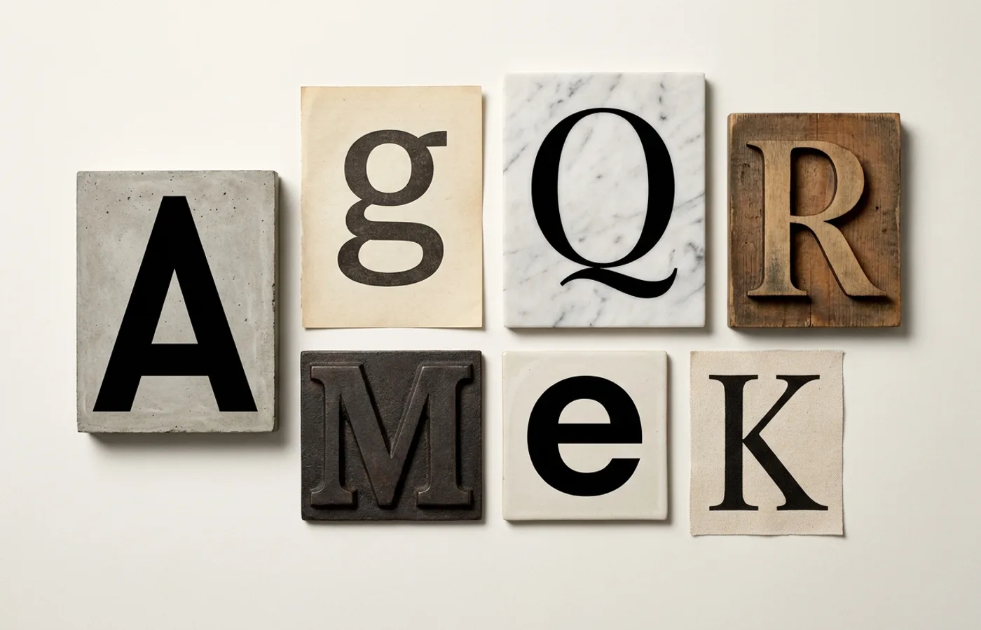
If you want to understand what a decade valued, skip the mission statements and look at the typefaces. The fonts a company licenses tell you more about its ambitions, its audience, and its sense of self than any brand manifesto ever could. The 2020s were no exception. A decade shaped by remote work, direct-to-consumer everything, and the relentless blurring of technology and lifestyle produced a typographic landscape that was both remarkably coherent and surprisingly varied.
What follows is not a ranking. It is a curated selection — seven typefaces that defined brand identity in the 2020s, each chosen because it did more than appear on a website or a business card. These typefaces became cultural signals. They told you, before you read a single word, exactly what kind of company you were dealing with.
Söhne — Klim Type Foundry
Designed by Kris Sowersby at Klim Type Foundry in New Zealand, Söhne arrived as a contemporary interpretation of Akzidenz-Grotesk — the typeface that preceded Helvetica and carries a rawer, less polished energy. Where Helvetica spent decades becoming invisible through overuse, Söhne offered something that felt familiar but unmistakably fresh.
Its defining moment came when Stripe adopted it as a central element of its visual identity, replacing the bespoke type that had served the payments company through its earlier years. The choice was significant. Stripe had become the infrastructure layer of the internet economy, and Söhne gave that position a typographic voice: precise, confident, unburdened by nostalgia. OpenAI followed, making Söhne the face of ChatGPT and, by extension, one of the most-seen typefaces in the world. When the product that defines an era sets its interface in your typeface, you have achieved something beyond commercial success. Söhne became the default voice of competence — the typeface that said, we know what we are doing, and we do not need to shout about it.
Inter — Rasmus Andersson
Inter is the typeface that should not have worked. An open-source sans-serif designed by Rasmus Andersson — a former designer at Spotify — and released for free, it had none of the exclusivity that typically drives brand adoption. And yet Inter became one of the most widely deployed typefaces of the decade, powering interfaces and identities from GitHub to Figma to Linear.
The reason is deceptively simple: Inter was designed for screens from the first stroke. Its tall x-height, generous spacing, and carefully tuned apertures made it legible at the small sizes where most UI text actually lives. As a variable font with a full weight axis, it gave design systems exactly the flexibility they needed. But Inter's real contribution to the decade was philosophical. It proved that a typeface could be simultaneously free and credible, that open-source did not mean generic. Startups that once would have licensed a foundry face at considerable expense could now build an identity on Inter without apology. The typeface democratised typographic quality in a way that reshaped the economics of brand design.
GT America — Grilli Type
If there was a single typeface that captured the 2020s rebrand wave — the moment when every company from fintech to insurance decided it needed to look like a thoughtful, design-forward technology company — it was GT America. Designed by Noël Leu at Grilli Type, it drew from the tradition of American gothic typefaces while refining them for contemporary digital use.
Coinbase made GT America central to its identity overhaul, pairing it with bold colour and illustrative work that helped the cryptocurrency exchange appeal beyond the crypto-native audience. Delivery Hero, Pitch, and a wave of European startups followed. The typeface became shorthand for a particular brand posture: serious but not corporate, modern but not trendy. Its multiple widths — from compressed to extended — gave brand teams unusual range within a single family, allowing a headline identity and a body text system to coexist without typographic conflict. GT America did not invent the "tech company that takes design seriously" archetype, but it dressed it better than almost anything else.
Canela — Commercial Type
The 2020s were not all neo-grotesques. Canela, designed by Miguel Reyes at Commercial Type, emerged as the serif of choice for brands that wanted warmth without whimsy, elegance without the dusty connotations of traditional serifs. Its forms split the difference between a Renaissance serif and a contemporary display face — the stroke contrast is there, but softened, organic, almost tender.
Mailchimp's adoption of Canela as part of its 2018-era rebrand carried the typeface into the new decade with enormous visibility. As Mailchimp evolved from email tool to marketing platform, Canela gave the brand permission to be both playful and authoritative. Away, the luggage company that defined DTC travel branding, leaned on Canela to set a tone of understated luxury. The typeface appeared across editorial platforms, boutique hotels, and lifestyle brands throughout the decade — anywhere a brand needed to signal that it cared about craft without crossing into stiffness. Canela proved that serif type was not a retreat to tradition but an advance into a new kind of sophistication.
ABC Diatype — Dinamo
Dinamo, the Swiss-Luxembourgish foundry, spent the 2020s becoming the typographic voice of a particular cultural frequency — the space where art direction, technology, and countercultural energy overlap. ABC Diatype, their neo-grotesque workhorse, was the typeface that carried that energy into the mainstream. It appeared across identities for Ssense, the fashion platform that blurred editorial and commerce, and became a favourite of studios working at the intersection of fashion, music, and technology.
What made Diatype distinctive was less about its individual letterforms — which are clean, functional, and deliberately understated — and more about what choosing it communicated. Selecting Diatype was a signal of typographic awareness, a declaration that the brand knew which foundries mattered and which design communities to align with. It was the typeface equivalent of knowing the right gallery or the right DJ. As a variable font with extensive language support, it was also genuinely practical. But practicality was never the point. Diatype was identity as affiliation, and in a decade where brand culture and subculture increasingly merged, that made it indispensable.
Neue Montreal — Pangram Pangram Foundry
If Söhne was the typeface of infrastructure companies and Diatype was the typeface of cultural insiders, Neue Montreal was the typeface of everyone in between. Released by Pangram Pangram Foundry and available at a price point significantly below the established European foundries, it became the default choice for a generation of startups, studios, and personal brands that needed something better than a system font but could not justify a five-figure licensing deal.
Neue Montreal's appeal was its approachability. A geometric-grotesque hybrid with rounded terminals and an open, friendly character, it read as modern and competent without the severity that marks many Swiss-tradition faces. You could find it on portfolio sites, product landing pages, coworking spaces, and DTC brands across every category. Critics might call it the decade's most overused typeface. That criticism misses the point. Neue Montreal succeeded precisely because it lowered the barrier to good typographic branding. It was the typeface that let a two-person startup look like it had a brand team, and that accessibility shaped the visual texture of the entire decade.
Reckless Neue — Displaay
Every typographic era needs its contrarian — the typeface that says no to whatever the prevailing consensus happens to be. In a decade dominated by clean sans-serifs and polished grotesques, Reckless Neue by Displaay was that contrarian. A high-contrast serif with sharp, almost aggressive detailing, it brought an editorial sensibility to brand identities that wanted to feel literary, opinionated, and unapologetically dramatic.
Reckless Neue found its home in publishing, fashion, and the growing category of brands that positioned themselves as cultural voices rather than mere products. Its tight spacing and pronounced stroke contrast gave headlines a visual tension that no sans-serif could replicate. Where Canela offered warmth, Reckless Neue offered edge. It became a favourite of independent magazines, design studios, and the wave of newsletter-driven media brands that defined the decade's publishing landscape. In a period when so much brand typography converged toward the same smooth, frictionless centre, Reckless Neue insisted on personality — and reminded designers that type is at its most powerful when it has a point of view.
What Comes Next
Seven typefaces, seven arguments about what brands wanted to be. The throughline is not a single aesthetic but a tension — between openness and exclusivity, between warmth and precision, between fitting in and standing apart. The 2020s gave us the most typographically literate generation of brand builders in history, and the typefaces they chose reflect that literacy.
The next decade will be shaped by forces that are already visible: variable font technology reaching full maturity, AI-assisted type design challenging traditional foundry models, and a growing demand for typefaces that work across Latin, Arabic, CJK, and Indic scripts simultaneously. The monoculture of the neo-grotesque will likely fracture further. Expect more serifs, more display faces, more type that risks something.
But the fundamental insight of the 2020s will endure: a typeface is not decoration. It is the first and most persistent expression of what a brand believes. Choose carefully.
WeLoveDaily is a design publication for people who care about how things look, work, and feel.