TL;DR — Key takeaways
- A brand guideline document is a snapshot; a brand system is an operating capability. The 25 below are all the second kind — built to be maintained, extended, and produced without the original team in the room.
- Steal the structural moves: token-first design systems, parametric color, optical-sized typography, explicit governance, decision documentation for edge cases.
- The current best-in-class systems are disproportionately from SaaS, luxury, and publicly scrutinized consumer brands. The categories with the most brand pressure produce the best brand documents.
---
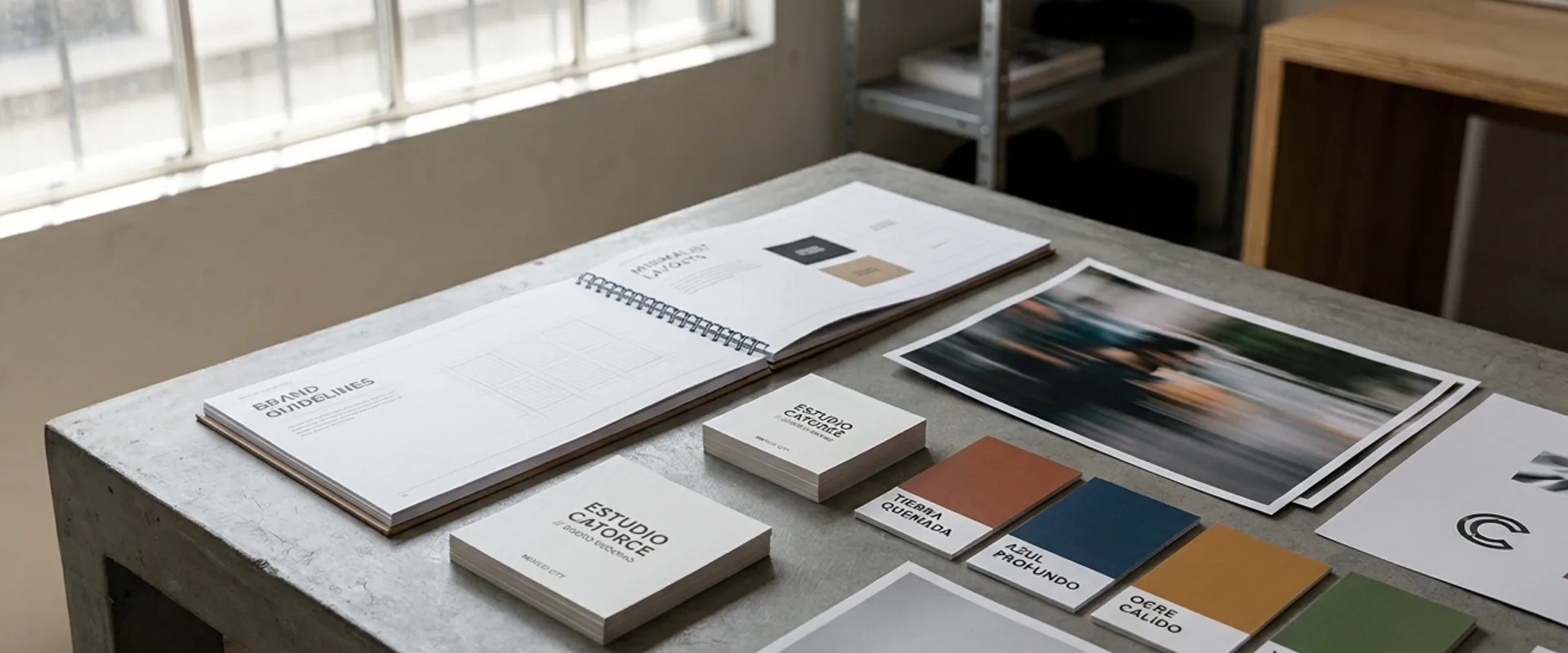
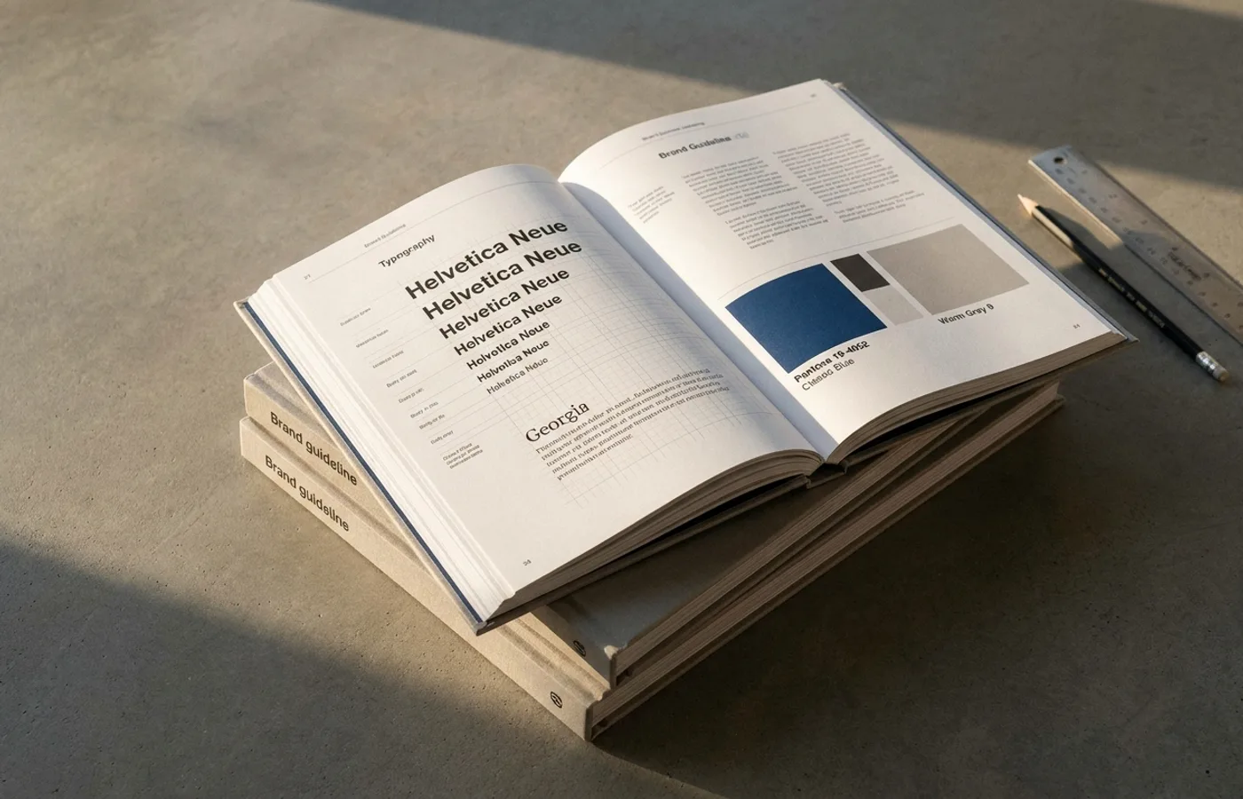
A well-made brand guideline is one of the most useful publicly-available teaching artifacts a designer can study. The best ones read like the design team's operating memo to its future self: here is why we made these decisions, here is the grid that holds, here is the mechanism by which new assets get added.
This list curates 25 brand systems that are both accessible to study (either published publicly, partially excerpted in case studies, or operating visibly enough in the wild that the system is reconstructible) and structurally instructive (the brand has solved at least one category problem in a way that's worth learning from).
Each entry names the system's distinguishing move, what to steal, and links to our full coverage.
Tech platforms — the brand-system archetypes
1. Figma
Distinguishing move: The brand is the tool is the community. Figma's identity lives as much in its color-and-geometry illustration language as in its logo. Steal: the way conference identity, developer materials, and product surfaces stay visually linked without any hard lockup.
2. Stripe
Distinguishing move: The Press brand system — a custom serif-and-sans family (Sohne) paired with mathematically precise grid spacing. Steal: the restraint. Stripe's visual vocabulary could halve in size and still be stronger than most of its competitors combined.
3. Notion
Distinguishing move: Emoji-first page identity — the brand ceded the hero spot on every page to user-chosen emoji, turning personalization into distribution. Steal: the principle that the strongest brand asset can sometimes be the one you give to the user.
4. Linear
Distinguishing move: Speed translated into typographic and spatial rhythm. Near-black palette, tight grotesque or monospace, a single violet accent. Steal: the discipline of treating one accent color as structurally meaningful (status change, action) rather than decoration.
5. Anthropic
Distinguishing move: Research-first restraint. Cream background, custom serif wordmark, no gradient. Steal: the refusal of category-default visual cliché as a brand argument.
6. Vercel
Distinguishing move: Set the aesthetic template for an entire sub-category. Geometric SVGs, monochromatic backgrounds, parsimonious type. Steal: the commitment to dark-first design with a single saturated accent.
7. Arc Browser
Distinguishing move: Treats the product UI itself as the primary brand surface, with the logo as a secondary asset. Steal: the warmth — rounded corners, considered transparencies, environmental photography — that makes software feel like furniture.
8. Bluesky
Distinguishing move: Deliberate refusal of platform-aesthetic convergence. Ink-blue butterfly, clean workhorse sans, restrained palette. Steal: the move of positioning against an entire category's visual consensus instead of optimizing within it.
9. Spotify
Distinguishing move: Color (specifically the #1DB954 green) does most of the brand work; typography and wordmark support. Steal: the model of letting one trademarkable color carry a global consumer brand across markets with zero translation cost.
10. Duolingo
Distinguishing move: Character-first brand (Duo the owl) treated as a narrative asset rather than a mascot. Steal: the discipline of extending a character across every surface — including unexpected ones — while keeping personality consistent.
Luxury — the restraint archetypes
11. Aesop
Distinguishing move: Restraint as the brand's primary asset. The apothecary amber bottles and minimal black-and-white labels have remained essentially unchanged for 35 years. Steal: the thesis that distinctiveness through restraint compounds faster than distinctiveness through invention.
12. Bottega Veneta
Distinguishing move: The invisible logo. The brand is encoded in the Intrecciato weave pattern rather than a mark. Steal: the idea that a craft technique can function as a brand asset more durable than any drawn identity.
13. Toteme
Distinguishing move: Minimalism-as-membership. A cream-and-tan palette, minimal typography, no visible logo on most product. Steal: the positioning — minimalism is not a style here, it's a filter for the customer base.
14. Loewe
Distinguishing move: Jonathan Anderson's direction treats the heritage typographic mark as a rotating creative artifact rather than a fixed asset. Steal: the license to let the logo be a design element rather than a protected constant — when the audience is sophisticated enough to tolerate it.
15. Patagonia
Distinguishing move: Values-led identity system. The visual language is consistent with the company's stated environmental positioning to a degree that costs them sales (anti-consumption campaigns). Steal: the coherence between brand claim and brand action.
Consumer — the scale archetypes
16. Nike
Distinguishing move: The swoosh has not meaningfully changed in 50 years. The surrounding system has been rebuilt four times. Steal: the principle that the durable asset is a symbol, and the transient assets (photography, typography, campaign identity) can evolve aggressively around it.
17. Airbnb
Distinguishing move: The Bélo is a symbol that works at app-icon scale, billboard scale, and cultural-reference scale. Steal: the bet on scale-invariant form over typographic charm.
18. Instagram
Distinguishing move: Gradient as the primary trademarkable asset. Steal: the recognition that a color system can carry more brand weight than a wordmark, and investing accordingly.
19. Oatly
Distinguishing move: Packaging-as-editorial. Hand-drawn marks, dense first-person copy, cream background. Steal: the permission to let the packaging itself be the brand's primary media channel.
20. Glossier
Distinguishing move: Community-led brand construction. The pink-and-red palette is correct; the real asset is the system for integrating user-generated content into official brand surfaces. Steal: the workflow for editing UGC at volume without flattening it.
Heritage, refresh, and recent rebrand archetypes
21. Volvo
Distinguishing move: Silent rebrand of both product and identity in parallel. The visual system reads as Scandinavian minimal in a category saturated with chrome ornament. Steal: the move of redesigning the product and the identity as one project, rather than as sequential commissions.
22. Mailchimp
Distinguishing move: Freddie the mascot survived an Intuit acquisition and a R/GA rebrand because the personality was defended as a strategic asset, not a decorative one. Steal: the practice of naming which assets are protected against change during a refresh.
23. Jaguar
Distinguishing move: High-risk total refresh that bet the brand on a forthcoming product line. Steal: the rarely-acknowledged truth that a rebrand can be correct and still fail if the underlying business product doesn't catch up in time.
24. Air France
Distinguishing move: Typographic modernization inside a protected color and mark system. Steal: the surgical approach — change the treatment, not the anchor.
25. Tropicana
Distinguishing move: The 2009 redesign failure remains the most-cited cautionary tale in consumer branding. Steal: the lesson — a shelf-recognition asset is a brand asset even if no one has ever named it as one.
What to study next
For retrospective analysis on specific rebrands, see Rebrand Before & After: 15 Identity Refreshes Analyzed. For motion-identity systems specifically, see Kinetic Logos: A Field Guide to Motion Identity Systems. For full curated project showcases by studio, browse the Studio Spotlight category.
One pattern worth repeating
The 25 brands here have one thing in common that isn't about typography or color: their brand systems are documented well enough that someone outside the original team can extend them. A guideline PDF is not a brand system — it's a snapshot. The system is the set of rules, tokens, and governance that lets a brand be produced consistently in every future context. The best systems here are valuable less for what they look like than for how they're structured.