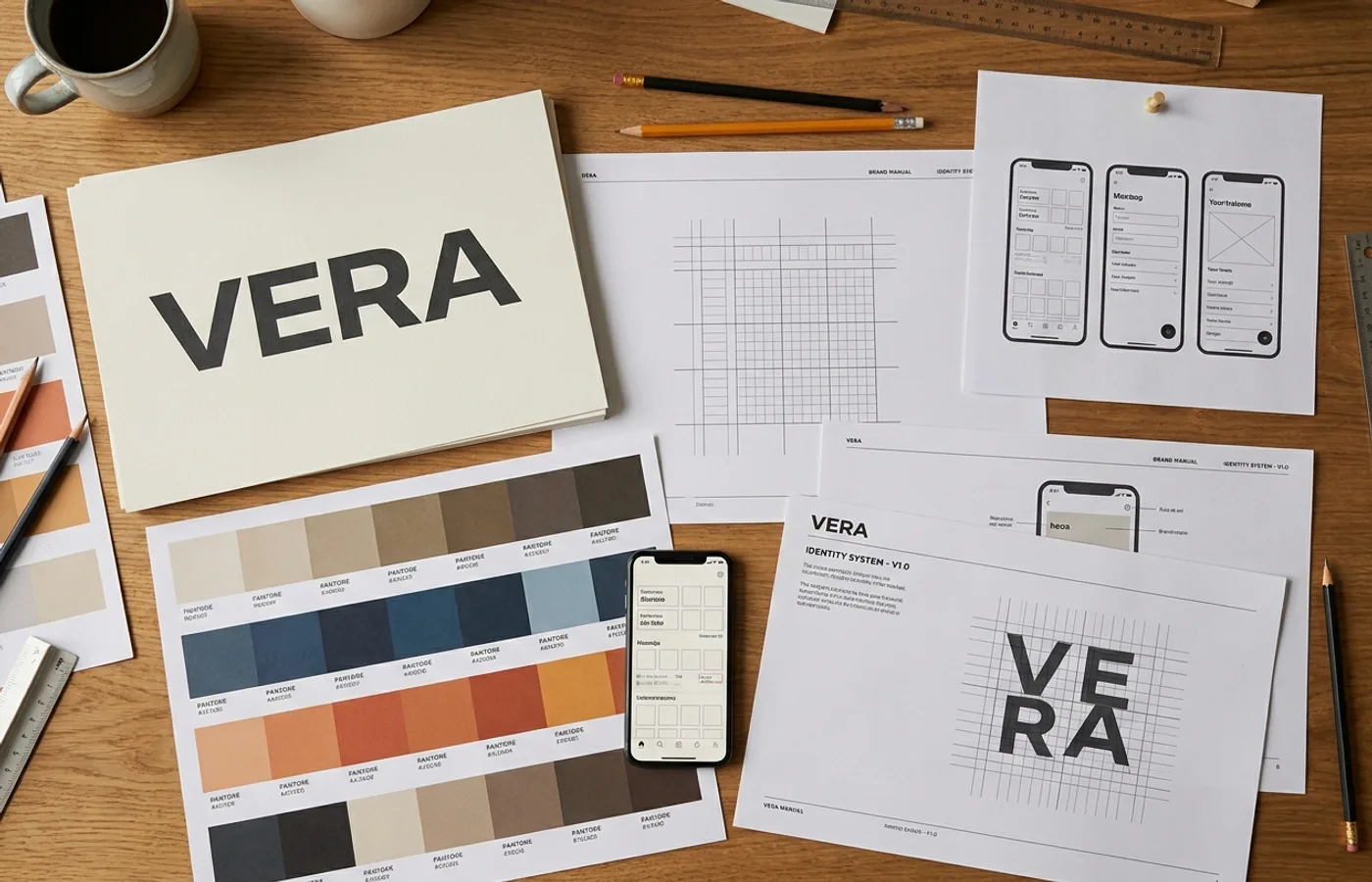
Name the last logo that genuinely surprised you.
Take your time. We'll wait.
If you're struggling, you're not alone, and you're not wrong. The most interesting identity work of the past eighteen months hasn't been about logos at all. It's been about systems: flexible, generative, context-aware identity frameworks that make the traditional mark-on-white-background reveal feel quaint.
This isn't a prediction. It's already happening. And it's reshaping what it means to "design a brand."
The Evidence
Look at the work that's generating the most conversation in the design community right now:
Spotify's ongoing evolution has moved so far beyond the green circle that the mark barely appears in most brand communications. The identity lives in Duotone photography treatments, the "Spotify Wrapped" data visualization system, and a typographic voice so consistent that you'd recognize a Spotify ad with the logo cropped out.
The New York Times' visual identity increasingly operates through its typeface (Cheltenham), its photographic style (high-contrast, documentary), and its information design patterns, not through the gothic "T" mark.
Stripe's brand is recognizable through its gradient system, its illustration style, and its obsessive typographic consistency. The wordmark exists, but it's not doing the heavy lifting.
The pattern is clear: the strongest brands are building recognition through systems, not symbols.
Why Now?
Three forces are converging:
Surface Area Explosion
A brand in 2026 lives across more touchpoints than at any point in history. App icons. Push notifications. Voice interfaces. AR overlays. Smart watch complications. In-car displays. Social stories. Newsletter headers. Each surface has different constraints, and a single logomark can't possibly optimize for all of them.
Systems solve this. A color can work at 1px (a notification dot). A typographic voice works in an email subject line. A motion principle works in a 0.3-second app transition. These elements carry brand recognition into spaces where a logo literally cannot fit.
Generative Design Tools
The tools have caught up to the ambition. Variable fonts, procedural color systems, and AI-assisted layout generation mean that a brand identity can now be a set of rules rather than a set of assets. The identity generates itself within parameters, consistent but never repetitive.
This is a fundamental shift. Traditional branding produces assets. System branding produces parameters. The output is infinite, the recognition is constant.
Audience Sophistication
The target audience for premium brands (the CMOs, creative directors, and design-literate consumers WeLoveDaily writes for) has seen every logo trick. Negative space cleverness. Geometric minimalism. Heritage revival. These still work, but they don't surprise. They're expected.
Systems surprise because they reveal themselves over time. You notice the color first. Then the type. Then the spacing. Then the motion. Each touchpoint adds to your understanding of the brand. It's recognition through accumulation, not recognition through a single symbol.
What This Means for Brand Designers
The craft is shifting. Designing a logomark is a week-long exercise. Designing an identity system is a months-long architecture project. The skills are different: systems thinking, parametric design, cross-platform testing, governance documentation.
The deliverable is changing. Clients increasingly expect a living system, not a PDF guidelines document. Brand books are being replaced by design tokens, Figma component libraries, and coded style systems that enforce consistency automatically.
The value proposition is evolving. A logo is a one-time deliverable. A system is an ongoing relationship. Studios that can design, build, and maintain identity systems have a fundamentally different business model than studios that deliver logo files.
What This Doesn't Mean
This is not a eulogy for the logo. Marks still matter: as anchors, as shorthand, as the thing that goes on the building. Nike's swoosh isn't going anywhere.
But the logo is being demoted from protagonist to ensemble player. It's one element in a system, not the system itself. The brands that understand this distinction are building identities that compound in recognition over time. The brands that don't are still arguing about kerning on their wordmark while their competitors are engineering systems that work everywhere.
The Question for 2026
If you're commissioning identity work this year (as a founder, a CMO, a head of brand) ask your design partner this question:
"If we removed the logo from every touchpoint, would people still recognize us?"
If the answer is no, you don't have an identity system. You have a logo and some guidelines. And in a world of infinite surfaces, that's not enough.
This is a WeLoveDaily Industry Signal, our series tracking the forces reshaping brand design and creative business. Follow us for weekly analysis.