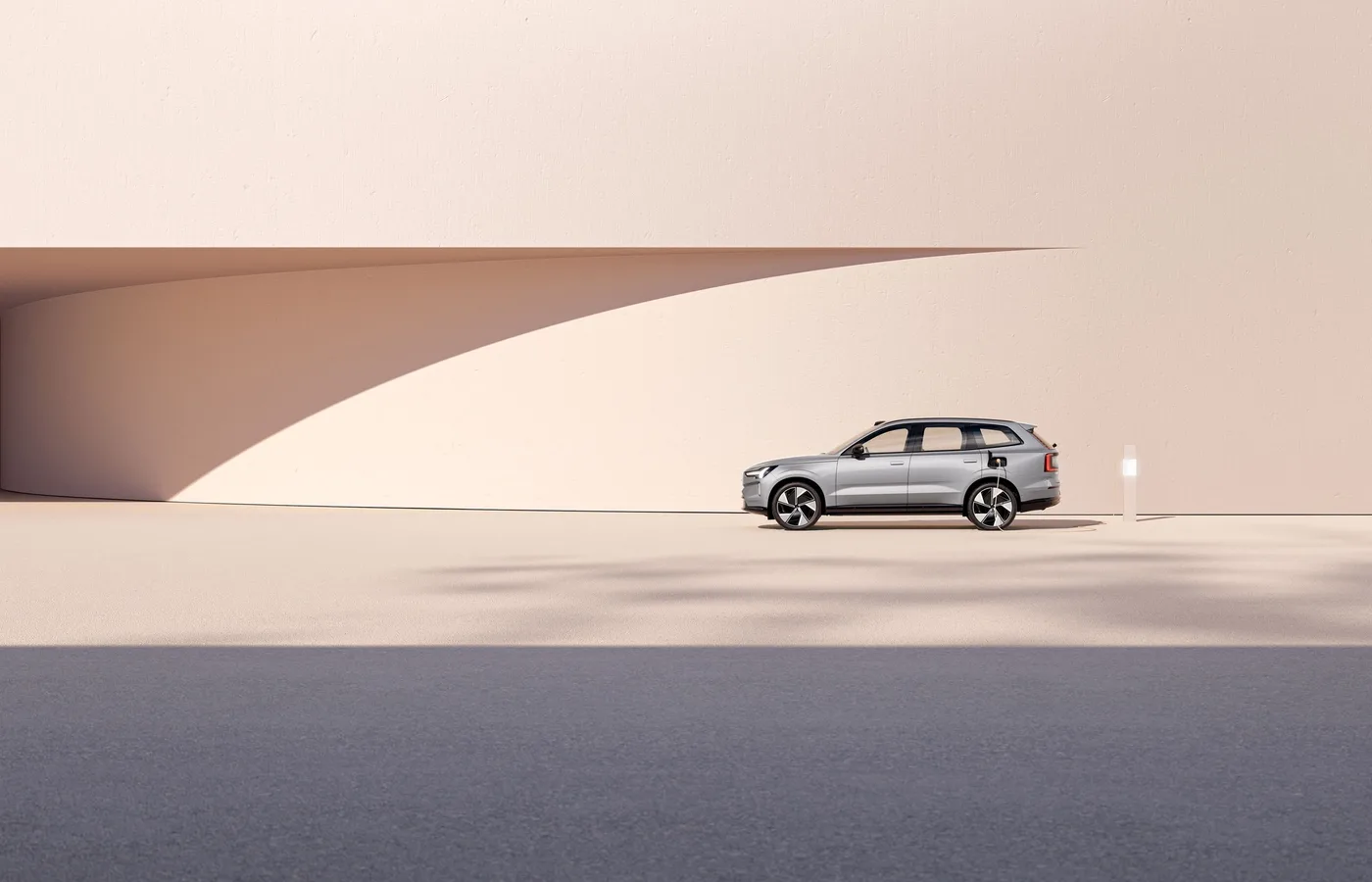
Most automotive rebrands arrive with a press release, a sans-serif, and an apology. Volvo's arrived with silence, and that silence said everything.
Over the past three years, Volvo has executed one of the most disciplined visual identity evolutions in consumer branding. No viral reveal. No controversy cycle. No desperate pivot to look like a tech company. Instead, a systematic refinement that made an already-respected mark feel inevitable.
This is how you rebrand when you already have something worth keeping.
The Iron Mark, Refined
Volvo's diagonal arrow-and-circle, the iron mark, is one of the oldest continuously used automotive symbols, dating to 1927. Where most heritage brands treat their marks as museum pieces or demolition sites, Volvo treated theirs as a living system.
The 2023–2025 refinements stripped the iron mark to its geometric essentials. The circle became optically perfect. The arrow gained mathematical precision. The wordmark shifted to a custom grotesque that shares DNA with the mark's geometry without imitating it.
The result: a symbol that looks like it was always this clean. That's the hardest thing to achieve in identity design, change that feels like discovery rather than invention.
Typography as Architecture
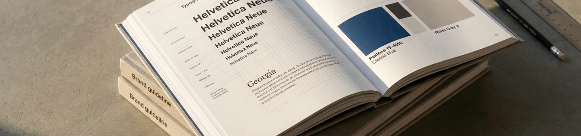
Volvo's type system is where the real ambition lives. The custom typeface, Volvo Novum, operates at three weights across every touchpoint, from dealer signage to the instrument cluster of an EX90. It's engineered for legibility at 8px on a dashboard and authority at 800px on a billboard.
This isn't type selection. It's type infrastructure. And it reveals a truth most rebrands ignore: a brand that works at every scale earns trust at every interaction.
The spacing is generous. The counters are open. The overall impression is calm competence, which, not coincidentally, is exactly what you want from the company building the car your family rides in.
Color: The Discipline of Restraint
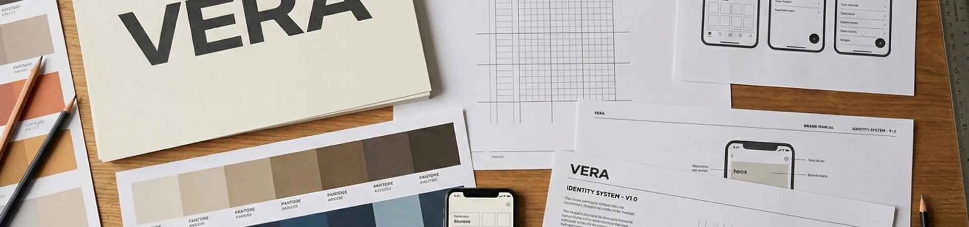
Volvo's palette is a masterclass in what to leave out. The primary system runs on three colors: Volvo Blue (a deep, confident navy), white, and the iron mark's silver. That's it.
In an industry addicted to gradient meshes and electric accent colors, Volvo's restraint is radical. Every competitor is trying to look like a consumer electronics brand. Volvo is trying to look like Volvo, and succeeding because they understand that consistency compounds.
The secondary palette exists but stays quiet: warm grays for interiors, a muted green for sustainability communications, a deep charcoal for premium sub-brands. Each is deployed with intention, never decoration.
The System Thinking
What makes Volvo's identity exceptional isn't any single element: it's the system governance. Every touchpoint follows the same spatial logic: generous margins, consistent grid, predictable hierarchy. Whether you're reading a Volvo sustainability report or configuring an EX30 online, the visual rhythm is identical.
This matters because brand trust is built in the spaces between interactions. When every touchpoint feels like it was designed by the same mind, the brand stops being a collection of assets and starts being an experience.
Volvo's design team, led by the Stockholm studio, maintains a living design system that updates quarterly. Not annually. Not when someone remembers. Quarterly, because identity is infrastructure, and infrastructure requires maintenance.
What Other Brands Should Steal
Restraint is a strategy, not a limitation. Volvo's three-color primary palette does more work than most brands' twelve-color systems because it's applied with absolute consistency.
Refine, don't replace. The iron mark wasn't broken. It was sharpened. The best rebrands are often the ones nobody notices happened.
Type is your voice. Volvo Novum isn't a font choice: it's an architectural decision that determines how the brand sounds at every scale.
Govern the system, not just the assets. Quarterly design system updates mean the identity never drifts. Most brands update their guidelines once and forget them.
The Verdict
Volvo's visual identity works because it respects the audience's intelligence. It doesn't try to be exciting. It tries to be trustworthy, and achieves it through craft, consistency, and the confidence to be quiet in a loud industry.
In a market where every competitor is screaming "we're the future," Volvo whispers "we're reliable", and that whisper carries further than any shout.
This is a WeLoveDaily Brand Breakdown: our series dissecting the identity decisions behind the world's most notable brands. Have a brand you'd like us to break down? Submit it here.