project
Work, articles, studios and categories across the archive.
project
…like engineering documentation than a marketing deck. The wordmark is a precise custom logotype; the color palette is restrained to a primary and a pair of editorial-weight accents;…

project
…in an app icon and at four meters tall on a billboard. Wordmarks rarely do both well; a logotype optimized for a billboard becomes illegible at favicon scale, and a logotype optimized…
project
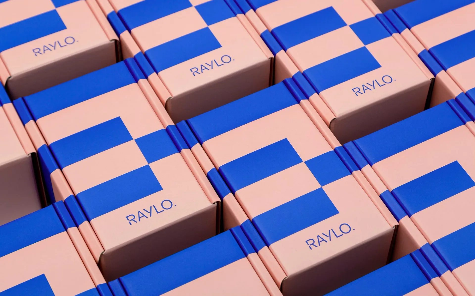
…square is cut out of the stem of the R. It is not discarded. It reappears at the end of the logotype as a full stop, so the letter gives something up and the word receives it. Pentagram calls…

article
…wordmark onto a baseball cap at twelve millimetres and expect legibility. You cannot reduce a logotype to a sixteen-pixel favicon without losing its character. There is also the question of…
project
…visual sameness: the grey-and-blue monotony of productivity SaaS, the interchangeable logotypes, the stock photography of people collaborating in well-lit offices: they were genuinely…
ranking
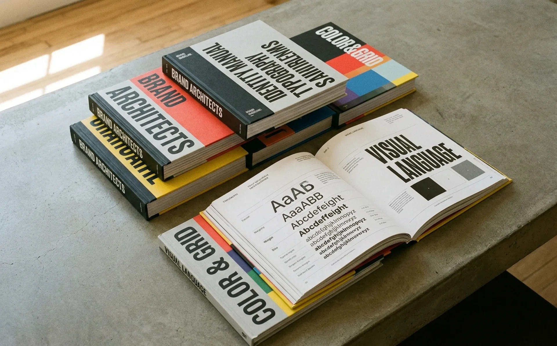
…systematic visual thinking. The manual specified every application of the NASA "worm" logotype: size relationships, spacing, color values for screen printing, vehicle livery, signage…
article
…designed by Peter Saville, replacing the brand's iconic Equestrian Knight crest and serif logotype with a stripped-back sans-serif wordmark. The new logo was clean, modern, and immediately…
guide
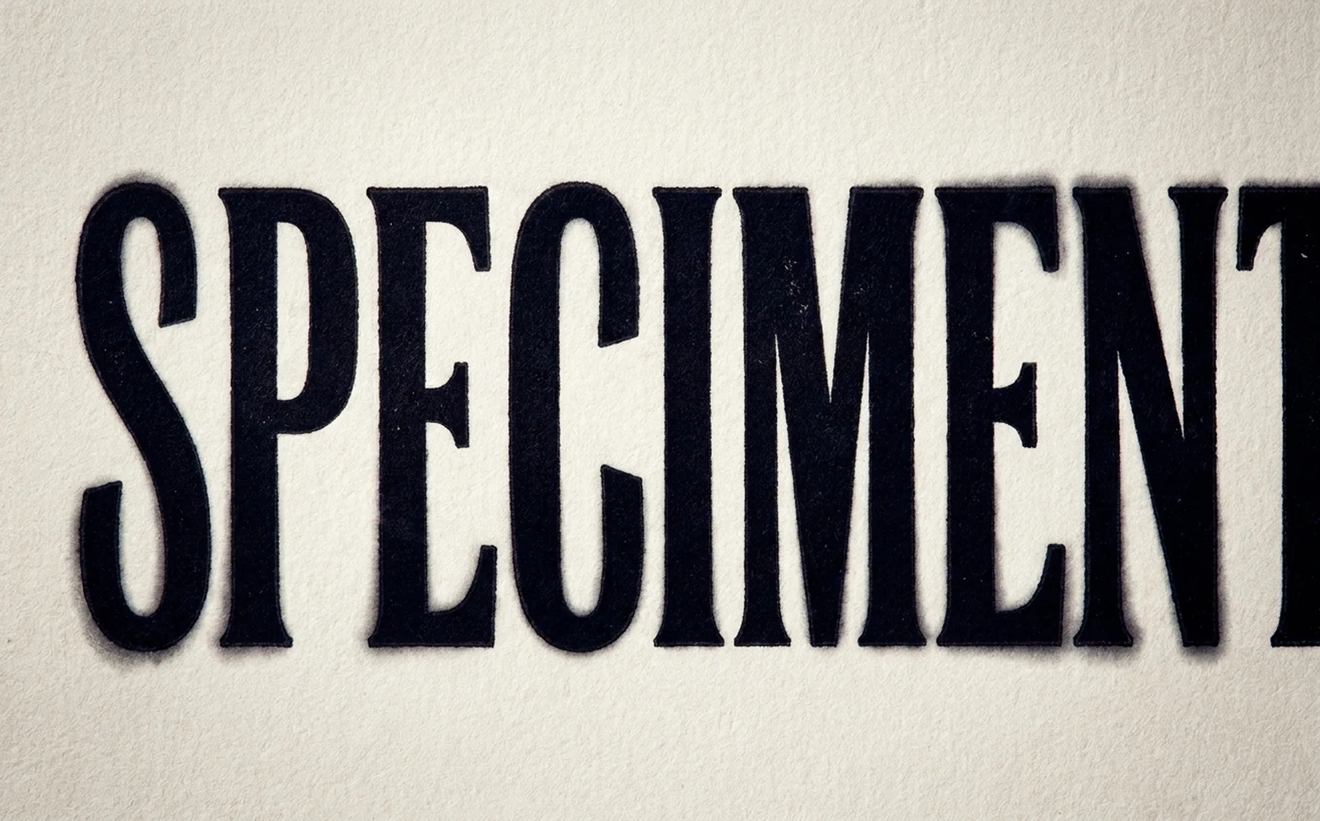
…the most-viewed typographic moment on the entire site. Real-World Analysis: The FedEx Logotype The FedEx logotype, designed by Lindon Leader at Landor in 1994, is one of the most studied…
article
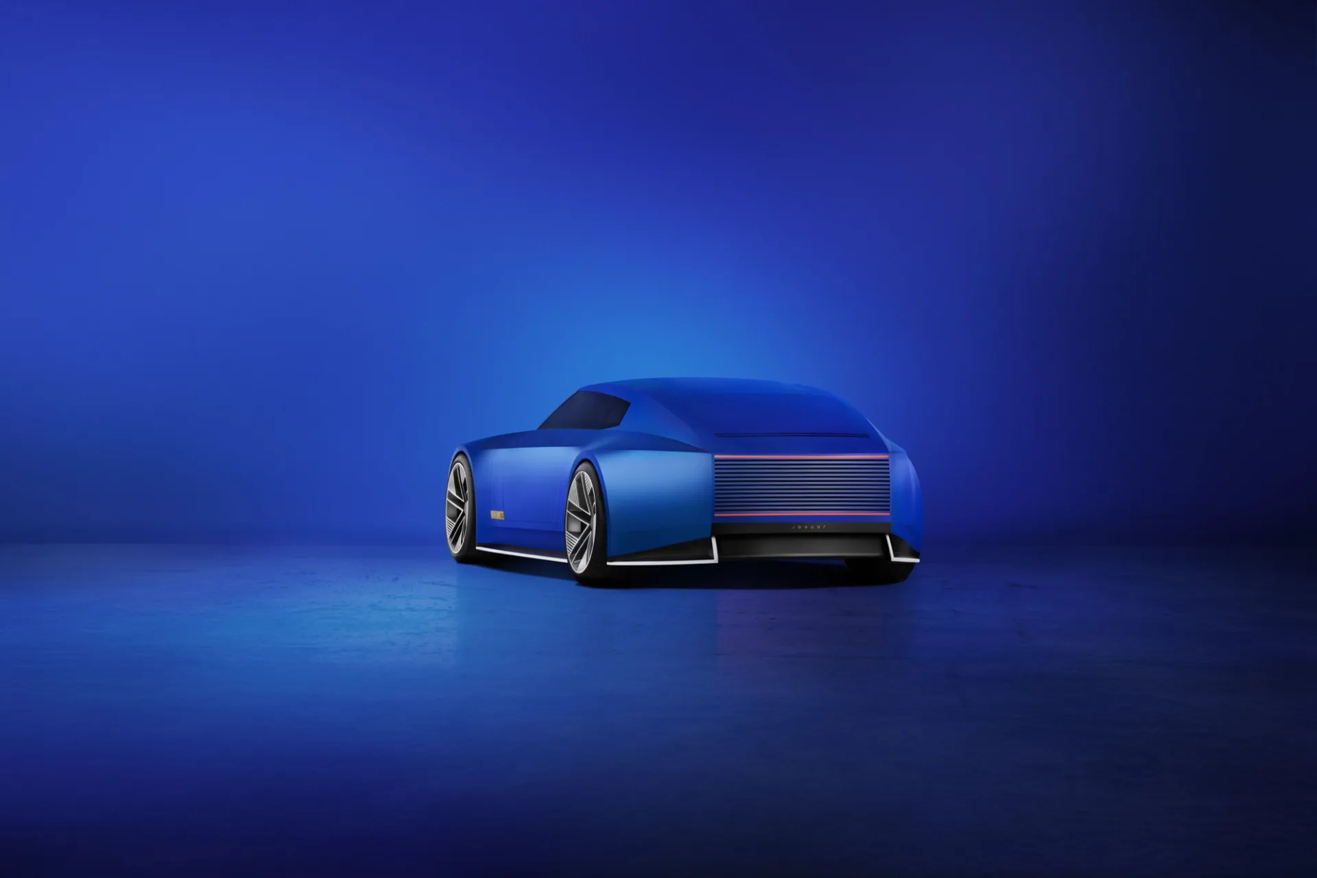
…and type design. Several decisions were deliberately provocative. The wordmark. The new logotype replaces the italic, calligraphic script that had been in use since the 1950s with a geometric…
article
…image of a glass of orange juice: actual product, prominently displayed. The Tropicana logotype was rotated to a vertical orientation on the side of the carton. The variety designation…
project
…deliberate typographic identities in technology. The wordmark itself (a simple, custom logotype) has been refined repeatedly, each iteration sharpening the letterforms while maintaining…

article
…The custom wordmark (geometric but not rigid, with a slightly elevated "i" that gave the logotype rhythm) replaced Cooper Light's decorative warmth with something more durable. Cooper…