project
Work, articles, studios and categories across the archive.
project
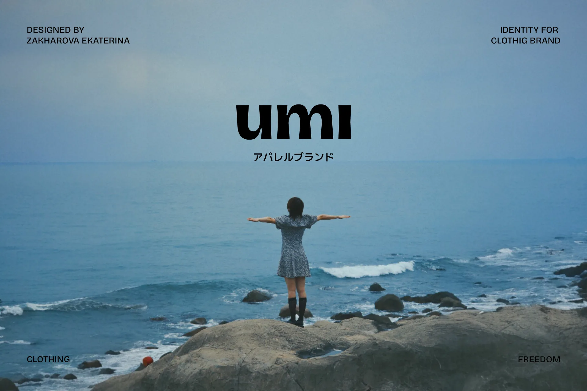
…cut and mood of each collection. Umi is a state of freedom embodied in clothing. Thus, the logo has a fluidity and a smooth expansion in the letters. The project's metaphor is the wave…
project
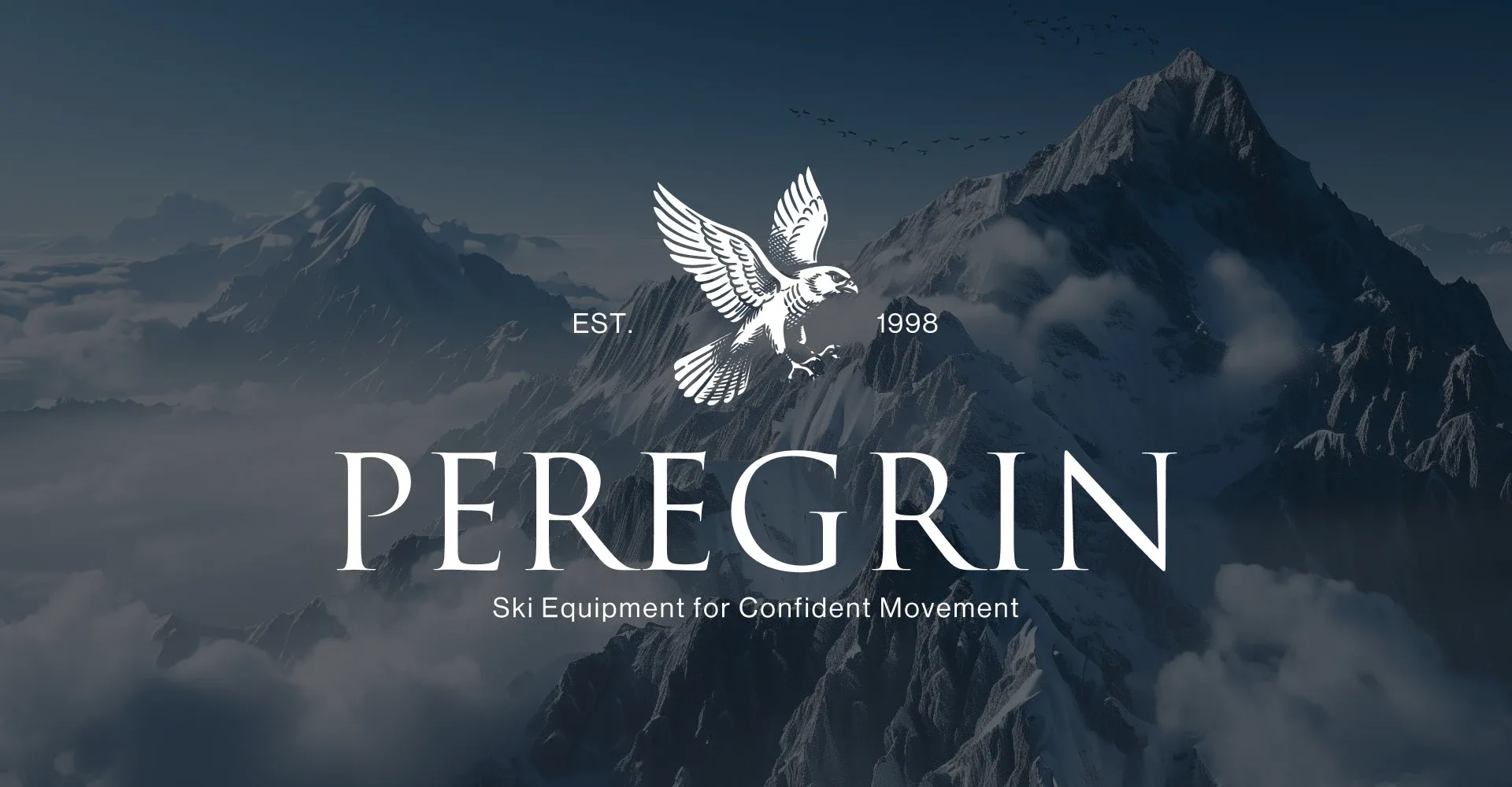
…positions its equipment — as a tool for confident movement and control on the slope. The logo is designed in an engraving style to convey naturalness, craftsmanship, and a sense of brand…

project
…intelligence. The identity is grounded in the philosophy of order through synthesis. The logomark functions as a structural model rather than a symbolic gesture, representing data as it…

project
…cultural institutions. Where an earlier generation of Pentagram partners might have delivered a logo, a typeface, and a set of usage guidelines bound in a handsome book, the newer partners…
ranking
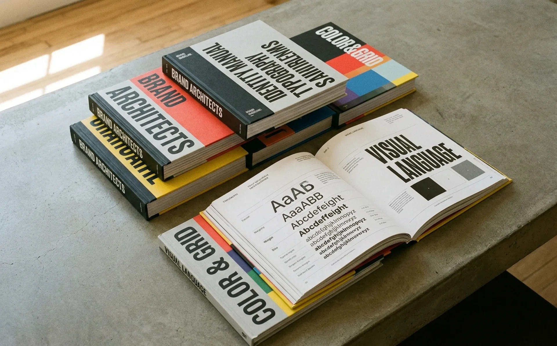
…digital dust, while the marketing team guesses at hex codes and the junior designer scales the logo by dragging the corner handle. This isn't a delivery problem. It's a design problem. Most…
ranking
…Volvo quietly updated its wordmark in April, refining the letterforms of its iron-mark logo for the first time in nearly a decade. The changes are subtle (tighter kerning, slightly…
guide
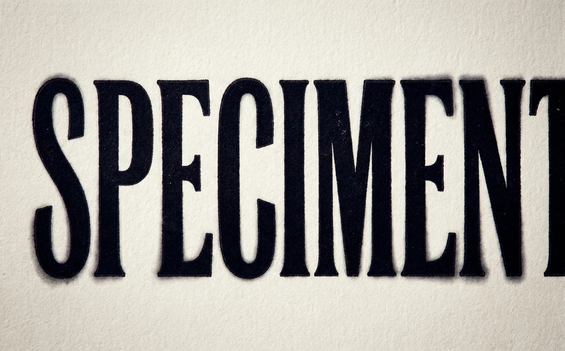
…overall headline for general tightness. For critical display moments (a hero headline, a logo lockup) consider setting the type as an SVG or using a tool like Kerntype or Lettering.js…
project
…London 2012 Olympics was unveiled in June 2007, the reaction was immediate and violent. The logo (a jagged, crystalline arrangement of the numerals "2012," rendered in electric pink) was…

article
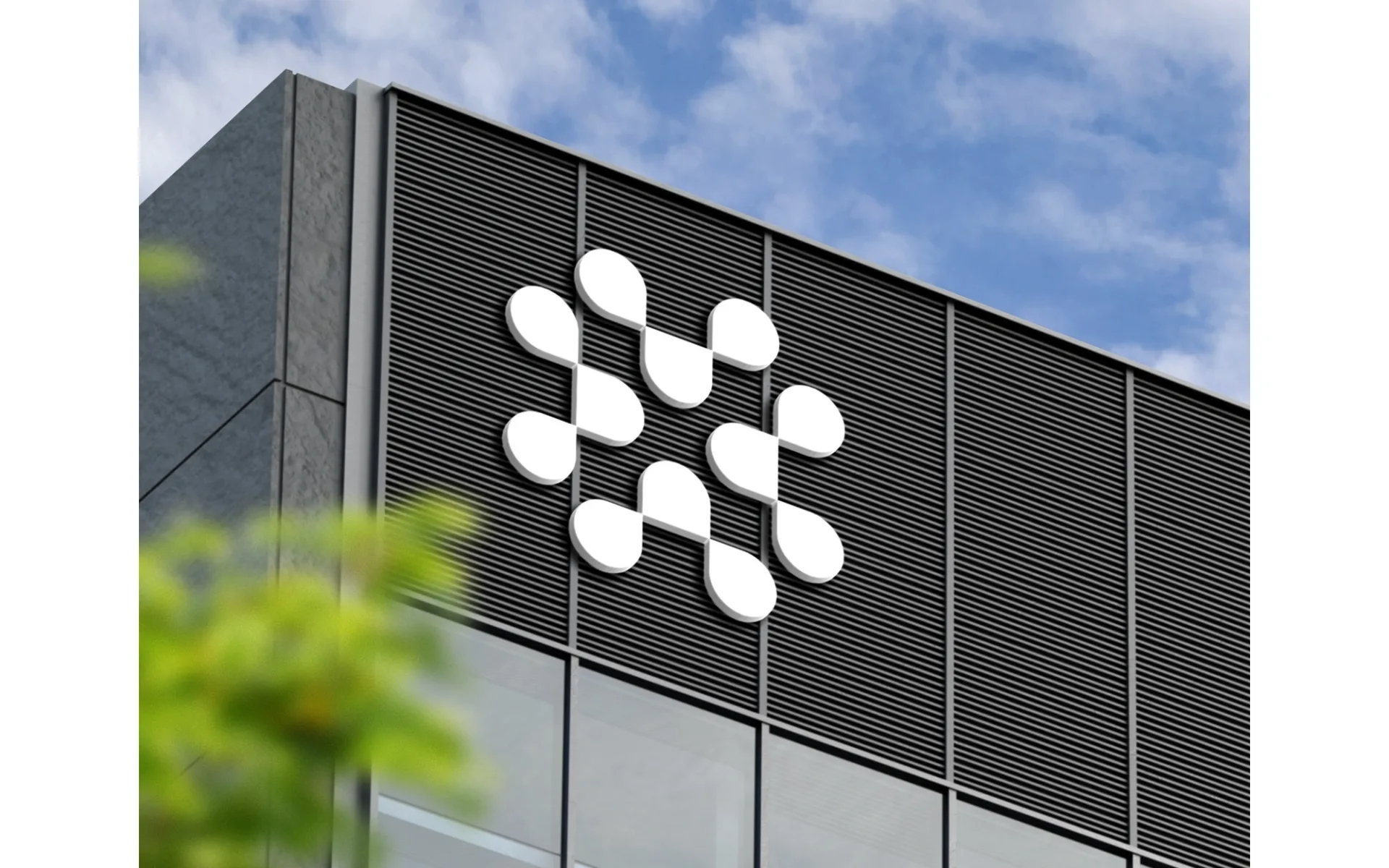
…happened in the mid-2010s. While Silicon Valley was busy stripping serifs from every tech logo it could find (Google, Spotify, Airbnb, Pinterest, all converging on the same clean geometric…
project
…time when the concept of a unified corporate visual identity didn't exist. Companies had logos, certainly. They had packaging and signage. But the idea that every visual touchpoint of…

article
…about organizational dynamics as about design. Before & After: What Actually Changed The Logo and Wordmark The shift from "MailChimp" to "Mailchimp" was more than a capitalization change…
article
…achieved something that most brand assets never accomplish: it had become a signal. Not a logo to be read, not a tagline to be processed, but a shape-colour pattern that the brain identified…

article
…and type design. Several decisions were deliberately provocative. The wordmark. The new logotype replaces the italic, calligraphic script that had been in use since the 1950s with a geometric…
article
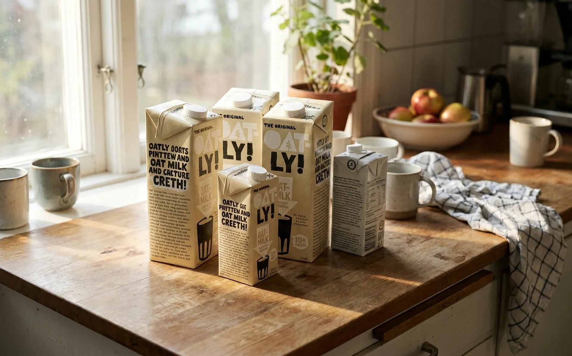
…packaging as editorial space, is the core innovation of the Oatly design system. It is not a logo. It is not a colour palette. It is not a typeface, though all of these elements are part…