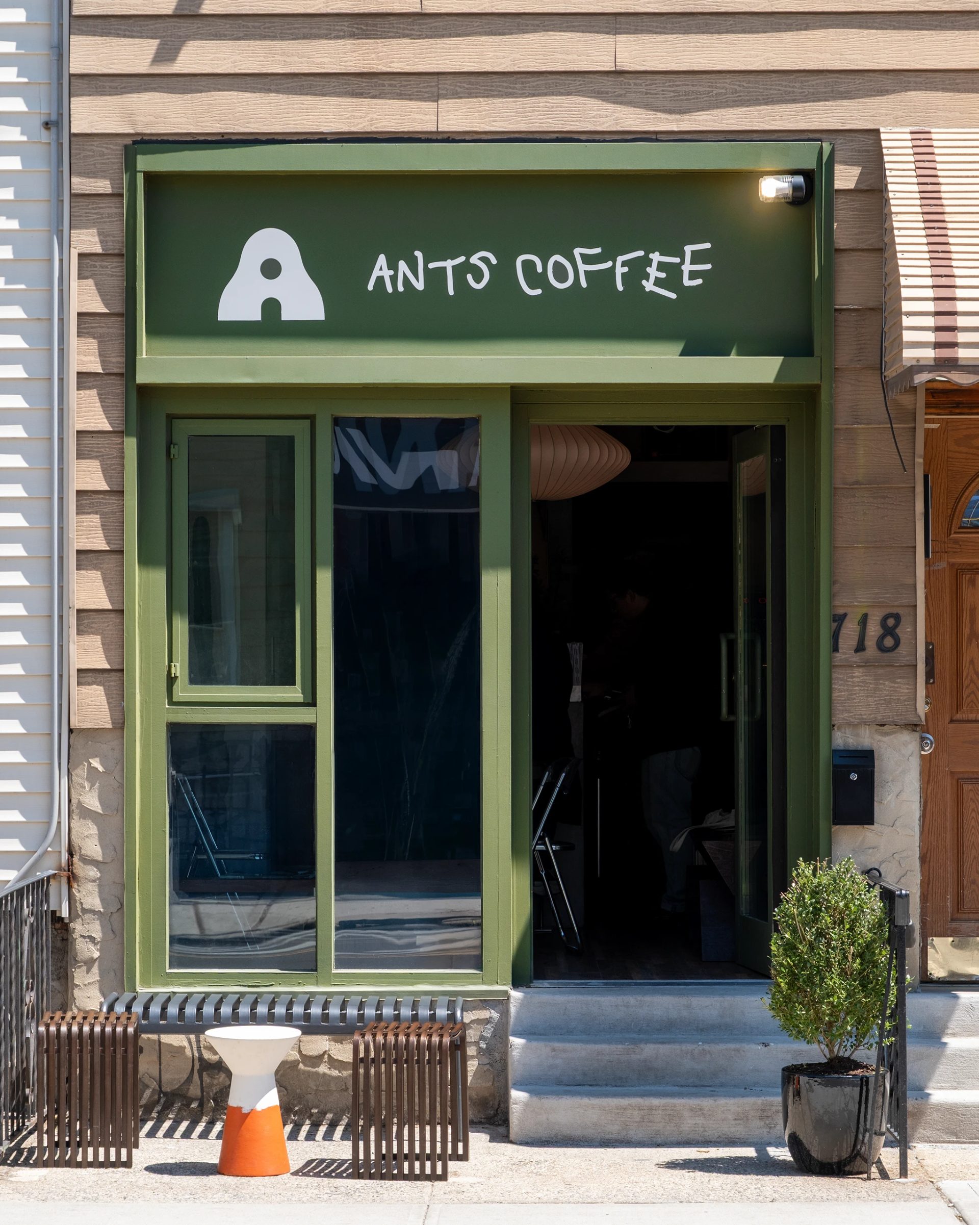
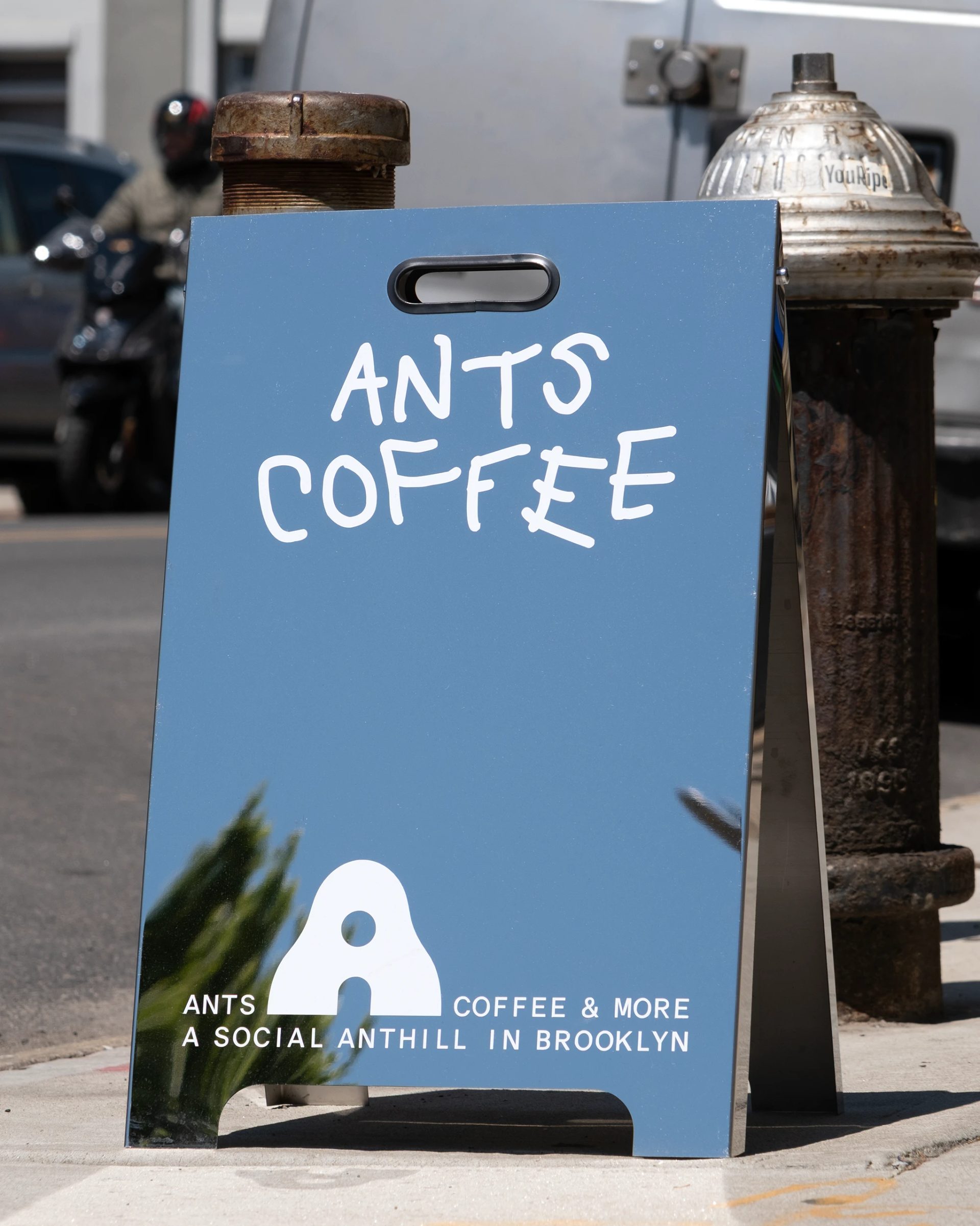
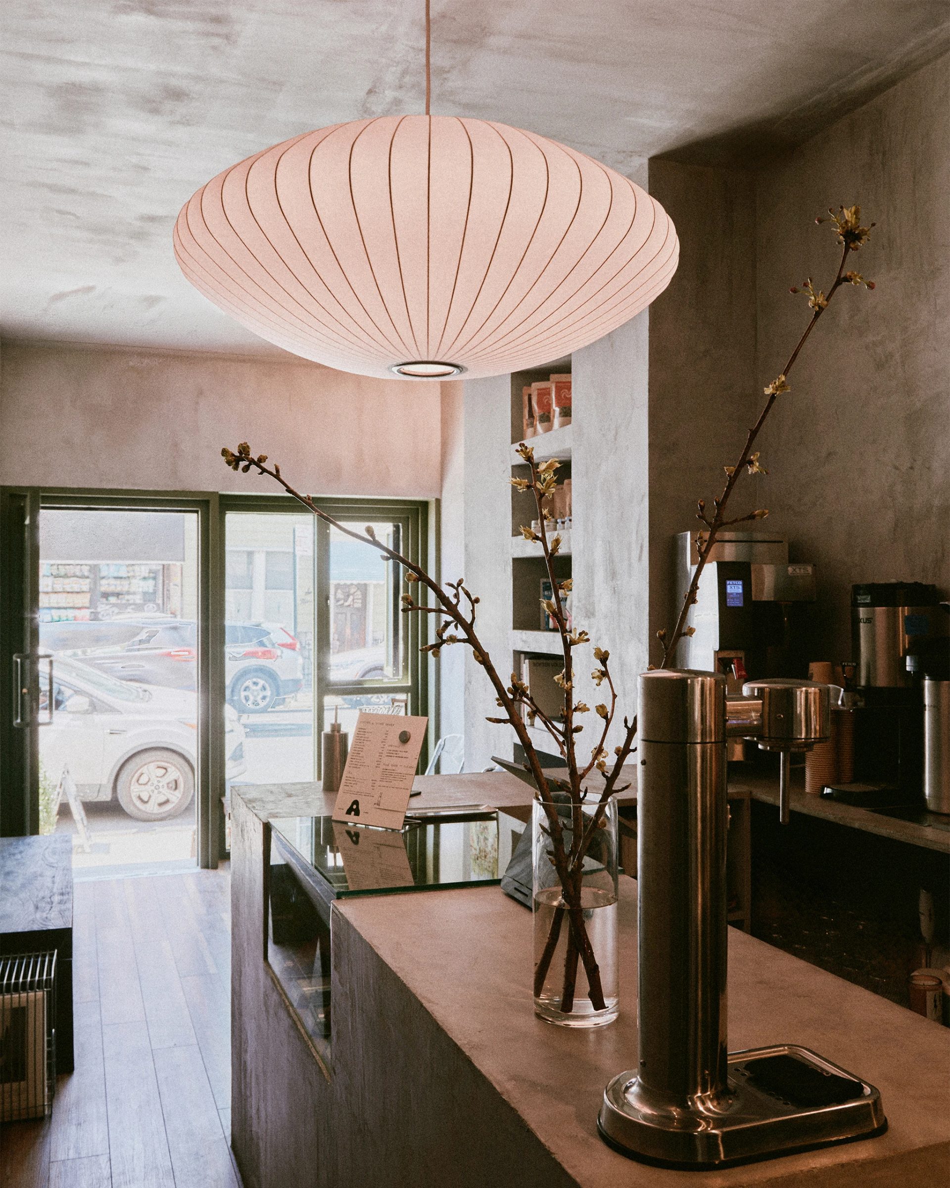
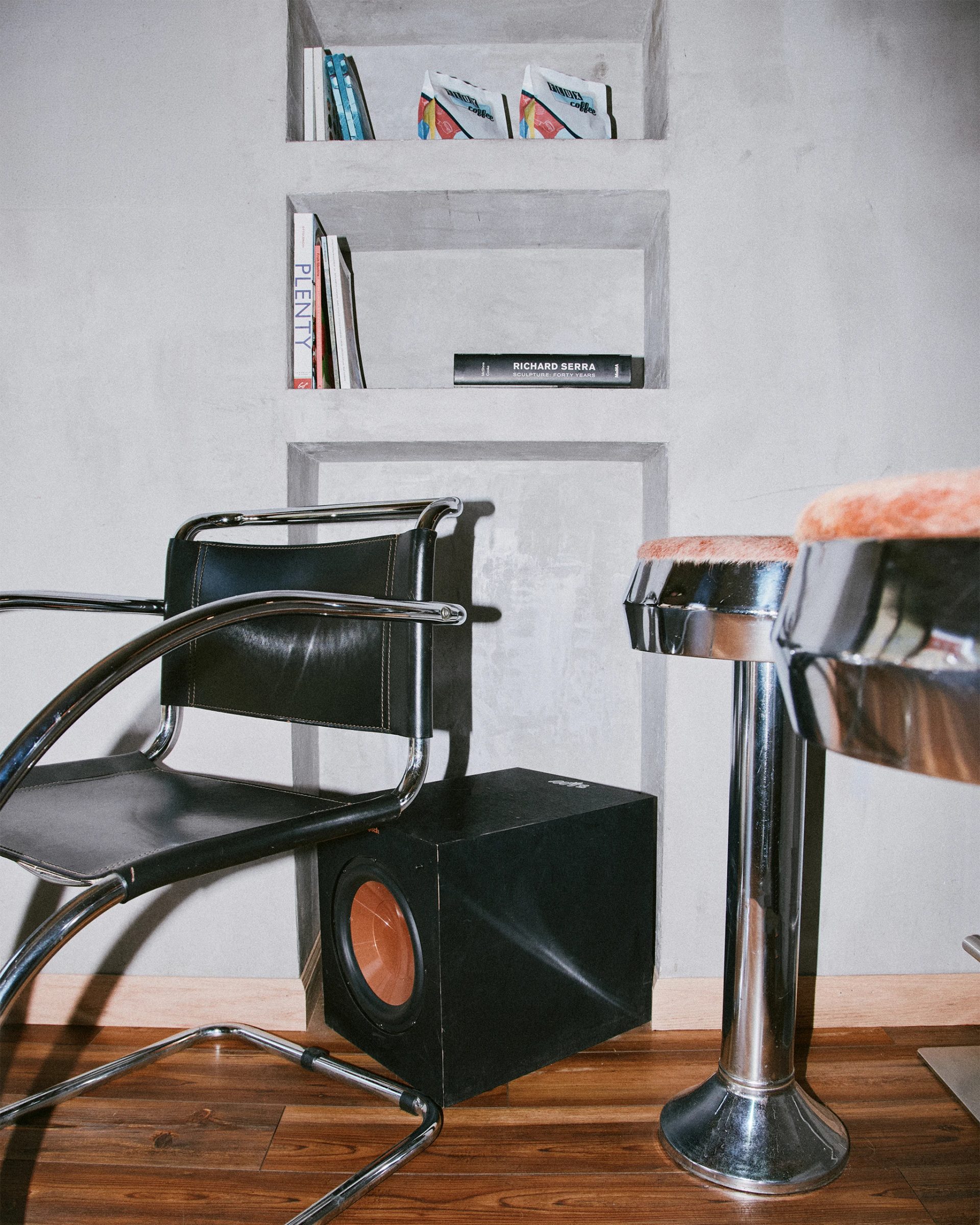
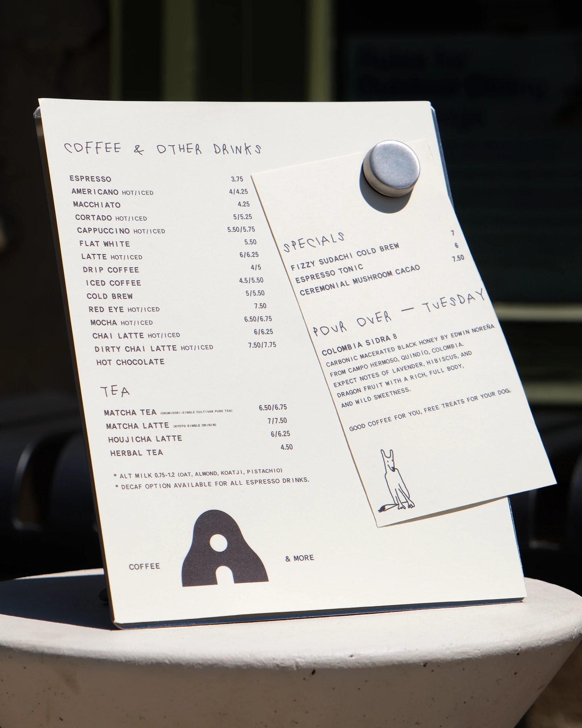
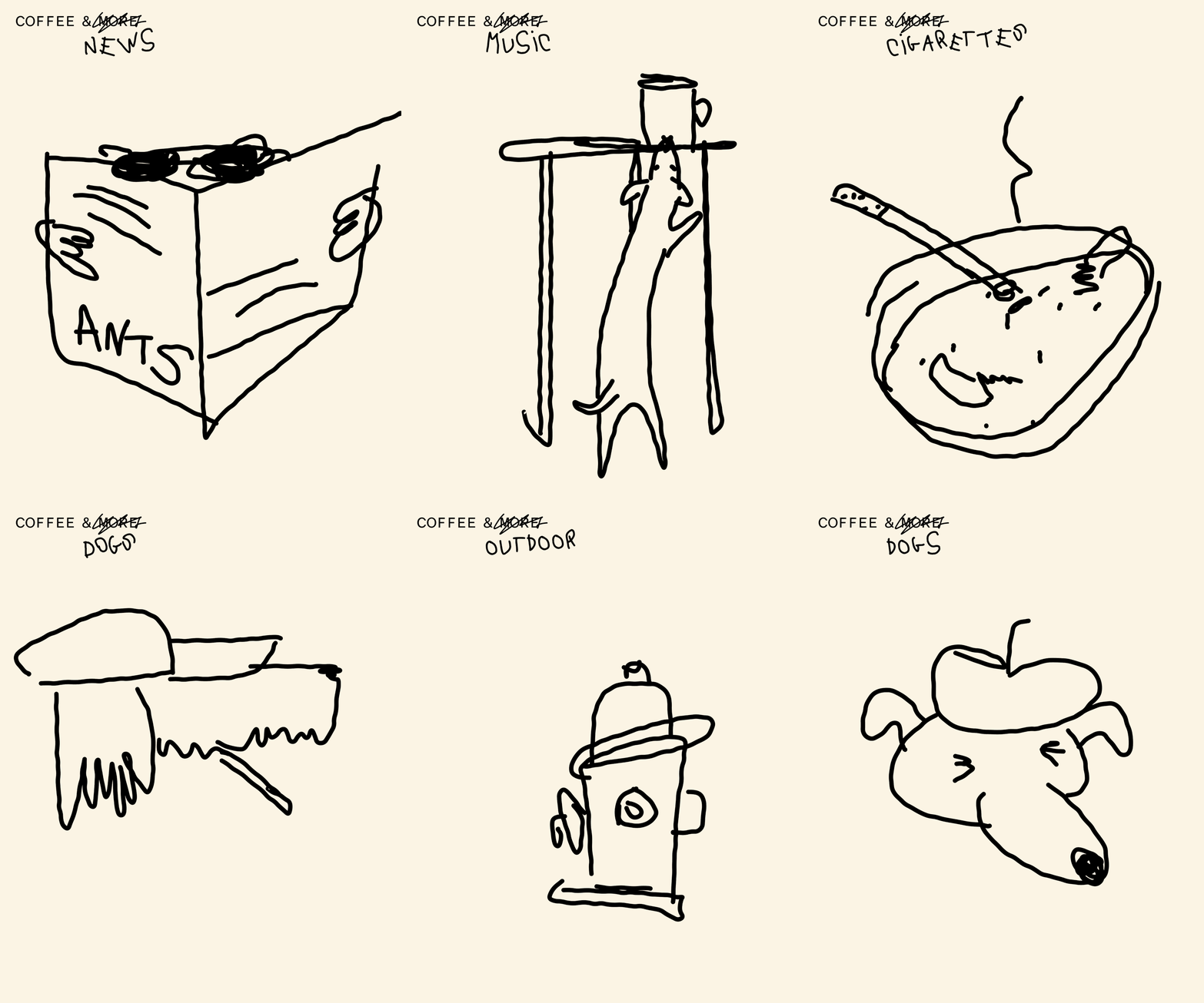
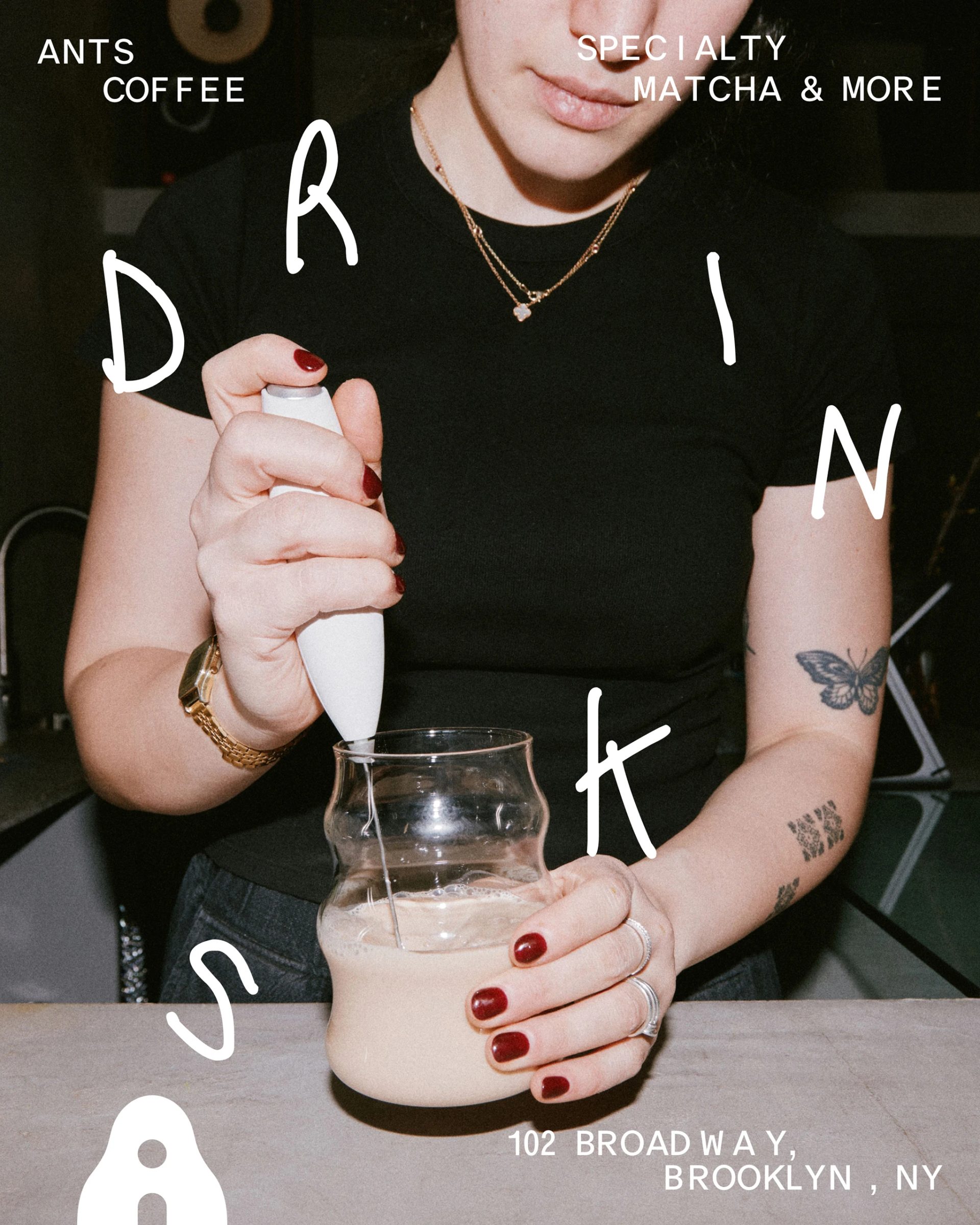
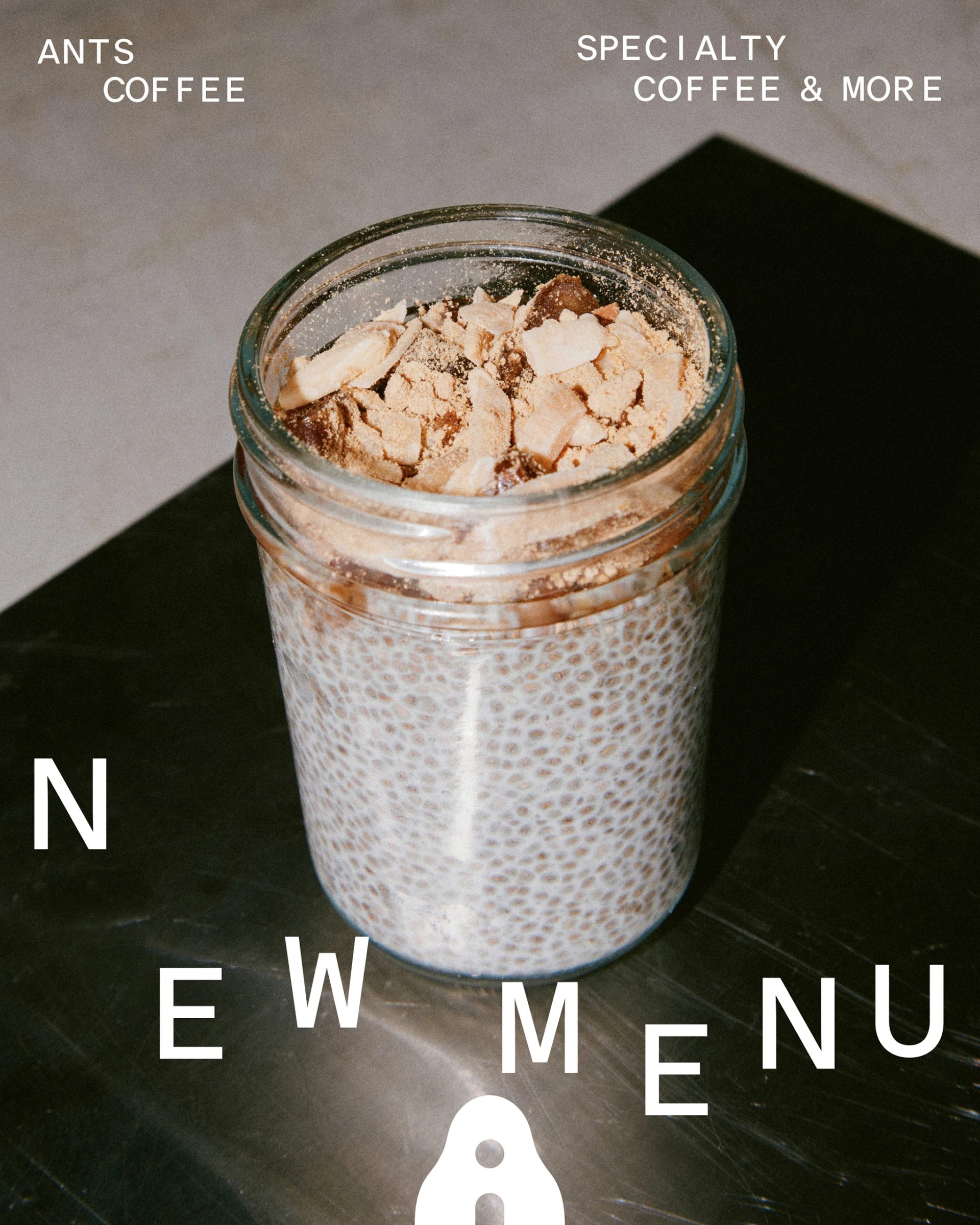
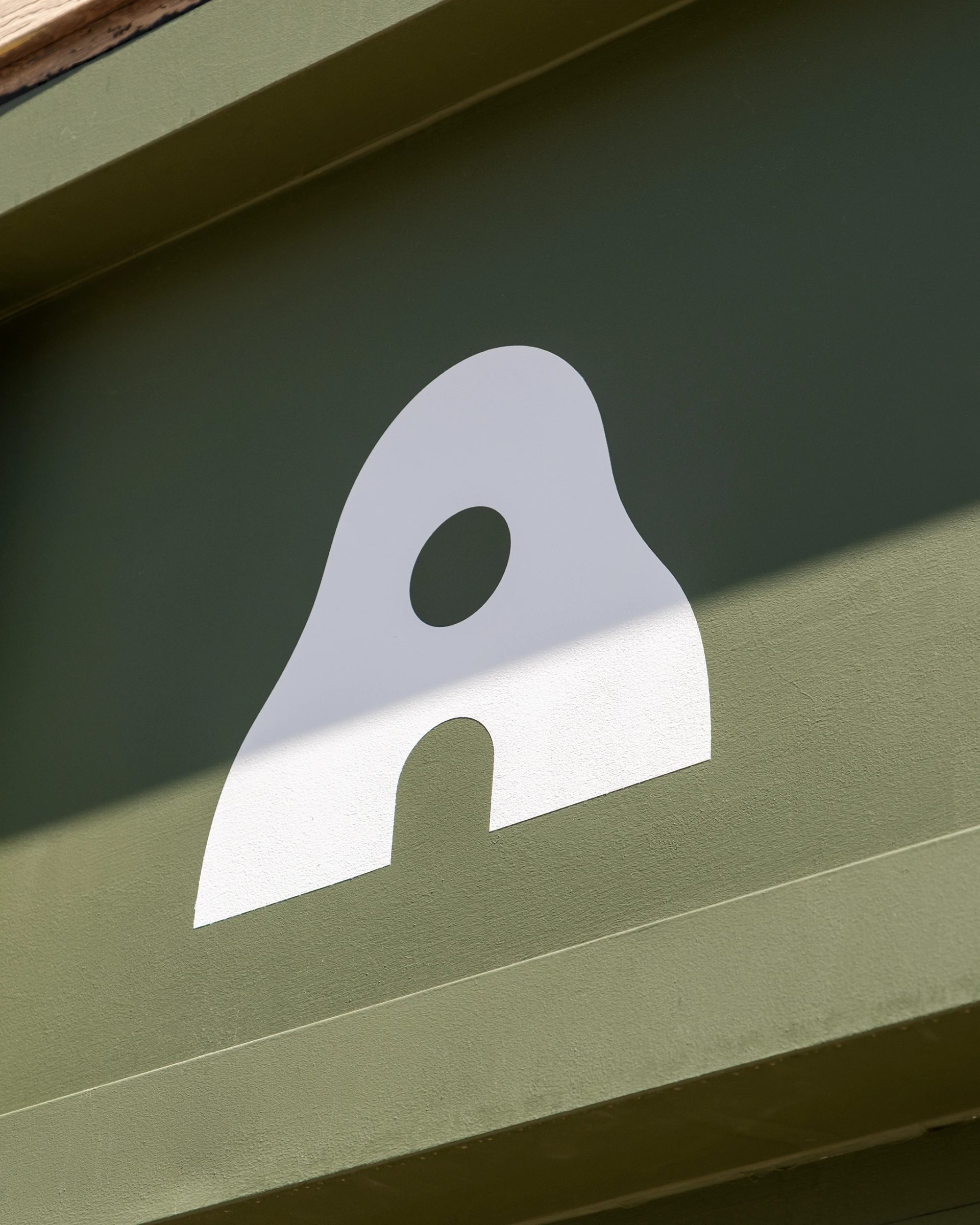
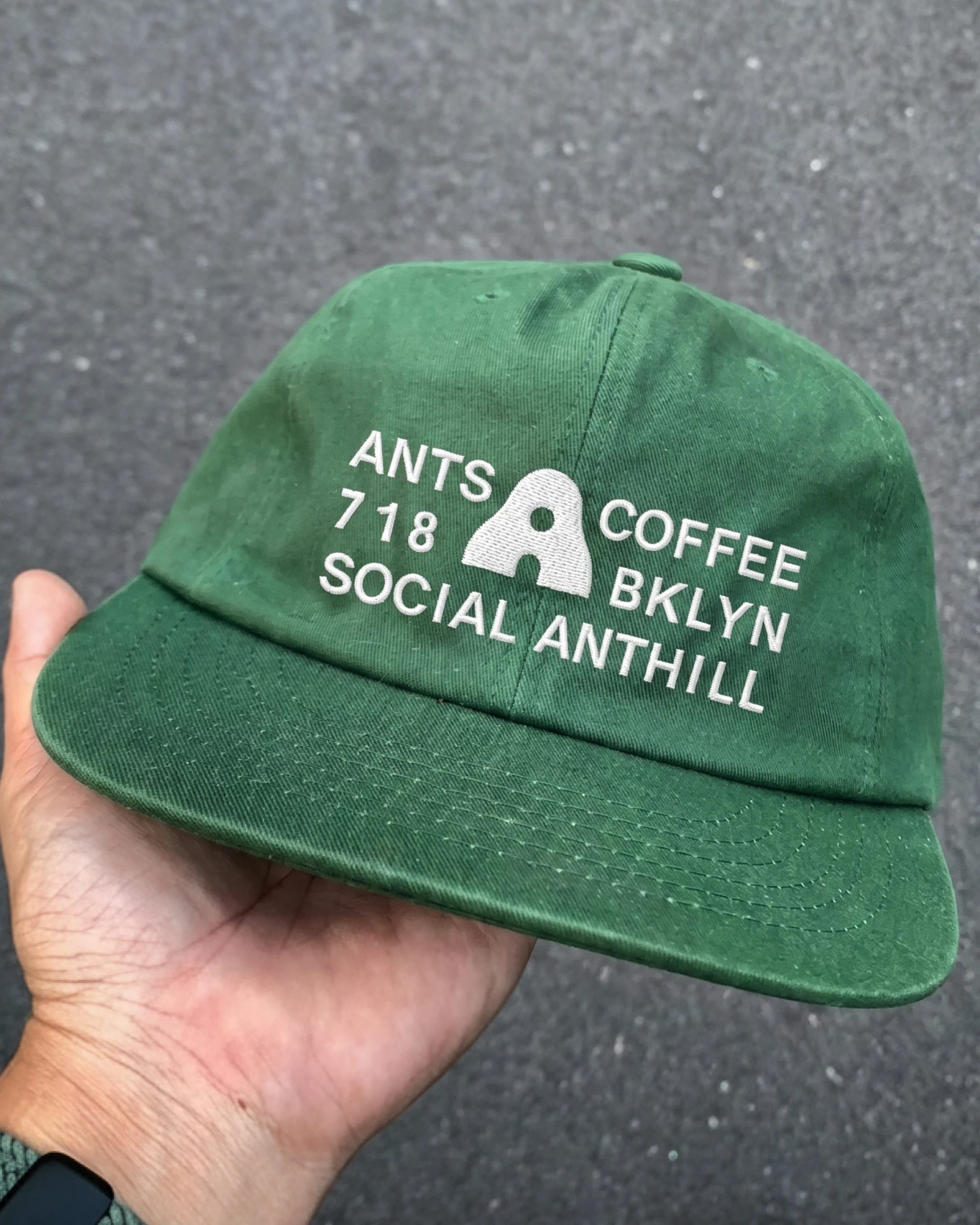
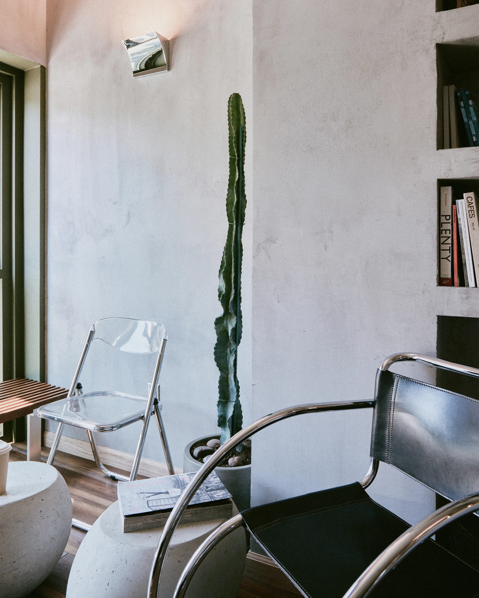
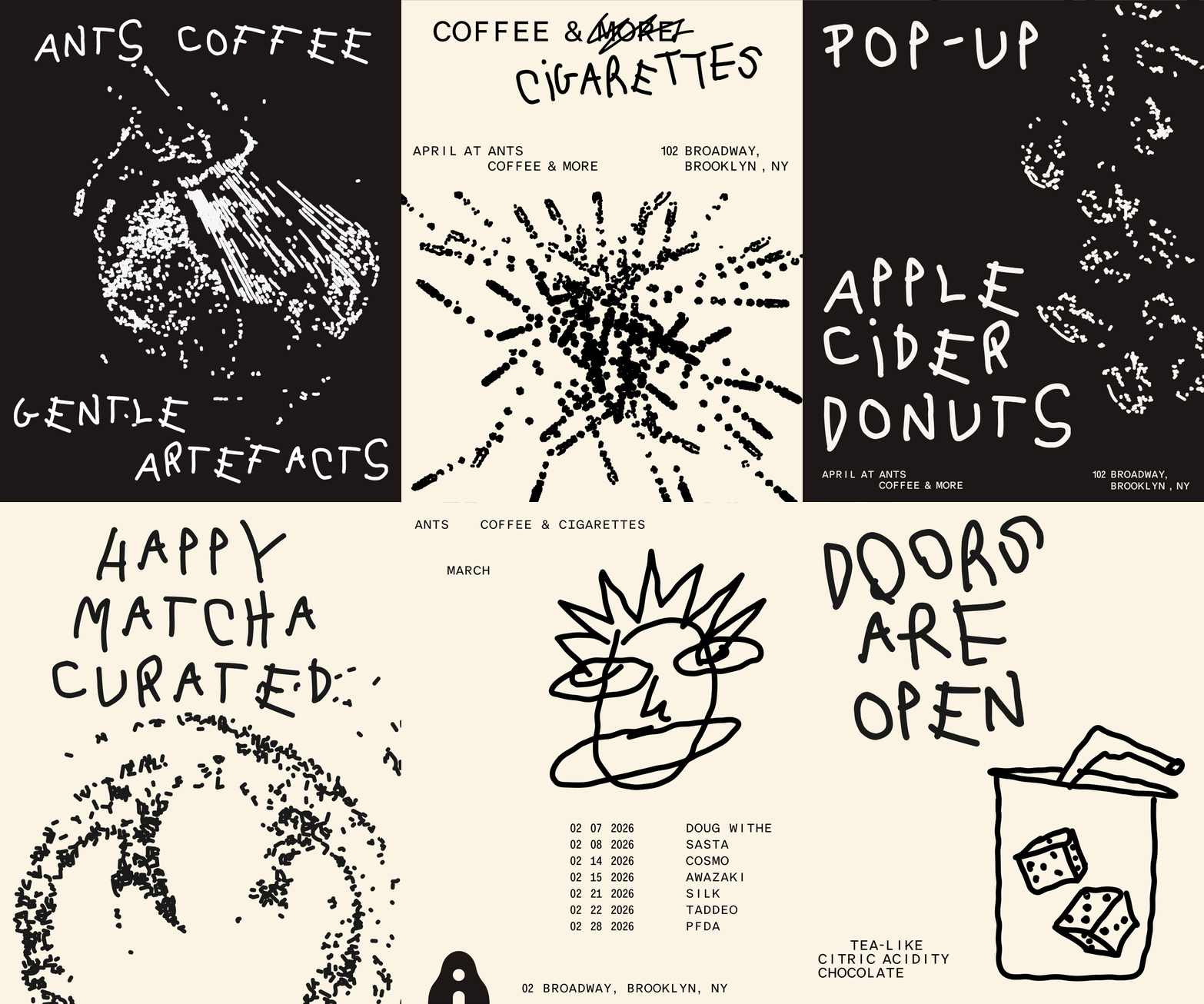
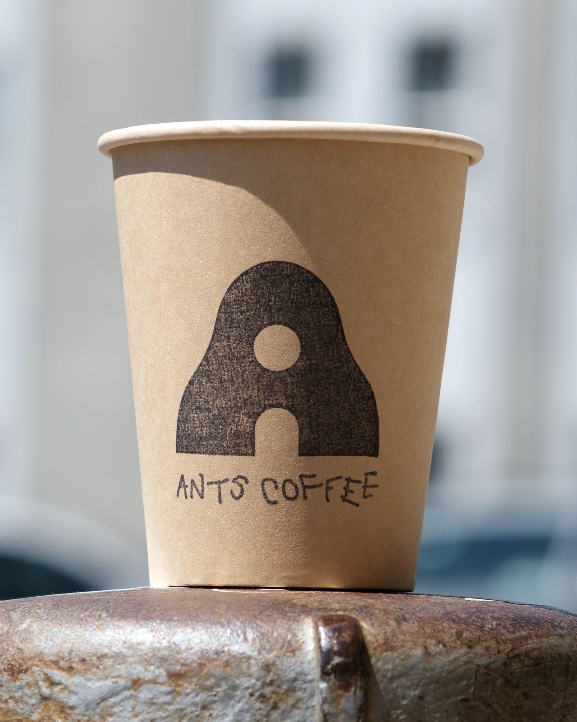
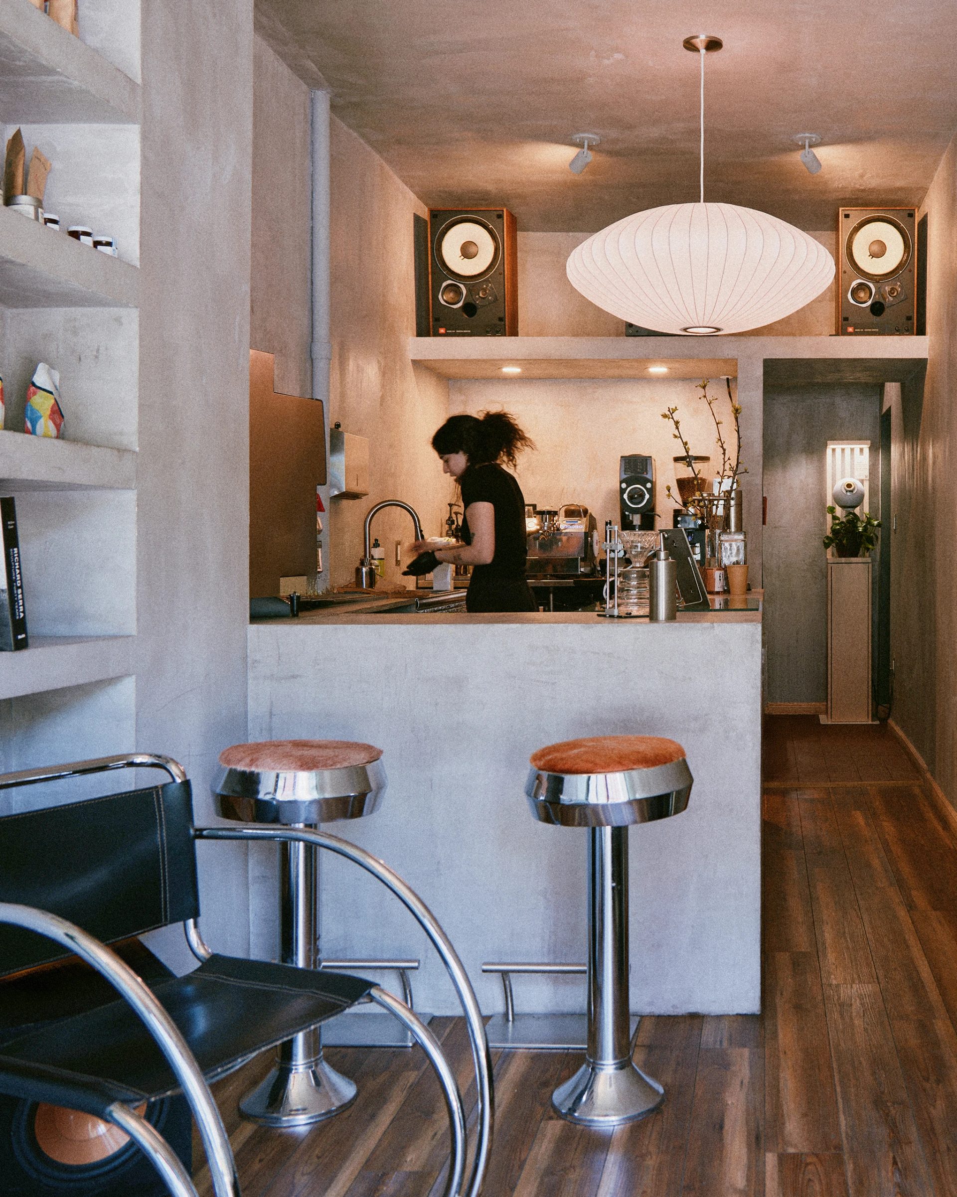
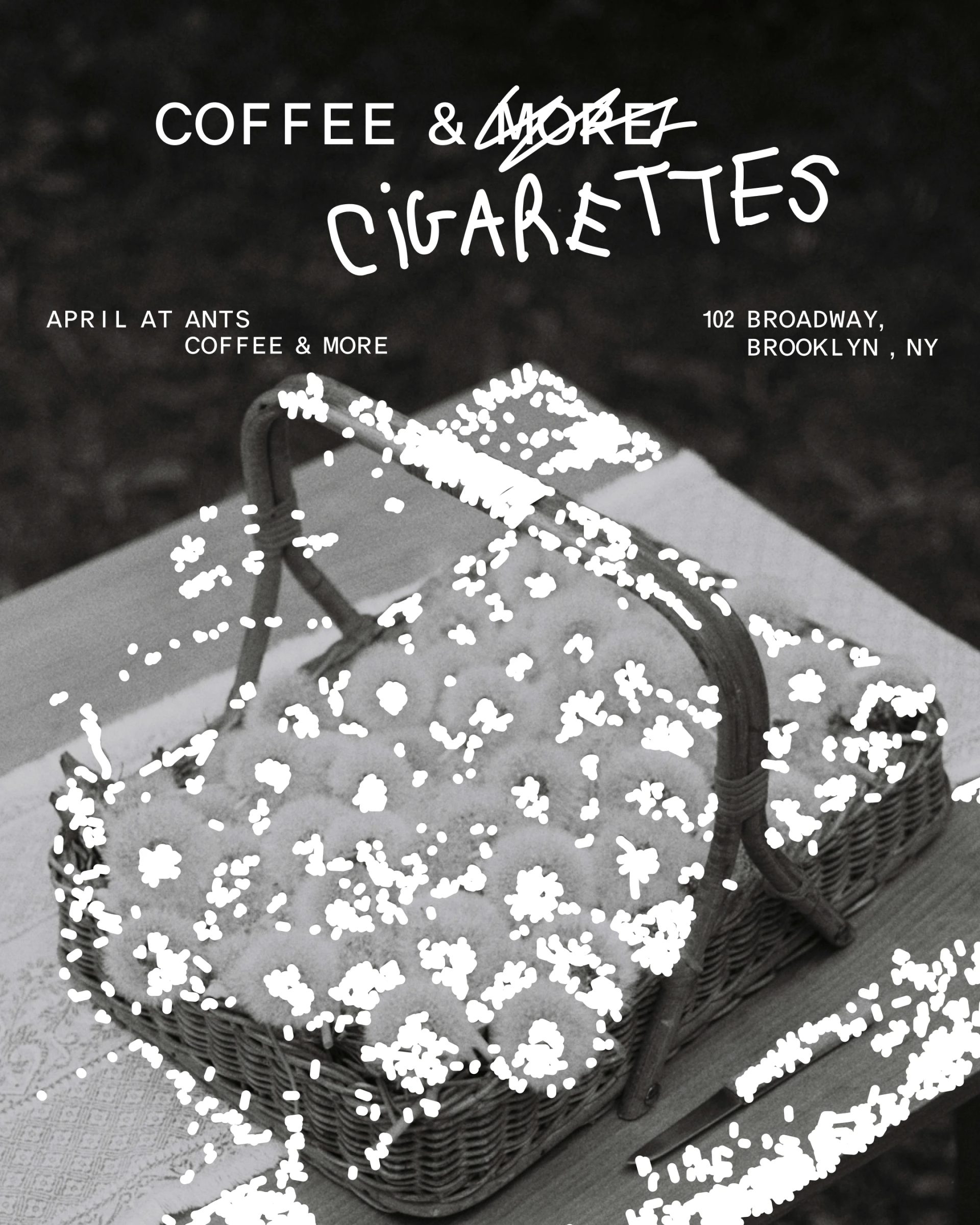
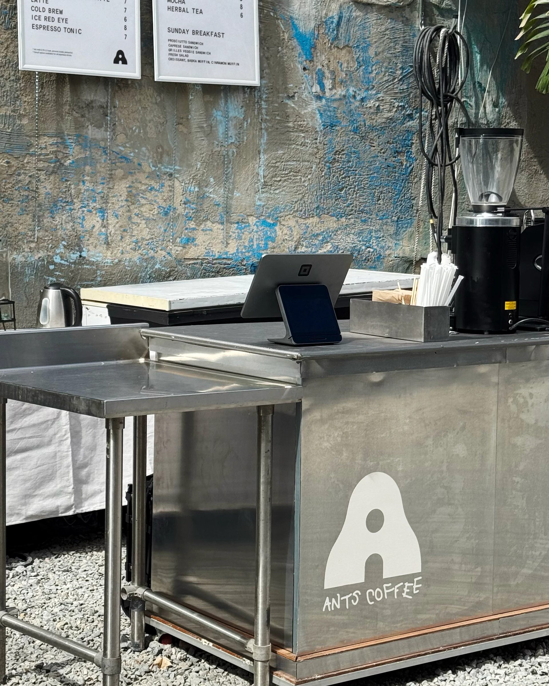
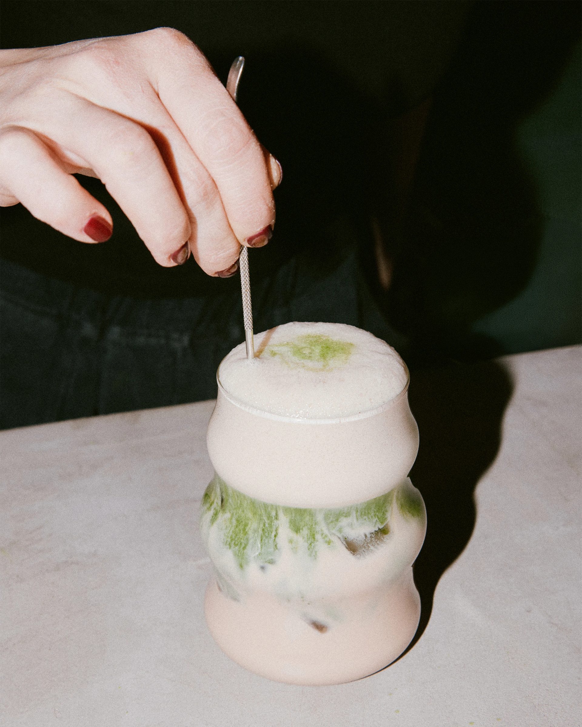
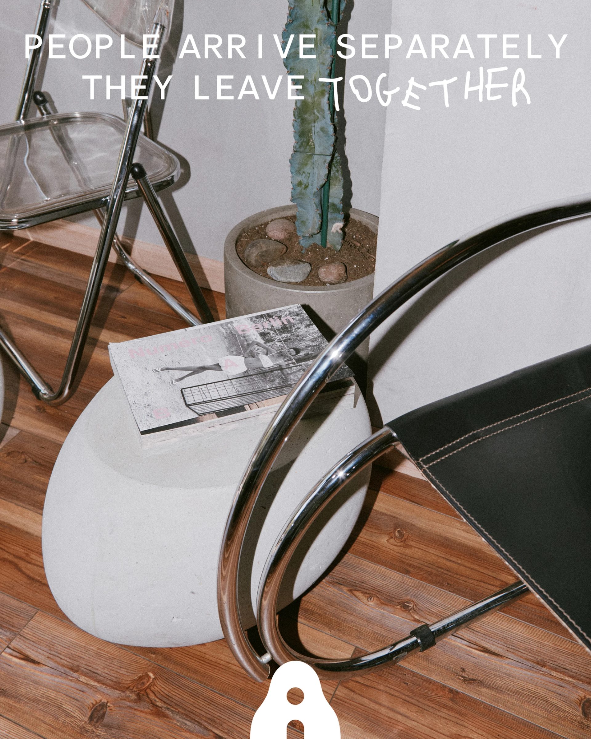
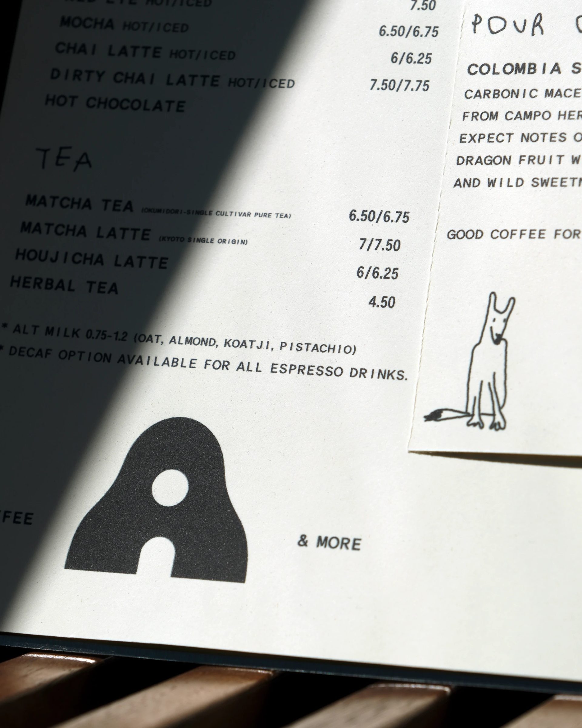
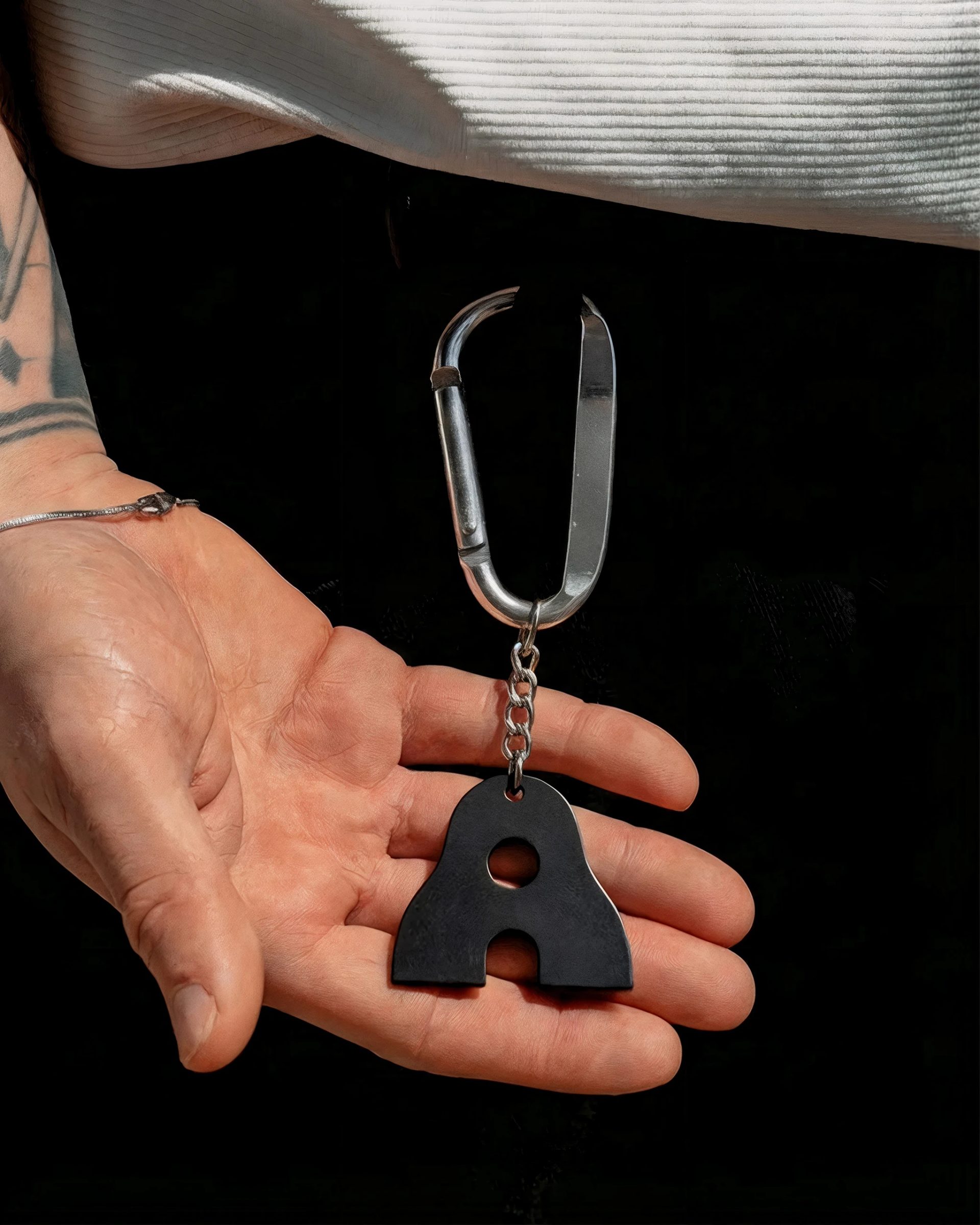
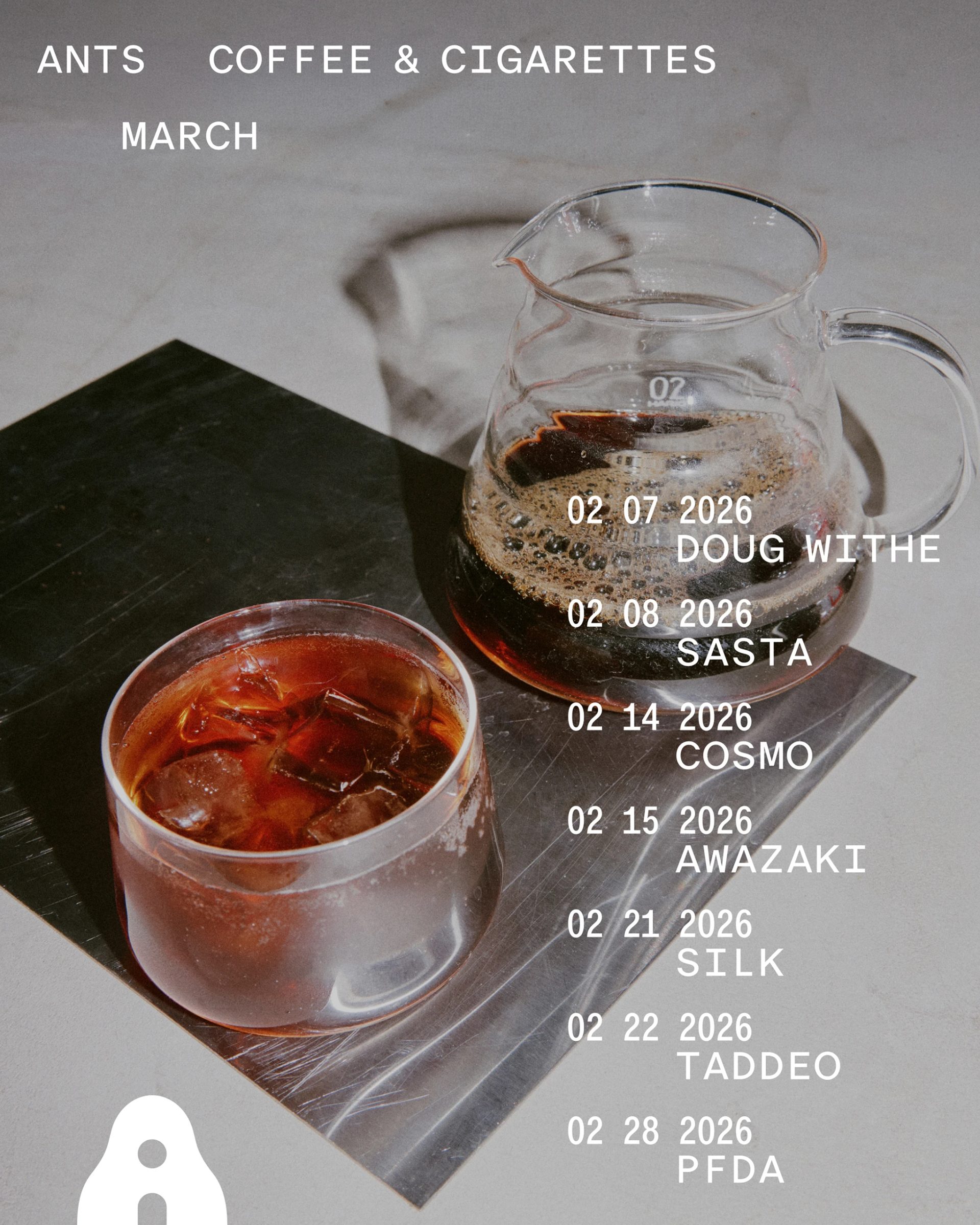
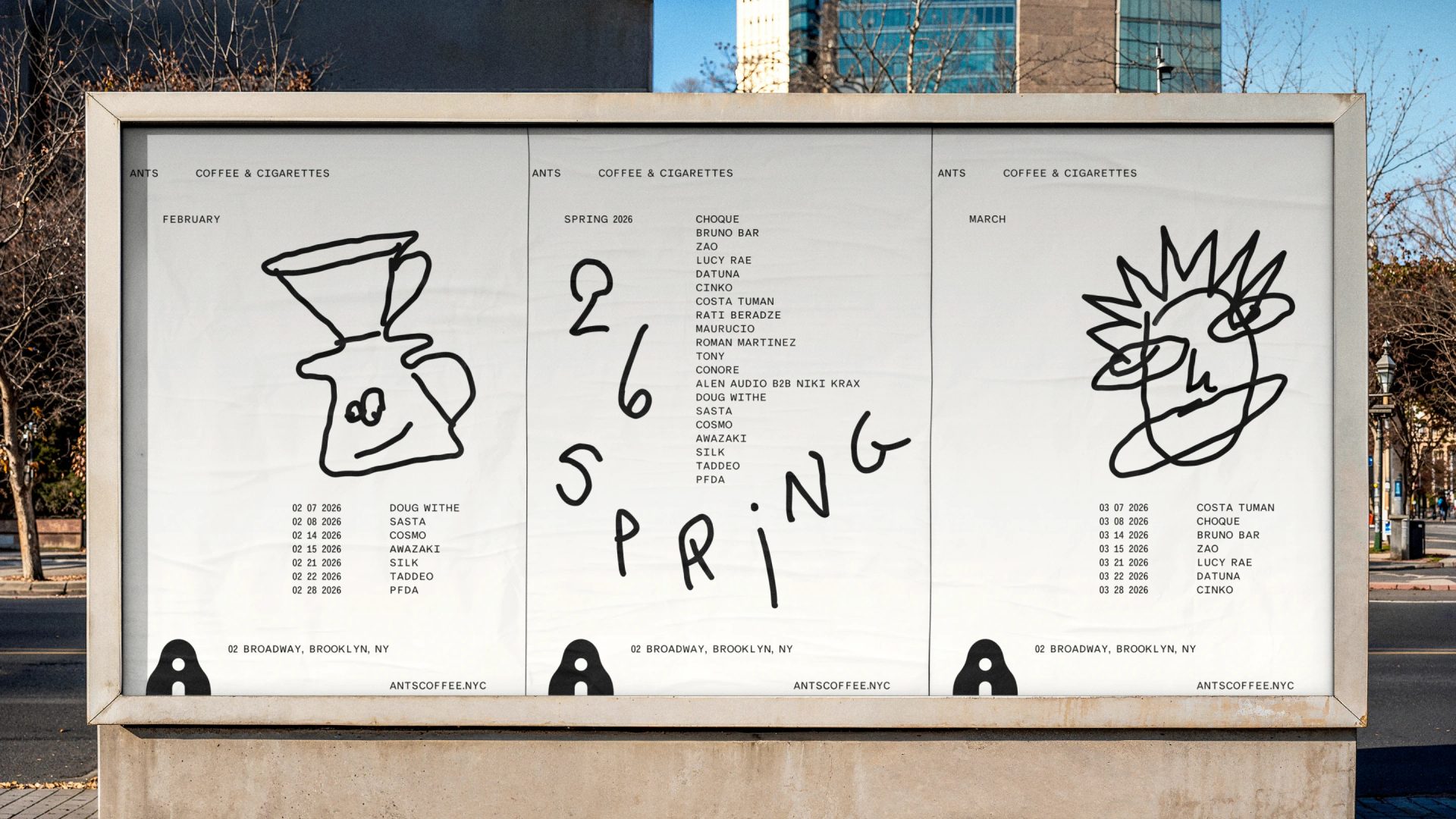
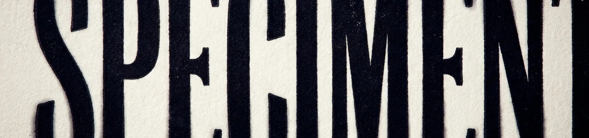
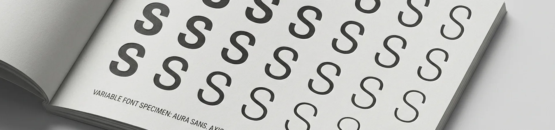
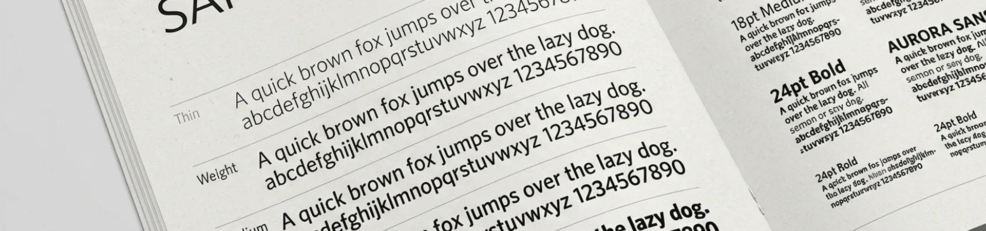
Ants Coffee started as a family project — sisters and their partners, with a decade in hospitality. They weren't building another neighborhood cafe. They were building something that functions like an anthill: people arrive separately, settle in, and without anyone organizing it, become part of something larger.
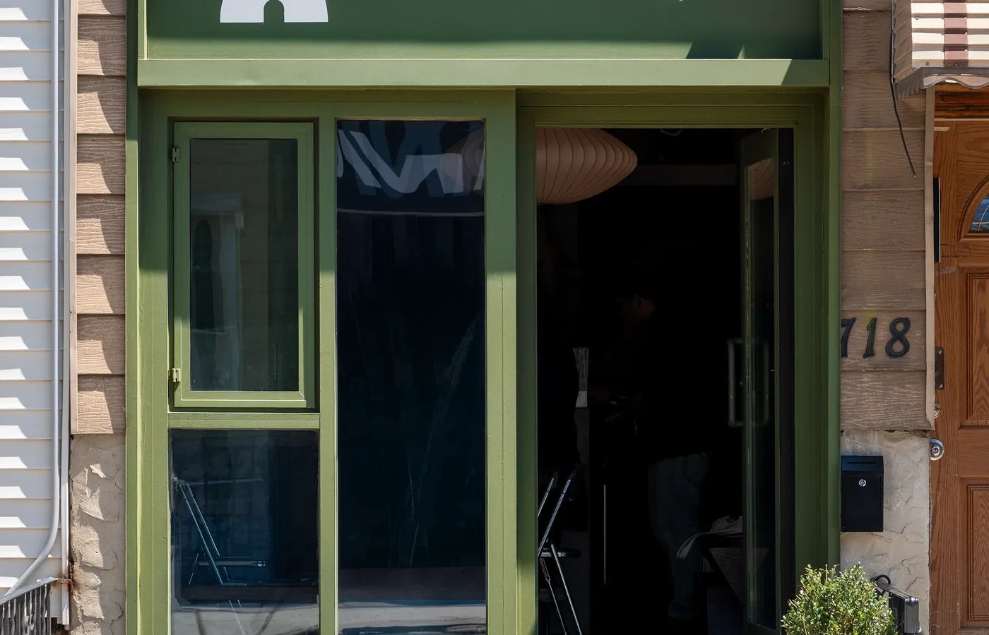
Ants Coffee: Tuman Studio's Self-Organizing Identity for a Brooklyn Café
A family-run Brooklyn café modeled on an anthill, with a visual identity that follows the same logic: self-organizing, imperfect, alive.
- brand identity
- ants coffee
- specialty coffee branding
- art direction
- Logo Design
- tuman studio
- tuman work
- graphic design
- typography
- Typographic Design
Full Credits
DesignerIrina Kosheleva
DesignerArtem Strizhkov
Browse more
The Edit
Curated work, sharp analysis, and one thing worth thinking about.
Free · Weekly · Unsubscribe anytime
Get The Edit — the week's best brand work