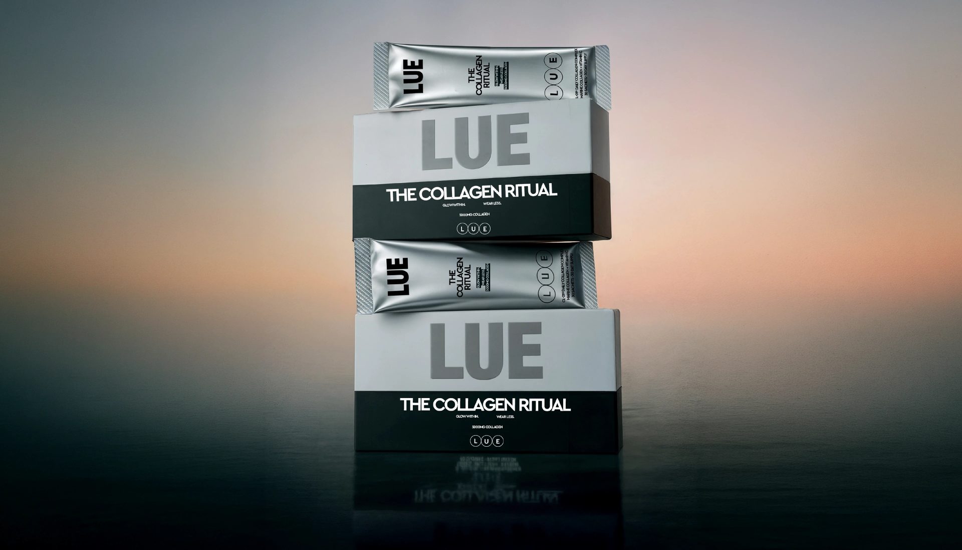
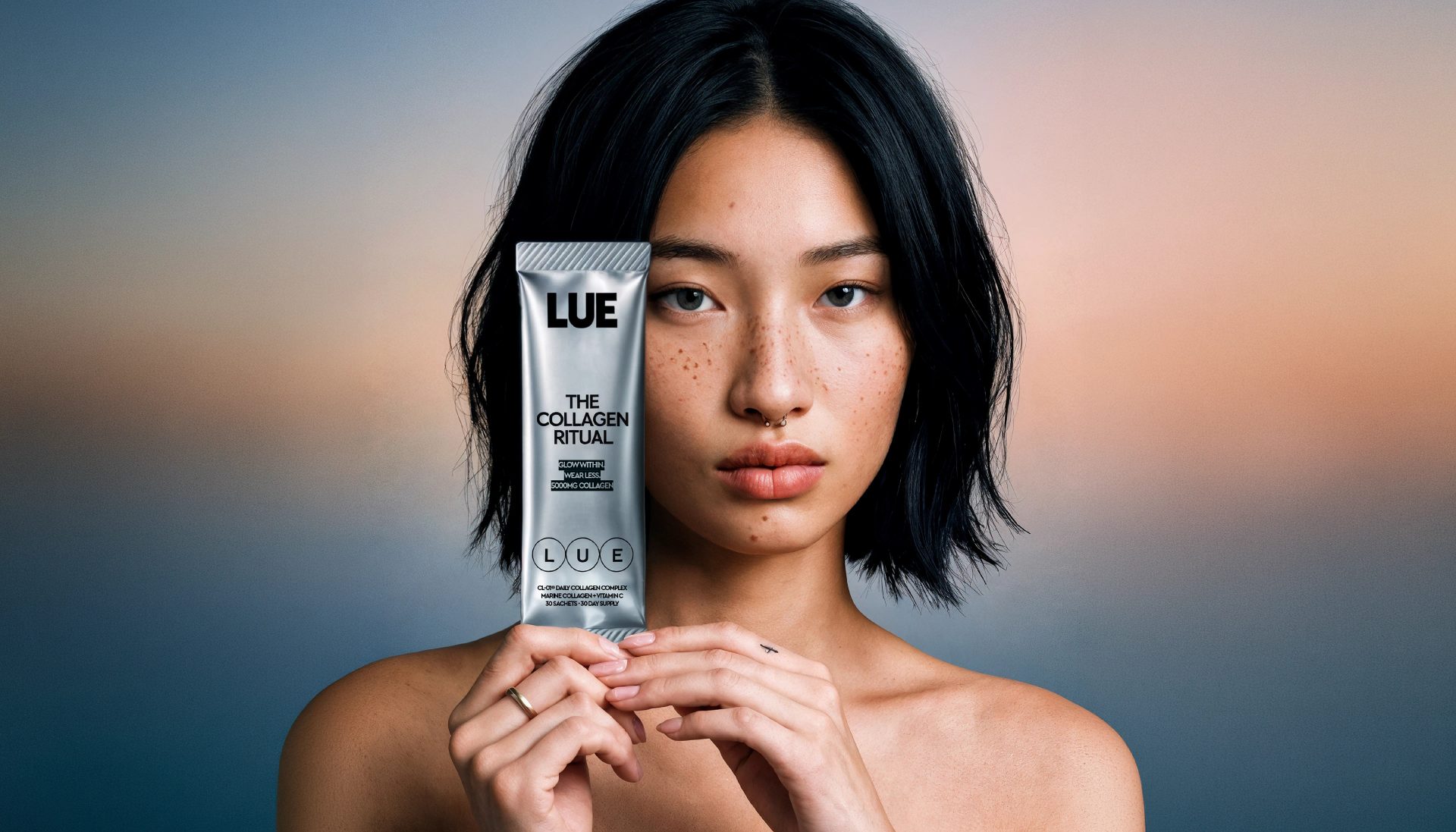
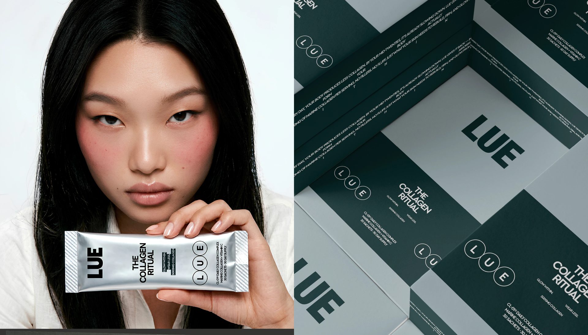
LUE is an internal glow-up. A collagen supplement brand built for the clean-girl era — people who want radiant skin without heavy makeup. The challenge was to create packaging that feels less like a supplement and more like a beauty essential.
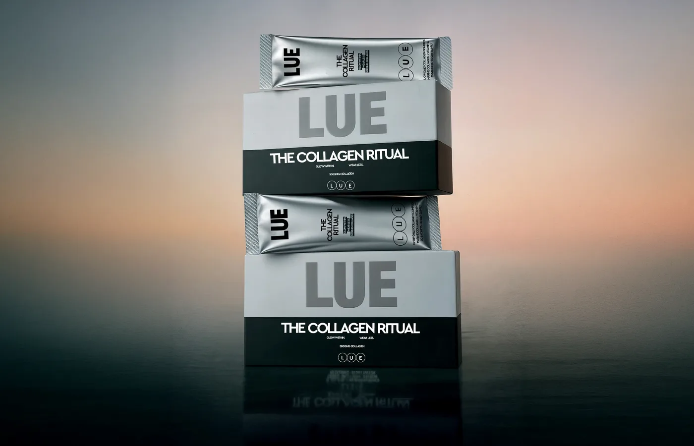
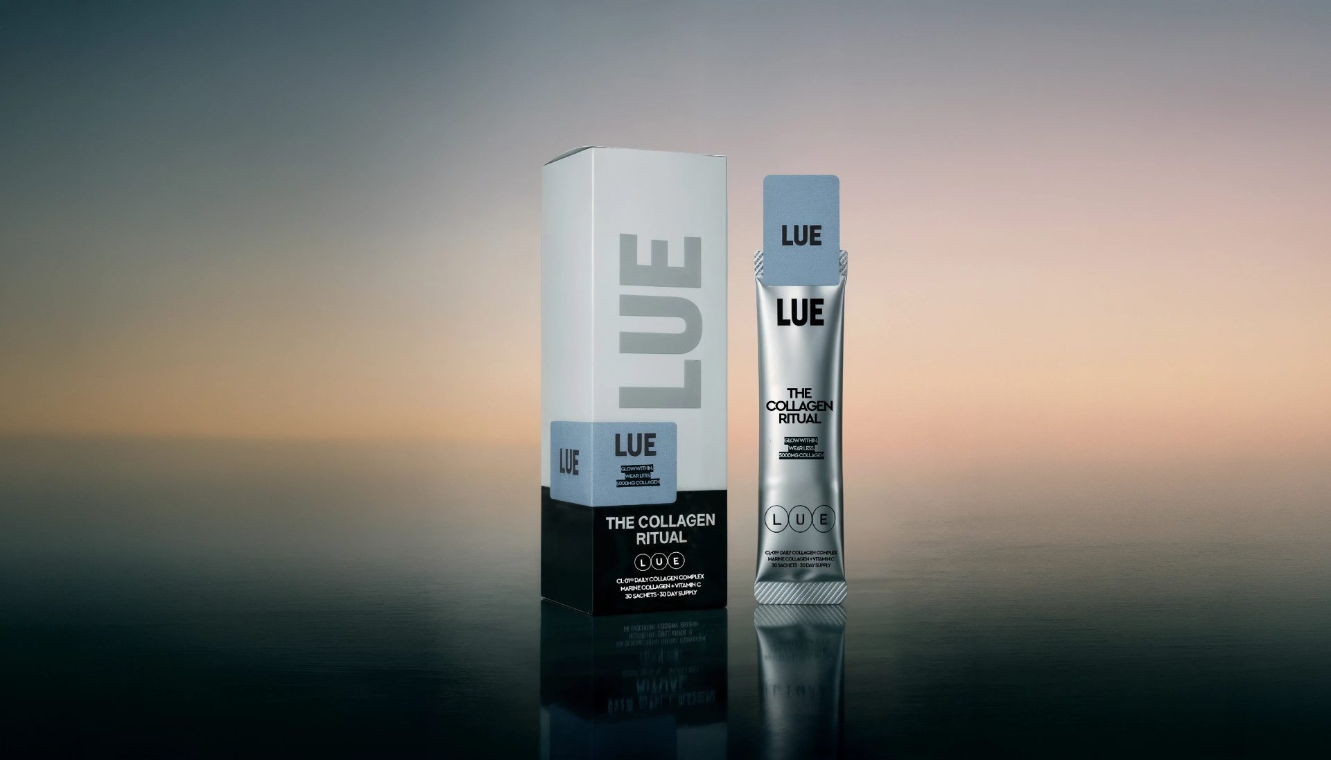
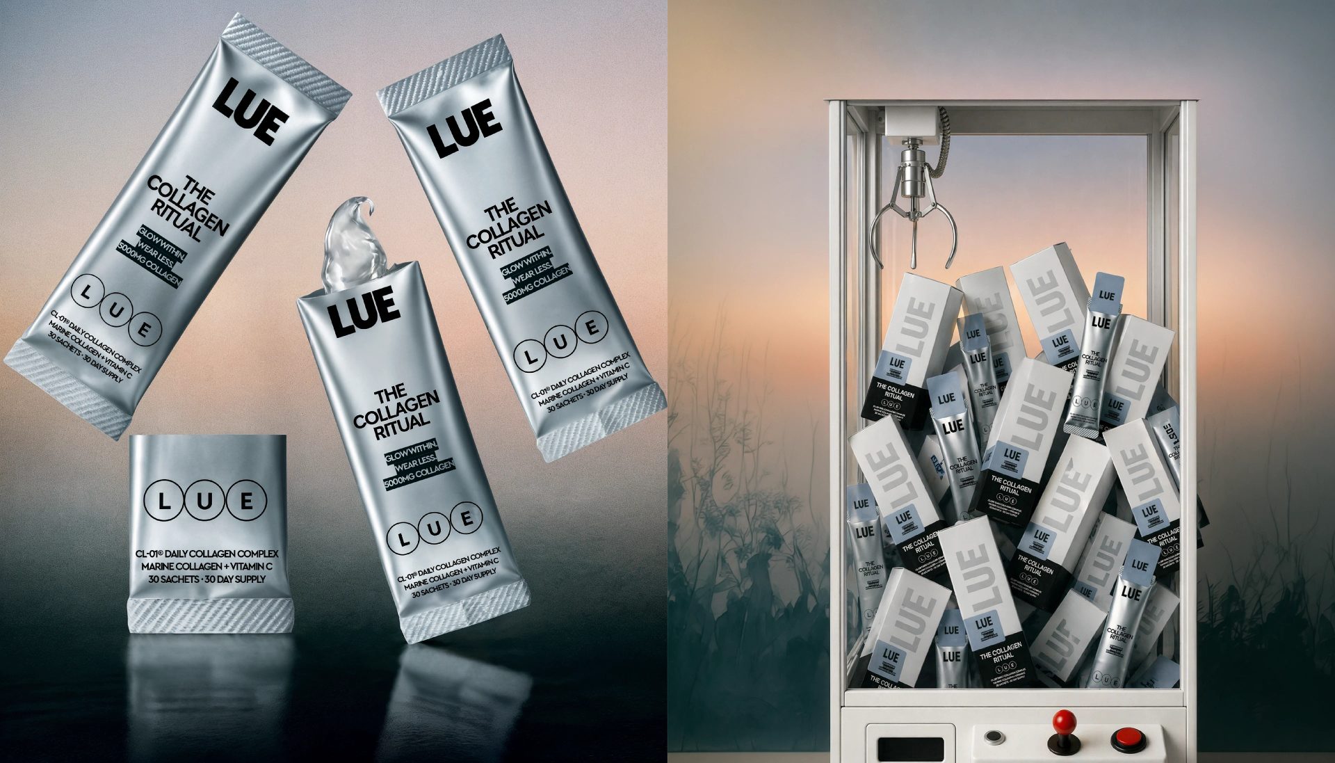
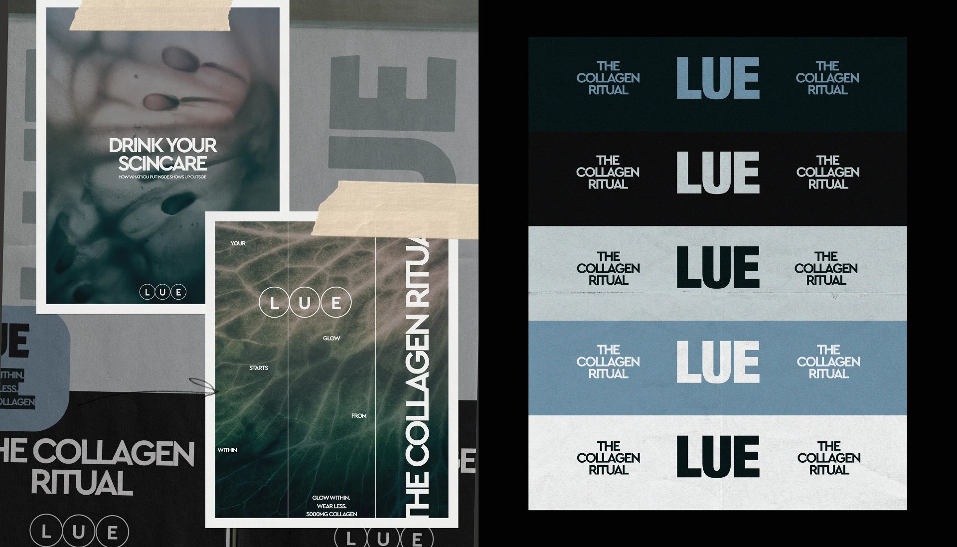
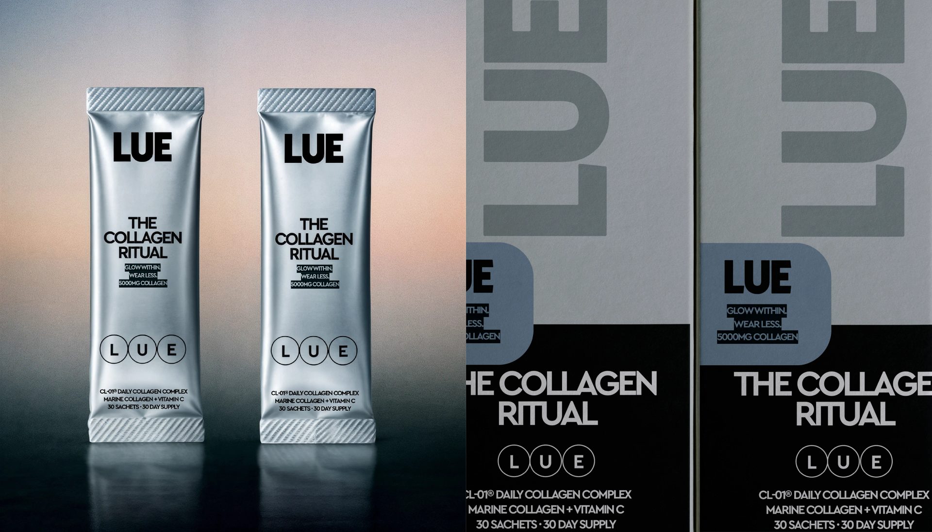
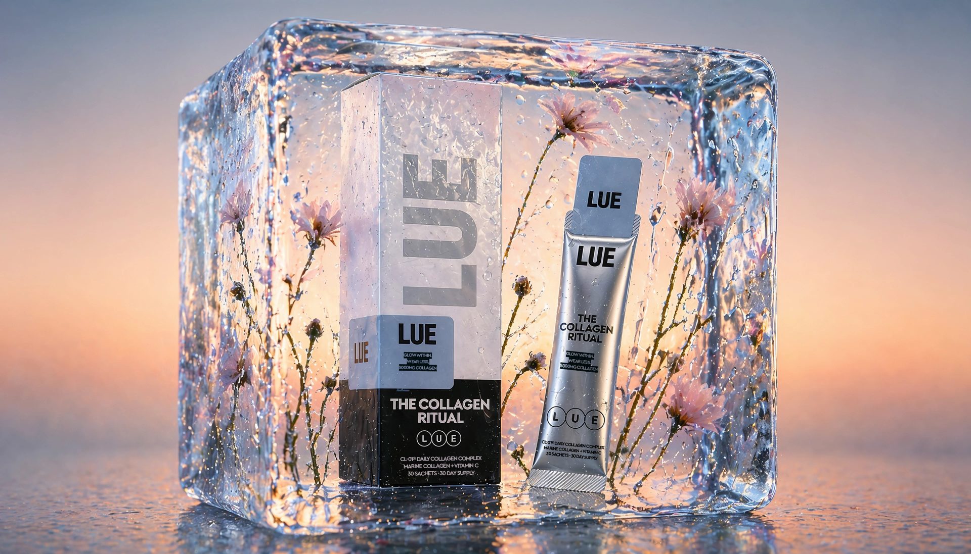
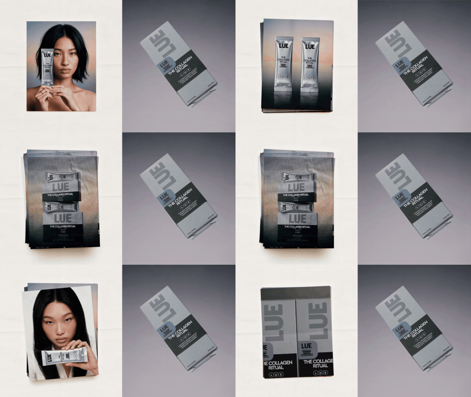
Clean whites, muted tones and a bold wordmark make a collagen supplement read less like a pill bottle and more like a beauty essential.
LUE is an internal glow-up. A collagen supplement brand built for the clean-girl era — people who want radiant skin without heavy makeup. The challenge was to create packaging that feels less like a supplement and more like a beauty essential.
Browse more
Curated work, sharp analysis, and one thing worth thinking about.
Free · Weekly · Unsubscribe anytime
Get The Edit — the week's best brand work
Direction
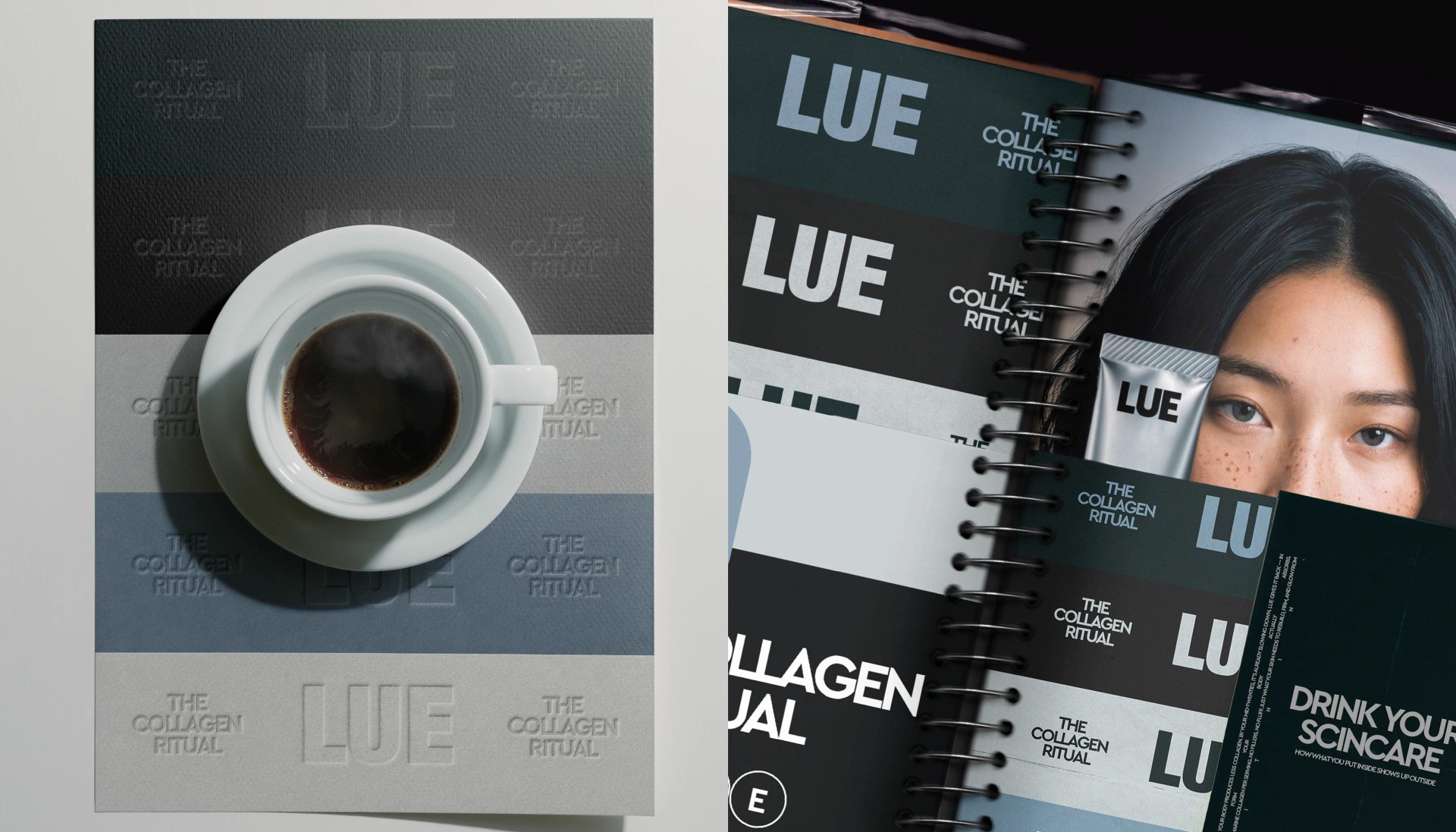
The design leans into a minimal, modern aesthetic — clean whites, muted tones, and bold typography. The name LUE takes center stage, making the packaging feel like something you’d leave on your vanity on purpose.
Open for freelance projects and creative collaborations
INSTAGRAM | withanastasii@gmail.com
Originally published on Behance by Anastasiia S.. View the original project.