There's a phrase that entered the startup vocabulary around 2015 and has quietly dominated consumer-facing brand decisions for a decade: the minimum viable brand. The idea was pragmatic. In the early stages of a startup, the brand work you do is probably wrong, because you don't yet know what the company is. The rational move is to ship the cheapest identity that won't actively hurt, use it to test the product, and invest in real brand work only after product-market fit.
This logic produced a generation of SaaS startups that all look the same: a Geist or Inter wordmark, a single saturated accent color, a minimalist illustration pack, maybe a Squarespace-era landing page. The minimum viable brand worked when it was a competitive differentiator — when most startups shipped terrible Bootstrap websites with their logo in Comic Sans, a tasteful minimal brand was a signal of serious craft.
That era is over. The minimum viable brand is no longer minimally viable. Here's why, and what's replacing it.
The Saturation Problem
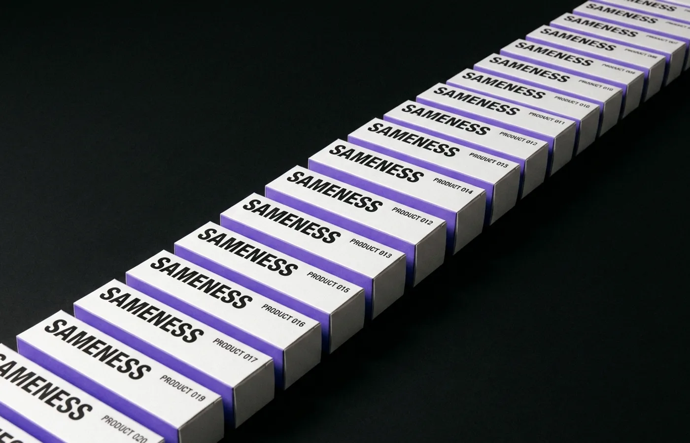
When every Series A startup ships a near-identical brand system, the signal that brand system was sending — "we're serious, we have taste" — is gone. A monospace logo on a black-and-violet marketing site in 2016 communicated discernment. The same system in 2026 communicates "we hired a designer off a template marketplace."
The category's visual consensus has converged so tightly that a consumer — even a sophisticated one — has no way to distinguish between twenty startups competing for the same budget. The brand stops doing the thing it was hired to do: make this startup distinguishable from that one.