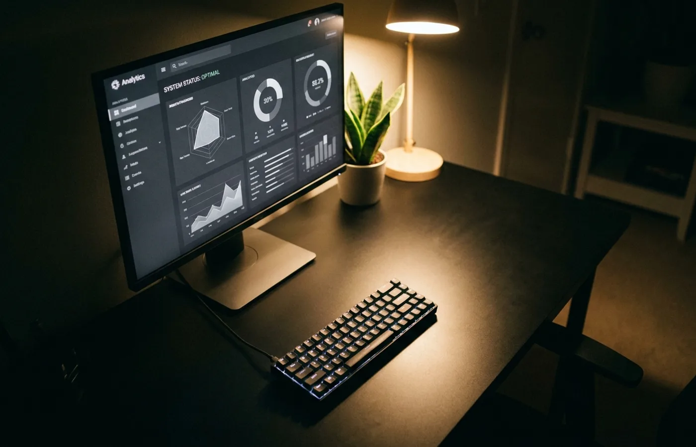
Spend an hour browsing the marketing sites for developer-facing companies released in the last three years — Planetscale, Turso, Neon, Upstash, Trigger, Resend, Railway, Convex, Cal.com, Linear — and you will notice the same visual signature.
Near-black backgrounds. A single saturated accent color, usually violet, cyan, or electric green. Mono or tight grotesque typography at a generous line-height. Geometric SVG illustrations rendered in flat line-work rather than full-color illustration. Aggressive whitespace. A hero video that's mostly a dashboard screen capture with subtle motion. A pricing table with bold numbers and parsimonious copy.
This visual language has a name in the industry, half-jokingly: the Vercel aesthetic. It's not an invention of Vercel alone — it owes as much to Linear, to the Rauno Freiberg UI movement, to the JetBrains and Figma interfaces that preceded it — but Vercel's hosting platform, deployed across approximately every indie developer's weekend project between 2020 and 2024, standardized the look across the entire category.
The Ingredients
Strip the aesthetic down to its component parts and it's remarkably formulaic:
- Background: true black or near-black (#0a0a0a). Never pure white at rest.