Branding by Industry
Beauty Branding
Beauty is where brand design moves fastest. Codes that felt premium two years ago — minimal sans, blush tones, apothecary restraint — get absorbed and commodified in months, forcing brands to keep sharpening their visual position. The category is a live feed of where consumer design is heading.
This collection tracks the beauty branding worth studying: identities that survived the minimalist wave, packaging systems built for both the shelf and the feed, and rebrands that repositioned entire companies. Each case study looks at the decision behind the surface.
What beauty branding actually covers
Beauty branding is the identity system a beauty brand competes on: the name and wordmark, the typography and color that carry them, the packaging architecture across a growing product line, the art direction that feeds retail and social at once, and the voice on everything from an ingredient list to a founder note. Beauty brand design is judged in two places simultaneously — the shelf and the feed — and the identities that win are engineered for both.
The category also commodifies its own codes faster than any other. Minimal sans, blush tones, apothecary restraint: each felt premium until everyone had it. That churn is why beauty product branding rewards a sharper strategic position than most categories — an identity built on borrowed codes depreciates on contact with the market.
What the strongest beauty brand identities share
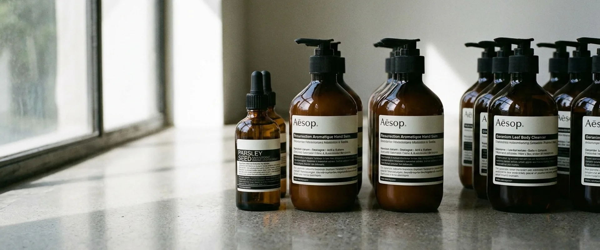
Three patterns repeat across the beauty work we have reviewed. First, restraint as a signature, not a default: Aesop turned saying less into the most recognizable position in the category — and kept it intact through an acquisition, which is the real test of a system. Second, form as brand: Sundae’s jellybean-shaped fragrance line makes the pack itself the primary recognition device — the silhouette does the work a wordmark usually carries, consistent with what our State of Brand Design report measured across categories. Third, the community caveat: Glossier built an identity on its audience, and its trajectory shows both the power of that asset and what happens to recognition when a brand scales past it.
The common thread is ownership. Whether the asset is a material palette, a bottle silhouette, or a way of speaking, the strongest beauty identities own something competitors cannot copy without being caught copying.
How to study the examples on this page
Read each case for the position first — clinical or sensorial, mass or cult, loud or restrained — and then for how the identity argues it at every touchpoint. Beauty overlaps heavily with packaging craft, so pair this page with our packaging design collection; for the analysis method itself, the brand case study hub breaks down how we review identity work.
Built a beauty brand that belongs here?
We review every submission. If your work meets the standard, we will feature it.
Submit your work