article
Work, articles, studios and categories across the archive.
project
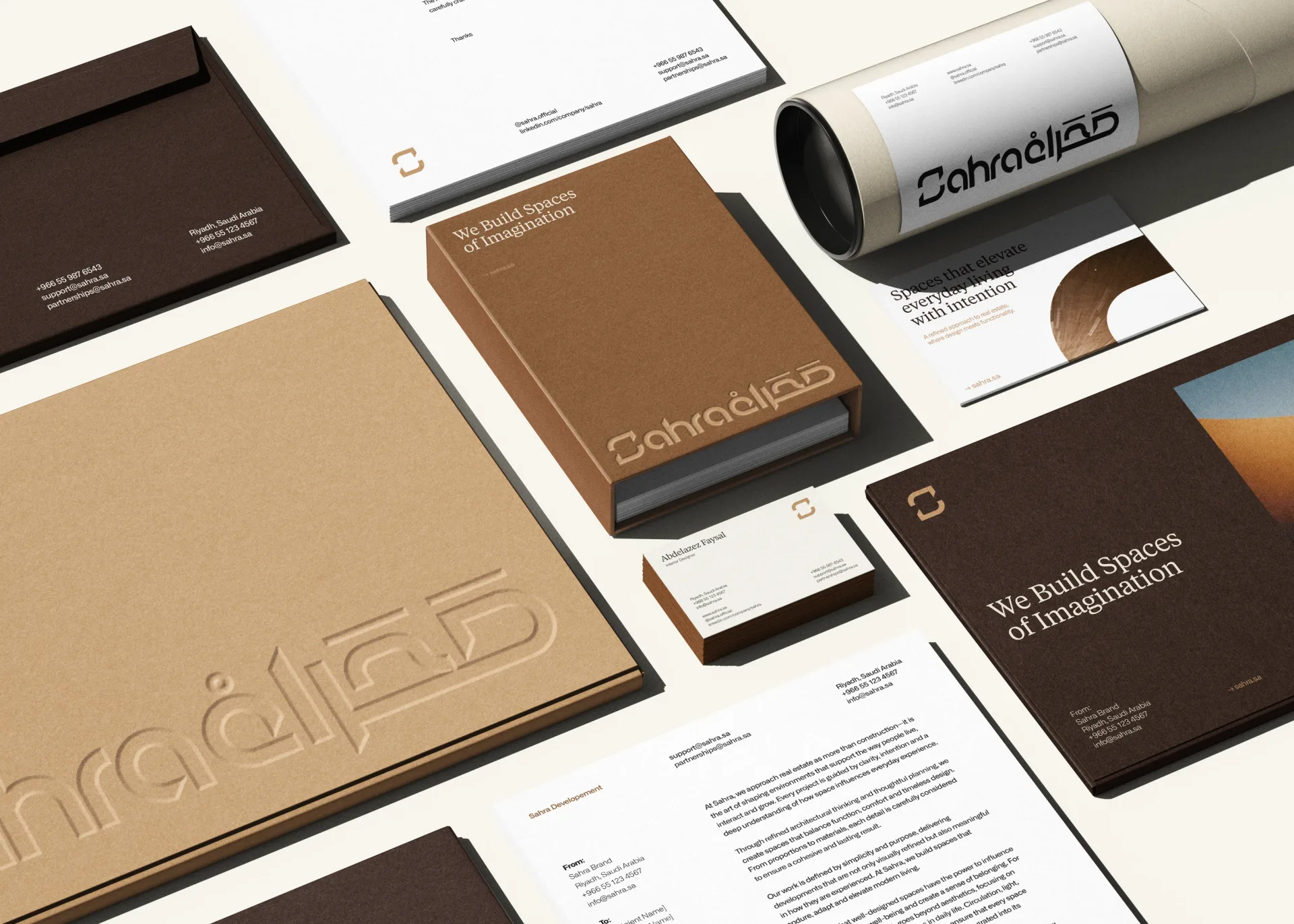
…where people can live, connect, and enjoy a unique balance between nature, comfort, and modern lifestyle. Scope of Work → Visual Direction & Project management → Agency: Fast Studio…
project
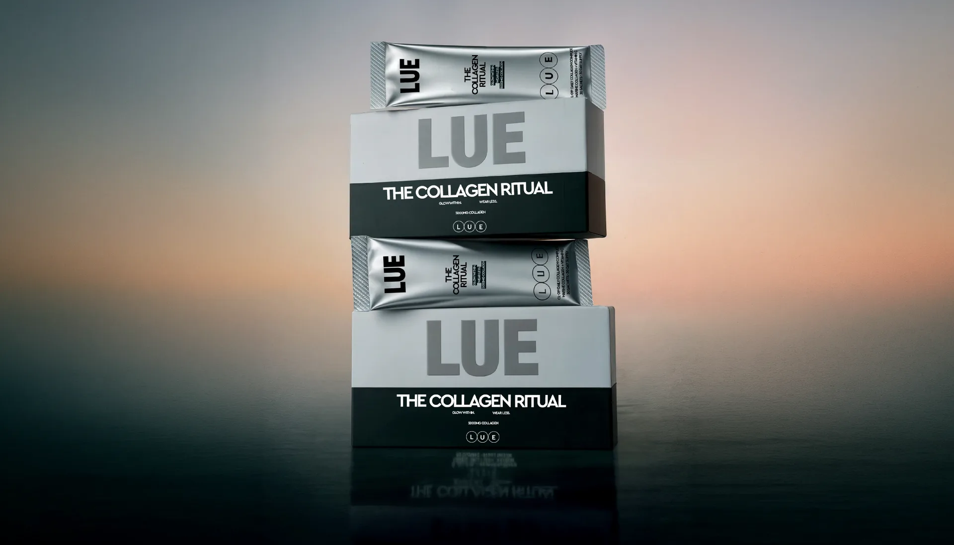
…supplement and more like a beauty essential. Direction The design leans into a minimal, modern aesthetic — clean whites, muted tones, and bold typography. The name LUE takes center stage…
project
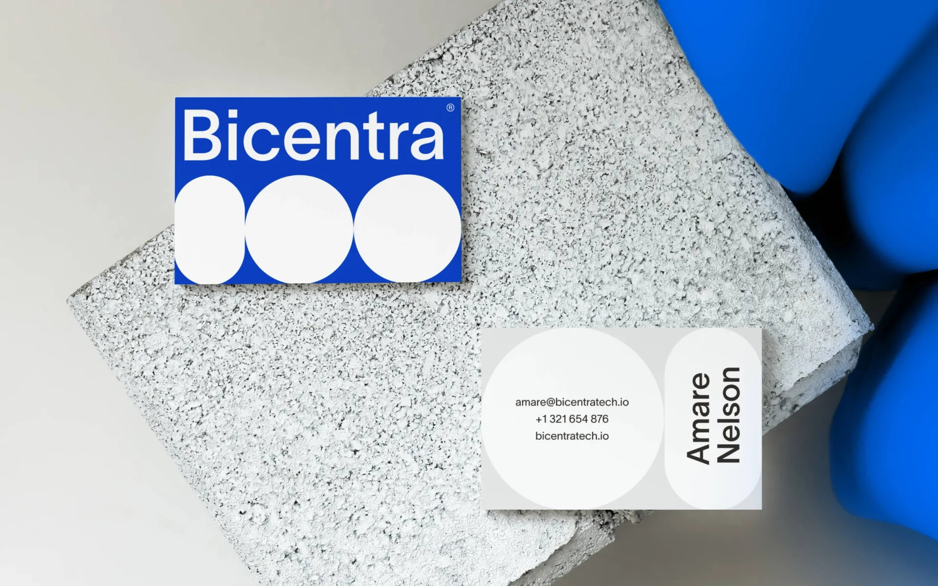
…s core values of precision, trust, scientific rigor, and calm confidence—while feeling modern, human, and built for clinical impact. PROJECT OVERVIEW: Bicentra Biotech is advancing…
project
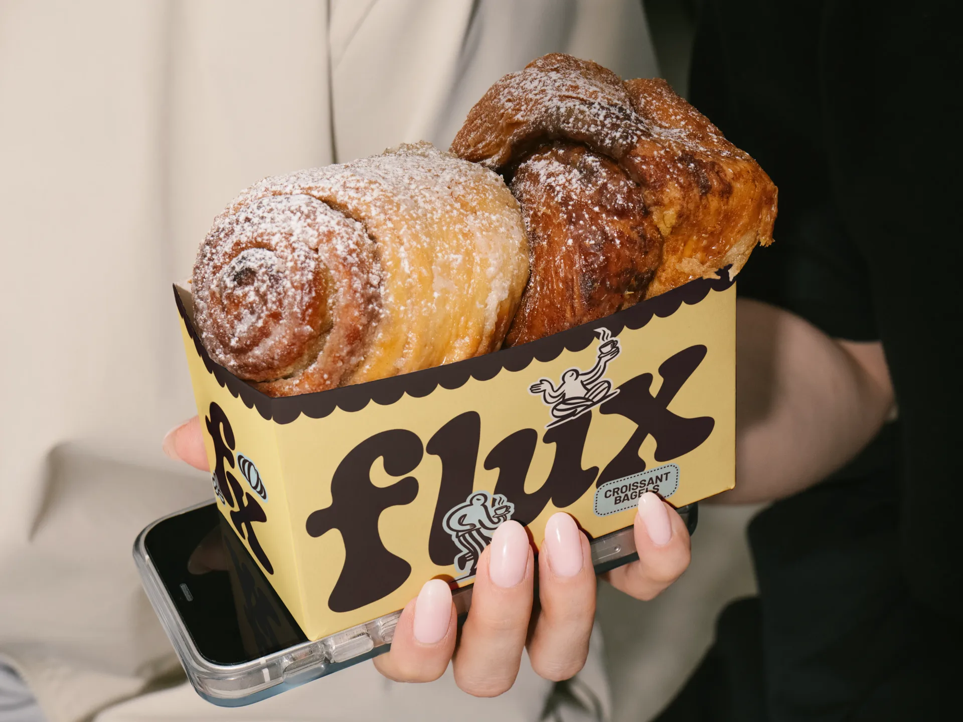
…designed to feel nostalgic yet fresh, bringing the comfort of a familiar café in a playful, modern way. BRANDING 2026 INSTAGRAM : @ARTSBYEMDEE
project
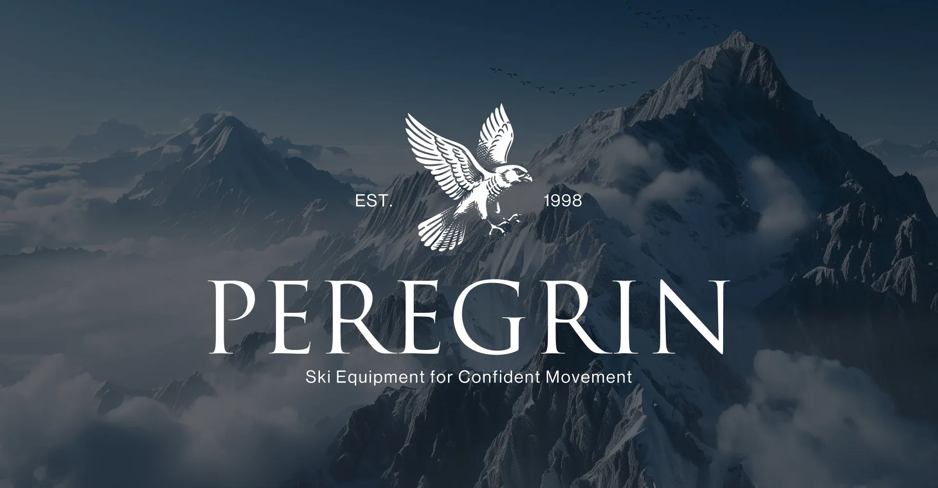
…style to convey naturalness, craftsmanship, and a sense of brand heritage. Combined with modern typography, the identity creates a balance between classic aesthetics and technological…
project
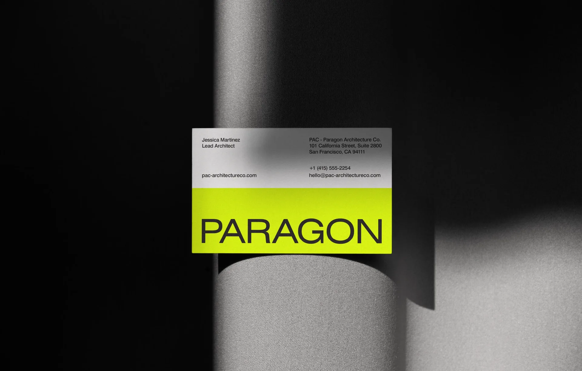
…identity that truly reflects PAC's vision and expertise. The new identity features a sleek, modern logo, a sophisticated color palette, and contemporary typography. The branding elements…

project
…iconography that communicates real benefits without the noise. The layout is clinical but soft, modern but restrained — designed to feel reliable on a shelf or in a scroll. Everything is built…
project
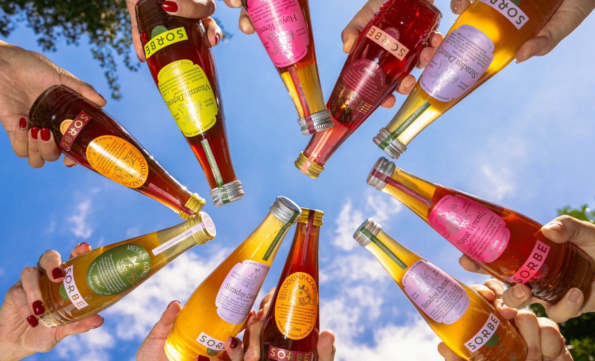
…stamps and seals, give the brand a distinctive and lively presence. The line “Taste of Modern Sherbet” captures Sorbe’s approach simply: a familiar drink, reintroduced for today. Across…
project
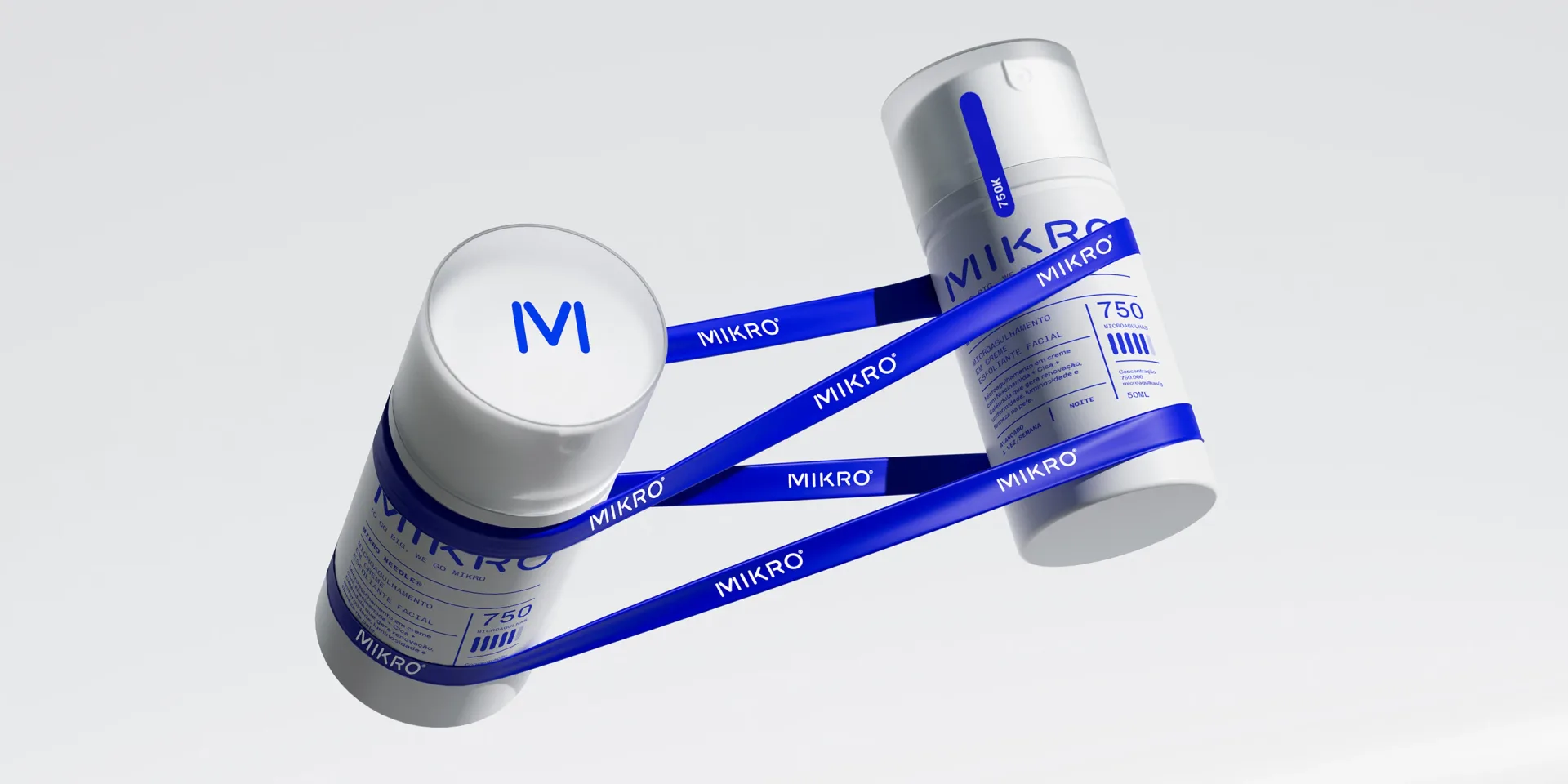
…By reimagining them into a proprietary design element, Mikro crafted a logo that is both modern and ownable. The soft, rounded edges defy the rigid, antiseptic look of competitors, making…
project
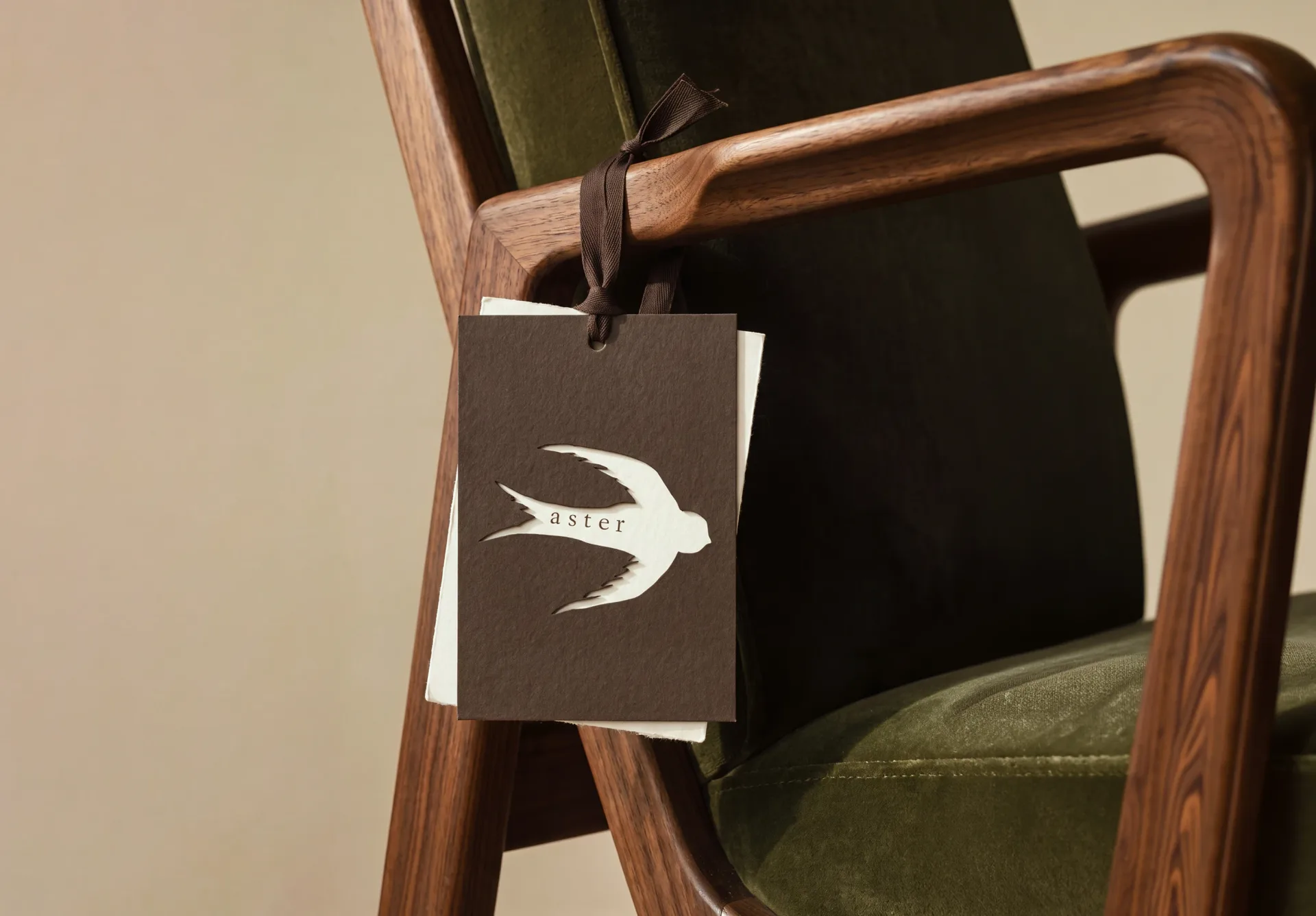
…luxury furniture house. ASTER is a furniture and home décor brand created to explore what a modern luxury furniture house could feel like beyond aesthetics alone. The goal of this project…

article
…incrementally over decades, each iteration modest enough to preserve recognition while quietly modernising the production values. The straw-in-orange motif, in particular, had achieved something…
project
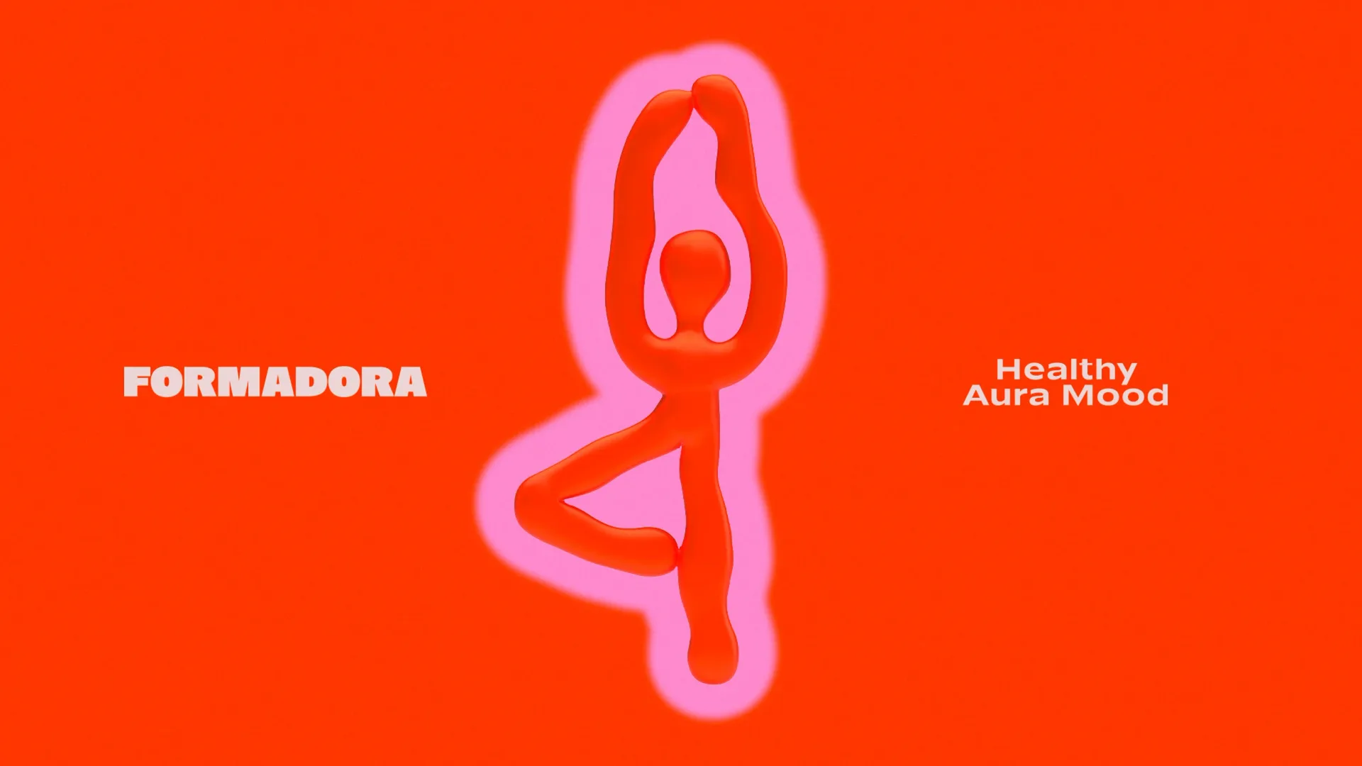
FORMADORA is a modern family-oriented wellness studio designed to transform self-care into a joyful, sustainable…
project
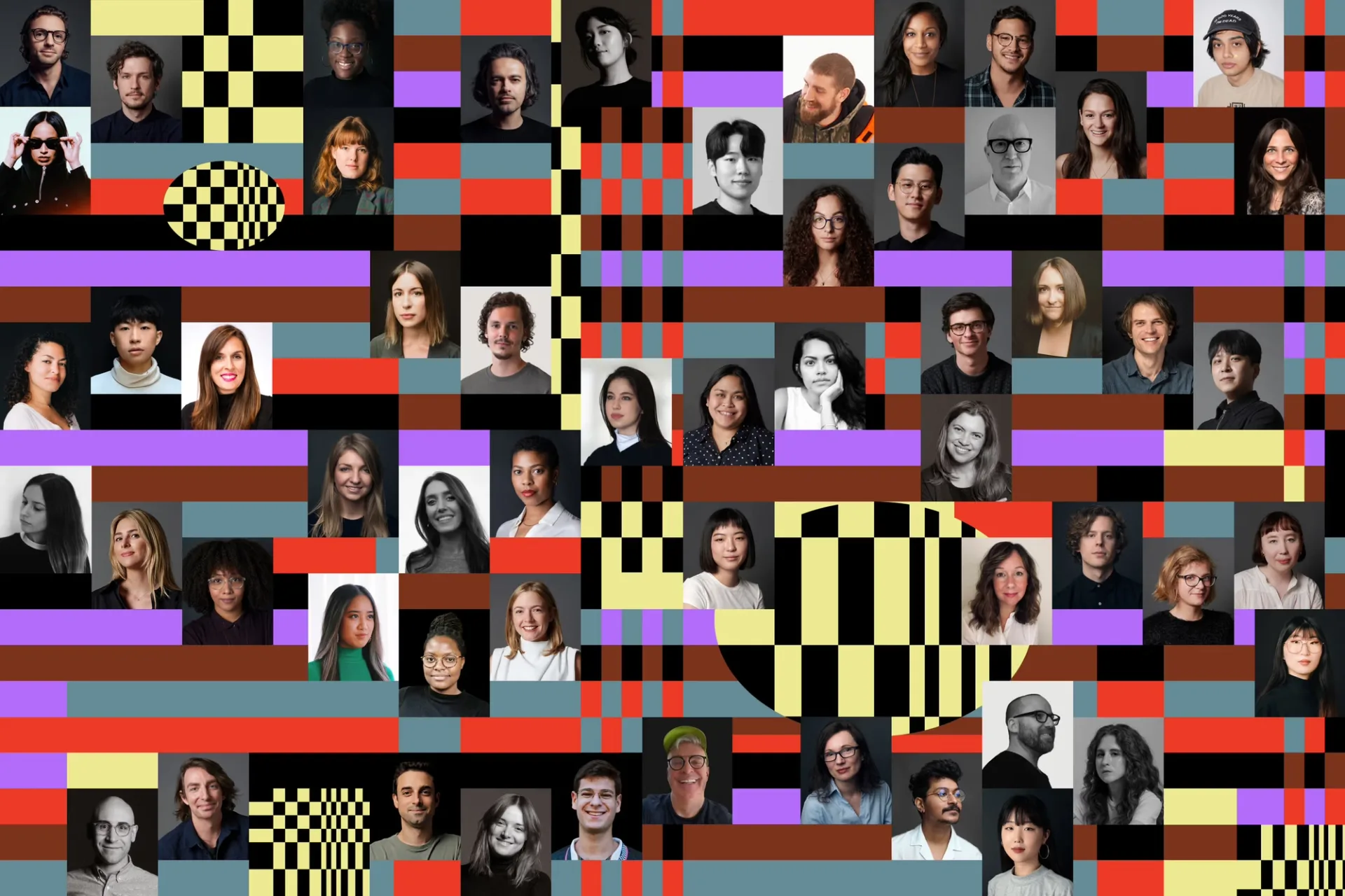
…built it. Collins' solution demonstrated their signature approach. Rather than simply modernising the logo or refreshing the colour palette, they built an identity system rooted in the…
project
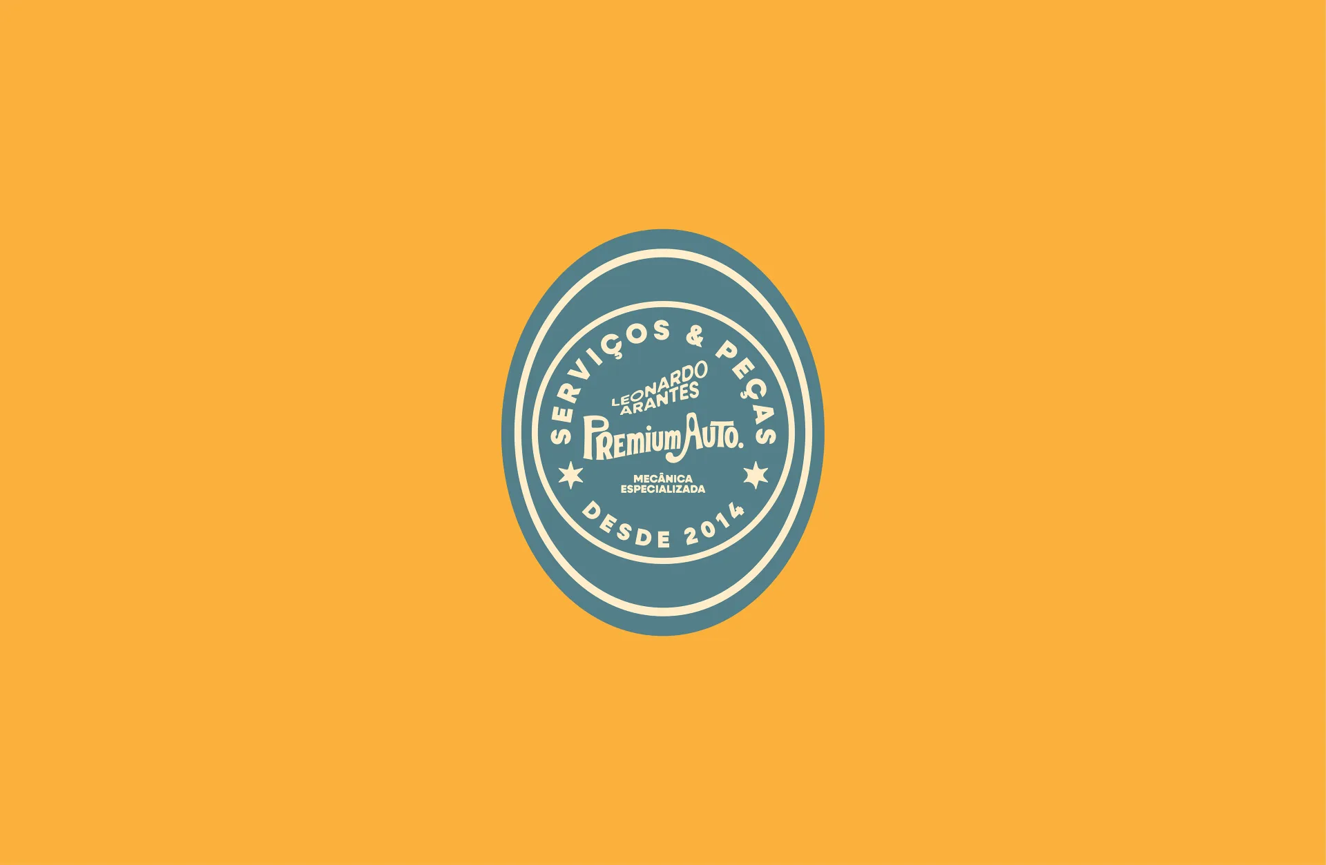
…condition, worry-free. The tradition and expertise built over the years come together with a modern approach, reflecting the essence of an auto repair shop: a timeless craft that evolves…
project
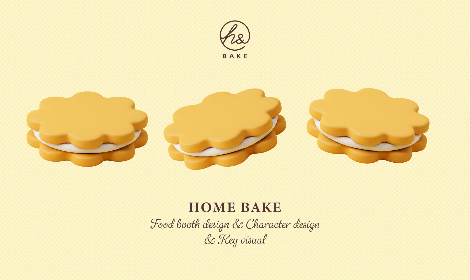
…characters play a pivotal role in the exhibition’s visuals, providing the brand with a modern, healing, and highly recognizable professional aesthetic through their three-dimensional…
article
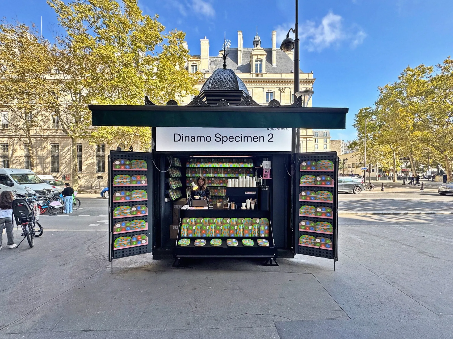
…geometric purity: no icon required. Vercel, the deployment platform behind much of the modern web, leads with typographic confidence. Arc, the browser that briefly made everyone reconsider…
project
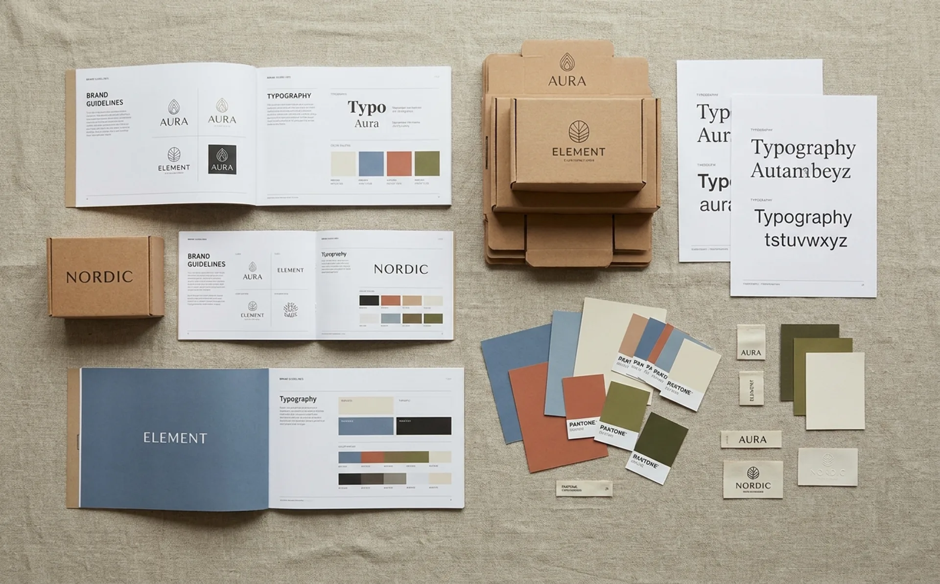
…ABC Whyte shows up in editorial layouts and app interfaces where the brief was clearly "modern but not cold, distinctive but not loud." These are typefaces that do their work by refusing…
ranking
…fermentation brand whose packaging integrates traditional Joseon-era color palettes with modern structural design shows a fluency in both cultural specificity and international design…
ranking
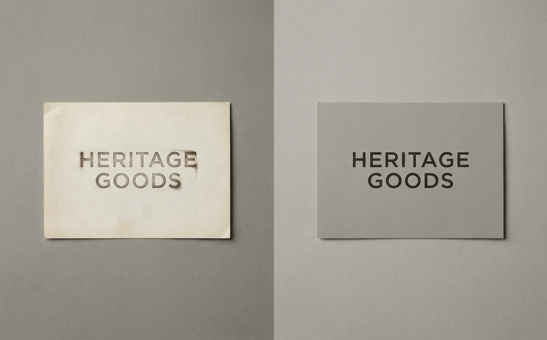
…product doesn't catch up in time. 24. Air France Distinguishing move: Typographic modernization inside a protected color and mark system. Steal: the surgical approach, change the treatment…
ranking
…seahorse). The failures either kept the wrong anchor or killed the right one. Distance, not modernity. The strongest entries read as distant from the old brand rather than modern. Modernity…
ranking
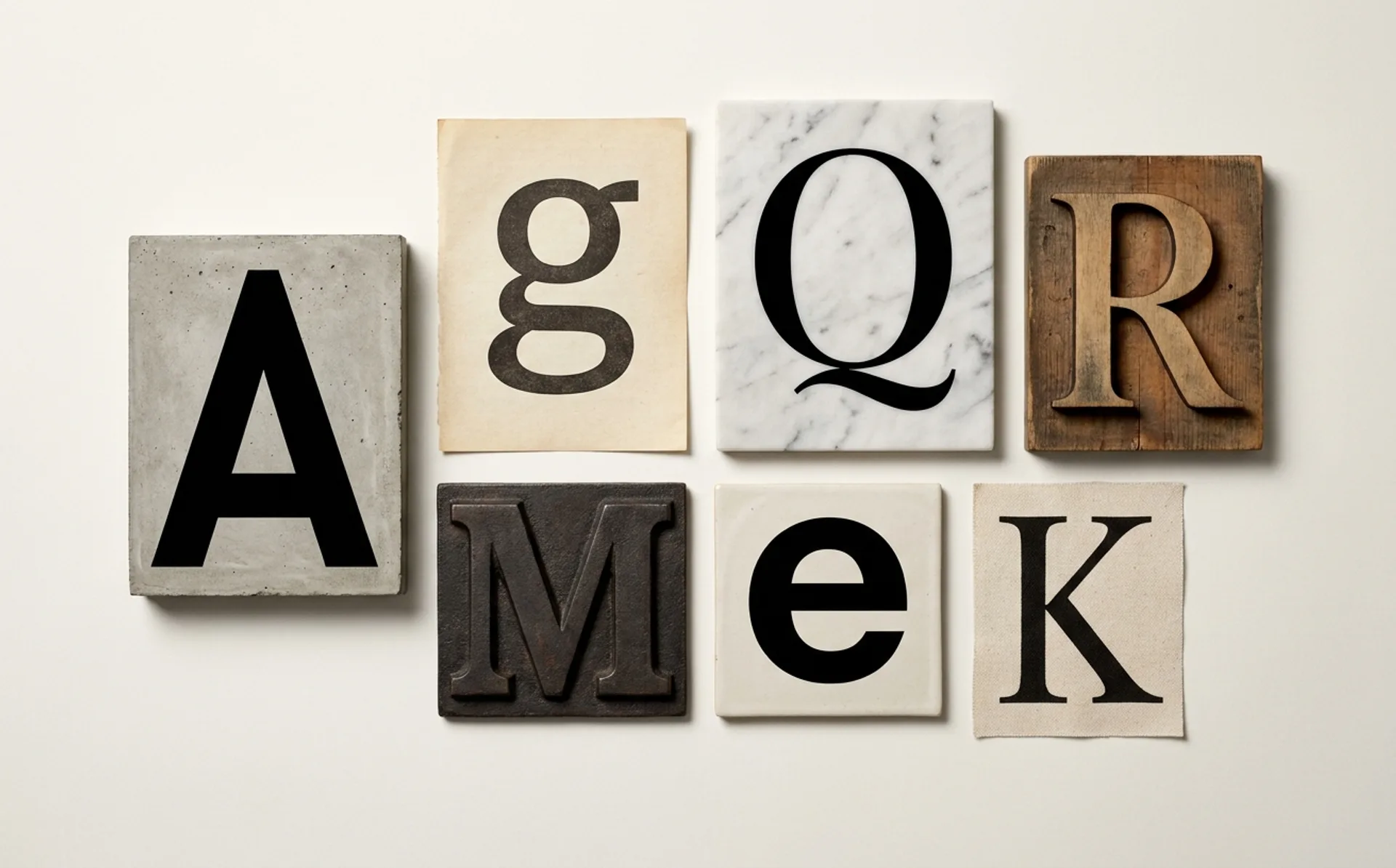
…The typeface became shorthand for a particular brand posture: serious but not corporate, modern but not trendy. Its multiple widths, from compressed to extended, gave brand teams unusual…
ranking
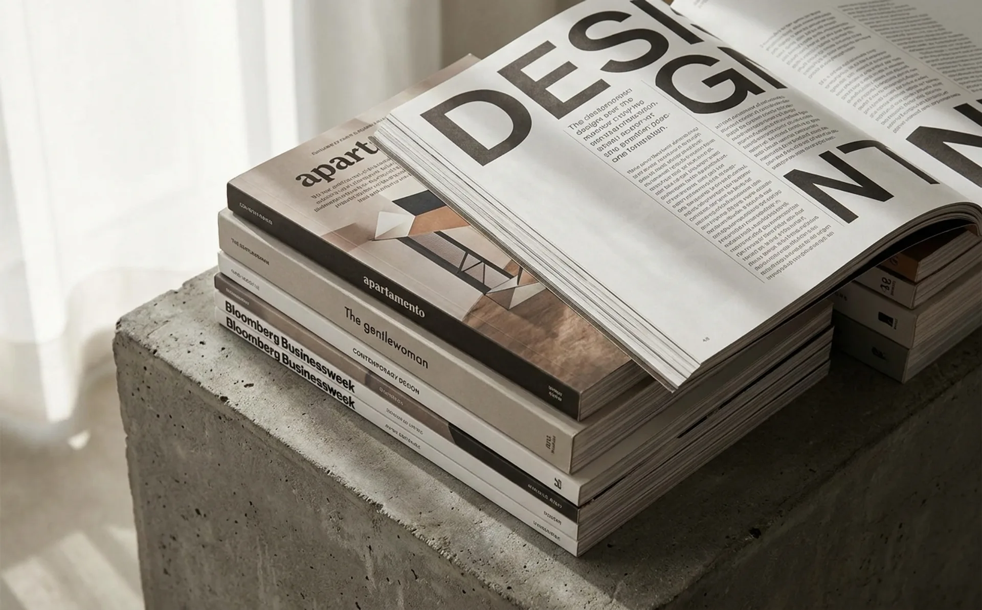
…uncomfortably between editorial and political-cartoon. Study the magazine's refusal to modernize the body column. 3. The Gentlewoman Penny Martin's editorial direction is the reference…
article
…nineteenth-century letterpress shop. The luxury world, it seemed, had read the brief on modern brand identity, and politely declined. This is not nostalgia. Or rather, it is not only…
article
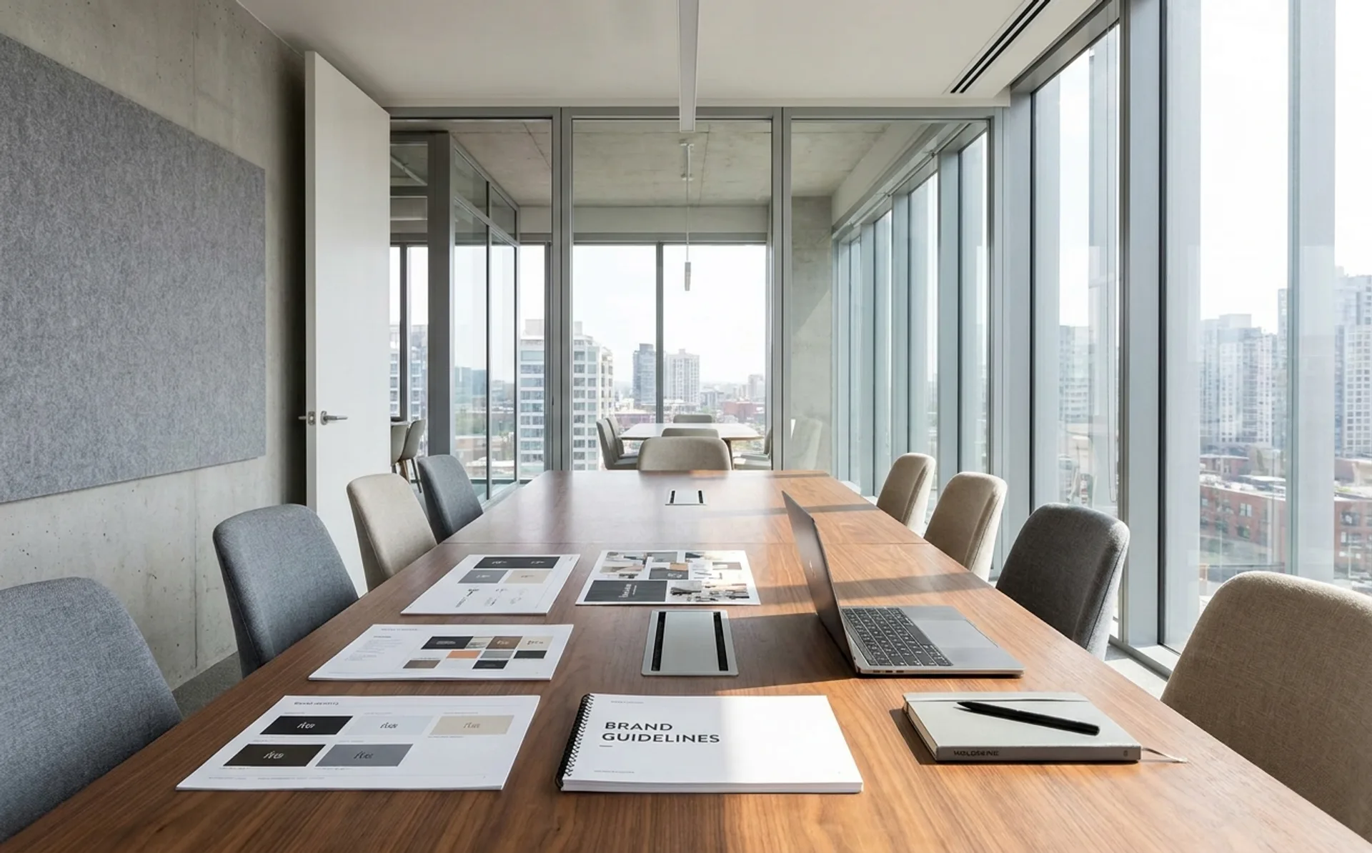
…manager" once described a mid-level marketing function. At Procter & Gamble, where the modern brand management system was formalised in the 1930s, the brand manager was responsible…
article
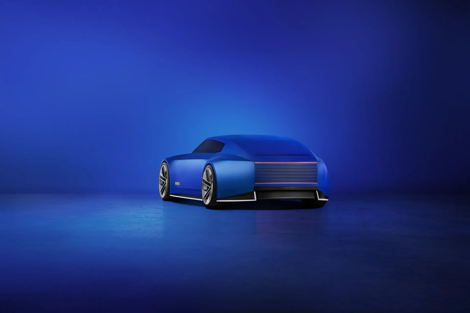
…pink. Deep yellow. Electric blue. The palette was described internally as "exuberant modernism," and it drew directly from contemporary art and fashion rather than automotive convention…