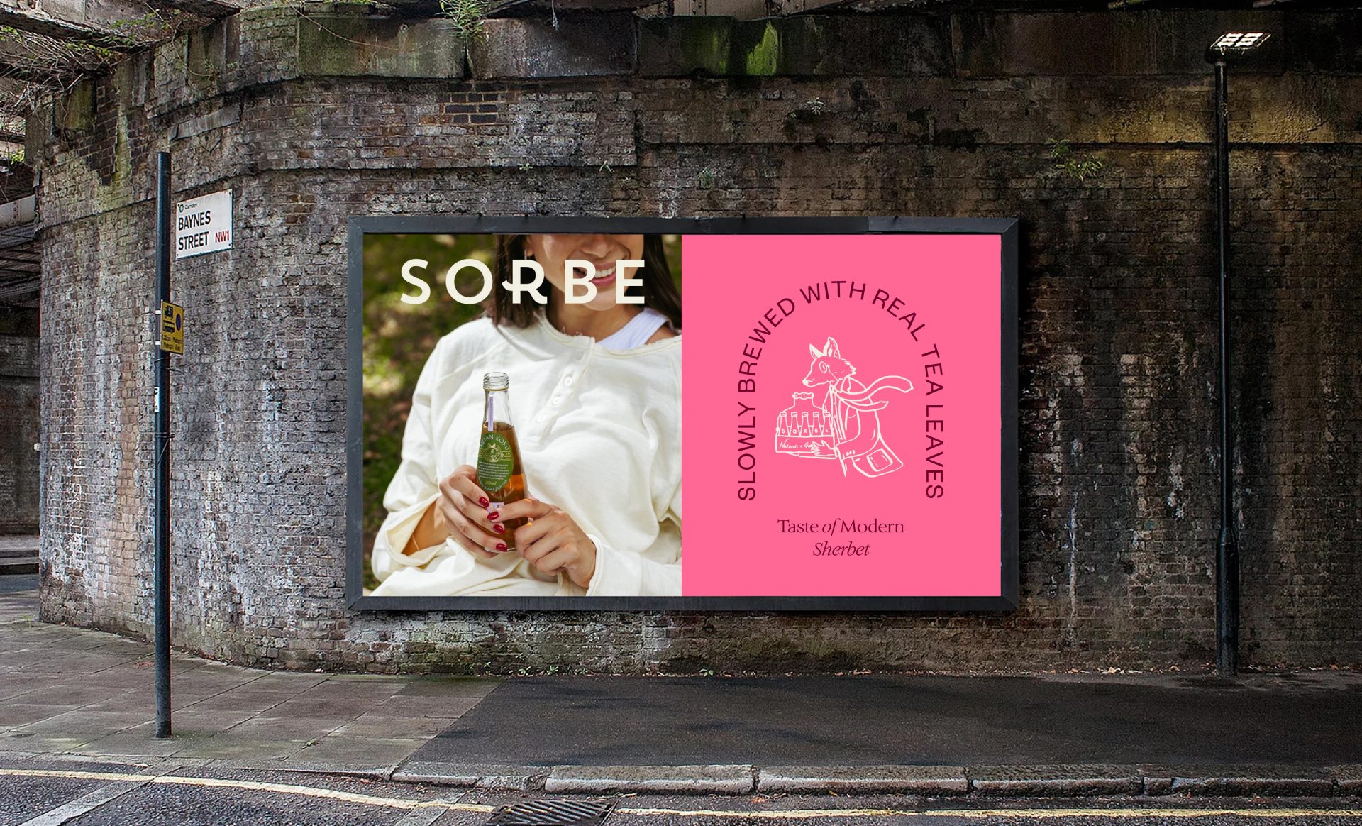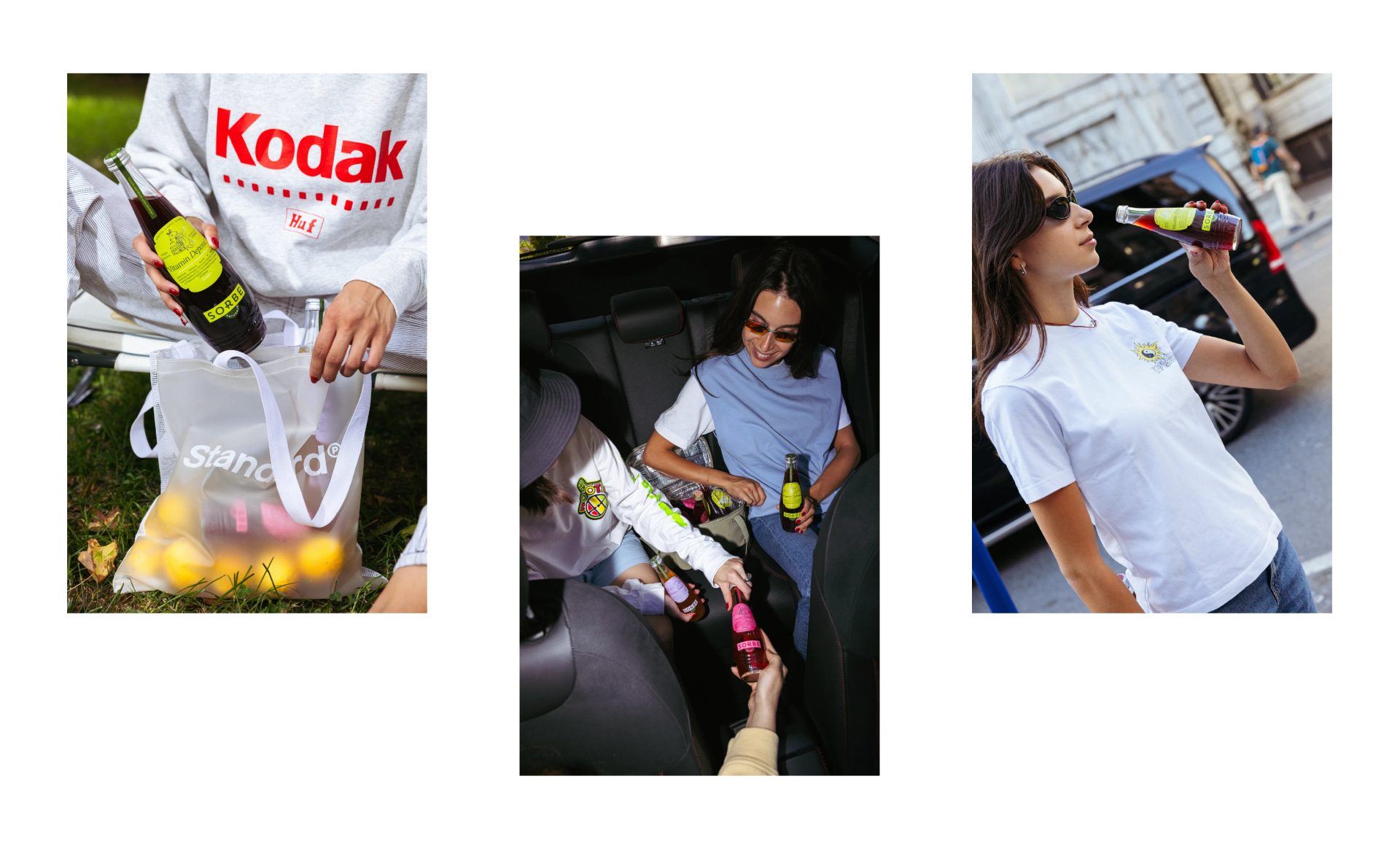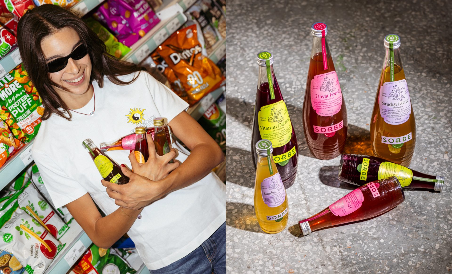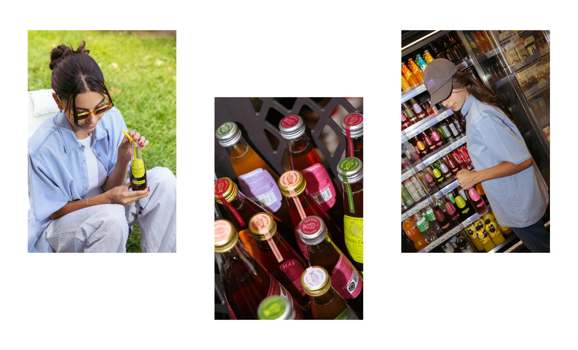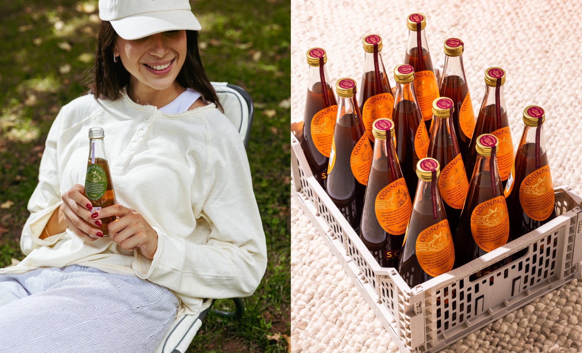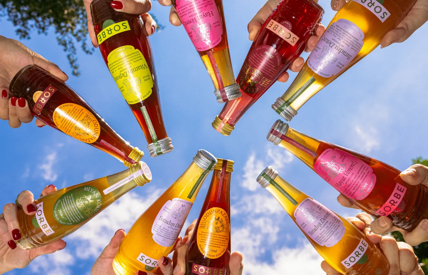
Sorbe grew from a collection of traditional sherbet recipes, passed down through a long-standing family restaurant. Working with the next generation, we shaped these recipes into a contemporary drinks brand one that respects its cultural roots without feeling nostalgic or overly traditional.
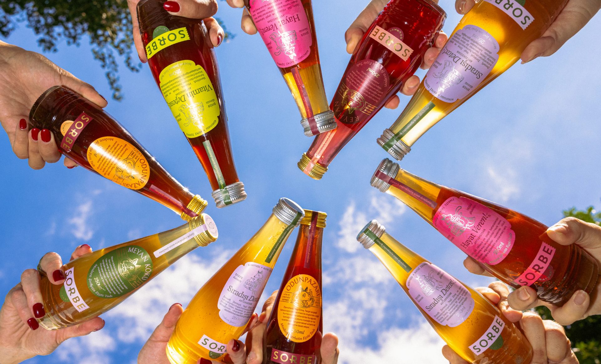
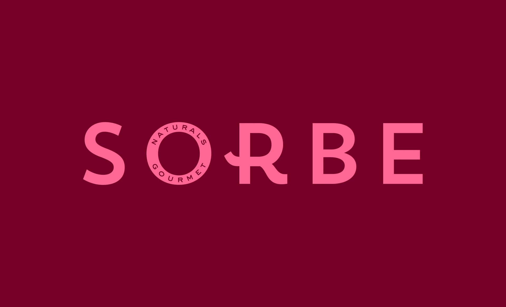
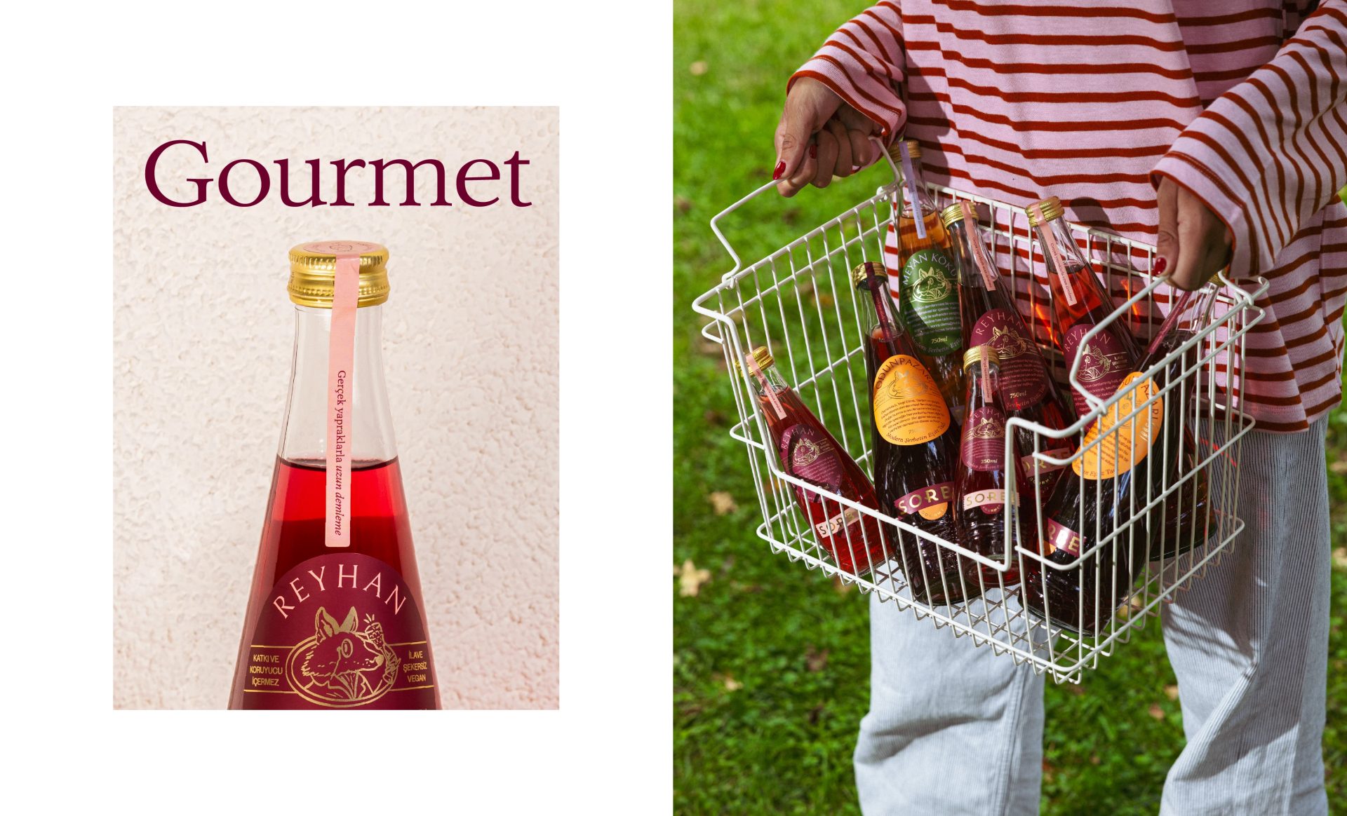
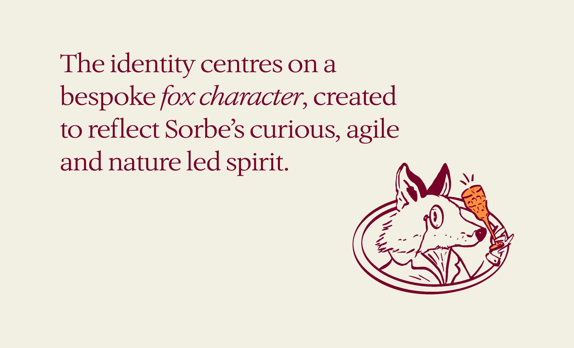
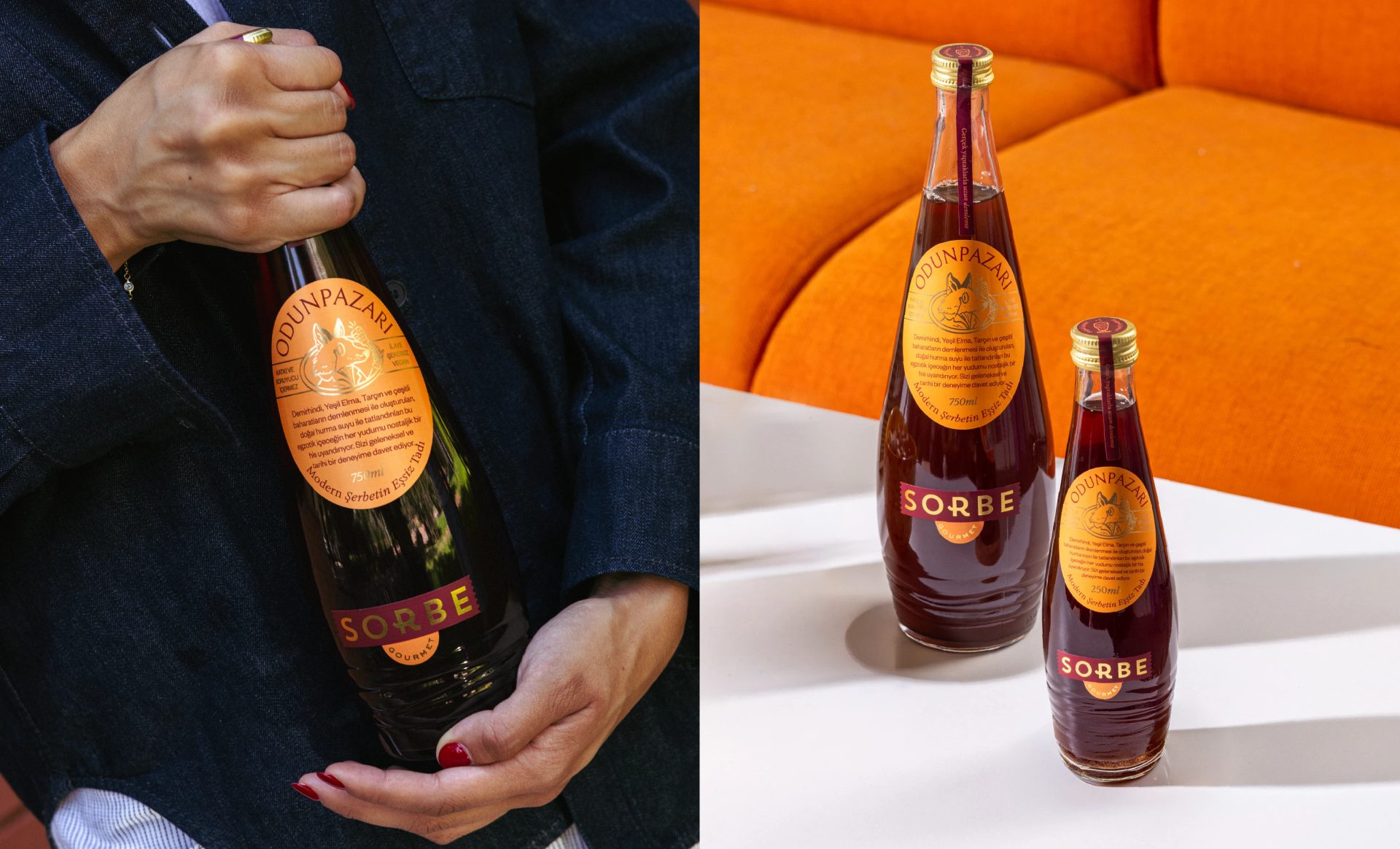
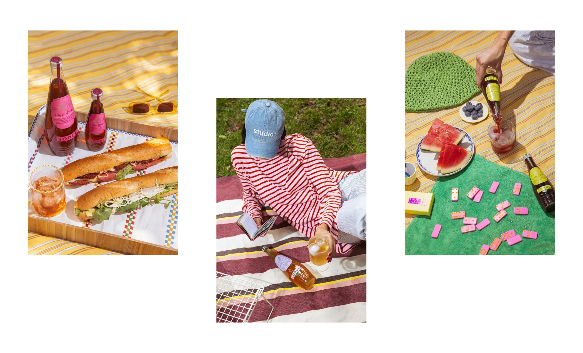
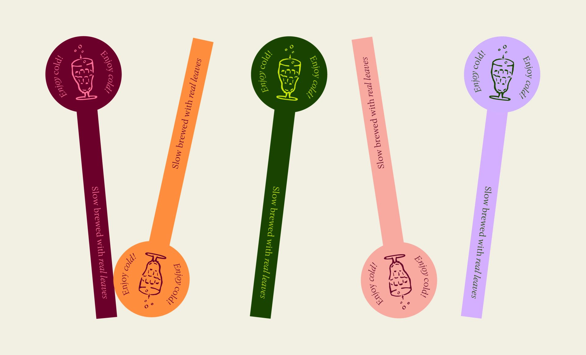
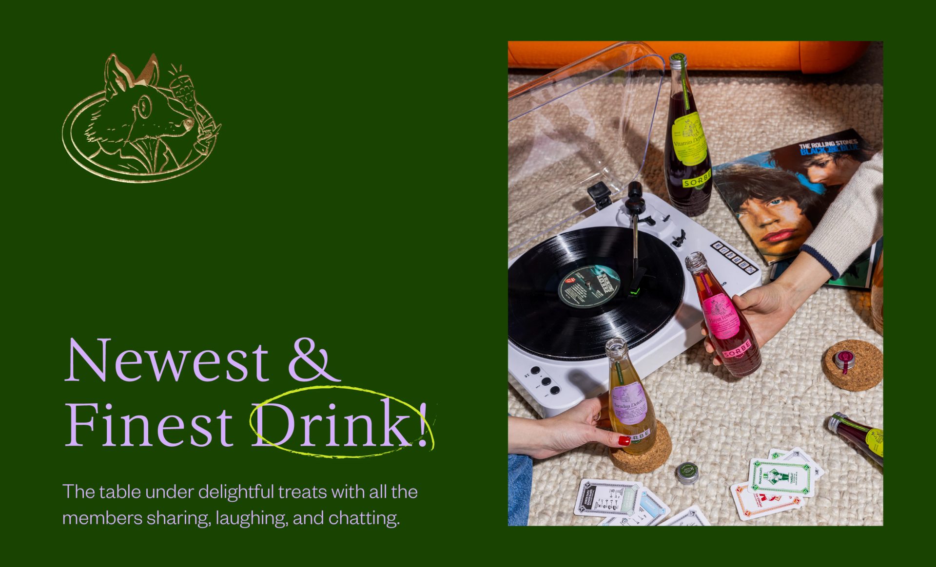
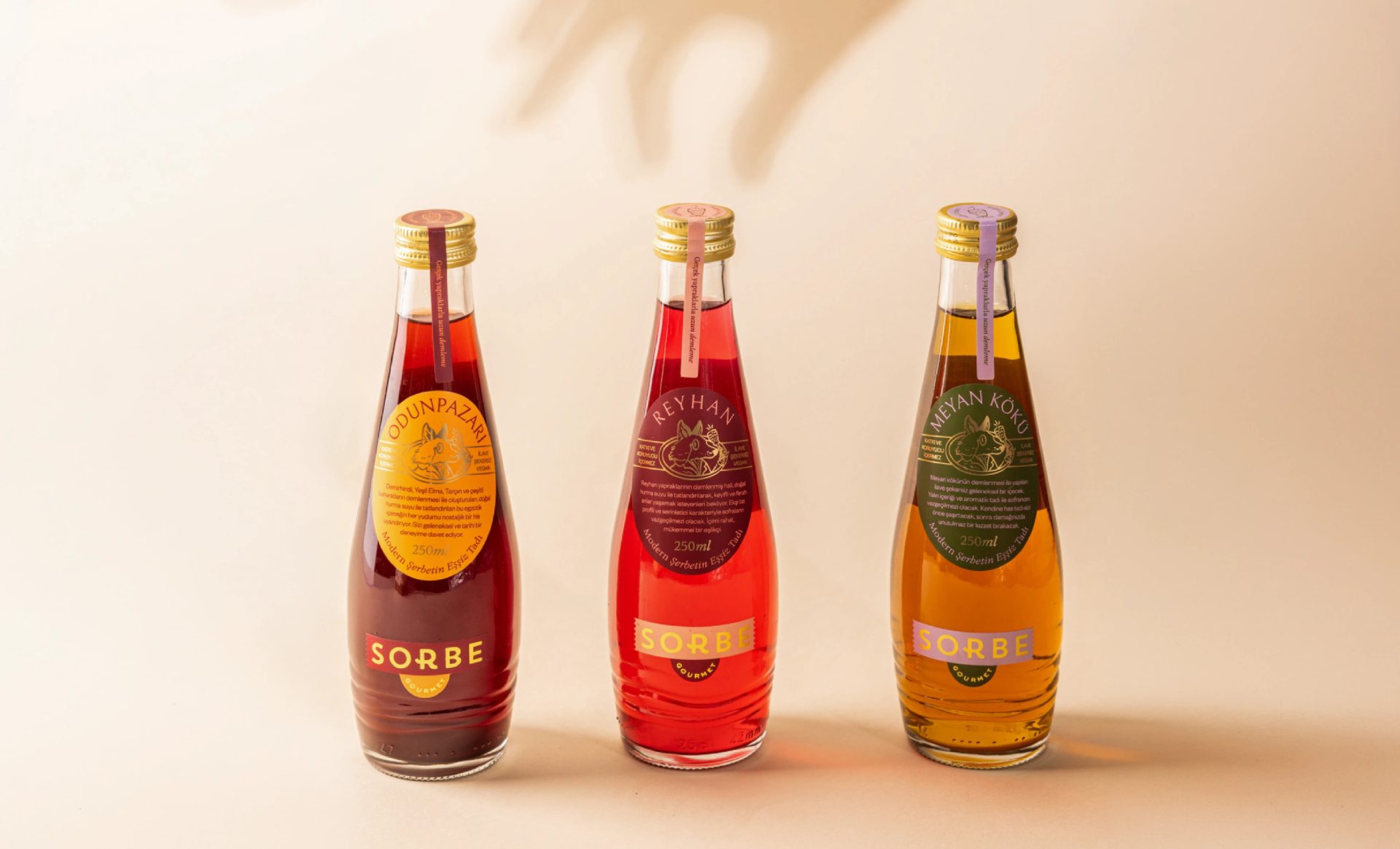
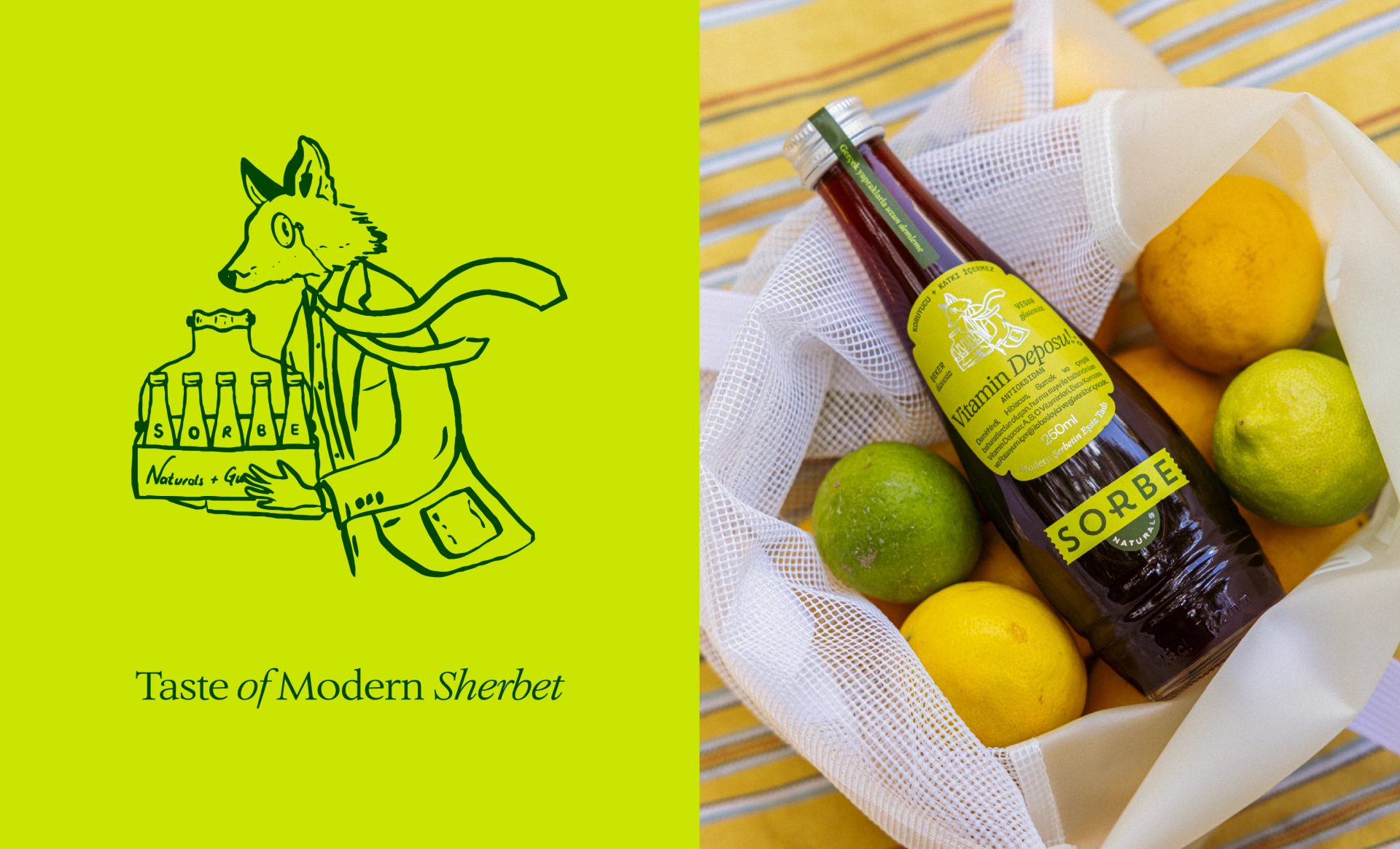
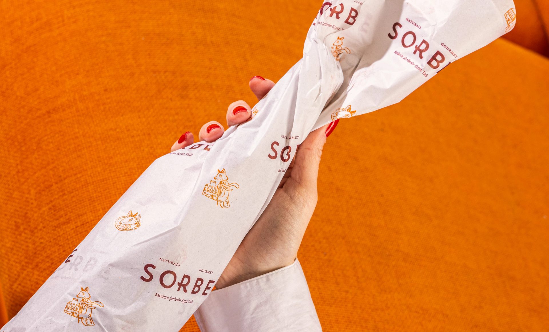
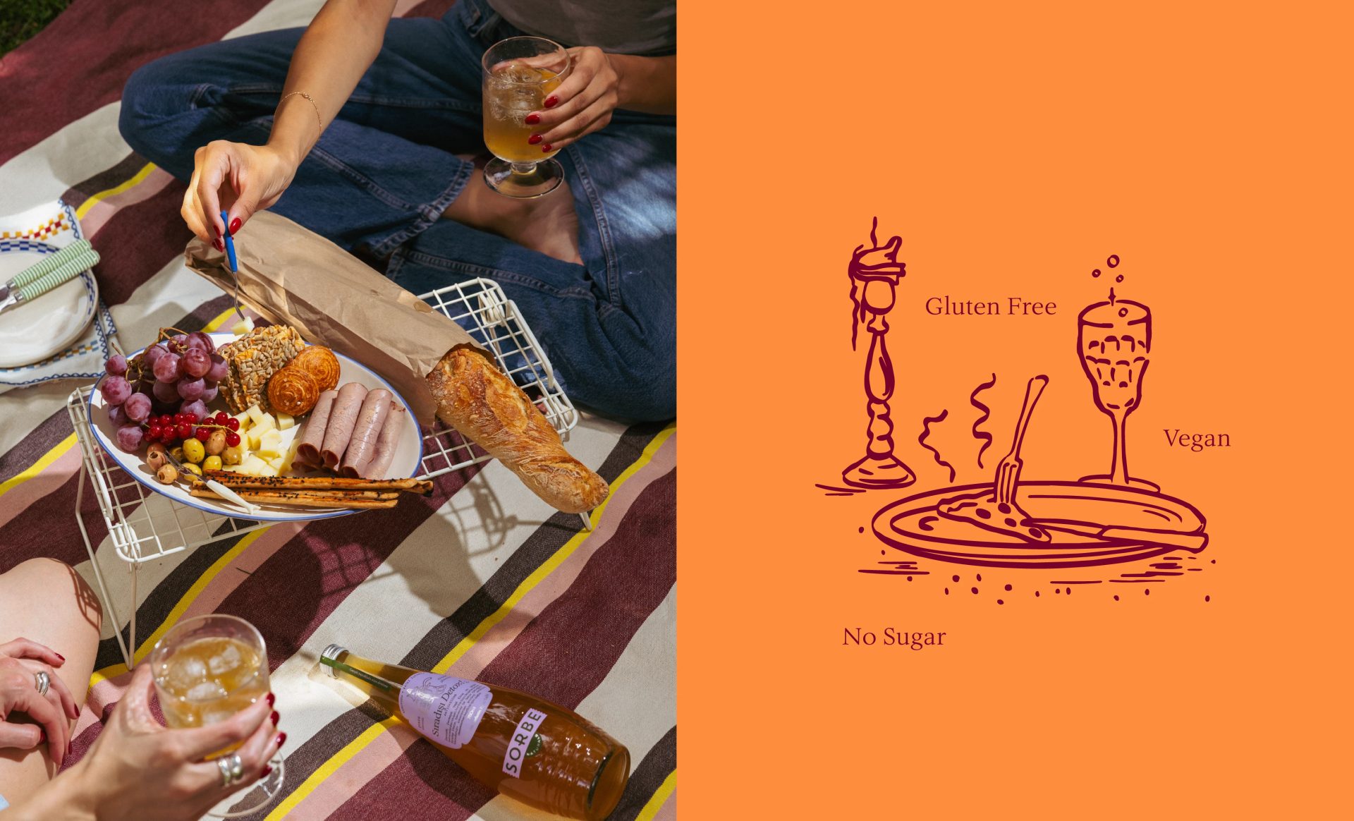
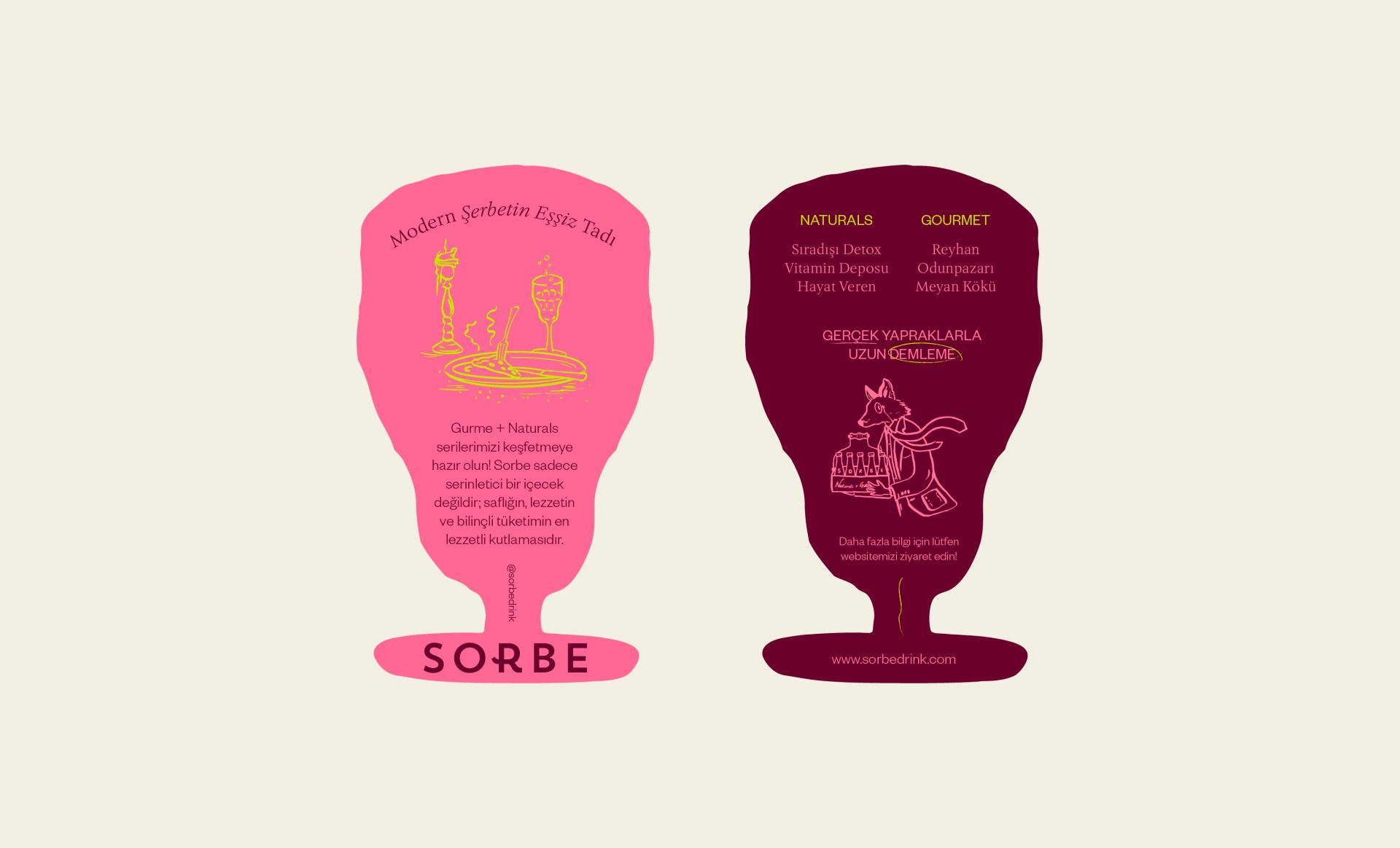
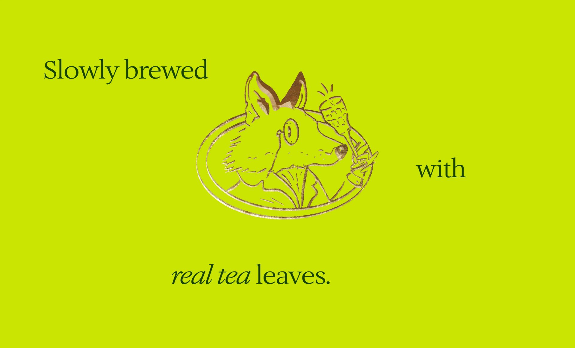
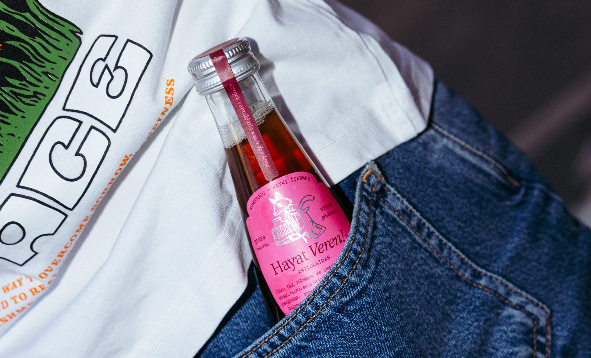
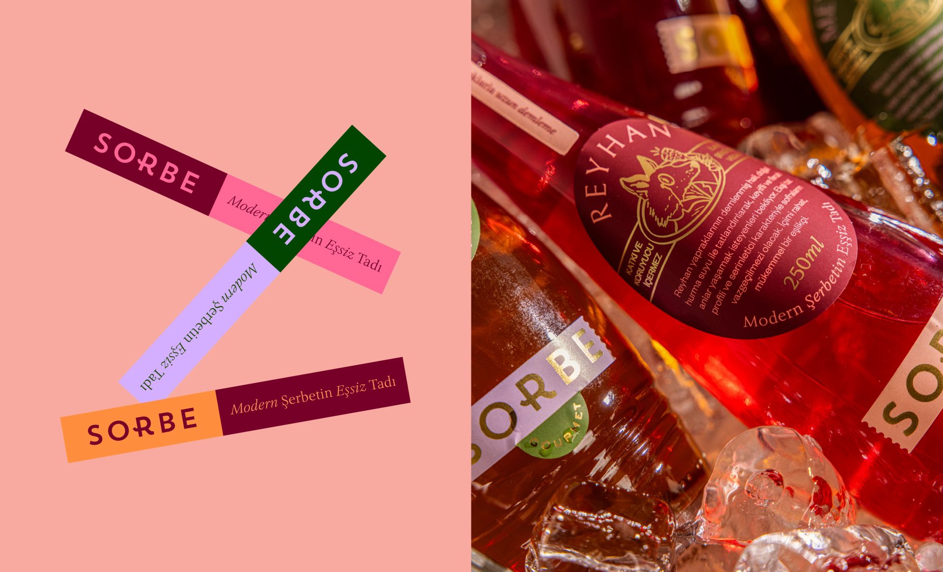
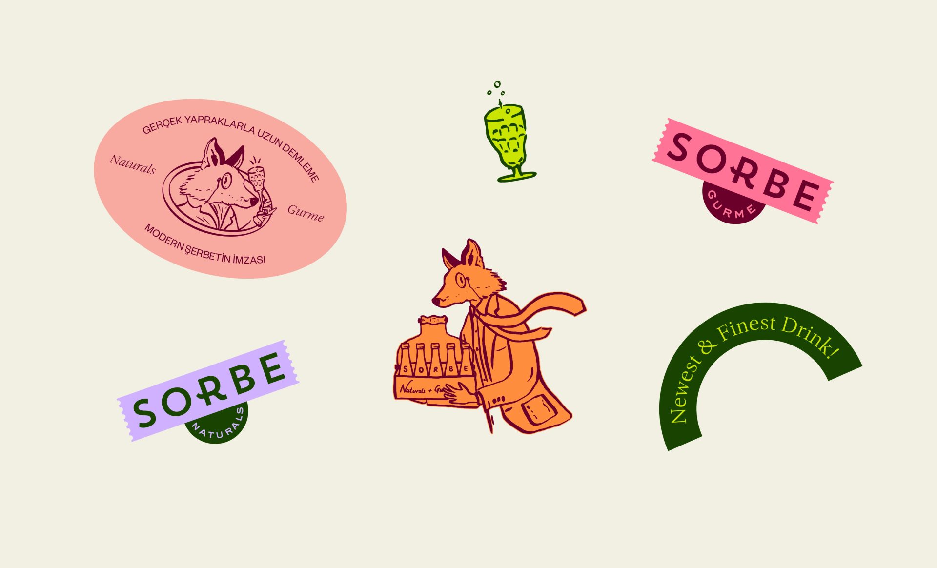
The identity centres on a bespoke fox character, created to reflect Sorbe’s curious, agile and nature-led spirit. Expressive typography, bold colour and a layered label system, drawing on stamps and seals, give the brand a distinctive and lively presence. The line “Taste of Modern Sherbet” captures Sorbe’s approach simply: a familiar drink, reintroduced for today. Across the packaging, the Gourmet and Naturals ranges share a clear visual language while keeping their own character. Gold foil lends the Gourmet range a richer, more considered finish, while silver foil gives Naturals a cooler, more contemporary feel. Together, the system presents sherbet in a way that feels fresh and characterful.