project
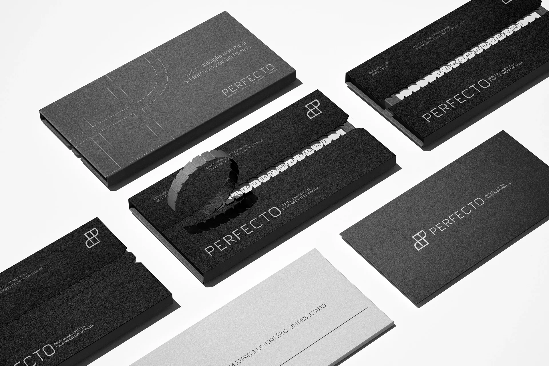
Perfecto: Solung Studio's Identity for an Aesthetic Dentistry Clinic
by Felipe Pedrosacurated by WeLoveDaily
We use cookies to measure site traffic and improve WeLoveDaily. Nothing loads until you choose. Cookie Policy.
Work, articles, studios, brands and categories across the archive.
22 results
project
by Felipe Pedrosacurated by WeLoveDaily
…Perfecto Location: João Pessoa Duration: 3 weeks Scope: Brand Strategy, Art Direction, Logo Design, Visual Identity Developed by: SolungStudio ® All rights reserved.

project
by Sohan Chakrabortycurated by WeLoveDaily
…intelligence. The identity is grounded in the philosophy of order through synthesis. The logomark functions as a structural model rather than a symbolic gesture, representing data as it…
project
by Olesia Stupiakcurated by WeLoveDaily
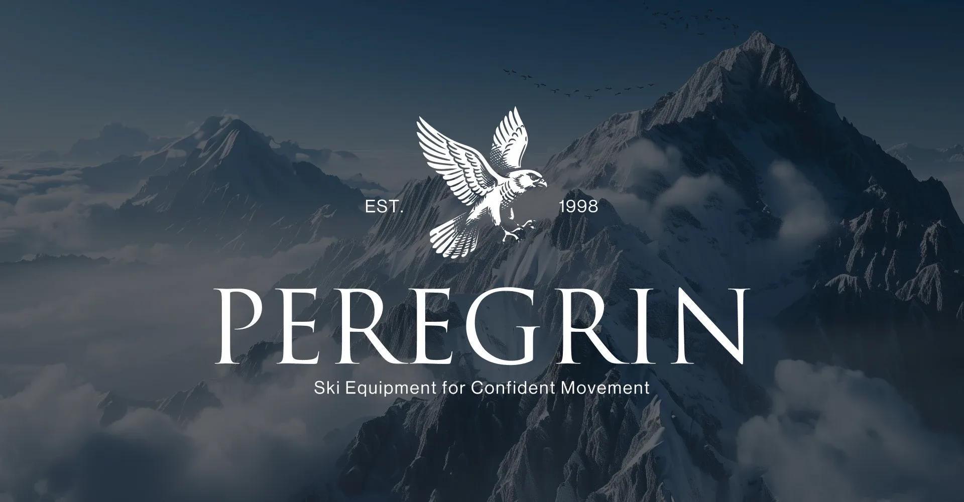
…positions its equipment — as a tool for confident movement and control on the slope. The logo is designed in an engraving style to convey naturalness, craftsmanship, and a sense of brand…
project
by Bashynska Designcurated by WeLoveDaily
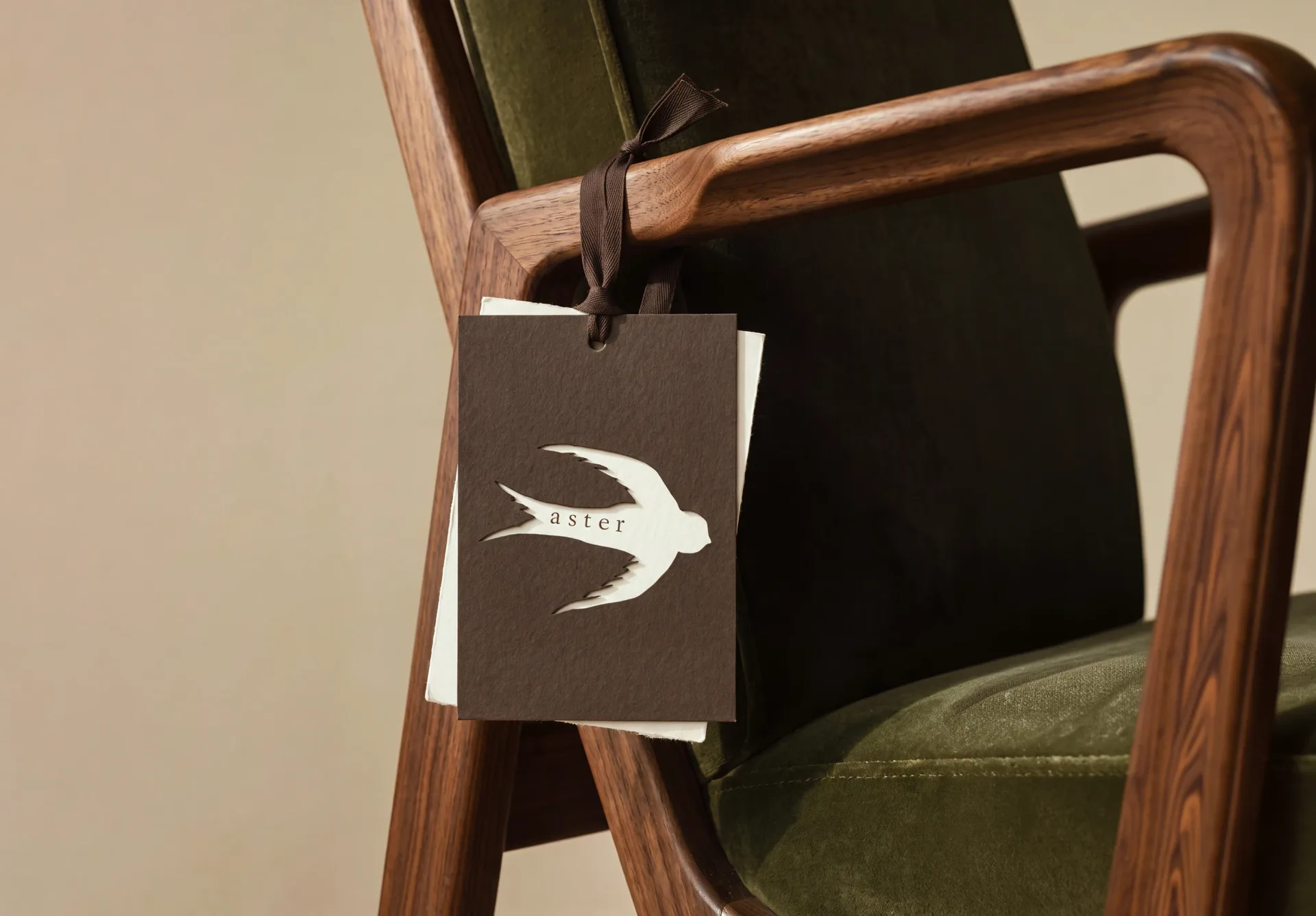
For ASTER, I created a cohesive brand ecosystem that extends far beyond the logo. I developed a visual identity inspired by architectural forms, timeless craftsmanship,…
project
by Kalleb Garciacurated by WeLoveDaily
…condition, worry-free. The tradition and expertise built over the years come together with a modern approach, reflecting the essence of an auto repair shop: a timeless craft that evolves…
project
by Sweety & Co.curated by WeLoveDaily
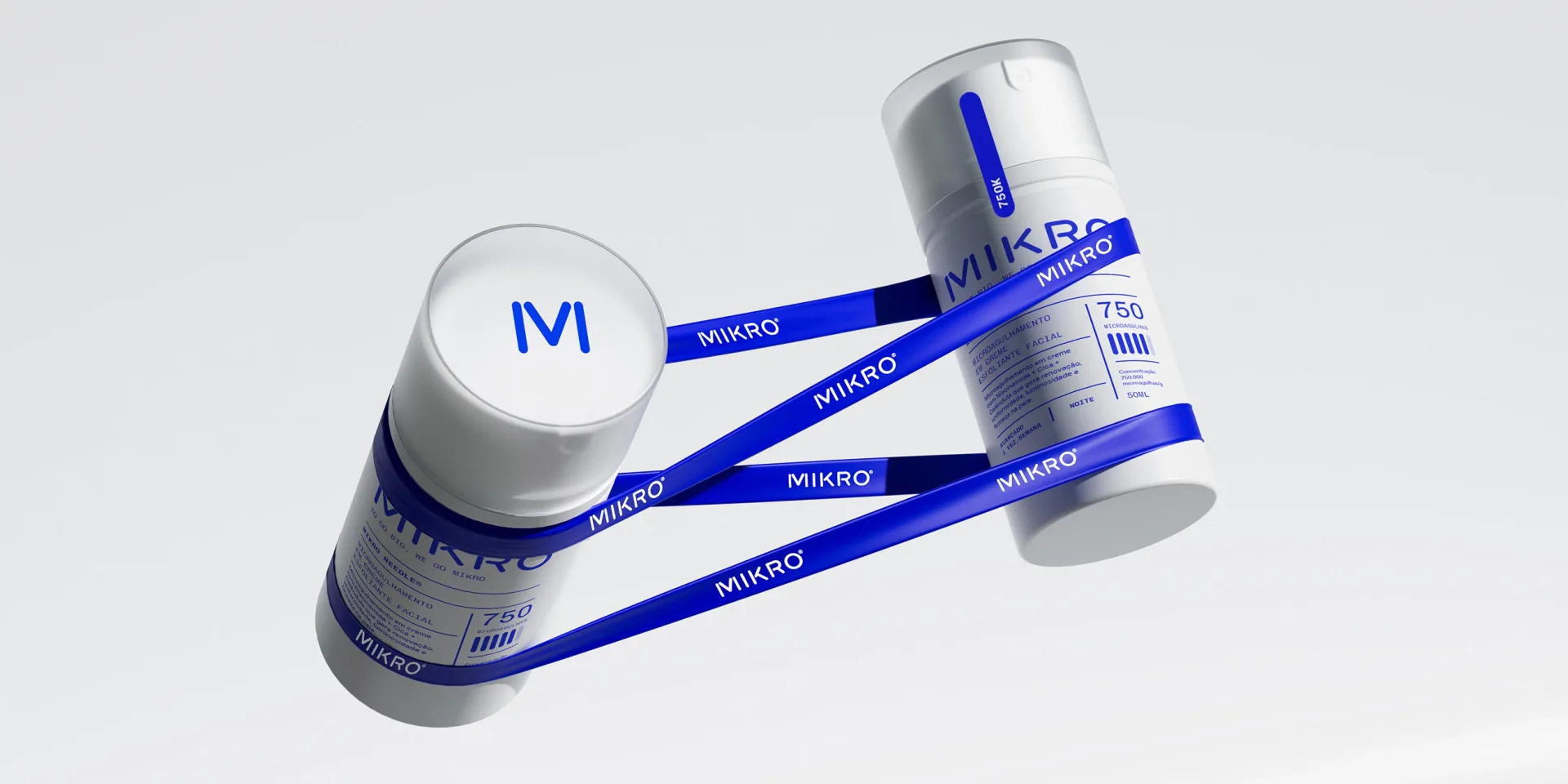
…the bio-needles. By reimagining them into a proprietary design element, Mikro crafted a logo that is both modern and ownable. The soft, rounded edges defy the rigid, antiseptic look…
ranking
by WeLoveDaily Editorial
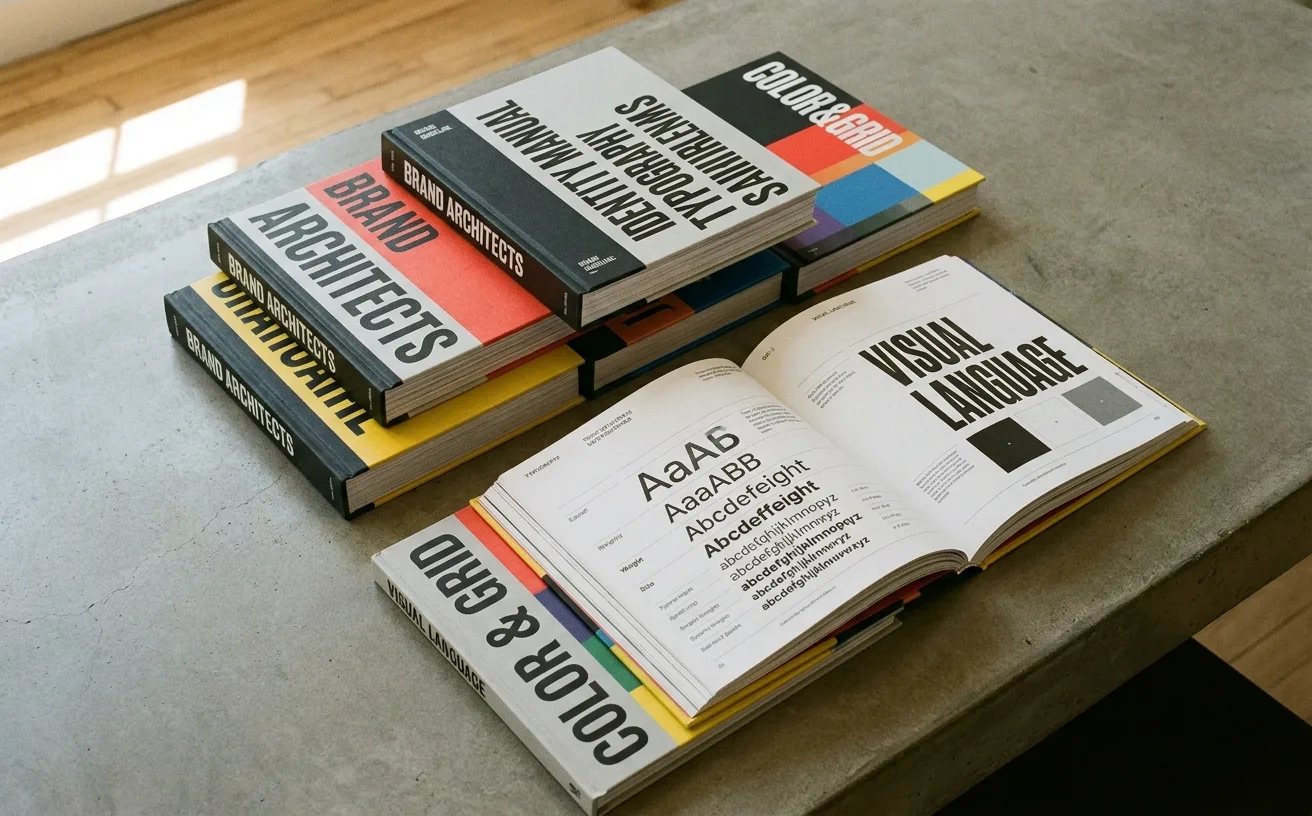
…digital dust, while the marketing team guesses at hex codes and the junior designer scales the logo by dragging the corner handle. This isn't a delivery problem. It's a design problem. Most…
project
by Pentagramcurated by WeLoveDaily
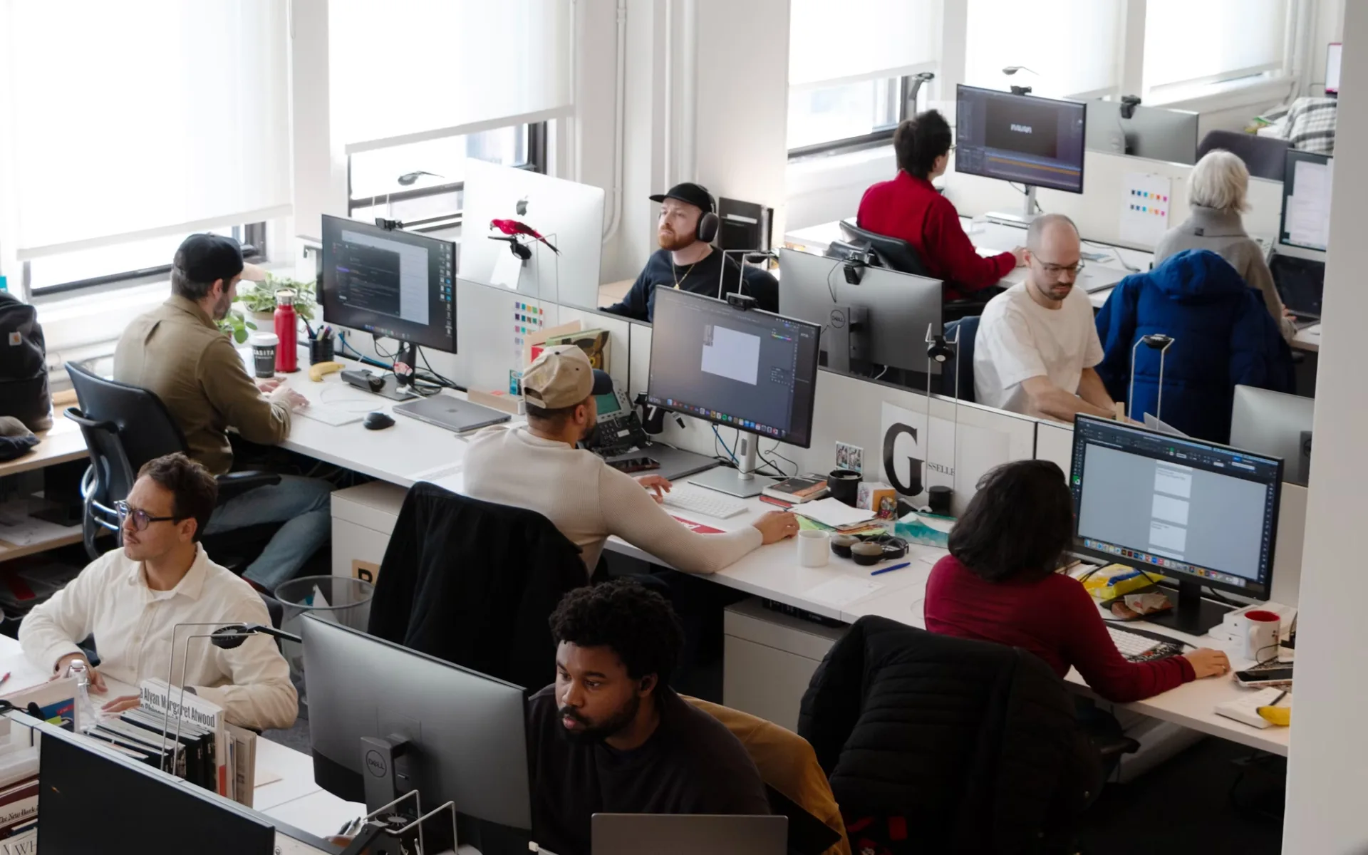
…cultural institutions. Where an earlier generation of Pentagram partners might have delivered a logo, a typeface, and a set of usage guidelines bound in a handsome book, the newer partners…
project
by Dinamocurated by WeLoveDaily
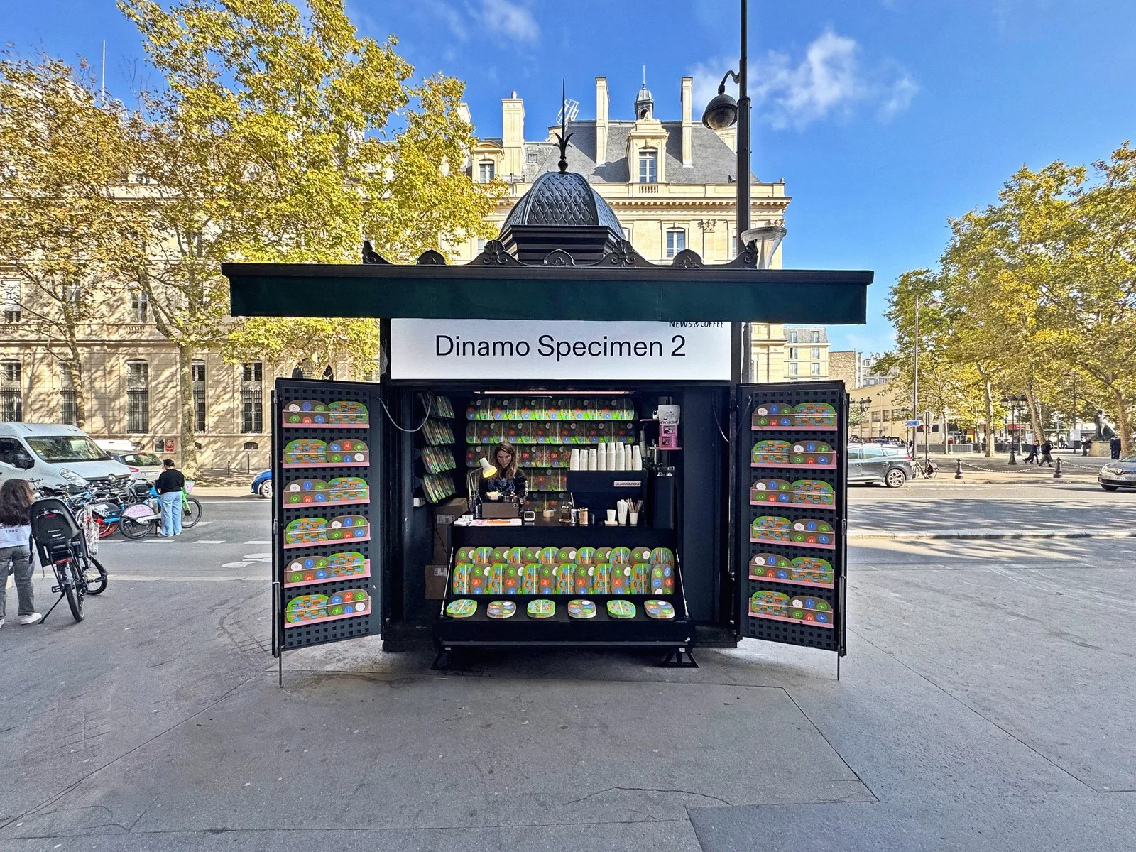
…ABC Whyte shows up in editorial layouts and app interfaces where the brief was clearly "modern but not cold, distinctive but not loud." These are typefaces that do their work by refusing…
guide
by WeLoveDaily Editorial
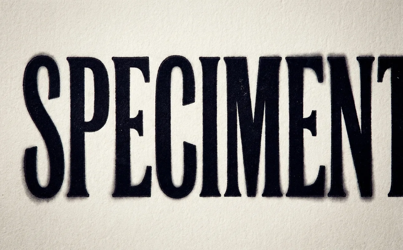
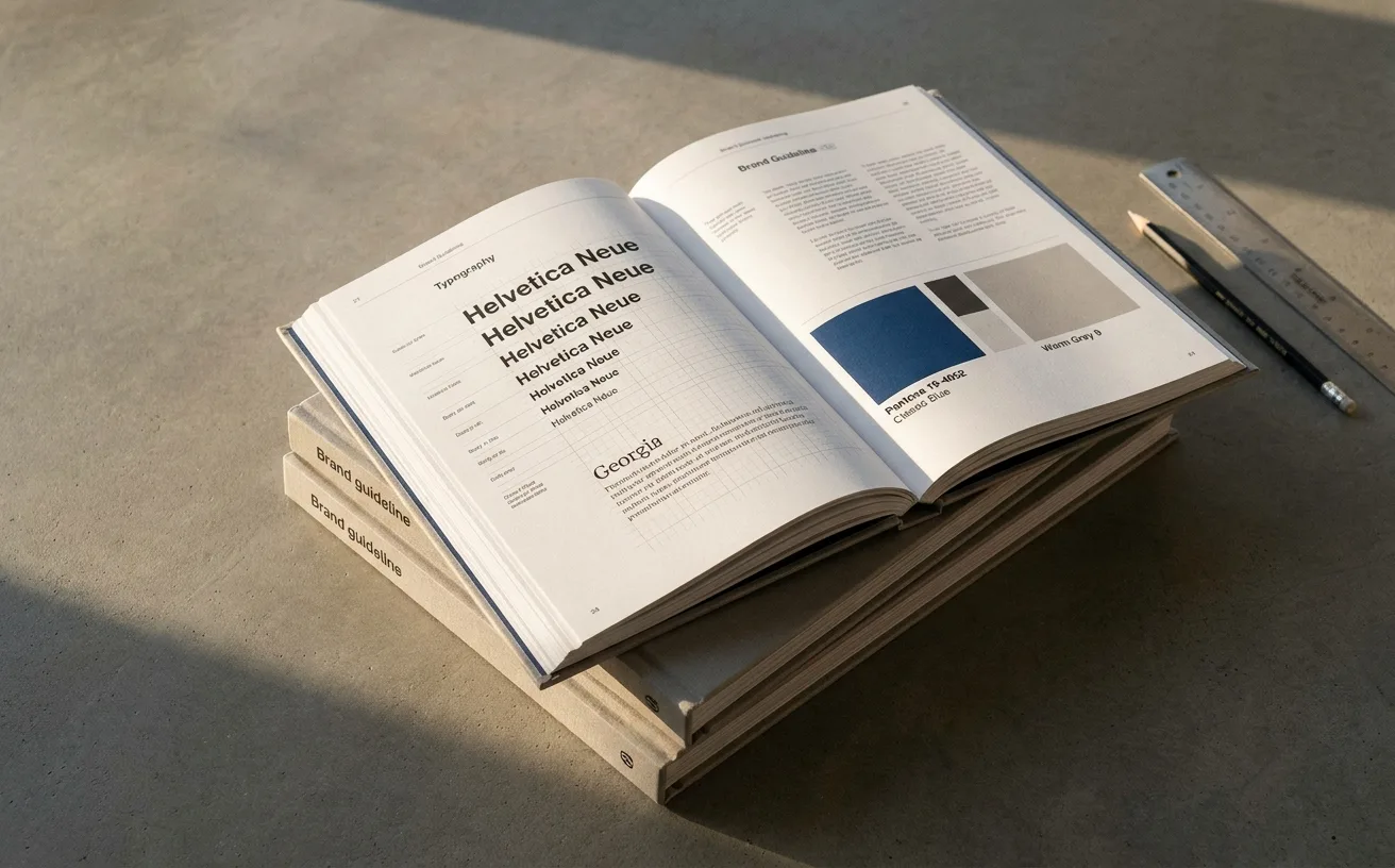
…overall headline for general tightness. For critical display moments (a hero headline, a logo lockup) consider setting the type as an SVG or using a tool like Kerntype or Lettering.js…
ranking
by Jose Pablo Dominguez
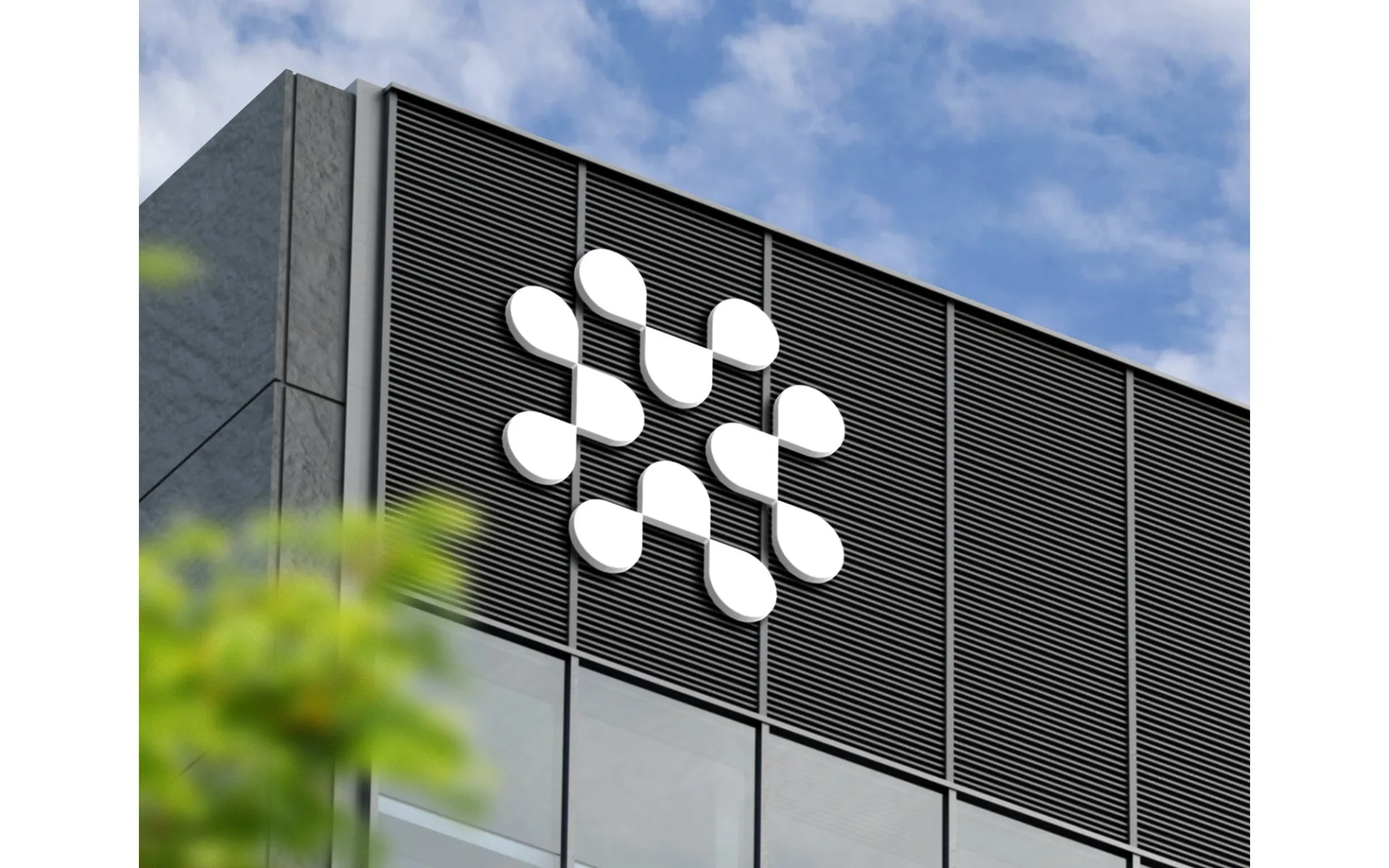
…Figma's identity lives as much in its color-and-geometry illustration language as in its logo. Steal: the way conference identity, developer materials, and product surfaces stay visually…
project
by Lippincottcurated by WeLoveDaily
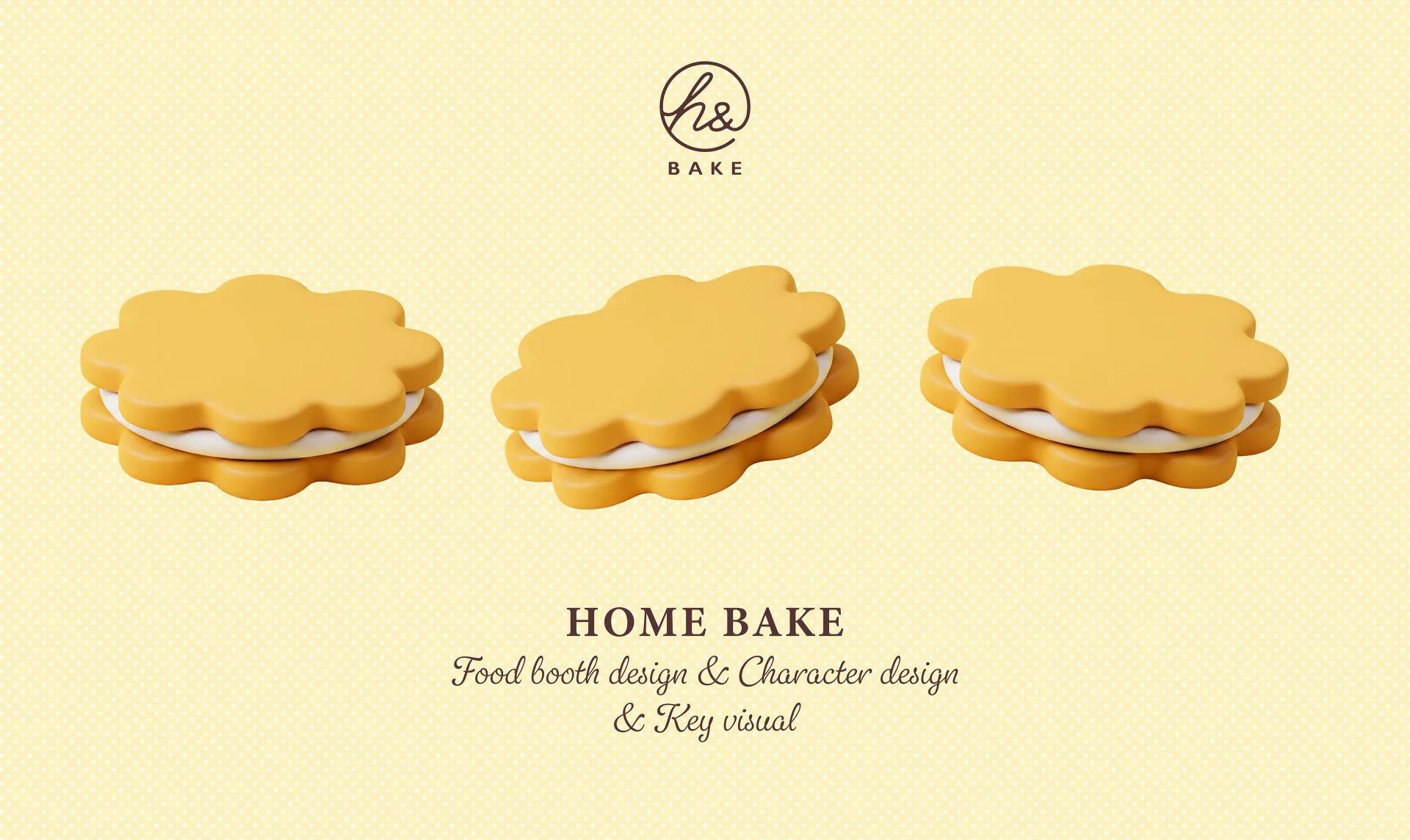
…time when the concept of a unified corporate visual identity didn't exist. Companies had logos, certainly. They had packaging and signage. But the idea that every visual touchpoint of…
project
by Little makcurated by WeLoveDaily
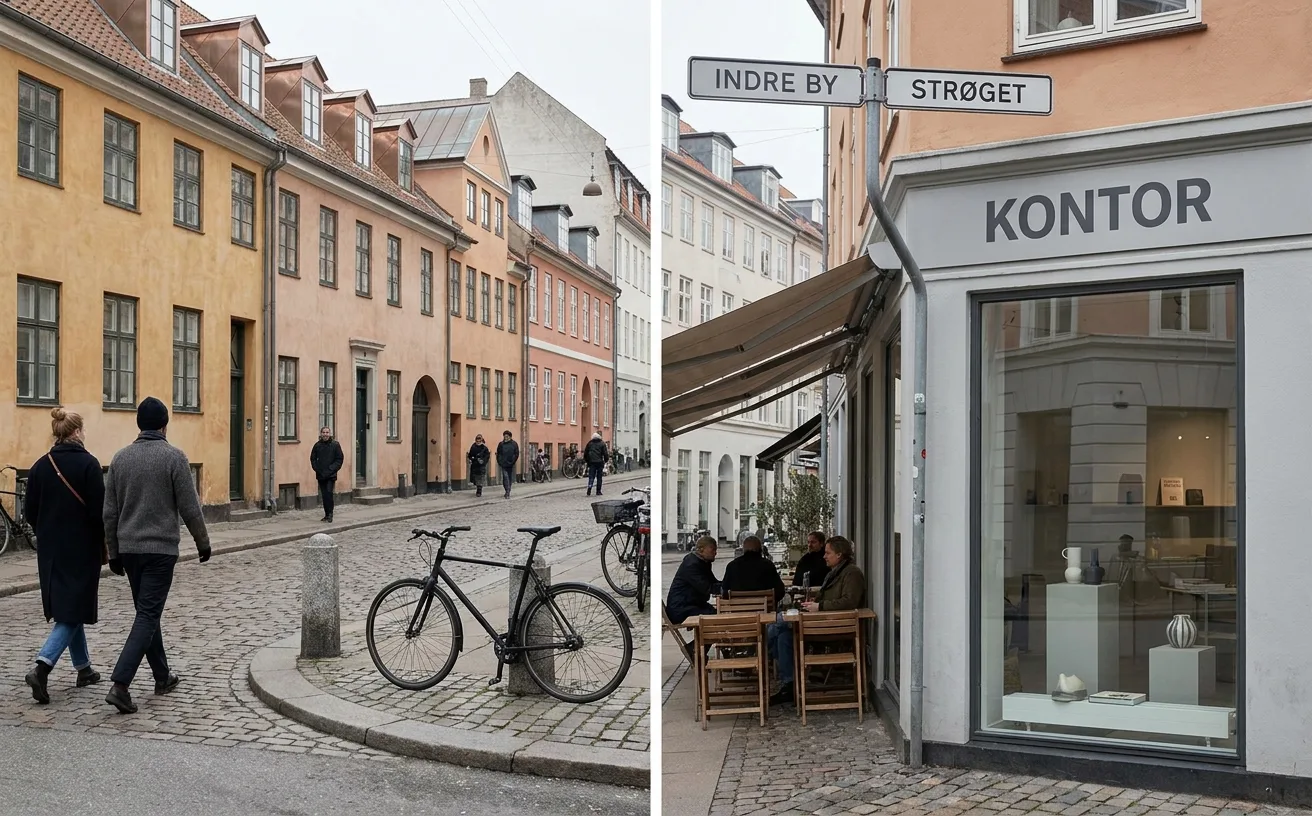
…characters play a pivotal role in the exhibition’s visuals, providing the brand with a modern, healing, and highly recognizable professional aesthetic through their three-dimensional…

project
by Collinscurated by WeLoveDaily
…built it. Collins' solution demonstrated their signature approach. Rather than simply modernising the logo or refreshing the colour palette, they built an identity system rooted in the…
article
by WeLoveDaily Editorial
…Their rebrand of Scandinavian Airlines (SAS) demonstrated that a legacy carrier could modernize its identity without abandoning the restrained, confident typography that defines Nordic…
ranking
by Jose Pablo Dominguez
…Verdict: The SaaS brand-system archetype. Figma's identity is no longer the F-in-a-box logo: it's the color-and-geometry language that runs across their conferences, merchandise, and…
ranking
by Jose Pablo Dominguez
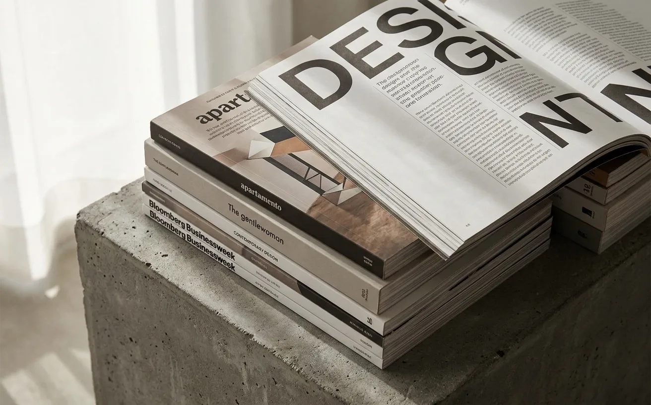
…uncomfortably between editorial and political-cartoon. Study the magazine's refusal to modernize the body column. 3. The Gentlewoman Penny Martin's editorial direction is the reference…

article
by WeLoveDaily Editorial
…Emily Weiss and her team built a visual identity around millennial pink, a clean sans-serif logo, and a photographic style that felt like a friend's Instagram feed rather than a department…
article
by WeLoveDaily Editorial
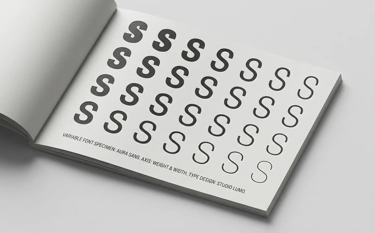
…predetermined states. Design tokens (the abstract, platform-agnostic values that power modern design systems) are a natural partner for variable fonts. A token like `--heading-weight…