project
Evenmouth: web design and 3D renders for science-led oral care
by Saxon Campbellcurated by WeLoveDaily
We use cookies to measure site traffic and improve WeLoveDaily. Nothing loads until you choose. Cookie Policy.
Work, articles, studios, brands and categories across the archive.
15 results

article
by WeLoveDaily Editorial
…is both Figma's achievement and its challenge. Because Figma is, in fact, a brand. A carefully constructed one. And its visual identity offers a case study in how to build recognition…
project
curated by WeLoveDaily
…worse, a governance concern) for enterprise IT. Notion's recent design moves suggest careful recalibration. Enterprise marketing is noticeably more restrained. Illustrations persist…

article
by WeLoveDaily Editorial
…unheard of in grocery. The typography is irregular in ways that feel intentional rather than careless. The brand's visual system extends to its advertising, which favours lo-fi production…
article
by WeLoveDaily Editorial
…difference in the first three seconds. WeLoveDaily is a design publication for people who care about how things look, work, and feel. Sources and data notes DIA's motion identity for…
ranking
by WeLoveDaily Editorial
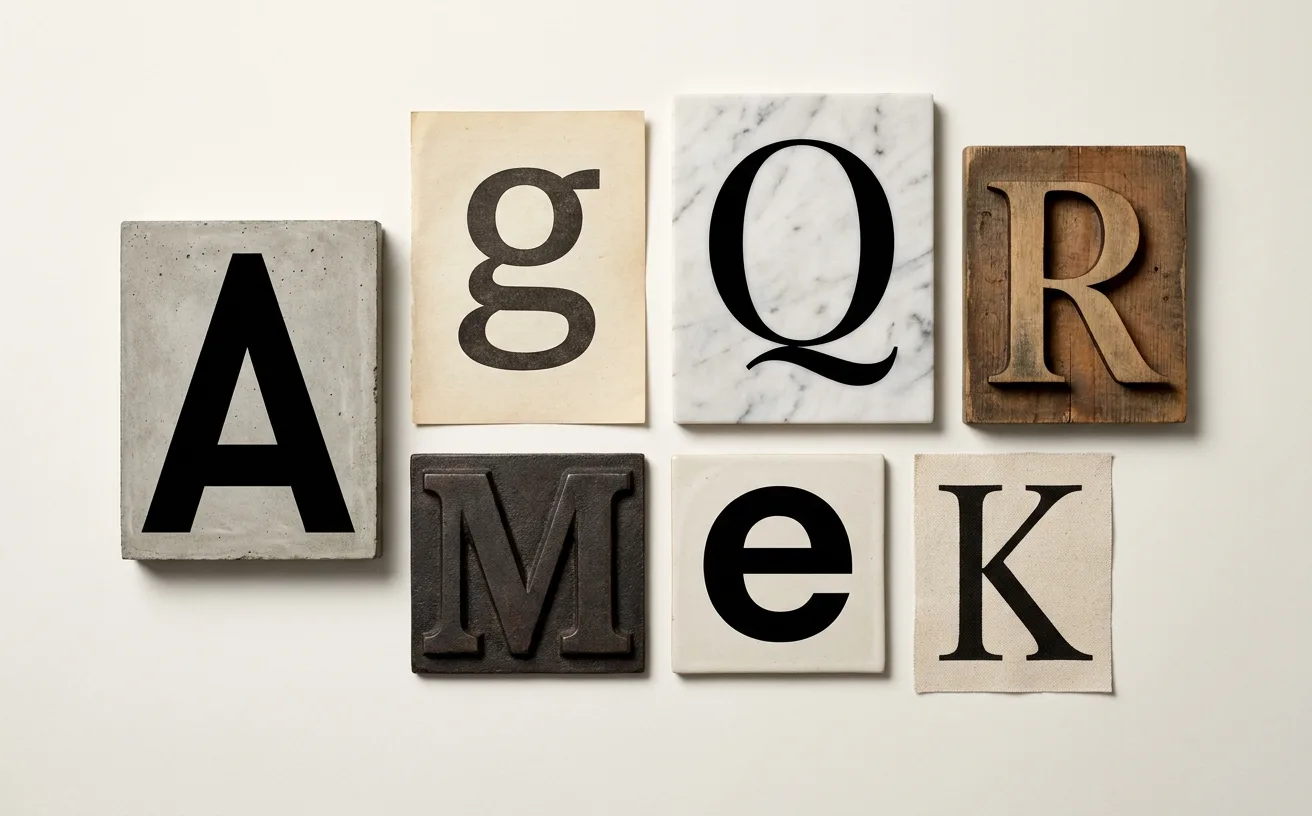
…designed for screens from the first stroke. Its tall x-height, generous spacing, and carefully tuned apertures made it legible at the small sizes where most UI text actually lives.…
article
by WeLoveDaily Editorial
…the "D" is wider than standard, the "R" has an elongated leg, the overall rhythm is carefully calibrated to feel timeless without being historicist. The typeface doesn't reference…

project
by Wolff Olinscurated by WeLoveDaily
…studio's provocative tradition. Others feel more conventional, more market-tested, more careful. Whether this represents a natural maturation or a gradual loss of nerve is a question…
project
curated by WeLoveDaily
…gradients so precise they appear to have been mixed by a colourist, typography set with the care of a fine-press book, and illustrations that belong in a design annual rather than on a…
article
by WeLoveDaily Editorial
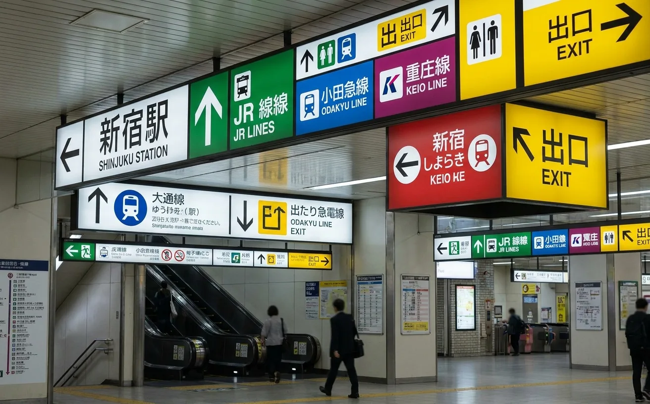
…and numbering systems. Typography ties it together. Station signage in Tokyo uses a carefully controlled typographic hierarchy. Japanese text, typically in a clean Gothic typeface…
article
by WeLoveDaily Editorial
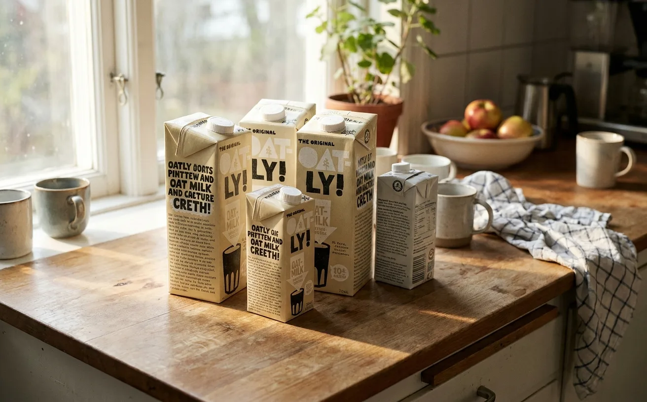
…a Page The Oatly brand identity packaging system is, at the level of visual craft, a carefully constructed machine designed to look unconstructed. Every element (the typography, the…

article
by WeLoveDaily Editorial
…conventional retail that it registers as a statement. And it is. Every Aesop store is a carefully constructed argument that restraint (in communication, in visual design, in the very act…