project
We use cookies to measure site traffic and improve WeLoveDaily. Nothing loads until you choose. Cookie Policy.
Work, articles, studios and categories across the archive.
project
…simplified. The bridge enables secure wallet migration and cross-environment access, ensuring users can move, connect, and operate without friction across the ecosystem. Nea St. …

project
…Made Visual Bluesky's product premise is decentralization: the AT Protocol, custom feeds, user-owned moderation. The brand needs to signal those values without screaming them. A logo…

project
…treated more like a research publication than a product site. Documentation, papers, and interface screenshots take visual priority over stock renders or mood-photography. This is a deliberate…

ranking
…are organized around the brand's logic (logo first, then color, then type) rather than the user's needs (how do I make a social post that looks right?). They're written in the language…

article
…Notion spent years as a wordmark-only brand before introducing a minimal mark that most users still cannot recall. This is not a coincidence. It is a pattern, and it is worth understanding…

project
…describe themselves as "typographic." ABC Whyte shows up in editorial layouts and app interfaces where the brief was clearly "modern but not cold, distinctive but not loud." These are…
article
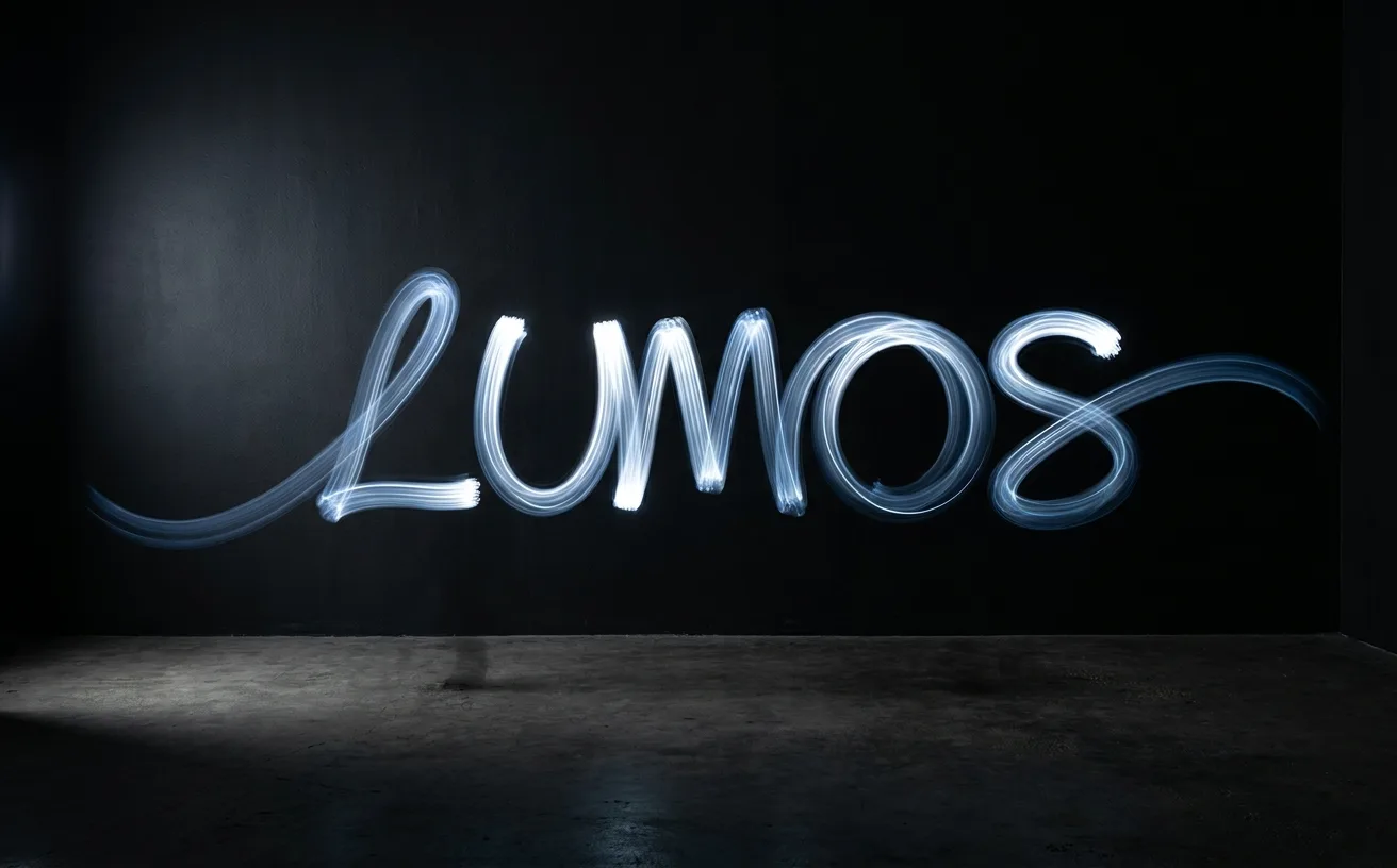
…product surface. Notion's page transitions. 5. Responsive Motion that reacts to context: user scroll, cursor position, device capability, network speed. The most mature version of kinetic…
article
…work was conceived from the start to live in motion across playlists, campaigns, and app interfaces. Their projects for Dropbox, Twitch, and CNET followed a similar logic: brand identity…
article
…Faster page loads. In an era of increasing attention to web performance and its impact on user experience, conversion rates, and search rankings, this was a compelling case on its own…
article
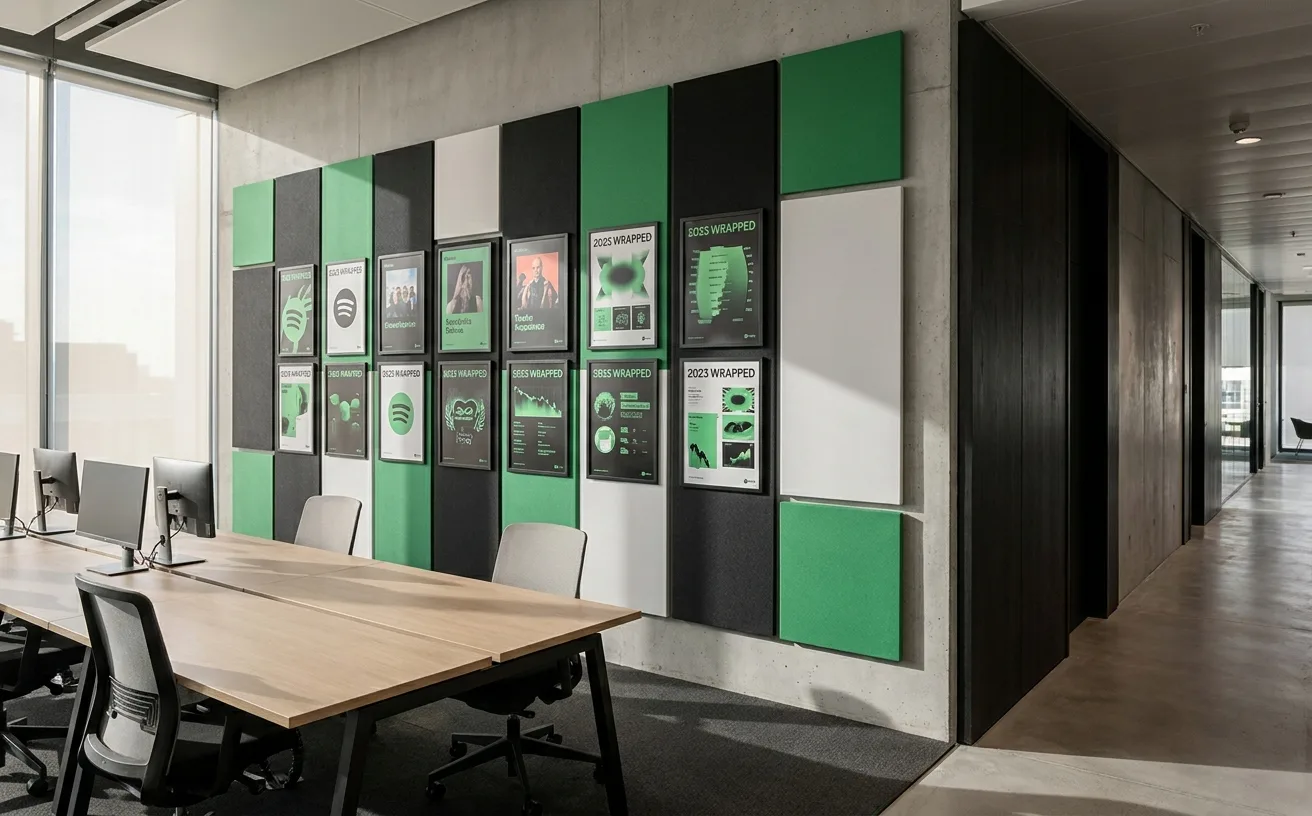
…Spotify's brand primarily lives. The decision was functional, not decorative. Spotify's interface is predominantly dark: dark album art backgrounds, dark navigation chrome, dark listening…
project
…shaped by the same design principles that govern any other human interaction with a visual interface. Stripe bet that taste would compound: that a beautiful product would attract better developers…

article
…admired the system's ambition and Collins' craft. Critics, many of them Mailchimp's existing users, felt the rebrand was solving a problem that didn't exist. The old Mailchimp was beloved…

article
…tertiary, each visually distinct and spatially consistent) is directly applicable to interface design. The principle that a user should be able to extract the most critical information…